MeDo

AIサイドバージェネレーター。

必要なサイドバーを説明してください — ナビゲーションリンク、ネストメニュー、フィルター、ウィジェット — MeDoが数秒でクリーンな本番対応コードを生成します。スキャフォールディング不要、ボイラープレート不要。

サイドバー
サイドバー

優れたサイドバーはあらゆる複雑なアプリの骨格です

サイドバーはリンクを並べるだけではありません — アプリの情報階層を定義し、ナビゲーションの摩擦を減らし、ユーザーをあらゆる深さで方向づけます。構造の悪いサイドバーはユーザーにコンテキストを見失わせ、フローの放棄につながります。ユーザーが実際にどう考えるかを反映したAI生成の構造で、最初から正しくスタートしましょう。

6 個のテンプレート

生成できる サイドバー テンプレート

どのテンプレートもスクリーンショットではなく実際のプロンプトです。任意の AI エディタに貼り付けるか、MeDo で実行して React + Tailwind のコードを受け取れます。

App shellAcme

Fixed 240px Nav With Nested Sections

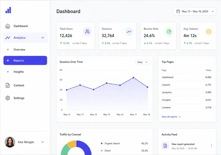
The dashboard default: icon plus label rows, two levels of nesting, a user block pinned to the bottom. Persist which sections are expanded, or the sidebar resets its shape on every page load.

Create a fixed 240px sidebar for an app shell: logo at the top, then icon-and-label rows for Dashboard, Analytics, Content and Settings, with Analytics and Content expanding into two or three nested sub-items behind a chevron that rotates 90 degrees when open. Mark the active route with aria-current="page", a left accent bar and a tinted row background, and auto-expand the section containing it on load. Persist expanded sections in localStorage. Pin a user block with avatar, name and workspace to the bottom with margin-top auto. Below 1024px, hide the sidebar off-canvas and open it as a drawer from a header toggle.

MeDoで試す
CollapsibleMega

Rail That Expands to Full Width

Toggles between a 64px icon rail and a 240px labelled panel. Icons alone are not self-explanatory — without tooltips in the collapsed state, users learn the rail by clicking things at random.

Create a collapsible sidebar that toggles between a 64px icon rail and a 240px expanded panel, animating the width over 200ms with a transform-friendly transition and no layout thrash on the main content. In the collapsed state, center each icon, hide the labels, and show the label as a tooltip on hover and on keyboard focus so the icons are not guesswork. Keep the toggle button at the bottom of the rail with aria-expanded and a chevron that mirrors direction. Persist the collapsed state in localStorage and honour it during server rendering so the panel does not flash open on load.

MeDoで試す
Docs TOCDocs

Scroll-Spy Table of Contents

A full documentation tree with the current heading tracked as you scroll. The hard part is not the highlight — it is keeping the active item inside the sidebar's own scroll viewport on load.

Create a documentation sidebar showing a full table of contents: six collapsible guide groups with four to eight page links each, the current page marked with aria-current="page", and beneath it an on-page heading list tracked by an IntersectionObserver so the visible section highlights as the reader scrolls. Give the sidebar its own overflow-y-auto scroll container with the header height subtracted from its max height, and scroll the active item into view on load using scrollIntoView with block: nearest so the page itself does not jump. Below 1024px, move the whole tree into a drawer.

MeDoで試す
FiltersShop

Faceted Filter Panel

Not navigation at all — a form that happens to sit in the left column. Each applied filter has to survive a page refresh, which means the URL is the state, not a hook.

Create a faceted filter sidebar for a product listing page: collapsible groups for Category with checkboxes and result counts, Price as a dual-handle range with numeric inputs, Brand as a searchable checkbox list capped at six visible items behind a Show all toggle, plus Rating and In stock. Reflect every applied filter in the URL query string so the filtered view is refreshable and shareable, and show applied filters as removable chips at the top with a Clear all. Announce the updated result count through an aria-live="polite" region. Below 1024px, present the whole panel as a bottom sheet behind a Filters button showing the active count.

MeDoで試す
Content railStudio

Sticky Article Companion

A right-hand rail on a blog or docs article carrying the table of contents, share links and related posts. Sticky positioning fails silently here if any ancestor has overflow set.

Create a sticky right-hand sidebar for a long article: an On this page heading list built from the h2 and h3 elements with the current section highlighted by an IntersectionObserver, a reading-time estimate, a vertical share row, and a three-item related-posts list at the bottom. Use position: sticky with a top offset equal to the header height, and make sure no ancestor of the sidebar sets overflow to hidden or auto, since that silently breaks sticky. Hide the rail entirely below 1280px and render the heading list as a collapsed details element above the article body instead.

MeDoで試す
Multi-levelShipfast

Three-Level Tree With Search

For CMS and admin tools where the tree is genuinely deep. Filtering the tree is what makes three levels usable — without a search field, level three is effectively unreachable.

Create a three-level sidebar tree for a CMS: a filter input at the top that matches labels at any depth and auto-expands the branches containing a match, then top-level sections each holding groups which hold page links. Indent each level by 12px with a hairline guide line rather than more padding, so depth stays readable at 240px. Support full keyboard traversal with arrow keys — down and up between visible rows, right to expand, left to collapse or move to the parent — and give each expandable row aria-expanded. Keep the active branch expanded across navigations.

MeDoで試す

サイドバー をカスタマイズする方法

情報の深さに合わせる

5-8セクションのフラットなアプリには、シングルレベルのサイドバーがすっきりします。管理ダッシュボードやドキュメントサイトのような深いアプリには、展開/折りたたみ動作付きの2-3レベルのネストを指定してください。

折りたたみ動作を指定する

サイドバーがモバイルでアイコンに折りたたまれるか、ハンバーガートグルでオフキャンバスにスライドするか、常に表示されるかをMeDoに伝えてください。各パターンは異なる画面サイズとユースケースに適しています。

コンテキストウィジェットを追加する

サイドバーはナビゲーションだけではありません — ユーザープロフィールカード、ストレージ使用量バー、通知バッジ、クイックアクションボタンを追加して、真の生産性ハブにしましょう。

幅と固定を制御する

固定のサイドバー幅(例:240px)またはリサイズ可能なパネルを指定してください。長いコンテンツのページでは、スクロールに追従するスティッキーサイドバーを指定すると、ナビゲーションが常に手の届く場所にあります。

サイドバー コンポーネントを使うのは誰か

SaaSダッシュボード

管理・分析ダッシュボードはサイドバーを使って、ユーザー、レポート、請求、設定などのモジュールを整理します — ネストされたサブ項目と未読通知のバッジカウンター付き。

ドキュメントサイト

ドキュメントサイトはサイドバーに依存して完全な目次を表示します。ガイドごとの折りたたみセクションとスティッキーなスクロールスパイにより、読者は常に自分の位置を把握できます。

ECカテゴリーフィルター

商品一覧ページではサイドバーパネルをファセットフィルタリングに使用します — カテゴリー、価格帯、ブランドチェックボックス — 買い物客がページを離れずに数千の結果を絞り込めます。

コンテンツ管理システム

CMSインターフェースはサイドバーを使ってコンテンツタイプ、下書き、メディアライブラリ、公開ワークフローをナビゲートし、メインキャンバスを編集用にクリアに保ちます。

サイト種別ごとの サイドバー パターン

同じ サイドバー コンポーネントを、掲載するサイトの種類に合わせて調整します。

01 / 06

SaaS Dashboard Sidebar

The primary navigation for a logged-in product: sections, sub-items, badge counts and a user block at the bottom. Persist which groups are expanded — a sidebar that collapses back to its default shape on every page load makes the app feel like it forgets you.

サイドバー のスタイルとバリアント

ページ全体のトーンに合うバリアントを選び、そのまま生成します。

01 / 06

Fixed Sidebar

Always visible at 240 to 280px, with the main content offset by the same width. The right default for a dashboard on desktop: navigation that never has to be summoned is navigation people actually use.

React・Next.js・Vue・Svelte での サイドバー

React、Next.js、Vue 3、SvelteKit、Astro、素の HTML — 同じ サイドバー を 6 通りの方法で組み込めます。

01 / 06

React Sidebar

Two pieces of state — the expanded groups and the mobile drawer — so keep both in the sidebar rather than lifting them to a layout provider. Take the current path as a prop so the component stays router-agnostic.

src/components/Sidebar.tsx

export function Sidebar({ sections, pathname }) {
  const [open, setOpen] = useState(() => activeGroup(sections, pathname))

  return (
    <aside className="w-60 shrink-0 overflow-y-auto">
      <nav aria-label="Sidebar">
        {sections.map((s) => (
          <Group key={s.id} section={s} expanded={open === s.id} />
        ))}
      </nav>
    </aside>
  )
}

サイドバー をプロジェクトに追加する方法

サイドバー テンプレートを選んで本番に載せるまでの 4 ステップ。

01~30s

Pick a Sidebar Template

Match it to what the column actually holds: app routes take the fixed nav, a docs tree takes scroll-spy, product facets take the filter panel. Those three have almost nothing in common beyond their position on screen.

02~10s

Copy the Prompt

Paste it into MeDo, Lovable, Bolt, v0 or Cursor with your real section names. Keep the persistence and mobile-drawer clauses — the localStorage state and the focus trap are the first things a trimmed prompt loses.

03~1min

Generate and Refine

You get React + Tailwind back with a live preview. Follow up in plain English — "add badge counts to Inbox", "collapse to an icon rail", "pin the user block to the bottom".

04~2min

Mount It in Your Layout

Put it in a nested layout — app/(app)/layout.tsx or +layout.svelte — beside a flex-1 main, not inside the page. Mounted per page it remounts on every navigation and loses its scroll position and expanded groups.

サイドバーに関するよくある質問

AIでサイドバーを作成するには?

MeDoを開き、必要なサイドバーをプレーンテキストで説明してください — リンク構造、動作(折りたたみ式、スティッキー、アイコンのみ)、配色を含めて — MeDoが完全なコンポーネントコードを生成します。プロンプトを洗練させながら、ビジョンに正確に一致するまで繰り返し調整できます。

最高のAIサイドバージェネレーターは?

MeDoはサイドバーのような洗練されたUIコンポーネント生成に特化して構築されています。汎用コードジェネレーターとは異なり、MeDoはレイアウトセマンティクス、レスポンシブ動作、デザインシステムを理解するため、スクリーンショットで見栄えが良いだけでなく、実際に機能するサイドバーが得られます。

AIで折りたたみ可能なサイドバーを生成できますか?

はい。プロンプトに「折りたたみ可能」を含めて、折りたたみターゲットを指定するだけです — アイコンのみモード、フルオフキャンバス、またはリサイズ可能なパネル。MeDoがJavaScriptのトグルロジックとCSSトランジションを自動的に処理します。

モバイルで動作するレスポンシブなサイドバーを作るには?

MeDoにブレークポイント(例:768px)以下の画面でハンバーガートリガーのドロワーに折りたたまれるサイドバーを生成するよう指示してください。生成されるコンポーネントにはメディアクエリとトグル状態管理が含まれ、すぐに正しく動作します。

AIでネストされたメニュー項目を持つサイドバーを生成できますか?

もちろんです。プロンプトでメニューの深さを説明してください — 例えば「各トップレベル項目がアニメーション付きシェブロンで3つのサブ項目を展開する2レベルのサイドバー」 — MeDoが再帰的またはフラットなネスト構造を適切に生成します。

MeDoはReactやNext.js用のサイドバーコンポーネントに対応していますか?

はい。MeDoは指定したフレームワークと言語でコンポーネントを生成します。TypeScript付きのReact関数コンポーネント、Next.js App Routerレイアウトサイドバー、またはプレーンHTML/CSS/JS版を指定できます — 出力はスタックに適応します。