MeDo

AI 헤더 생성기.

페이지 상단을 설명하면 MeDo가 띠 전체를 만듭니다 — 로고와 브랜드 락업, 그 위에 놓는 선택적 공지 바, 프로스트 글라스 블러를 곁들인 스티키 스크롤 동작, 그리고 CTA까지. 내비게이션 링크는 그 안에 있고, 헤더는 그것을 감싸는 모든 것입니다.

헤더
헤더

헤더는 모든 페이지에 빠짐없이 등장하는 유일한 컴포넌트입니다

랜딩 페이지, 문서, 결제 흐름 사이에서 다른 것이 무엇이 바뀌든 헤더는 변하지 않습니다. 그래서 헤더는 브랜드 정체성을 지고 가는 요소이면서, 성능을 잘못 다뤘을 때 가장 비싼 대가를 치르는 자리입니다. 폰트가 로드될 때 밀리는 헤더, 하이드레이션 전에 높이를 확보하지 않는 헤더는 한 페이지가 아니라 방문자가 보는 모든 페이지에서 레이아웃 시프트를 만듭니다. 스티키 동작에도 같은 배수가 적용됩니다. 스크롤 프레임마다 다시 그려지는 블러는 사이트 전체의 부드러움을 앗아갑니다. 한 번 생성해 모든 곳에서 쓰기 때문에, 헤더는 프롬프트에서 과하게 상세히 지정할 가치가 있습니다.

템플릿 6개

생성할 수 있는 헤더 템플릿

모든 템플릿은 스크린샷이 아니라 실제 프롬프트입니다. 어떤 AI 에디터에든 붙여넣거나 MeDo에서 실행해 React + Tailwind 코드를 그대로 받으세요.

Fixed heightAcme

Sticky Header With a Frosted Scroll State

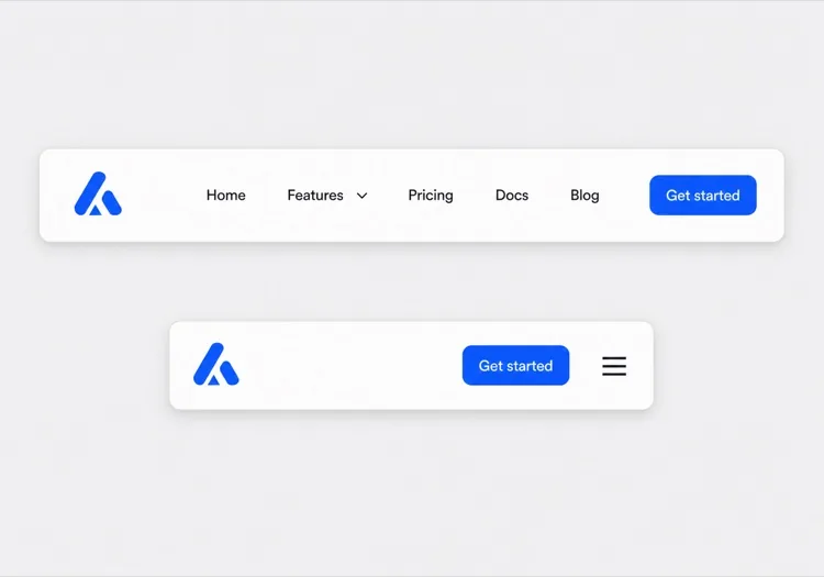
The default worth starting from: a pinned height and a blur that only appears once you have scrolled. Specifying the height is the whole point — a header that sizes to its content shifts on every page as the webfont swaps in.

Create a sticky website header with an explicit 64px height set on the container so the space is reserved before the logo and webfonts load. Logo mark plus wordmark on the left, four navigation links in the middle, one filled Get started button on the right. Start with a solid white background and a 1px bottom border, then switch to a semi-transparent surface with a backdrop blur once the page scrolls past 80px, transitioning over 200ms. Drive the state from an IntersectionObserver watching a 1px sentinel above the header rather than a scroll listener, so nothing runs on the scroll thread. Below 768px, replace the links with a hamburger that opens a drawer.

MeDo에서 시도하기
Announcement barMega

Promo Bar Above a Sticky Row

Two stacked strips where only the lower one stays pinned. The trap is the sticky offset: dismiss the bar without recomputing it and the header floats 36px below the viewport top for the rest of the session.

Create a two-part header: a dismissible 36px announcement bar on an accent background with a short promo line, an inline link and a close button, and beneath it a 64px main row with logo, links and a CTA. Only the main row is sticky. Persist the dismissal in localStorage so the bar does not return on the next page, and recompute the sticky top offset when it is removed so the main row still pins flush to the viewport top. Render the bar server-side and hide it with a class rather than mounting it after hydration, so dismissing it never causes a visible reflow of the page below.

MeDo에서 시도하기
TransparentShipfast

Transparent Over Hero, Solid on Scroll

For landing pages with a full-bleed hero behind the header. Everything that depends on the background — logo variant, link color, border, button style — has to flip in one state change, not four.

Create a header that overlays a full-bleed hero image: fully transparent with no border at the top of the page, with a light logo variant and white links. Once the page scrolls past the hero height, switch in a single state change to a solid white surface, a dark logo variant, dark links and a 1px bottom border, transitioning over 200ms. Keep the header height fixed at 72px in both states so the switch does not move the links. Add a scroll-margin-top equal to the header height on all headings so in-page anchors do not land behind the bar.

MeDo에서 시도하기
Two-rowShop

Utility Row Over a Sticky Search Row

A storefront header where the top row scrolls away and the search row stays. Pinning both eats 100px of a phone viewport, which is most of a product image.

Create a two-row e-commerce header. The top row, 32px tall, carries a free-shipping message on the left and Track order, Help and account links on the right, and scrolls away with the page. The bottom row, 64px tall, holds the logo, a wide search input, a wishlist icon and a cart button with a count badge, and is the only row that stays sticky. Announce cart count changes through an aria-live="polite" region. Below 768px, collapse the top row entirely, keep logo, search icon and cart in the sticky row, and open search as a full-width overlay when the icon is tapped.

MeDo에서 시도하기
App shellDocs

Fixed Header With a Sidebar Toggle

A docs header that has to coordinate with a sidebar below it. Reserve the toggle button's space at every breakpoint, otherwise the logo jumps sideways when the button appears at the tablet threshold.

Create a fixed 56px documentation header: a sidebar toggle button on the far left that is only interactive below 1024px but keeps its 40px slot reserved at every breakpoint so the logo never shifts, then the logo, a version switcher, a search button with a Command-K hint, a theme toggle and a GitHub link. Because the header is fixed rather than sticky, add matching top padding to the page body and set scroll-margin-top on every heading so deep links from search land below the bar. Give the toggle aria-expanded and aria-controls pointing at the sidebar element.

MeDo에서 시도하기
StaticStudio

Oversized Wordmark, No Sticky

Not everything needs to be pinned. A tall static header that scrolls away gives an agency site its full viewport back, and removes the scroll listener along with it.

Create a static header for a design studio that scrolls away with the page rather than sticking: 120px tall, with an oversized lowercase wordmark on the left, a one-line location and availability note beneath it, and four right-aligned links in a light weight with wide letter spacing. No border, no background change, no scroll listener at all. Below 640px, reduce the height to 80px, keep the wordmark, and move the four links into a full-screen overlay opened by a text Menu button — labelled Menu rather than a hamburger icon, and closing on Escape with focus returned to the button.

MeDo에서 시도하기

헤더 커스터마이즈 방법

스타일을 손대기 전에 높이를 못박으세요

헤더 높이를 명시적으로 요청하세요. 한 줄이면 되고, 로고와 웹폰트가 로드될 때 모든 페이지에서 발생하는 레이아웃 시프트를 없애줍니다. 이는 헤더에서 비롯되는 가장 흔한 Core Web Vitals 퇴행입니다.

스크롤 상태를 스로틀링하세요

가공하지 않은 스크롤 리스너로 토글되는 backdrop blur는 초당 수십 번 다시 그려집니다. 스크롤 핸들러를 requestAnimationFrame으로 스로틀링하거나 IntersectionObserver 센티넬로 구동하도록 지정해, 중급 하드웨어에서도 스크롤이 부드럽게 유지되도록 하세요.

공지 바를 헤더의 일부로 다루세요

메인 행 위에 프로모션 띠를 원한다면 같은 프롬프트에서 함께 설명해 그 높이가 스티키 오프셋에 반영되도록 하세요. 나중에 덧붙이면 콘텐츠를 가리거나, 닫은 뒤 높이를 이중으로 계산하게 됩니다.

브랜드 락업을 정확히 지정하세요

마크만 쓸지, 마크와 워드마크를 함께 쓸지, 작은 화면에서 마크만 남도록 줄일지 말해주세요. 헤더는 모든 페이지에 있는 유일한 컴포넌트이므로, 브랜드 일관성은 바로 이곳에서 지켜지거나 무너집니다.

헤더 컴포넌트를 사용하는 사람

SaaS 제품 사이트

고정 높이 64px의 흰색 헤더로, 스크롤하면 프로스트 블러가 걸리고, 그 위에는 캠페인 기간 동안 출시 프로모션을 노출하는 닫을 수 있는 공지 바가 놓입니다.

이커머스 스토어

상단 행에는 무료 배송 배너와 계정 링크, 하단 행에는 검색과 장바구니를 배치한 2단 헤더로, 쇼퍼가 스크롤할 때 하단 행만 스티키로 남습니다.

마케팅 또는 랜딩 페이지

풀블리드 히어로 이미지 위에 놓인 투명 헤더가 스크롤 시 솔리드 배경으로 전환되고, 같은 브레이크포인트에서 로고가 밝은 버전에서 어두운 버전으로 교체됩니다.

개발자 문서 사이트

버전 스위처와 검색 트리거가 있는 고정 헤더에, 태블릿 브레이크포인트 아래에서 나타나는 사이드바 토글이 자체 공간을 확보해 문서 본문이 절대 다시 흐르지 않습니다.

웹사이트 유형별 헤더 패턴

같은 헤더 컴포넌트를 게시되는 사이트 유형에 맞춰 조정합니다.

01 / 06

SaaS Product Header

One fixed-height sticky strip with a brand lockup, links and a single CTA. Because it renders on every route, any layout shift here is multiplied across your whole Core Web Vitals field data rather than isolated to the landing page.

헤더 스타일과 변형

페이지의 나머지 부분과 어울리는 변형을 골라 바로 생성하세요.

01 / 06

Fixed-Height Sticky Header

An explicit height on the container, pinned to the top. The height is not a styling detail — without it the strip resizes as the logo and webfonts resolve, and that shift lands on every page a visitor opens.

React, Next.js, Vue, Svelte에서의 헤더

React, Next.js, Vue 3, SvelteKit, Astro 또는 순수 HTML — 같은 헤더을 여섯 가지 방식으로 넣을 수 있습니다.

01 / 06

React Header

Keep the scroll state in the header itself with an IntersectionObserver on a sentinel div, not a scroll listener. Render it once above your router outlet so the observer is created once per session.

src/components/Header.tsx

export function Header() {
  const [pinned, setPinned] = useState(false)
  const ref = useRef(null)

  useEffect(() => {
    const io = new IntersectionObserver(
      ([e]) => setPinned(!e.isIntersecting)
    )
    io.observe(ref.current)
    return () => io.disconnect()
  }, [])

  return <header className={pinned ? 'backdrop-blur' : ''} />
}

헤더을 프로젝트에 추가하는 방법

헤더 템플릿을 고르고 프로덕션에 배포하기까지 네 단계.

01~30s

Pick a Header Template

Decide two things first: does the strip stay pinned, and is there an announcement bar. Those choices drive the sticky offset and the scroll state, and they are the awkward ones to retrofit.

02~10s

Copy the Prompt

Paste it into MeDo, Lovable, Bolt, v0 or Cursor. Keep the explicit pixel height and the sentinel-based scroll state in the text — those two sentences are what stop the header shifting and repainting on every page.

03~1min

Generate and Refine

You get React + Tailwind back with a live preview. Follow up in plain English — "make the blur stronger", "persist the dismissed announcement bar", "flip the logo variant on scroll".

04~2min

Mount It in Your Layout

Put the header above {children} in your root layout. If it is fixed rather than sticky, add matching top padding to the body and scroll-margin-top to your headings so anchor links do not land underneath it.

헤더에 대한 자주 묻는 질문

AI 헤더 생성기란?

AI 헤더 생성기는 웹사이트에 대한 자연어 설명을 받아 완전하고 스타일링된 헤더 컴포넌트의 HTML, CSS, JavaScript를 자동으로 생성하는 도구입니다. 레이아웃 코드를 처음부터 작성하는 대신, 원하는 것을 설명하면 작동하는 코드를 돌려받습니다.

AI로 웹사이트 헤더를 어떻게 만드나요?

MeDo를 열고, "디자인 에이전시를 위한 스티키 헤더 만들기. 왼쪽에 로고, 작업물, 소개, 연락처 링크, 오른쪽에 '이야기합시다' 버튼"과 같은 프롬프트를 입력하면 MeDo가 전체 컴포넌트를 생성합니다. 그런 다음 코드를 복사하거나 후속 프롬프트로 계속 편집할 수 있습니다.

AI로 반응형 헤더를 생성할 수 있나요?

네. MeDo는 기본적으로 모바일 우선 헤더를 생성합니다. 관심 있는 브레이크포인트나 디바이스를 알려주세요 — "768px 이하에서 햄버거 메뉴로 축소" — 그러면 반응형 로직을 처리해 줍니다.

헤더와 내비바의 차이는 무엇인가요?

헤더는 모든 페이지 맨 위의 전체 너비 띠입니다. 브랜드 락업, 선택적 공지 바, 스티키 및 스크롤 동작, 그리고 이 모두를 담는 컨테이너가 포함됩니다. 내비바는 그 안의 내비게이션 링크입니다. 사이트 전반에서 페이지 상단이 어떻게 보이고 동작하는지가 중요하다면 헤더를 만드세요. 실제 관심사가 링크 구조, 드롭다운, 모바일 메뉴라면 AI 내비바 생성기를 확인하세요.

헤더가 레이아웃 시프트를 일으키지 않게 하려면?

프롬프트에서 헤더에 명시적인 높이를 주어 폰트와 로고가 로드되기 전에 브라우저가 공간을 확보하게 하고, 공지 바가 있다면 하이드레이션 이후 콘텐츠를 밀어내지 않도록 그 자리도 미리 확보하세요. 헤더가 sticky가 아니라 fixed라면 페이지 본문에 같은 크기의 상단 패딩을 더하세요. MeDo에 고정 헤더 높이를 요청하면 둘 다 적용해 줍니다.

웹사이트 헤더 생성에 가장 좋은 AI 도구는?

MeDo는 헤더를 포함한 개별 웹사이트 컴포넌트를 프롬프트에서 생성하기 위해 특별히 만들어졌습니다. 범용 AI 채팅 도구와 달리 MeDo는 컴포넌트 구조, 접근성 요구사항, 실제 UX 패턴을 이해하므로 — 결과물이 시니어 프론트엔드 개발자가 제공하는 것에 더 가깝습니다.