MeDo

منشئ التنبيهات بالذكاء الاصطناعي.

صِف الرسالة ويُنشئ MeDo مجموعة التنبيهات المضمّنة كاملة — أنماط معلومات ونجاح وتحذير وخطأ مع شريط لوني وأيقونة وعنوان ووصف ورابط إجراء اختياري وزر إغلاق عندما لا يكون التنبيه دائماً.

التنبيه
التنبيه

الخطورة يجب أن تُفهم دون الاعتماد على اللون

التنبيه هو المكوّن الوحيد الذي تتمثل وظيفته بالكامل في إيصال مدى خطورة الأمر، واللون هو أقل القنوات موثوقية لأداء ذلك. نحو رجل واحد من كل اثني عشر يعاني شكلاً من ضعف تمييز الألوان، والأحمر والأخضر هما الزوج الأكثر التباساً، والتنبيه نفسه إذا عُرض في السمة الداكنة أو على شاشة حاسوب محمول خافتة أو طُبع بالتدرج الرمادي يفقد التمييز كلياً. النتيجة العملية أن التنبيه يحتاج ترميزاً مكرراً بحكم التصميم: شكل أيقونة مختلف لكل مستوى خطورة، وصياغة تذكر الموقف صراحةً بدل الاعتماد على استنتاج القارئ من درجة لونية. وتوليد المستويات الأربعة كلها من وصف واحد هو ما يحفظ مجموعة الأيقونات قابلة للتمييز فعلياً، لأنها تُختار في مقابل بعضها لا واحدة تلو الأخرى.

6 قالبًا

قوالب التنبيه التي يمكنك توليدها

كل قالب هو طلب حقيقي لا صورة. انسخه إلى أي محرّر ذكاء اصطناعي، أو شغّله في MeDo لتحصل على كود React و Tailwind مباشرة.

BasicFour Severities

Accent-Bar Alert in Four Tones

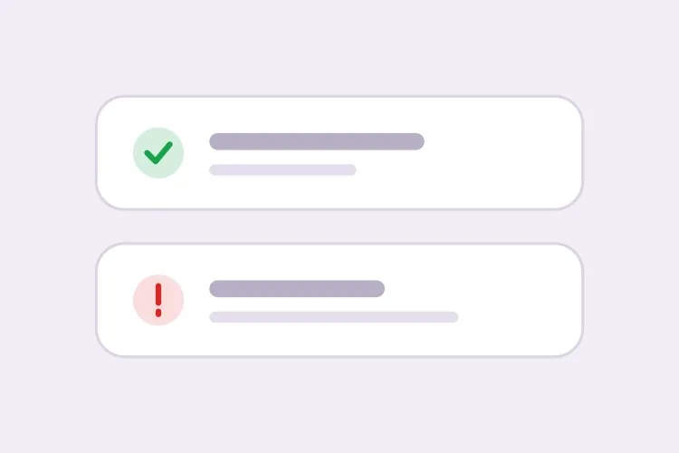
The baseline set. Generating all four together is what keeps the icon shapes distinguishable from each other rather than four recolors of one glyph.

Create an inline alert component with four severities — info in blue with a circle icon, success in green with a check, warning in amber with a triangle, error in red with an octagon. Each is full width within its container with a 4px left accent bar in the severity color, a background tinted to roughly 8% of that color, 16px padding, an 8px radius, and a 20px icon aligned to the first text line rather than vertically centered. Render a semibold 15px title with an optional 14px muted description below. Because the alert renders with the page rather than appearing dynamically, use role="region" with an aria-label naming the severity, not role="alert" — an assertive live region on initial paint talks over everything else. Check every tinted background against its text color for 4.5:1 contrast.

جرّبه في MeDo
ClosableDismissible

Alert With an Opt-In Close Button

Dismissal has to be per-instance, not global. A close button on an expired-payment alert lets the user hide a problem that still exists, and they will.

Add an opt-in dismiss control to an inline alert: a 32px icon button on the right with aria-label="Dismiss" and a visible focus ring, rendered only when a dismissible prop is passed so permanent alerts cannot be closed by accident. On dismiss, remove the alert from the DOM and move focus to the next focusable element after it rather than leaving focus on a detached node. Animate the collapse with height and opacity over 150ms, and skip the animation entirely under prefers-reduced-motion. Accept an onDismiss callback so the caller can persist the dismissal, and document that the alert should reappear on the next session while the underlying condition is unresolved.

جرّبه في MeDo
With actionActionable

Alert Carrying One Next Step

An alert that names a problem without a route out of it just relocates the work. One action, concretely worded — two actions and neither reads as the primary.

Create an alert variant with a single inline action below the description, rendered in the severity color as a text link with an underline on hover and focus. Keep it to exactly one action so the next step is unambiguous, and require concrete wording in the label — "Update payment method", not "Learn more". If the action navigates, use an anchor; if it mutates state, use a button, and show an inline pending state on the button rather than replacing the alert while the request is in flight. Place the action inside the alert region so its purpose is announced together with the message, and keep its hit area at least 44px tall on touch.

جرّبه في MeDo
CompactField Error

Single-Line Error Under an Input

No title, no icon block, no accent bar — just the message wired to the input it belongs to. The full alert anatomy next to a text field is visual noise that pushes the form apart.

Create a compact single-line alert for form-field errors: 13px text in the error color with a 14px inline icon, no title, no accent bar and no background tint, sitting 6px below its input with no vertical margin collapse. Give it a stable ID and reference it from the input with aria-describedby, and set aria-invalid="true" on the input at the same time. Because the message appears in response to a submit attempt, wrap it in role="alert" so it is announced immediately — but render the element only when there is an error rather than keeping an empty live region in the DOM, or the first error will be announced as a change to existing content. Reserve the line height so the layout does not jump when the message appears.

جرّبه في MeDo
GlobalPage Banner

Full-Width Banner Above the App Shell

Trial countdowns, maintenance windows, degraded service. It sits above the layout rather than inside a page, so the thing that breaks is sticky-header offset math, not the alert itself.

Create a full-width alert banner that mounts above the application shell: edge-to-edge tinted background, centered content capped at the app container width, a 16px icon, one line of text and a single inline action, at 44px total height. Because it displaces the layout, expose its height as a CSS custom property on the root element so a sticky header can offset itself instead of being covered. Support a dismissible mode that persists to localStorage keyed by banner ID and version, so editing the message re-shows it to users who dismissed the previous one. Use role="region" with an aria-label rather than role="alert", since the banner is present on load and should not interrupt.

جرّبه في MeDo
ValidationError Summary

Alert Listing Every Failed Field

The summary above the submit button, with one link per failure jumping to its input. It tells the user how many problems exist — the field-level messages tell them what to fix.

Create a validation summary alert for the top of a form: an error-severity block with a title stating the count — "3 fields need attention" — and an unordered list of links, each labelled with the field name plus the specific problem, each jumping to and focusing its input on click. Render it only after a submit attempt fails, give it role="alert" and move keyboard focus to the alert container itself with tabindex="-1" so a screen reader user lands on the summary rather than hunting for it. Rebuild the list on every failed submit and re-announce even when the set of errors is unchanged. Pair it with per-field messages wired through aria-describedby rather than replacing them.

جرّبه في MeDo

كيف تخصّص التنبيه الخاص بك

اقرن كل لون بشكل أيقونة مميز

اطلب أيقونة محددة لكل مستوى خطورة — علامة صح للنجاح، ومثلثاً للتحذير، ومثمّناً للخطأ، ودائرة للمعلومات. تبقى الأشكال مقروءة بالتدرج الرمادي ولمستخدمي عمى الألوان، وتتيح تمييز مستوى الخطورة بالرؤية المحيطية قبل قراءة كلمة واحدة.

حدّد مسبقاً ما إذا كان التنبيه قابلاً للإغلاق

زر الإغلاق على تنبيه يصف حالة غير محلولة، مثل وسيلة دفع منتهية الصلاحية، يتيح للمستخدم إخفاء مشكلة لا تزال قائمة. اجعل الإغلاق اختيارياً لكل حالة على حدة، وأبقِ التنبيهات دائمة عندما يجب أن تختفي الرسالة فقط بعد تغيّر الحالة الأساسية.

افصل لافتات مستوى الصفحة عن أخطاء الحقول

تنبيه مستوى الصفحة يقدّم ملخصاً ويوضع في أعلى النموذج؛ أما خطأ مستوى الحقل فيوضع مباشرة تحت حقل الإدخال ويُشار إليه عبر aria-describedby. اطلب نمطاً مدمجاً من سطر واحد لحالة الحقل حتى لا يحمل كتلة عنوان وأيقونة بجانب حقل نصي.

اكتب الإجراء داخل التنبيه

التنبيه الذي يصف مشكلة دون إتاحة مخرج منها لا يفعل سوى نقل العمل إلى مكان آخر. حدّد رابط إجراء مضمّناً واحداً بصياغة ملموسة، مثل "تحديث وسيلة الدفع"، واقتصر على إجراء واحد ليبقى الخطوة التالية واضحة.

من يستخدم مكوّن التنبيه

منتج SaaS

لافتة تحذير دائمة أعلى التطبيق عندما تتبقى ثلاثة أيام من الفترة التجريبية، مع رابط إجراء "الترقية"، إلى جانب تنبيهات نجاح داخل صفحات الإعدادات تؤكد حفظ الإعداد.

متجر تجارة إلكترونية

تنبيه معلومات في صفحة سلة الشراء يوضح آخر موعد للشحن، وتنبيه خطأ فوق نموذج الدفع يلخص تفاصيل رفض الدفع حتى تبقى الرسالة بعد إعادة عرض الصفحة.

لوحة تحكم أو أداة إدارية

تنبيهات خطأ في شاشات استيراد البيانات تسرد الصفوف التي فشلت في التحقق، وتنبيه معلومات يشرح نافذة صيانة مجدولة ويبقى ظاهراً حتى انقضائها.

موقع توثيق

تنبيهات إشارة مضمّنة تُعلّم واجهات البرمجة المهجورة كتحذير والسلوك الخاص بإصدار معيّن كمعلومة، موضوعة داخل سياق النص حيث لا يفيد الإشعار العائم.

أنماط التنبيه لمواقع مختلفة

المكوّن التنبيه نفسه، مُهيّأ لنوع الموقع الذي يُنشر عليه.

01 / 06

SaaS Product Alerts

Trial countdowns and plan limits as permanent banners above the app shell, success alerts inside settings pages after a save. The banner is the tricky one: expose its height as a custom property or your sticky header will sit under it on every route.

أنماط التنبيه وتنويعاته

اختر التنويعة التي تناسب بقية الصفحة، ثم ولّدها.

01 / 06

Left Accent Bar Alert

A 4px bar in the severity color with a tinted fill. The bar gives the eye a vertical edge to scan a stack of alerts against, which matters when three appear together on a settings page — four flat tinted boxes are much harder to separate.

التنبيه في React و Next.js و Vue و Svelte

React و Next.js و Vue 3 و SvelteKit و Astro أو HTML صِرف — المكوّن التنبيه نفسه بست طرق للإضافة.

01 / 06

React Alert

A static alert needs no state at all — keep the severity map outside the component so tones and icons stay in one place. Only the dismissible variant needs a hook, so split it out rather than making every alert stateful.

src/components/Alert.tsx

const tones = {
  info: { bar: 'bg-blue-500', bg: 'bg-blue-50', Icon: InfoIcon },
  error: { bar: 'bg-red-500', bg: 'bg-red-50', Icon: OctagonIcon },
}

export function Alert({ severity = 'info', title, children }) {
  const { bar, bg, Icon } = tones[severity]
  return (
    <div role="region" aria-label={severity} className={`flex gap-3 ${bg}`}>
      <span className={`w-1 ${bar}`} />
      <Icon className="mt-0.5 h-5 w-5" />
      <div>
        <p className="font-semibold">{title}</p>
        {children}
      </div>
    </div>
  )
}

كيف تضيف التنبيه إلى مشروعك

أربع خطوات، من اختيار قالب التنبيه إلى إطلاقه في الإنتاج.

01~30s

Pick an Alert Pattern

Choose by where the message lives: the four-severity block for in-page state, the compact variant for a field error, the summary for a failed submit, the banner for something app-wide.

02~10s

Copy the Prompt

Take it into MeDo, Lovable, Bolt, v0 or Cursor. Decide whether this alert is dismissible before you run it — that choice determines whether a user can hide an unresolved problem.

03~1min

Generate and Refine

You get all four severities back with a live preview. Follow up in plain English — "add an Update payment method link", "make the error variant outlined", "drop the title on the compact one" — rather than recoloring tints by hand.

04~2min

Place It and Check the Roles

Put page-level alerts above the submit area and field errors under their inputs with aria-describedby. Then confirm the load-time alerts are not using role="alert", or a screen reader will announce them over the rest of the page.

أسئلة شائعة حول التنبيه

كيف أُنشئ مكوّن تنبيه بالذكاء الاصطناعي؟

صِف مستويات الخطورة والبنية وما إذا كان يمكن إغلاق التنبيه — على سبيل المثال "تنبيهات معلومات ونجاح وتحذير وخطأ مع شريط لوني على اليسار وأيقونة وعنوان ووصف ورابط إجراء اختياري" — ويُنشئ MeDo الأنماط الأربعة كلها من ذلك الوصف الواحد. ولأنها تُنتج معاً، تتطابق الحشوة ونصف القطر وحجم الأيقونات بين مستويات الخطورة.

ما الفرق بين التنبيه المضمّن وإشعار التوست العابر؟

التنبيه المضمّن يعيش داخل تصميم الصفحة ويبقى حتى تتغير الحالة التي يصفها، لذا يناسب الحالات التي قد يحتاج المستخدم لإعادة قراءتها: مشكلة فوترة، إشعار صيانة، خطأ في نموذج. أما إشعار التوست فهو إشعار عابر يطفو فوق الصفحة ويختفي بعد ثوانٍ قليلة، لذا يناسب تأكيد إجراء نفّذه المستخدم للتو. استخدم التنبيه المضمّن عندما يجب أن تبقى الرسالة موجودة بعد التمرير أو إعادة التحميل.

هل يجب أن يكون التنبيه قابلاً للإغلاق؟

فقط عندما تكون الرسالة معلوماتية ولا يترتب على فقدانها أي كلفة. إذا كان التنبيه يصف مشكلة غير محلولة، فأبقِه دائماً ودعه يزول من نفسه عند حل الحالة، وإلا فإن الإغلاق يخفي أمراً لا يزال يحتاج انتباهاً. والحل الوسط الشائع هو السماح بالإغلاق مع ظهور التنبيه مرة أخرى في الجلسة التالية حتى تُصلح المشكلة.

هل يمكن للتنبيه إيصال الخطورة دون استخدام اللون؟

لا بد له من ذلك. اقرن كل مستوى خطورة بشكل أيقونة مميز وصياغة تسمّي الموقف، حتى تصل الرسالة على شاشة بالتدرج الرمادي أو إلى قارئ لا يميز الألوان. اطلب من MeDo في الموجه ترميزاً يجمع الأيقونة مع النص، فسيخصص رمزاً مختلفاً لكل مستوى بدل تلوين أيقونة واحدة أربع مرات.

أين ينبغي أن يوضع تنبيه خطأ النموذج؟

ضع تنبيه ملخص مباشرة فوق منطقة الإرسال أو في أعلى النموذج، والرسائل الفردية تحت حقولها موصولة بـ aria-describedby و aria-invalid. الملخص يخبر المستخدم بعدد المشكلات، ورسائل الحقول تخبره بما ينبغي إصلاحه، ووجودهما معاً يعني أن مستخدمي لوحة المفاتيح وقارئات الشاشة لا يبحثون عن موضع الخطأ.

هل يحتاج التنبيه إلى role="alert"؟

ليس دائماً. استخدم role="alert" فقط للرسائل التي تظهر ديناميكياً وتحتاج إلى المقاطعة، مثل فشل التحقق بعد محاولة إرسال. أما التنبيه الموجود عند تحميل الصفحة فينبغي أن يكون منطقة عادية أو يستخدم role="status"، لأن منطقة حيّة حازمة عند العرض الأول تتحدث فوق كل شيء آخر في الصفحة.