MeDo

مولّد شبكة الميزات بالذكاء الاصطناعي.

صِف مزايا منتجك بالعربية البسيطة وسيولّد MeDo شبكة ميزات أنيقة ومتجاوبة في ثوانٍ. بدّل الأيقونات، واضبط الأعمدة، وحسّن النصوص — كل ذلك دون لمس سطر برمجي واحد.

شبكة الميزات
شبكة الميزات

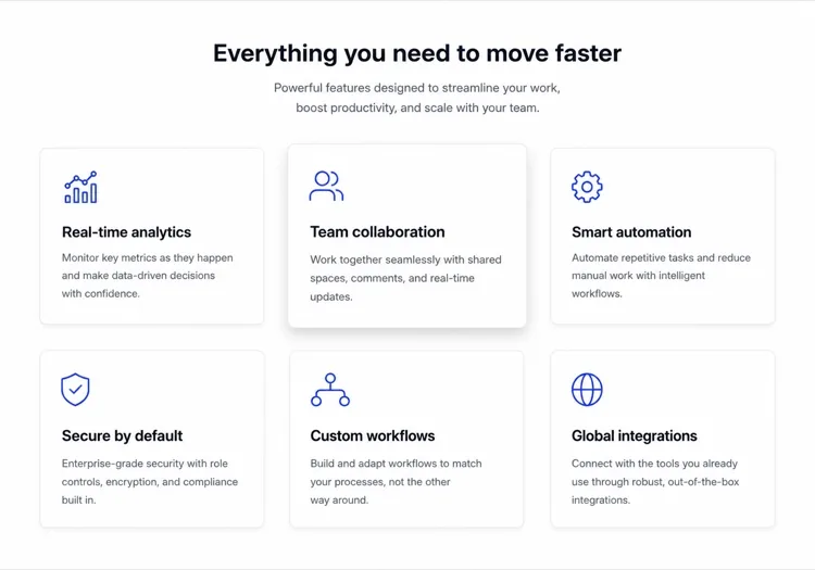
شبكة ميزات رائعة تحوّل الزوار إلى مؤمنين.

شبكة الميزات هي غالباً أول مكان ينظر إليه الزائر بعد قراءة العنوان — تجيب على سؤال "لكن ماذا يفعل فعلاً؟" بتنسيق مرئي قابل للمسح. الشبكة المنظمة جيداً تبني المصداقية بسرعة: الأيقونات الواضحة تقلل العبء المعرفي، والأوصاف الموجزة تحترم مدة الانتباه، والتخطيط المتسق يشير إلى منتج مدروس. تُظهر الدراسات باستمرار أن أقسام الميزات الموضوعة فوق الطية تزيد بشكل كبير من وقت البقاء في الصفحة ومعدلات التسجيل التجريبي.

6 قالبًا

قوالب شبكة الميزات التي يمكنك توليدها

كل قالب هو طلب حقيقي لا صورة. انسخه إلى أي محرّر ذكاء اصطناعي، أو شغّله في MeDo لتحصل على كود React و Tailwind مباشرة.

Icon cardsAcme

Three-Column Icon Card Grid

The workhorse feature grid. Six cards is the ceiling before scanning turns into reading — at nine the visitor stops comparing cards and starts skipping them.

Create a three-column feature grid holding exactly six cards. Above the grid, a centered eyebrow label, an h2 section heading and one line of supporting copy at a max width of 42rem. Each card has a filled icon in a tinted rounded square, an h3 title of two to four words, and a description of one to two sentences. Cards share a light surface, a 12px radius and a hairline border, with a hover state that raises the shadow and shifts the card up 2px — guarded behind prefers-reduced-motion. Collapse to two columns at 1024px and one at 640px, keeping equal card heights via the grid rather than fixed pixel values.

جرّبه في MeDo
BentoMega

Bento Grid With One Feature Card

Unequal cells let one feature carry a screenshot while the rest stay text. Use it when the features are genuinely unequal in importance — a bento of six equally weighted cells is just a grid with worse alignment.

Create a bento-style feature grid on a twelve-column base: one hero cell spanning eight columns and two rows containing a title, two lines of copy and a cropped product screenshot; two cells of four columns each with an icon, title and one-line description; and a full-width cell at the bottom with a title, a short paragraph and a text link. Give every cell the same radius, border and internal padding so the varied spans still read as one system. Below 900px, flatten to a single column in importance order and drop the screenshot to full width with explicit dimensions.

جرّبه في MeDo
Alternating rowsShipfast

Feature Rows With Alternating Screenshots

Not a grid at all — three stacked rows that flip image side each time. The right choice when each feature needs a screenshot to make sense, which an icon card can never provide.

Create a feature section as three alternating rows instead of a grid. Each row is a two-column layout: copy on one side with an eyebrow label, an h3, a two-sentence description and a bulleted list of three sub-points, and a product screenshot on the other side in a bordered frame at explicit width and height. Flip the image from right to left to right down the rows using an order utility at the desktop breakpoint only. Add generous vertical rhythm between rows and a hairline divider. Below 900px, every row stacks with the copy first so the reading order stays consistent.

جرّبه في MeDo
Minimal listBuilders

Borderless Grid With Small Icons

No cards, no shadows — just a two-by-four field of small icons with tight copy. Fits documentation and developer sites where card chrome reads as marketing decoration.

Create a borderless feature grid with no cards or shadows: a four-column layout on desktop holding eight items, each with a 20px outline icon above an h3 title of two or three words and a description capped at two lines. Rely on column and row gap for separation rather than borders, and keep the icons a single stroke weight from one library. Add a left-aligned section heading and a single text link to the docs beneath the grid. Collapse to two columns at 768px and one at 480px, preserving the icon-above-title stacking at every size.

جرّبه في MeDo
NumberedStudio

Numbered Capability Grid

Swaps icons for large numerals, which is the honest move when your features have no natural iconography. Reads as a deliverables list, so agencies and service pages get more from it than products do.

Create a numbered feature grid of six cells in three columns. Each cell opens with an oversized two-digit numeral in a muted tint, then an h3 title and a two-sentence description. Numbering runs left to right and must be visual only — set the numerals as decorative text with aria-hidden so a screen reader hears the titles as a clean list. Use a shared top border on each cell instead of full card outlines. Include a section heading and a short intro paragraph above. Two columns at 1024px, one at 640px, with the numeral scaling down one step on mobile.

جرّبه في MeDo
ComparisonBrand*

Feature Grid With Plan Availability

Each card names the tier that includes it. Removes the click to pricing at the cost of maintenance — if the tiers change and this grid does not, it becomes a support ticket generator.

Create a feature grid where each card carries plan availability: three columns, six cards, and inside each an icon, an h3 title, a two-sentence description and a small badge row reading Starter, Pro or Enterprise. Style the badge by tier with distinguishable text labels rather than color alone. Add a filter row of tier pills above the grid that hides non-matching cards on click, keeping the pressed state on the active pill with aria-pressed. Announce the visible count in a live region. Collapse to two columns at 1024px and one at 640px, with the filter row scrolling horizontally on mobile.

جرّبه في MeDo

كيف تخصّص شبكة الميزات الخاص بك

ابدأ بالنتائج وليس الميزات

بدلاً من "أذونات قائمة على الأدوار"، اكتب "تحكّم بمن يرى ماذا — بدون تذكرة IT." إعادة صياغة كل بطاقة حول فائدة المستخدم بدلاً من اسم الميزة تجعل الشبكة أكثر إقناعاً وتركيزاً على التحويل فوراً.

استخدم نمطاً ووزناً متسقاً للأيقونات

خلط أيقونات الخطوط العريضة مع الأيقونات المملوءة، أو أوزان خطوط مختلفة، يخلق ضوضاء بصرية. اختر نمطاً واحداً — outline أو filled أو duotone — وطبّقه على كل بطاقة. اطلب من MeDo الحصول على جميع الأيقونات من نفس المكتبة (Lucide, Heroicons, Phosphor) للحفاظ على التناسق تلقائياً.

اقرن الشبكة بنقطة إثبات

أضف إحصائية خفيفة أو علامة إثبات اجتماعي أسفل كل بطاقة — "يستخدمه 12,000 فريق" أو "يوفّر 3 ساعات أسبوعياً في المتوسط." رقم واحد يُرسي الفائدة في الواقع ويزيد المصداقية المتصوّرة بشكل كبير.

اضبط عدد الأعمدة حسب كثافة الميزات

ثلاث أو أربع ميزات تعمل بشكل أفضل في تخطيط من عمودين حتى تحصل كل بطاقة على مساحة للتنفس. ست إلى تسع ميزات تناسب شبكة من 3 أعمدة. أكثر من تسع، فكّر في تجميع الميزات تحت عناوين فئات بدلاً من إضافة المزيد من البطاقات — الشبكات تصبح مربكة فوق 9 عناصر.

من يستخدم مكوّن شبكة الميزات

صفحات منتجات SaaS

شبكات الميزات هي العمود الفقري لكل صفحة تسويق SaaS. تتيح للعملاء المحتملين تأهيل أنفسهم بمسح القدرات — الزائر الذي يتعرف على نقطة ألمه في بطاقة يكون أكثر احتمالاً بكثير لبدء تجربة.

صفحات هبوط أدوات المطورين

أدوات المطورين تستخدم شبكات الميزات لإبراز القدرات التقنية — دعم SDK، معايير الأداء، التكاملات — بتنسيق يمكن للمهندسين استيعابه في أقل من 30 ثانية دون قراءة جدار من النص.

صفحات عرض تطبيقات الهاتف

صفحات هبوط التطبيقات تستخدم شبكات ميزات مدفوعة بالأيقونات لتوصيل مجموعة غنية من الميزات في مساحة عمودية محدودة، وغالباً ما تقرن الشبكة بلقطة شاشة لنموذج التطبيق للحفاظ على توازن التخطيط بصرياً.

محافظ الوكالات والمستقلين

الشركات القائمة على الخدمات تستخدم شبكات الميزات لسرد ما يتضمنه الحزمة — تصميم، تطوير، SEO، دعم — مما يجعل العروض تبدو شفافة ويقلل التواصل المتبادل أثناء عملية البيع.

أنماط شبكة الميزات لمواقع مختلفة

المكوّن شبكة الميزات نفسه، مُهيّأ لنوع الموقع الذي يُنشر عليه.

01 / 06

SaaS Product Feature Grid

Six icon cards framed as outcomes, not feature names. Visitors self-qualify by scanning for their own problem, so a card titled "Role-based permissions" does less work than one titled "Control who sees what". Keep the card count fixed as the product grows or this section becomes a changelog.

أنماط شبكة الميزات وتنويعاته

اختر التنويعة التي تناسب بقية الصفحة، ثم ولّدها.

01 / 06

Icon Card Grid

Bordered or shadowed cards with a tinted icon tile, title and description. The most legible default because the card boundary does the grouping for you. Keep icons from one library at one stroke weight or the grid reads as assembled from three different sites.

شبكة الميزات في React و Next.js و Vue و Svelte

React و Next.js و Vue 3 و SvelteKit و Astro أو HTML صِرف — المكوّن شبكة الميزات نفسه بست طرق للإضافة.

01 / 06

React Feature Grid

Drive it from a typed array and map over it rather than hand-writing six near-identical card blocks. No state is involved, so this stays a plain function component even in a heavily interactive app.

src/components/FeatureGrid.tsx

const features = [
  { icon: Zap, title: 'Real-time sync', body: 'Changes land everywhere at once.' },
]

export function FeatureGrid() {
  return (
    <div className="grid gap-6 sm:grid-cols-2 lg:grid-cols-3">
      {features.map(({ icon: Icon, title, body }) => (
        <article key={title} className="rounded-xl border p-6">
          <Icon className="h-5 w-5" aria-hidden />
          <h3 className="mt-4 font-medium">{title}</h3>
          <p className="mt-2 text-sm text-zinc-500">{body}</p>
        </article>
      ))}
    </div>
  )
}

كيف تضيف شبكة الميزات إلى مشروعك

أربع خطوات، من اختيار قالب شبكة الميزات إلى إطلاقه في الإنتاج.

01~30s

Pick a Feature Grid Template

Choose by what each feature needs to show. Icons and a sentence means a card grid; a screenshot per feature means alternating rows; no natural iconography means numbered cells.

02~10s

Copy the Prompt

Take the prompt into MeDo, Lovable, Bolt, v0 or Cursor. Replace the placeholder feature names with your real ones first — the card count decides the column count, not the other way round.

03~2min

Generate and Refine

You get React + Tailwind back with a live preview. Follow up in plain English — "make it four columns", "drop the shadows", "rewrite the titles as outcomes" — rather than hand-editing the array.

04~1min

Drop It Below the Hero

Place it after the hero and check the outline: one h2 for the section, h3 on each card. Then move the feature copy into a typed array or your CMS so the next edit does not touch JSX.

أسئلة شائعة حول شبكة الميزات

كيف أنشئ شبكة ميزات بالذكاء الاصطناعي؟

افتح MeDo، صِف الميزات التي تريد عرضها — بما في ذلك عدد الأعمدة، والأيقونات أو الألوان المراد استخدامها، ونبرة النص — وسيولّد MeDo مكوّن شبكة ميزات مُنسّق بالكامل ومتجاوب. يمكنك التكرار بأوامر متابعة لضبط التخطيط أو تغيير الأيقونات أو إعادة كتابة أوصاف البطاقات الفردية.

ما هو أفضل مولّد شبكة ميزات بالذكاء الاصطناعي؟

MeDo مصمم خصيصاً لتوليد مكونات واجهة مستخدم مصقولة من أوامر اللغة الطبيعية. على عكس أدوات الكود AI العامة، يفهم MeDo اصطلاحات التصميم — التباعد المتسق، تباين الألوان المتاح، نقاط التوقف المتجاوبة — لذا تبدو شبكة الميزات المولّدة كأنها من مصمم محترف وليس مكتبة قوالب.

كم عدد الميزات التي يجب عرضها في الشبكة؟

بين 3 و9 ميزات هو النطاق المثالي. أقل من 3 يبدو ضعيفاً؛ أكثر من 9 يُربك الزوار ويشتت الانتباه. إذا كان لديك أكثر من 9 ميزات، جمّعها تحت فئات موضوعية — كل مجموعة تصبح شبكتها المصغرة — بدلاً من سردها جميعاً في شبكة واحدة لا نهائية.

هل يمكنني توليد شبكة ميزات تتوافق مع نظام تصميمي الحالي؟

نعم. في أمر MeDo الخاص بك، حدد رموز التصميم — اللون الأساسي، عائلة الخط، نصف قطر الحدود، شدة الظل — وسيطبقها MeDo في جميع أنحاء المكون المولّد. يمكنك أيضاً لصق إعدادات Tailwind أو قائمة متغيرات CSS وطلب من MeDo بناء الشبكة حول نظامك الحالي.

ما هي أفضل الأيقونات لشبكة الميزات؟

أيقونات الخطوط (مثل Heroicons أو Lucide) تعمل جيداً للتصاميم البسيطة والعصرية. الأيقونات المملوءة أو الثنائية اللون تناسب التخطيطات الأكثر جرأة والملونة. القاعدة الأهم هي الاتساق: كل أيقونة في الشبكة يجب أن تأتي من نفس المكتبة وتستخدم نفس وزن الخط. MeDo يستخدم Lucide افتراضياً لكنه سيستخدم أي مكتبة تحددها.

هل يمكن لـ MeDo توليد شبكة ميزات بـ React أو Next.js؟

نعم. حدد إطار العمل — React، Next.js، Vue، Svelte — وسيُخرج MeDo مكوناً أصلياً لإطار العمل. لمشاريع React وNext.js، يستخدم MeDo واجهات TypeScript لتحديد أنواع الخصائص، ويمكنه توليد المكون كمصفوفة بيانات ثابتة حتى يتمكن فريق المحتوى من تحديث الميزات دون تعديل JSX.