MeDo

مولد قسم المدونة بالذكاء الاصطناعي.

صِف تخطيط المدونة الذي تريده — أسلوب البطاقة وعدد المنشورات والمقال المميز وفلاتر الفئات — ويُنشئ MeDo المكوّن الكامل. قدّم قسم مدونة متقن دون لمس خاصية CSS grid واحدة.

قسم المدونة
قسم المدونة

قسم المدونة الرائع يحول القراء إلى زوار متكررين.

مدونتك هي أحد أصولك الأكثر تأثيراً في SEO وبناء الثقة — لكن فقط إذا تمكن الزوار من العثور عليها واستكشافها. يُبرز قسم المدونة المصمم جيداً أفضل محتواك فوراً، ويوصل السلطة الموضوعية من خلال الفئات المرئية، ويوجه القراء من صفحة الهبوط إلى قمع المحتوى. MeDo يتيح لك إنشاء التخطيط الذي يناسب علامتك التجارية وحجم المحتوى بدقة، بدلاً من الانسجام مع قالب عام.

6 قالبًا

قوالب قسم المدونة التي يمكنك توليدها

كل قالب هو طلب حقيقي لا صورة. انسخه إلى أي محرّر ذكاء اصطناعي، أو شغّله في MeDo لتحصل على كود React و Tailwind مباشرة.

Three cardAcme

Three-Card Homepage Preview

The smallest blog section that still looks intentional. Three posts and a View all link — enough to prove the blog is alive without turning a marketing page into an index.

Create a blog preview section with a section heading, a one-line subheading and a three-column card grid. Each card holds a 16:9 cover image in a fixed aspect-ratio box, a category pill above the title, a two-line title clamped with line-clamp-2, a two-line excerpt clamped with line-clamp-2, and a footer row with author name, publish date in a time element with a machine-readable datetime, and a reading-time estimate. Make the whole card one link with the heading as the accessible name rather than adding a separate Read more link. Below the grid, a centred View all posts link. Two columns on tablet, one on mobile, with the cover images lazy loaded.

جرّبه في MeDo
Featured splitEditorial

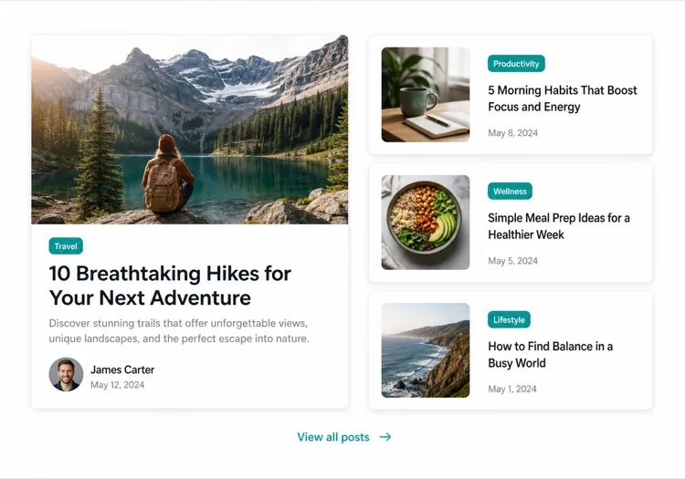
One Featured Post, Three Stacked

Creates a clear lead story, which an even grid never does. Only works if the featured post is genuinely your best — promoting whatever published last makes the asymmetry look arbitrary.

Create an asymmetric blog section: on the left, a featured post card taking about 60% of the width with a large 3:2 cover image, a category pill, a headline at display size, a three-line excerpt and an author row with avatar, date and reading time. On the right, three compact cards stacked vertically, each with a small square thumbnail on the left and a category, a two-line clamped title and a date on the right. Divide the stacked cards with hairline rules rather than shadows so they read as a list next to the feature. Stack the feature above the list on tablet and below on mobile, keeping the feature image eager loaded.

جرّبه في MeDo
Index gridMega

Paginated Post Index

The standalone blog page rather than a homepage teaser. Nine cards is the ceiling before the grid stops being scannable — past that, pagination beats a longer page or infinite scroll.

Create a blog index section: a page heading, a horizontal row of category filter chips, and a nine-card grid at three columns. Each card carries a cover image in a fixed 16:9 box, a category pill, a clamped two-line title, a clamped two-line excerpt, and a meta row with author, a time element for the date and a reading time. Below the grid, numbered pagination with previous and next controls, aria-current on the active page, and real anchor hrefs to /blog/page/2 so pages are crawlable and linkable rather than swapped in by client state. Show a labelled empty state when a filter returns nothing. Two columns on tablet, one on mobile.

جرّبه في MeDo
Text listLedger

Dated List With No Images

No thumbnails, just date, title and one line of description. Faster to scan than any card grid and the honest choice when your posts have no cover art — a grid of stock photography reads worse than plain text.

Create an image-free blog list: rows separated by hairline rules, each row showing a left-aligned date in a fixed-width muted column, then the post title as a link at large text size, a one-line clamped description beneath it, and a right-aligned reading time. Group the rows under year headings when the list spans multiple years. Give each row a full-width hover background so the whole row reads as the hit target, and keep the vertical rhythm tight so twenty posts fit in two screens. Stack the date above the title on mobile. Use an ordered list with time elements for the dates.

جرّبه في MeDo
Category tabsStudio

Topic Tabs Over a Card Grid

Turns a mixed blog into something a reader can navigate by interest. Needs at least a few posts per tab — a tab that opens onto two articles makes the blog look thinner than one undivided grid would.

Create a blog section with topic tabs above a six-card grid: tabs labelled All, Engineering, Design and Product with a post count beside each. Use real tab semantics — a tablist with arrow-key navigation, aria-selected, and managed focus — and reflect the active tab in the URL so a topic view is linkable. Switching a tab swaps the card set with a short fade rather than a layout jump, and keeps the grid height stable by always rendering a fixed number of card slots. Each card has a cover image, category pill, clamped title and excerpt, and a meta row with author and date. Announce the result count in an aria-live region.

جرّبه في MeDo
ChangelogShipfast

Release Notes Timeline

A blog section for product updates, where version and date matter more than a cover image. Keep the newest entry expanded and the rest collapsed so the page opens on what changed most recently.

Create a changelog-style blog section: a vertical timeline with a left rail of dots and connecting line, each entry showing a version tag, a date in a time element, a type pill for Added, Fixed or Changed, a title and a two-to-three sentence summary. Expand the most recent entry by default and render the rest as collapsed disclosure panels using button plus aria-expanded so keyboard users can open them. Add anchor links on each version so a specific release can be linked directly, and a Subscribe to updates link at the top of the section. Collapse the left rail to a simple stacked list on mobile.

جرّبه في MeDo

كيف تخصّص قسم المدونة الخاص بك

ابدأ بمنشور مميز

سلّط الضوء على أهم مقال بك ببطاقة أكبر — أضف صورة غلاف كاملة العرض ومقتطفاً أطول ومعالجة بصرية مميزة. أخبر MeDo أي المنشور "featured" وسيُنشئ التخطيط غير المتماثل تلقائياً.

أضف فلاتر الفئات أو العلامات

إذا كنت تنشر عبر موضوعات متعددة، اطلب من MeDo تضمين شريط فلاتر أفقي فوق الشبكة. يحوّل هذا قسم المدونة إلى أداة اكتشاف ذاتية الخدمة ويبقي القراء على الصفحة لفترة أطول.

اعرض سياق المؤلف

إدراج صورة رمزية للمؤلف واسمه وتقدير وقت القراءة يبني الثقة ويُحدد توقعات القارئ. اذكر حقول البيانات الوصفية هذه في موجهك لتكون مدمجة في كل بطاقة.

تحكم في كثافة البطاقات بعدد المنشورات

حدد عدد المنشورات التي ستُعرض بدقة — ثلاث بطاقات لمعاينة مدمجة على الصفحة الرئيسية، وستة إلى تسعة لصفحة فهرس مدونة مستقلة. اقرنها بـ CTA "عرض الكل" لتجنب الشبكة اللانهائية في صفحات التسويق.

من يستخدم مكوّن قسم المدونة

موقع تسويق SaaS

قسم معاينة ثلاثي البطاقات على الصفحة الرئيسية يرتبط بدروس المنتج وقصص العملاء وملاحظات الإصدار — يجلب حركة المرور للمدونة دون الإخلال بتدفق التحويل.

منشور يركز على المحتوى

تخطيط تحريري كامل العرض مع مقال رئيسي وتبويبات الفئات وشبكة بطاقات مرقمة — كل ما يتوقعه القراء من منشور احترافي.

وكالة أو استوديو

فسيفساء بسيطة ذات عمودين من دراسات الحالة ومنشورات ريادة الفكر، تُظهر عمق الخبرة للعملاء المحتملين قبل حتى أن ينقروا.

علامة تجارية للتجارة الإلكترونية

قسم مدونة أسلوب حياة مع صور كبيرة ونصوص ترويجية قصيرة ترتبط بأدلة الشراء ومقتطفات الاتجاهات والقصص من وراء الكواليس التي تُرسّخ نية الشراء.

أنماط قسم المدونة لمواقع مختلفة

المكوّن قسم المدونة نفسه، مُهيّأ لنوع الموقع الذي يُنشر عليه.

01 / 06

SaaS Marketing Blog Section

A three-card teaser on the homepage, not an index. The job is proving the product is maintained and that someone is writing about the problem, so lead with the tutorial or customer story — release notes belong in their own changelog, not competing for the same three slots.

أنماط قسم المدونة وتنويعاته

اختر التنويعة التي تناسب بقية الصفحة، ثم ولّدها.

01 / 06

Three-Card Grid

Equal cards in one row with a View all link beneath. The right default on a marketing page where the blog is supporting evidence rather than the destination, and it stays honest when you have only published a handful of posts.

قسم المدونة في React و Next.js و Vue و Svelte

React و Next.js و Vue 3 و SvelteKit و Astro أو HTML صِرف — المكوّن قسم المدونة نفسه بست طرق للإضافة.

01 / 06

React Blog Section

Keep the posts in one typed array and let the card be a pure function of a post. No state is needed unless you add filters, which is what makes this section safe to render on the server.

src/components/BlogSection.tsx

type Post = { slug: string; title: string; excerpt: string; date: string; minutes: number }

export function BlogSection({ posts }: { posts: Post[] }) {
  return (
    <ul className="grid gap-8 md:grid-cols-3">
      {posts.map((post) => (
        <PostCard key={post.slug} post={post} />
      ))}
    </ul>
  )
}

كيف تضيف قسم المدونة إلى مشروعك

أربع خطوات، من اختيار قالب قسم المدونة إلى إطلاقه في الإنتاج.

01~30s

Pick a Blog Layout

Choose by post volume and by whether you have cover art — three cards for a homepage teaser, a featured split when one post should lead, a dated list when the posts have no images worth showing.

02~10s

Copy the Prompt

Take the prompt into MeDo, or paste it into Lovable, Bolt, v0 or Cursor. Name the metadata you actually have first — author, reading time, category — since a card designed around fields you cannot populate is the usual reason these sections get rebuilt.

03~1min

Generate and Refine

You get React + Tailwind back with a live preview. Follow up in plain English — "clamp titles to two lines", "drop the excerpt on mobile", "move the category above the title" — instead of tuning class strings by hand.

04~2min

Connect Your Posts

Point the component at your real source — an MDX directory, a content collection or a CMS query — and map the fields once. Sort by date server-side and let the card stay a pure function of a post.

أسئلة شائعة حول قسم المدونة

كيف أُنشئ قسم مدونة بالذكاء الاصطناعي؟

افتح MeDo وصِف تخطيط المدونة الذي تحتاجه — أسلوب البطاقة وعدد المنشورات وما إذا كنت تريد مقالاً مميزاً وحقول البيانات الوصفية للعرض (المؤلف والتاريخ ووقت القراءة) وأي فلاتر. يُنشئ MeDo كود المكوّن الكامل في ثوانٍ. يمكنك بعد ذلك نسخه إلى مشروعك والاستمرار في تحسينه بموجهات متابعة.

ما أفضل مولد قسم مدونة بالذكاء الاصطناعي؟

MeDo مبني خصيصاً لإنشاء مكوّنات موقع حقيقية، وليس فقط نماذج تصميم. على عكس أدوات الدردشة العامة بالذكاء الاصطناعي، يفهم MeDo أنظمة التخطيط وأنماط البطاقات والسلوك الاستجابي — لذا يخرج قسم مدونتك كوداً نظيفاً جاهزاً للإنتاج بدلاً من نقطة بداية خام تحتاج إلى تحرير مكثف.

هل يمكن للذكاء الاصطناعي إنشاء شبكة بطاقات مدونة استجابية؟

نعم. يُنشئ MeDo مكوّنات بأولوية استجابية. حدد عدد الأعمدة التي تريدها بحجم سطح المكتب وسيتولى نقاط الكسر تلقائياً — تنهار إلى تكديس بعمود واحد على الهاتف المحمول دون عمل إضافي من جانبك.

كيف أضيف فلاتر الفئات إلى قسم مدونة تم إنشاؤه بالذكاء الاصطناعي؟

أدرج متطلب الفلتر في موجهك — على سبيل المثال، "أضف تبويبات فلتر الفئات للتصميم والهندسة والمنتج فوق شبكة البطاقات." سيُنشئ MeDo واجهة الفلتر ومنطق العرض الشرطي المطابق.

هل يمكنني استخدام الذكاء الاصطناعي لإنشاء تخطيط منشور مدونة مميز؟

بالتأكيد. اطلب من MeDo تخطيطاً غير متماثل مع بطاقة مميزة كبيرة وبطاقات ثانوية أصغر بجانبها. هذا النمط التحريري من أكثر الطرق فعالية لإبراز المحتوى الأساسي مع عرض عدة منشورات حديثة في آنٍ واحد.

هل يتضمن قسم المدونة الذي أنشأه الذكاء الاصطناعي البيانات الوصفية للمؤلف والتاريخ؟

نعم — فقط اذكر البيانات الوصفية التي تريدها في موجهك. يمكن لـ MeDo تضمين اسم المؤلف وصورته الرمزية وتاريخ النشر ووقت القراءة المقدر وعلامة الفئة والمقتطف. أنت تتحكم في ما يظهر بالضبط على كل بطاقة.