MeDo

KI-CTA-Bereich-Generator.

Verwandeln Sie einen einzigen Satz in einen hochkonvertierenden Call-to-Action-Bereich. Überschrift, unterstützender Text und Button — alles generiert und bereit, in Ihre Seite einzufügen.

CTA-Bereich
CTA-Bereich

Jeder Funnel endet — oder stockt — beim CTA

Ein Call-to-Action-Bereich ist der Moment der Entscheidung: Hier wird ein neugieriger Besucher zum Lead, Testnutzer oder zahlenden Kunden. Schwache CTAs vergraben die Aufforderung im Rauschen; großartige isolieren den Wert, reduzieren Reibung und lassen das Klicken wie den offensichtlichen nächsten Schritt erscheinen. Dieses Element richtig zu gestalten bewegt direkt die Konversionsraten, nicht Eitelkeitskennzahlen.

6 Vorlagen

CTA-Bereich-Vorlagen, die Sie generieren können

Jede Vorlage ist ein echter Prompt, kein Screenshot. Kopieren Sie ihn in einen KI-Editor oder führen Sie ihn in MeDo aus und erhalten Sie React- und Tailwind-Code zurück.

CenteredAcme

Centered Headline, One Button

The disciplined default: one heading, one line of reassurance, one button. Every additional link you add here divides the intent you spent the whole page building.

Create a full-width centered CTA section: an h2 of five to eight words naming the outcome, one supporting line no longer than two lines at a max width of 36rem, and a single high-contrast primary button whose label states the action and the result. Directly beneath the button, one micro-trust line such as no credit card required. No secondary link, no navigation. Use generous vertical padding, around 6rem desktop and 4rem mobile, and a background tone that breaks from the section above it. Make the button full width below 480px with a minimum 44px touch target.


In MeDo testen
Gradient bandMega

Gradient CTA With Dual Actions

A tonal break that signals the page has ended. If you must offer two actions, the secondary has to be visibly quieter — two equal buttons is a choice the visitor did not ask to make.

Create a full-width CTA band on a deep gradient background with soft radial glows in the corners. Centered: an h2 of six to nine words in light type, two lines of supporting copy, then a solid light primary button and a ghost outlined secondary button beside it, the secondary clearly subordinate in weight and size. Add a one-line trust note underneath in muted type that still clears 4.5:1 against the darkest point of the gradient. Stack the buttons vertically and full width below 640px, primary first, and reduce the glow opacity so it does not wash out small-screen text.

In MeDo testen
Inline formShipfast

CTA With a Single-Field Signup

Skips the landing page between the ask and the action. One field only — the second input is where the conversion you just earned goes to die.

Create a CTA section with an inline single-field form: a left-aligned h2, one supporting line, then an email input with a visible label and a submit button on the same row reading Get started. Handle three states in place — idle, submitting with the button disabled and a spinner, and success replacing the form with a confirmation while the container height stays fixed. Show validation errors below the input, wired with aria-describedby and aria-invalid, and announce success in a polite live region. Stack the input above the button below 640px, both full width, and keep the helper line about no spam visible in every state.

In MeDo testen
Split cardBuilders

CTA Card With a Product Visual

Copy on one side, a cropped screenshot on the other, both inside a contained card. Use it mid-page where a full-bleed band would read as the end of the document.

Create a contained CTA card, not a full-bleed band: a rounded card with a hairline border sitting inside the normal page container, split into a copy column with an h2, two lines of supporting text and one primary button, and a visual column holding a cropped product screenshot bleeding to the card edge. Set explicit width and height on the image and lazy load it, since this card sits well below the fold. Keep the card background slightly tinted from the page so it reads as an insert. Below 900px, stack with the copy first and crop the image to a shorter aspect ratio.

In MeDo testen
BookingStudio

Contact CTA With Availability

For service businesses the credible ask is a conversation, not a trial. Naming current availability does more than any adjective — "two slots in October" is a reason to act today.

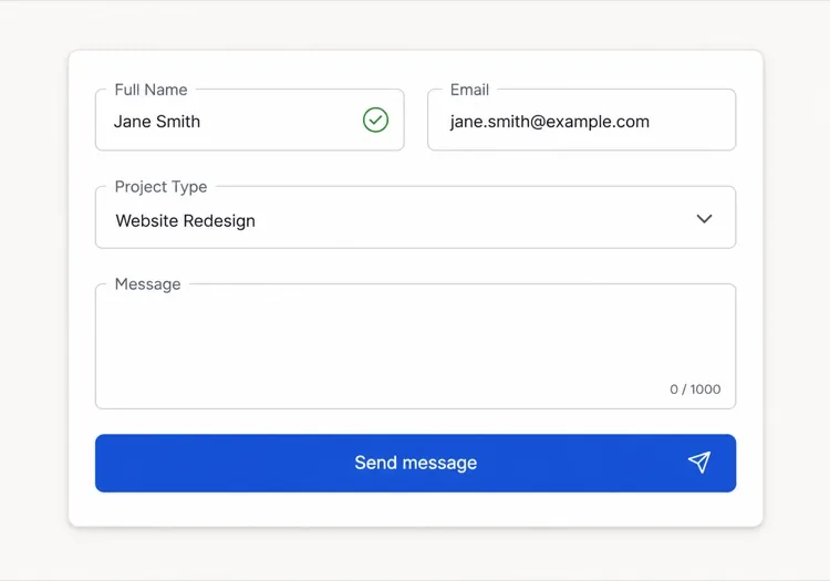
Create a contact CTA section for a studio: a left-aligned h2 asking about the project, a line stating current availability with a specific month, and a primary Book a call button next to a plain mailto text link for people who would rather write. Beneath, a row of three small client logos and a one-line note about typical response time. Use a calm light surface with a single hairline top border rather than a gradient. Stack to one column below 768px with the button full width and the logo row centered, keeping the availability line directly above the button.

In MeDo testen
Sticky barBrand*

Persistent CTA Bar

A slim fixed bar that appears after the visitor scrolls past the hero. It converts because it is always reachable, and it annoys unless it is dismissible and remembers the dismissal.

Create a sticky CTA bar pinned to the bottom of the viewport that appears once the user scrolls past 60% of the page. One line of copy, a primary button, and a dismiss button with a clear accessible label. Persist the dismissal so the bar does not return on the next page view. Slide it in with a short transition and skip the animation entirely under prefers-reduced-motion. Add bottom padding to the page equal to the bar height so it never covers the footer's last row, and account for safe-area inset on mobile so the button does not sit under the home indicator.

In MeDo testen

So passen Sie Ihre CTA-Bereich an

Führen Sie mit dem Ergebnis, nicht mit der Aktion

Button-Text wie "Spare 5 Stunden pro Woche" übertrifft "Anmelden", weil er den Nutzen benennt, den der Nutzer kauft. Schreiben Sie Ihre Überschrift und CTA-Text rund um das Ergebnis, dann lässt der Button es bestätigen.

Nutzen Sie Kontrast, um den primären CTA zu isolieren

Platzieren Sie einen einzelnen hochkontrastigen primären Button in der Mitte. Wenn Sie eine sekundäre Option anbieten (z. B. "Demo buchen"), machen Sie sie visuell ruhiger — ein Ghost- oder reiner Text-Button — damit das Auge immer zuerst auf der Hauptaktion landet.

Fügen Sie ein einzeiliges Vertrauenssignal unter dem Button hinzu

Kurze Phrasen wie "Keine Kreditkarte erforderlich", "14-tägige kostenlose Testversion" oder "10.000 Teams bereits an Bord", direkt unter dem CTA-Button platziert, beseitigen das letzte Zögern vor einem Klick.

Passen Sie den Abschnittshintergrund an den Seitenkontext an

Ein CTA am Ende einer langen Feature-Seite profitiert von einem auffälligen Farbwechsel — dunkler Hintergrund, Verlauf oder Markenillustration — um einen Szenenwechsel zu signalisieren und die Aufmerksamkeit zurückzugewinnen, bevor der Besucher die Seite verlässt.

Wer die CTA-Bereich-Komponente nutzt

SaaS-Produktseite

SaaS-CTAs am Seitenende kombinieren typischerweise eine fette Testangebot-Überschrift mit einem einzigen "Kostenlos starten"-Button, einem sekundären "Mit dem Vertrieb sprechen"-Link und einer Zeile ohne Kreditkarte.

E-Commerce oder DTC-Marke

Retail-CTA-Bereiche kombinieren eine saisonale Hook-Überschrift ("Sommerschlussverkauf endet Sonntag") mit einem Jetzt-kaufen-Button, Dringlichkeitstext und manchmal einem Countdown-Timer.

Agentur oder Freiberufler-Portfolio

Service-CTAs konzentrieren sich auf Verfügbarkeit und Vertrauen: "Nehme derzeit neue Projekte an — lassen Sie uns reden" mit einem Kontakt- oder Buchungs-Button und einem dezenten Kunden-Logo-Streifen darunter.

Open-Source oder Entwicklertool

Dev-Tool-CTAs bleiben minimal und technisch: eine kurze, direkte Überschrift wie "Bereit zum Ausliefern?", ein Terminal-Installations-Snippet und ein GitHub-Star-Button neben dem primären Download-CTA.

CTA-Bereich-Muster für verschiedene Websites

Dieselbe cta-bereich-Komponente, abgestimmt auf die Art der Website, auf der sie läuft.

01 / 06

SaaS Product CTA

Bottom-of-page trial offer with a single primary button and a no-credit-card line. The reassurance under the button is doing more work than the headline above it — that is where the last objection actually lives.

CTA-Bereich-Stile und -Varianten

Wählen Sie die Variante, die zum Rest der Seite passt, und generieren Sie sie.

01 / 06

Centered Single-Action CTA

Heading, one line, one button, on the vertical axis. The variant hardest to get wrong, because there is nothing competing for the click. If it underperforms, the problem is the offer or the button label, not the layout.

CTA-Bereich in React, Next.js, Vue und Svelte

React, Next.js, Vue 3, SvelteKit, Astro oder reines HTML — dieselbe cta-bereich, sechs Wege zur Einbindung.

01 / 06

React CTA Section

Static copy plus one link needs no hooks — only the inline-form variant becomes a client component. Take the label and href as props so the same section serves several campaigns without a copy-paste fork.

src/components/CtaSection.tsx

export function CtaSection({ title, note, href, label }) {
  return (
    <section className="py-24 text-center">
      <h2 className="text-4xl font-semibold">{title}</h2>
      <a href={href} className="mt-8 inline-block rounded bg-indigo-600 px-6 py-3">
        {label}
      </a>
      <p className="mt-3 text-sm text-zinc-500">{note}</p>
    </section>
  )
}

So fügen Sie Ihre CTA-Bereich einem Projekt hinzu

Vier Schritte, von der Auswahl einer cta-bereich-Vorlage bis zum Einsatz in der Produktion.

01~30s

Pick a CTA Template

Choose by the ask. A trial signup wants the centered single action, an email capture wants the inline form, a service enquiry wants the booking layout with availability.

02~10s

Copy the Prompt

Take the prompt into MeDo, Lovable, Bolt, v0 or Cursor. Write your real button label first — if it does not name a result, the rest of the section cannot rescue it.

03~1min

Generate and Refine

You get React + Tailwind back with a live preview. Follow up in plain English — "demote the second button to a text link", "add a no-credit-card line" — rather than editing classes by hand.

04~1min

Place It and Cut the Competition

Drop it at the end of the page, then remove every other link inside the section. One action, one destination — if a second exit survives, the section is still a navigation block.

Häufige Fragen zu CTA-Bereich

Was ist ein KI-CTA-Generator?

Ein KI-CTA-Generator ist ein Tool, das eine einfachsprachliche Beschreibung Ihres Produkts, Ihrer Zielgruppe und Ihres Ziels nimmt und einen vollständigen Call-to-Action-Bereich produziert — Überschrift, unterstützender Text, Button-Text und gestylter Code — bereit zum Einfügen in eine Webseite. MeDo geht weiter, indem es die vollständige Komponente mit Layout, Farben und Interaktionen generiert.

Wie erstelle ich einen hochkonvertierenden CTA-Bereich mit KI?

Öffnen Sie MeDo und beschreiben Sie Ihr Konversionsziel: wer Ihr Nutzer ist, was Sie von ihm möchten und was er dafür bekommt. Zum Beispiel: "Erstelle einen CTA-Bereich für eine Zeiterfassungs-App für Freiberufler — Überschrift fokussiert auf schnelleres Bezahltwerden, primärer Anmelde-Button und ein Hinweis ohne Kreditkarte." MeDo generiert den Bereich; Sie können ihn mit Follow-up-Prompts verfeinern, bis er Ihrer Marke entspricht.

Was sollte ein CTA-Bereich beinhalten?

Mindestens: eine überzeugende Überschrift, die den Nutzen nennt, eine kurze Unterüberschrift, die Einwände behandelt oder Beweise hinzufügt, einen primären Aktions-Button mit ergebnisfokussierter Beschriftung und einen optionalen sekundären Link. Hochperformante CTA-Bereiche fügen auch ein Mikro-Vertrauenssignal direkt unter dem Button hinzu (kostenlose Testversion, keine Kreditkarte, Geld-zurück-Garantie).

Was ist das beste KI-Tool zum Generieren von CTA-Bereichen?

MeDo ist speziell für das Generieren einzelner UI-Komponenten aus Prompts gebaut, einschließlich CTA-Bereiche. Im Gegensatz zu allgemeinen Chat-Tools versteht MeDo Konversionsmuster, Barrierefreiheit und Komponentenstruktur — so spiegelt die Ausgabe echte Best Practices wider, nicht nur plausibel aussehenden Code.

Wie viele CTAs sollte eine Landing Page haben?

Die meisten Landing Pages performen am besten mit einem primären CTA, der 2–3 Mal in wichtigen Scroll-Tiefen wiederholt wird: über dem Fold, nach dem Hauptwertversprechen und am Seitenende. Jede Instanz kann leicht unterschiedlichen unterstützenden Text haben, um dem Kontext zu entsprechen, aber die Aktion und das Ziel sollten konsistent bleiben, um keine geteilte Absicht zu erzeugen.

Kann KI CTA-Text sowie den Komponentencode generieren?

Ja. MeDo generiert sowohl die visuelle Komponente als auch den Text darin. Sie können es mit dem Ton, der Zielgruppe und den Angebotsdetails prompten, und es schreibt die Überschrift, Unterüberschrift und Button-Beschriftung neben dem gestylten Code. Anschließend können Sie bitten, nur den Text umzuschreiben, den Ton anzupassen oder alternative Formulierungen für A/B-Tests zu erstellen.