MeDo

KI-Toast-Generator.

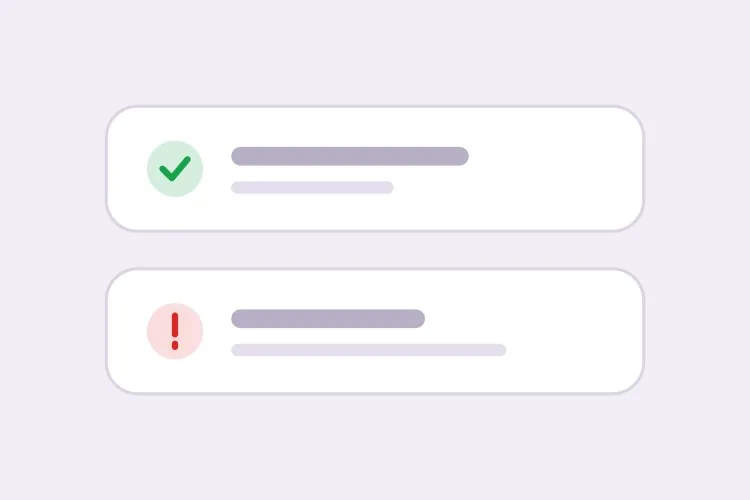
Beschreiben Sie Ihr Benachrichtigungsverhalten und MeDo generiert das komplette Toast-System — vier semantische Typen, eine Stapel-Warteschlange, Auto-Ausblende-Timer, die beim Hover pausieren, Wegwischen per Touch und die passende aria-live-Höflichkeitsstufe für jeden Typ.

Toast
Toast

Ein Toast ist ein Timer, eine Warteschlange und eine Live-Region, die sich als Kästchen tarnt

Der visuelle Teil eines Toasts dauert Minuten. Alles darunter nicht. Ein Toast muss entscheiden, wie lange er bleibt, was passiert, wenn drei gleichzeitig eintreffen, was passiert, wenn der Nutzer mitten in einem Formularsatz ist, und wie ein Screenreader ihn vorliest, ohne unterbrochen zu werden. Die nicht offensichtliche Folge: Toast-Fehler zeigen sich als Vertrauensfehler. Eine Speicherbestätigung, die verschwindet, bevor sie gelesen wird, oder eine Fehlermeldung, die sich auflöst, während der Nutzer noch das betroffene Feld liest, bringt Menschen dazu, der Oberfläche nicht mehr zu glauben. Wenn Timing-Regeln, Warteschlangen-Limits und Live-Region-Höflichkeit gemeinsam generiert werden, bleiben diese Entscheidungen konsistent, statt über jede aufrufende Stelle verstreut zu sein.

6 Vorlagen

Toast-Vorlagen, die Sie generieren können

Jede Vorlage ist ein echter Prompt, kein Screenshot. Kopieren Sie ihn in einen KI-Editor oder führen Sie ihn in MeDo aus und erhalten Sie React- und Tailwind-Code zurück.

BasicFour Tones

Success, Error, Warning, Info Stack

The baseline set, and the only one where per-type rules matter more than styling. Errors that auto-dismiss are the single most common toast bug in production.

Create a toast system with four semantic types — success with a check icon and green accent, error with an alert icon and red accent, warning with a triangle and amber accent, info with a circle and blue accent. Each toast is 360px wide with a 12px radius, 16px padding, a semibold title, an optional description and a close button with an accessible label. Stack in the bottom-right with 8px gaps, newest on top, three visible at once and the rest queued. Auto-dismiss success, info and warning after 5000ms; keep errors until the user closes them. Wrap non-error toasts in role="status" with aria-live="polite" and give errors role="alert". Slide in 16px from the right and fade out; under prefers-reduced-motion, fade only.


In MeDo testen
TimingPausable Timer

Countdown Bar That Freezes on Hover

A visible progress bar plus a timer that stops while the pointer or keyboard focus is on the toast. Without the pause, a toast can vanish while the user is reaching for its own action button.

Create a toast with a visible dismiss countdown: a 2px progress bar along the bottom edge animating from full to zero over the toast duration. Pause the timer and freeze the bar on pointerenter and on focusin anywhere inside the toast, then resume from the remaining time on pointerleave and focusout — track elapsed time explicitly rather than restarting the interval, or the toast will live longer every time the pointer crosses it. Reset to the full duration when the toast content is updated in place. Under prefers-reduced-motion, replace the animated bar with a static severity stripe and keep the timer behaviour unchanged. Keep the toast in a role="status" region with aria-live="polite".

In MeDo testen
UndoAction Toast

Toast With an Undo or Retry Action

The moment a toast carries a button, it stops being decoration and becomes the only route to a reversible operation — so it must not auto-dismiss while the action is still valid.

Create a toast variant with a single inline action button — Undo or Retry — beside the close control. Do not auto-dismiss while an action is present unless the caller passes an explicit duration, and never dismiss on a timer shorter than the window in which the action is still valid server-side. Move keyboard focus nowhere on mount; instead expose the toast region via a landmark and make the action reachable through a documented shortcut plus normal tab order, so a toast never steals focus from a form the user is typing in. Announce the toast with role="status" and aria-live="polite", and include the action label in the announced text so the option is heard, not just seen.

In MeDo testen
AsyncPromise Toast

One Toast That Updates in Place

Pending, then success or error, on the same node. Firing a second toast when a request resolves stacks two notifications about one event and doubles the screen reader announcement.

Create a promise-driven toast that mounts in a pending state with a spinner and a loading title, then updates the same toast node to success or error when the promise settles rather than mounting a second toast. Keep the toast ID stable across the transition so the stack position does not change, swap the icon and accent, and start the auto-dismiss timer only once the promise resolves. On rejection, switch the container to role="alert" and cancel auto-dismiss. Because the live region content changes in place, debounce the announcement so a request that resolves in under 400ms announces the final state only. Cap the pending state with a timeout that converts to an error toast rather than spinning forever.

In MeDo testen
MobileSwipe Toast

Top-Center Toast With Swipe Dismiss

On a phone the bottom corner is under the thumb and the home indicator. Top-center with a horizontal drag threshold is the only placement that does not fight the platform.

Create a mobile-first toast pinned to the top-center with a safe-area inset using env(safe-area-inset-top), full width minus 16px gutters, capped at a single line of title text with the description truncated to two lines. Add horizontal swipe-to-dismiss with a 60px or 40% drag threshold, translating with the pointer and springing back below the threshold; suppress the pointer handlers while the user is scrolling the page underneath. Keep the close button hit area at 44px even though the glyph is 16px. Show one toast at a time and replace rather than stack, since a stack on a 375px viewport covers the content. Use role="status" with aria-live="polite" and disable the spring under prefers-reduced-motion.

In MeDo testen
SnackbarCompact Snackbar

Single-Line Bar With No Icon

One line, no title, no icon — for low-stakes confirmations like "Link copied" where a 360px card with an icon block is more furniture than the message deserves.

Create a compact snackbar toast: a single line of 14px text on a dark surface, 8px radius, 12px vertical and 16px horizontal padding, no icon and no separate title, with an optional text-only action on the right. Anchor it bottom-center with a 24px offset and allow only one at a time — a new snackbar replaces the current one and resets its 4000ms timer instead of queueing, because these fire from rapid interactions like copy and toggle. Announce via role="status" with aria-live="polite", and when the text is identical to the previous message, force re-announcement by clearing the live region for one frame. Fade and lift 8px on entry; fade only under prefers-reduced-motion.

In MeDo testen

So passen Sie Ihre Toast an

Geben Sie Fehlern andere Regeln als allem anderen

Fordern Sie Auto-Ausblendung für success, info und warning, und dass Fehler bestehen bleiben, bis sie geschlossen werden. Fehler erfordern meist eine Handlung des Nutzers, und eine Meldung, die sich entfernt, bevor sie verstanden wurde, ist schlimmer als keine Meldung.

Setzen Sie ein Stapel-Limit und definieren Sie den Überlauf

Legen Sie fest, wie viele Toasts gleichzeitig sichtbar sein dürfen — drei ist eine sinnvolle Obergrenze — und ob weitere in der Warteschlange landen oder den ältesten ersetzen. Ohne Limit tapeziert eine Schleife, die pro Element eine Benachrichtigung auslöst, den gesamten Viewport zu.

Verlangen Sie, dass der Timer bei Hover und Fokus pausiert

Fordern Sie im Prompt, dass der Ausblende-Countdown einfriert, solange der Zeiger über dem Toast liegt oder ein Steuerelement darin den Tastaturfokus hat. Andernfalls kann ein Toast verschwinden, während der Nutzer nach dessen eigener Aktionsschaltfläche greift.

Nennen Sie die Ecke und die Safe Area

Wählen Sie eine Position und beschreiben Sie sie: unten rechts liegt abseits der meisten Hauptnavigationen, oben mittig wird am schnellsten gelesen. Bitten Sie auf Mobilgeräten um env(safe-area-inset-bottom)-Abstand, damit Toasts nicht unter dem Home-Indikator oder einer fixierten Tab-Leiste landen.

Wer die Toast-Komponente nutzt

SaaS-Produkt

Kurze Erfolgs-Toasts bestätigen automatische Speicherungen und Einladungen, während dauerhafte Fehler-Toasts eine „Wiederholen"-Aktion tragen, wenn eine Hintergrundsynchronisierung fehlschlägt. Die Position unten rechts hält sie von der App-Seitenleiste frei.

Online-Shop

Ein „Zum Warenkorb hinzugefügt"-Toast mit Vorschaubild und „Warenkorb ansehen"-Link, der nach fünf Sekunden verschwindet. Lager- und Zahlungsfehler nutzen den Fehlertyp und bleiben stehen, damit der Käufer lesen kann, was schiefgelaufen ist.

Dashboard oder Admin-Tool

Massenoperationen erzeugen einen einzigen Zusammenfassungs-Toast statt einen pro Datensatz, und langlaufende Jobs aktualisieren einen einzelnen Toast direkt von „ausstehend" zu „erfolgreich", anstatt eine zweite Benachrichtigung darüber zu stapeln.

Mobile Web-App

Oben mittig platzierte Toasts mit Wegwischen und Safe-Area-Insets, auf eine einzige Zeile dimensioniert, sodass sie niemals das Feld verdecken, in das der Nutzer gerade tippt.

Toast-Muster für verschiedene Websites

Dieselbe toast-Komponente, abgestimmt auf die Art der Website, auf der sie läuft.

01 / 06

SaaS Product Toasts

Autosave confirmations and invite receipts, bottom-right so they clear the sidebar. The rule that matters most here is that background-sync failures get persistent error toasts with a Retry action — a sync error that dismisses itself is indistinguishable from a sync that worked.

Toast-Stile und -Varianten

Wählen Sie die Variante, die zum Rest der Seite passt, und generieren Sie sie.

01 / 06

Card Toast With Icon and Accent

The full anatomy: icon, semibold title, description, close button, colored accent. Worth the vertical space when the message has a subject and a detail. It is overkill for "Copied" — use the snackbar for those.

Toast in React, Next.js, Vue und Svelte

React, Next.js, Vue 3, SvelteKit, Astro oder reines HTML — dieselbe toast, sechs Wege zur Einbindung.

01 / 06

React Toast

A context provider holding the queue plus a portal for the container. Mount the provider once above the router so navigating between routes does not unmount the toast that was just fired.

src/components/ToastProvider.tsx

export function ToastProvider({ children }) {
  const [toasts, setToasts] = useState([])
  const push = (t) => setToasts((prev) => [...prev, { id: uid(), ...t }])

  return (
    <ToastContext.Provider value={{ push }}>
      {children}
      {createPortal(<ToastStack toasts={toasts} />, document.body)}
    </ToastContext.Provider>
  )
}

So fügen Sie Ihre Toast einem Projekt hinzu

Vier Schritte, von der Auswahl einer toast-Vorlage bis zum Einsatz in der Produktion.

01~30s

Pick a Toast Pattern

Choose by the event, not the look: the four-tone stack for general notifications, the promise toast for async jobs, the action toast for anything reversible, the swipe variant for phone-first surfaces.

02~10s

Copy the Prompt

Take it into MeDo, Lovable, Bolt, v0 or Cursor. Set the duration and the stack limit before you run it, and decide there whether errors auto-dismiss — that is the decision you will otherwise relitigate at every call site.

03~1min

Generate and Refine

You get the provider, the queue and the toast back with a live preview. Follow up in plain English — "pause the timer on hover", "move it to top-center on mobile", "cap the stack at two" — instead of hand-editing timer logic.

04~2min

Mount the Provider Once

Put it above the router in your root layout so a toast fired just before a navigation survives it, then fire one from a real form submit and confirm a screen reader announces it without cutting off the page.

Häufige Fragen zu Toast

Wie generiere ich eine Toast-Benachrichtigungskomponente mit KI?

Beschreiben Sie semantische Typen, Position und Timing in einem Prompt — zum Beispiel „success-, error-, warning- und info-Toasts unten rechts gestapelt, Auto-Ausblendung nach 5 Sekunden außer bei Fehlern" — und MeDo generiert den Provider, die Warteschlange und den Toast selbst. Sie erhalten die Auslöserfunktion zusammen mit dem Markup statt eines statischen Kästchens, das Sie noch verdrahten müssen.

Wie lange sollte ein Toast auf dem Bildschirm bleiben?

Vier bis sechs Sekunden passen für eine kurze Bestätigung, und 5000ms sind ein sinnvoller Standardwert. Längere Meldungen brauchen mehr Zeit, denn die Lesegeschwindigkeit setzt die Untergrenze, nicht die Ästhetik. Fehler und alles mit einer Aktionsschaltfläche sollten überhaupt nicht automatisch ausblenden.

Was ist der Unterschied zwischen einer Alert-Komponente und einem Toast?

Ein Toast ist flüchtig und schwebt in einer fixen Ecke über der Seite, daher passt er für Bestätigungen von etwas, das der Nutzer gerade getan hat. Ein Inline-Alert ist Teil des Dokumentflusses und bleibt, bis sich der Zustand ändert, daher passt er für Zustände, die eine einzelne Aktion überdauern — eine fehlgeschlagene Zahlungsmethode, ein Wartungsfenster, ein Formularfehler. Wenn der Nutzer zurückkehren und es noch lesen können muss, verwenden Sie einen Alert.

Sollte ein Toast role="status" oder role="alert" verwenden?

Verwenden Sie role="status" mit aria-live="polite" für Erfolgs- und Informations-Toasts, damit die Ansage auf eine Sprechpause wartet. Reservieren Sie role="alert", das implizit assertiv ist und unterbricht, für Fehler und Warnungen, die sofortige Aufmerksamkeit brauchen. Jeden Toast als Alert zu markieren führt dazu, dass der Screenreader ständig über den Nutzer hinwegspricht.

Kann ich mehrere Toasts stapeln, ohne dass sie sich überlappen?

Ja. Bitten Sie MeDo um einen Toast-Container, der einen begrenzten Stapel mit festem Abstand rendert und alles über dem Limit in die Warteschlange stellt, wobei das nächste Element freigegeben wird, sobald eines geschlossen wird. Eine Austritts-Transition und das Reservieren der Höhe des verschwindenden Elements bis zum Ende der Animation verhindern, dass die übrigen Toasts springen.

Funktioniert ein Toast auf Touch-Geräten?

Ja, wenn Sie Gestenunterstützung anfordern. Geben Sie horizontales Wegwischen mit einer Zieh-Schwelle an, halten Sie die Schließen-Schaltfläche in ihrer antippbaren Fläche mindestens 44px groß und ergänzen Sie Safe-Area-Inset-Abstand, damit der Toast den Home-Indikator und jede fixierte untere Leiste freihält.
