MeDo

KI Feature-Grid-Generator.

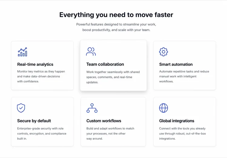
Beschreiben Sie Ihre Produktvorteile in einfachem Deutsch und MeDo erstellt in Sekunden ein ausgefeiltes, responsives Feature-Grid. Icons austauschen, Spalten anpassen und Texte verfeinern — alles ohne eine Zeile Code.

Feature Grid
Feature Grid

Ein großartiges Feature-Grid verwandelt Besucher in Überzeugungstäter.

Das Feature-Grid ist oft die erste Stelle, die ein Besucher nach dem Lesen Ihrer Überschrift ansieht — es beantwortet die Frage „Aber was macht es eigentlich?" in einem übersichtlichen, visuellen Format. Ein gut strukturiertes Grid baut schnell Glaubwürdigkeit auf: Klare Icons reduzieren die kognitive Belastung, prägnante Beschreibungen respektieren die Aufmerksamkeitsspanne und ein konsistentes Layout signalisiert ein durchdachtes Produkt. Studien zeigen durchgehend, dass Feature-Bereiche oberhalb des sichtbaren Bereichs die Verweildauer und Trial-Anmeldequoten deutlich erhöhen.

6 Vorlagen

Feature Grid-Vorlagen, die Sie generieren können

Jede Vorlage ist ein echter Prompt, kein Screenshot. Kopieren Sie ihn in einen KI-Editor oder führen Sie ihn in MeDo aus und erhalten Sie React- und Tailwind-Code zurück.

Icon cardsAcme

Three-Column Icon Card Grid

The workhorse feature grid. Six cards is the ceiling before scanning turns into reading — at nine the visitor stops comparing cards and starts skipping them.

Create a three-column feature grid holding exactly six cards. Above the grid, a centered eyebrow label, an h2 section heading and one line of supporting copy at a max width of 42rem. Each card has a filled icon in a tinted rounded square, an h3 title of two to four words, and a description of one to two sentences. Cards share a light surface, a 12px radius and a hairline border, with a hover state that raises the shadow and shifts the card up 2px — guarded behind prefers-reduced-motion. Collapse to two columns at 1024px and one at 640px, keeping equal card heights via the grid rather than fixed pixel values.

In MeDo testen
BentoMega

Bento Grid With One Feature Card

Unequal cells let one feature carry a screenshot while the rest stay text. Use it when the features are genuinely unequal in importance — a bento of six equally weighted cells is just a grid with worse alignment.

Create a bento-style feature grid on a twelve-column base: one hero cell spanning eight columns and two rows containing a title, two lines of copy and a cropped product screenshot; two cells of four columns each with an icon, title and one-line description; and a full-width cell at the bottom with a title, a short paragraph and a text link. Give every cell the same radius, border and internal padding so the varied spans still read as one system. Below 900px, flatten to a single column in importance order and drop the screenshot to full width with explicit dimensions.

In MeDo testen
Alternating rowsShipfast

Feature Rows With Alternating Screenshots

Not a grid at all — three stacked rows that flip image side each time. The right choice when each feature needs a screenshot to make sense, which an icon card can never provide.

Create a feature section as three alternating rows instead of a grid. Each row is a two-column layout: copy on one side with an eyebrow label, an h3, a two-sentence description and a bulleted list of three sub-points, and a product screenshot on the other side in a bordered frame at explicit width and height. Flip the image from right to left to right down the rows using an order utility at the desktop breakpoint only. Add generous vertical rhythm between rows and a hairline divider. Below 900px, every row stacks with the copy first so the reading order stays consistent.

In MeDo testen
Minimal listBuilders

Borderless Grid With Small Icons

No cards, no shadows — just a two-by-four field of small icons with tight copy. Fits documentation and developer sites where card chrome reads as marketing decoration.

Create a borderless feature grid with no cards or shadows: a four-column layout on desktop holding eight items, each with a 20px outline icon above an h3 title of two or three words and a description capped at two lines. Rely on column and row gap for separation rather than borders, and keep the icons a single stroke weight from one library. Add a left-aligned section heading and a single text link to the docs beneath the grid. Collapse to two columns at 768px and one at 480px, preserving the icon-above-title stacking at every size.

In MeDo testen
NumberedStudio

Numbered Capability Grid

Swaps icons for large numerals, which is the honest move when your features have no natural iconography. Reads as a deliverables list, so agencies and service pages get more from it than products do.

Create a numbered feature grid of six cells in three columns. Each cell opens with an oversized two-digit numeral in a muted tint, then an h3 title and a two-sentence description. Numbering runs left to right and must be visual only — set the numerals as decorative text with aria-hidden so a screen reader hears the titles as a clean list. Use a shared top border on each cell instead of full card outlines. Include a section heading and a short intro paragraph above. Two columns at 1024px, one at 640px, with the numeral scaling down one step on mobile.

In MeDo testen
ComparisonBrand*

Feature Grid With Plan Availability

Each card names the tier that includes it. Removes the click to pricing at the cost of maintenance — if the tiers change and this grid does not, it becomes a support ticket generator.

Create a feature grid where each card carries plan availability: three columns, six cards, and inside each an icon, an h3 title, a two-sentence description and a small badge row reading Starter, Pro or Enterprise. Style the badge by tier with distinguishable text labels rather than color alone. Add a filter row of tier pills above the grid that hides non-matching cards on click, keeping the pressed state on the active pill with aria-pressed. Announce the visible count in a live region. Collapse to two columns at 1024px and one at 640px, with the filter row scrolling horizontally on mobile.

In MeDo testen

So passen Sie Ihre Feature Grid an

Führen Sie mit Ergebnissen, nicht mit Features

Statt „Rollenbasierte Berechtigungen" schreiben Sie „Bestimmen Sie, wer was sieht — ohne IT-Ticket." Wenn Sie jede Karte um den Nutzen statt den Feature-Namen formulieren, wird das Grid sofort überzeugender und conversionorientierter.

Verwenden Sie einen einheitlichen Icon-Stil und -Stärke

Das Mischen von Outline-Icons mit gefüllten Icons oder unterschiedlichen Strichstärken erzeugt visuelles Rauschen. Wählen Sie einen Stil — Outline, Filled oder Duotone — und wenden Sie ihn auf jede Karte an. Bitten Sie MeDo, alle Icons aus derselben Bibliothek (Lucide, Heroicons, Phosphor) zu beziehen, um die Kohärenz automatisch sicherzustellen.

Kombinieren Sie das Grid mit einem Beweispunkt

Fügen Sie unter jeder Feature-Karte einen dezenten Statistikwert oder Social-Proof-Tag hinzu — „Von 12.000 Teams genutzt" oder „Spart durchschnittlich 3 Std./Woche." Eine einzelne Zahl verankert den Nutzen in der Realität und steigert die wahrgenommene Glaubwürdigkeit erheblich.

Passen Sie die Spaltenanzahl an die Feature-Dichte an

Drei oder vier Features funktionieren am besten in einem 2-Spalten-Layout, damit jede Karte Raum zum Atmen hat. Sechs bis neun Features eignen sich für ein 3-Spalten-Grid. Ab neun sollten Sie Features unter Kategorieüberschriften gruppieren, anstatt weitere Karten hinzuzufügen — Grids werden über 9 Elemente hinaus unübersichtlich.

Wer die Feature Grid-Komponente nutzt

SaaS-Produktseiten

Feature-Grids sind das Rückgrat jeder SaaS-Marketingseite. Sie ermöglichen es Interessenten, sich selbst zu qualifizieren, indem sie Funktionen überfliegen — ein Besucher, der seinen Schmerzpunkt in einer Karte wiedererkennt, startet mit deutlich höherer Wahrscheinlichkeit einen Trial.

Developer-Tool-Landingpages

Entwicklertools nutzen Feature-Grids, um technische Fähigkeiten hervorzuheben — SDK-Unterstützung, Performance-Benchmarks, Integrationen — in einem Format, das Ingenieure in unter 30 Sekunden erfassen können, ohne eine Textwand lesen zu müssen.

Mobile-App-Showcase-Seiten

App-Landingpages nutzen Icon-gesteuerte Feature-Grids, um ein reichhaltiges Feature-Set auf begrenztem vertikalen Raum zu kommunizieren, oft kombiniert mit einem App-Mockup-Screenshot, um das Layout visuell ausgewogen zu halten.

Agentur- und Freelancer-Portfolios

Dienstleistungsunternehmen nutzen Feature-Grids, um aufzulisten, was in einem Paket enthalten ist — Design, Entwicklung, SEO, Support — was Angebote transparent wirken lässt und Rückfragen im Verkaufsprozess reduziert.

Feature Grid-Muster für verschiedene Websites

Dieselbe feature grid-Komponente, abgestimmt auf die Art der Website, auf der sie läuft.

01 / 06

SaaS Product Feature Grid

Six icon cards framed as outcomes, not feature names. Visitors self-qualify by scanning for their own problem, so a card titled "Role-based permissions" does less work than one titled "Control who sees what". Keep the card count fixed as the product grows or this section becomes a changelog.

Feature Grid-Stile und -Varianten

Wählen Sie die Variante, die zum Rest der Seite passt, und generieren Sie sie.

01 / 06

Icon Card Grid

Bordered or shadowed cards with a tinted icon tile, title and description. The most legible default because the card boundary does the grouping for you. Keep icons from one library at one stroke weight or the grid reads as assembled from three different sites.

Feature Grid in React, Next.js, Vue und Svelte

React, Next.js, Vue 3, SvelteKit, Astro oder reines HTML — dieselbe feature grid, sechs Wege zur Einbindung.

01 / 06

React Feature Grid

Drive it from a typed array and map over it rather than hand-writing six near-identical card blocks. No state is involved, so this stays a plain function component even in a heavily interactive app.

src/components/FeatureGrid.tsx

const features = [
  { icon: Zap, title: 'Real-time sync', body: 'Changes land everywhere at once.' },
]

export function FeatureGrid() {
  return (
    <div className="grid gap-6 sm:grid-cols-2 lg:grid-cols-3">
      {features.map(({ icon: Icon, title, body }) => (
        <article key={title} className="rounded-xl border p-6">
          <Icon className="h-5 w-5" aria-hidden />
          <h3 className="mt-4 font-medium">{title}</h3>
          <p className="mt-2 text-sm text-zinc-500">{body}</p>
        </article>
      ))}
    </div>
  )
}

So fügen Sie Ihre Feature Grid einem Projekt hinzu

Vier Schritte, von der Auswahl einer feature grid-Vorlage bis zum Einsatz in der Produktion.

01~30s

Pick a Feature Grid Template

Choose by what each feature needs to show. Icons and a sentence means a card grid; a screenshot per feature means alternating rows; no natural iconography means numbered cells.

02~10s

Copy the Prompt

Take the prompt into MeDo, Lovable, Bolt, v0 or Cursor. Replace the placeholder feature names with your real ones first — the card count decides the column count, not the other way round.

03~2min

Generate and Refine

You get React + Tailwind back with a live preview. Follow up in plain English — "make it four columns", "drop the shadows", "rewrite the titles as outcomes" — rather than hand-editing the array.

04~1min

Drop It Below the Hero

Place it after the hero and check the outline: one h2 for the section, h3 on each card. Then move the feature copy into a typed array or your CMS so the next edit does not touch JSX.

Häufige Fragen zu Feature Grid

Wie erstelle ich ein Feature-Grid mit KI?

Öffnen Sie MeDo, beschreiben Sie die Features, die Sie präsentieren möchten — einschließlich Spaltenanzahl, gewünschte Icons oder Farben und den Tonfall der Texte — und MeDo generiert eine vollständig gestylte, responsive Feature-Grid-Komponente. Sie können mit Folgeprompts das Layout anpassen, Icons austauschen oder einzelne Kartenbeschreibungen umschreiben.

Was ist der beste KI-Feature-Grid-Generator?

MeDo ist speziell dafür entwickelt, ausgefeilte UI-Komponenten aus natürlichsprachlichen Prompts zu generieren. Im Gegensatz zu allgemeinen KI-Code-Tools versteht MeDo Designkonventionen — konsistente Abstände, barrierefreie Farbkontraste, responsive Breakpoints — sodass das generierte Feature-Grid aussieht, als käme es von einem Senior Designer, nicht aus einer Template-Bibliothek.

Wie viele Features sollte ich in einem Feature-Grid zeigen?

Zwischen 3 und 9 Features ist der ideale Bereich. Weniger als 3 wirkt dünn; mehr als 9 überfordert Besucher und verwässert die Aufmerksamkeit. Wenn Sie mehr als 9 Features haben, gruppieren Sie diese unter thematischen Kategorien — jede Gruppe wird zu einem eigenen Mini-Grid — anstatt sie alle in einem einzigen endlosen Grid aufzulisten.

Kann ich ein Feature-Grid generieren, das zu meinem bestehenden Design-System passt?

Ja. Geben Sie in Ihrem MeDo-Prompt Ihre Design-Tokens an — Primärfarbe, Schriftfamilie, Border-Radius, Schattenintensität — und MeDo wendet sie in der gesamten generierten Komponente an. Sie können auch eine Tailwind-Konfiguration oder CSS-Variablenliste einfügen und MeDo bitten, das Grid um Ihr bestehendes System herum zu erstellen.

Welche Icons eignen sich am besten für ein Feature-Grid?

Outline-Icons (wie Heroicons oder Lucide) eignen sich gut für minimale, moderne Designs. Gefüllte oder Duotone-Icons passen zu kräftigeren, farbenfroheren Layouts. Die wichtigste Regel ist Konsistenz: Jedes Icon im Grid sollte aus derselben Bibliothek stammen und dieselbe Strichstärke verwenden. MeDo verwendet standardmäßig Lucide-Icons, nutzt aber jede Bibliothek, die Sie angeben.

Kann MeDo ein Feature-Grid in React oder Next.js generieren?

Ja. Geben Sie Ihr Framework an — React, Next.js, Vue, Svelte — und MeDo gibt eine framework-native Komponente aus. Für React- und Next.js-Projekte verwendet MeDo TypeScript-Interfaces für Prop-Typisierung und kann die Komponente als statisches datengetriebenes Array generieren, sodass Ihr Content-Team Features aktualisieren kann, ohne JSX bearbeiten zu müssen.