MeDo

KI-Tabs-Generator.

Beschreiben Sie Ihre Panels und MeDo generiert eine vollständige Tabs-Komponente — korrekte ARIA-Rollen, Pfeiltasten-Navigation, ein animierter Aktiv-Indikator, Overflow-Handling auf Mobilgeräten und ein aktiver Tab, der mit der URL synchron bleibt und einen Reload übersteht.

Tabs
Tabs

Tabs sind eine Routing-Entscheidung, getarnt als Styling-Entscheidung

Ein Tab-Set versteckt nicht nur Inhalte, es teilt eine Seite in mehrere Ansichten, die sich eine einzige URL teilen. Sobald jemand den Preise-Tab teilen, aus einem Support-Artikel darauf verlinken oder neu laden möchte, ohne die Stelle zu verlieren, braucht die Komponente echten Zustand, der außerhalb von React lebt. Teams entdecken das meist erst nach dem Launch und schrauben dann eine Query-String-Behandlung an, die gegen die Animation und das initiale Rendering arbeitet. Wenn man von Anfang an festlegt, dass der aktive Tab aus der URL statt aus lokalem State abgeleitet wird, wird die ganze Komponente einfacher: der Trigger wird zu einer link-artigen Aktion, Deep Links funktionieren automatisch, und Server-Rendering liefert schon beim ersten Paint das richtige Panel. Es verändert auch, wie man das Markup schreibt — deshalb ist es viel günstiger, es direkt so zu generieren, als es später nachzurüsten.

6 Vorlagen

Tabs-Vorlagen, die Sie generieren können

Jede Vorlage ist ein echter Prompt, kein Screenshot. Kopieren Sie ihn in einen KI-Editor oder führen Sie ihn in MeDo aus und erhalten Sie React- und Tailwind-Code zurück.

BasicUnderline

Underlined Tab Row With a Sliding Indicator

The default that reads as tabs without any explanation. Reach for it when the panels are static content and you want the indicator to do the signalling rather than a border box.

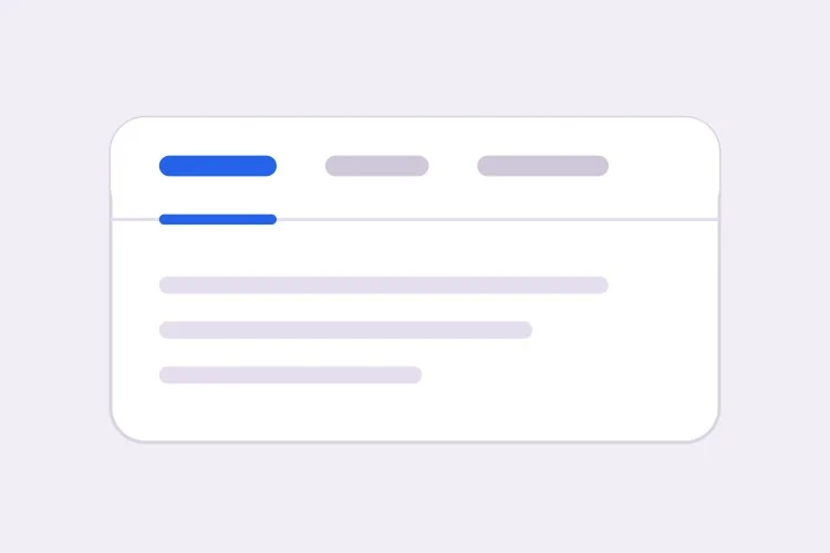
Create a tabs component with four triggers using the ARIA tabs pattern: role="tablist" on the container, role="tab" with aria-selected and aria-controls on each trigger, and role="tabpanel" with aria-labelledby on each panel. Use roving tabindex so only the selected tab has tabindex 0 and Tab moves out of the group entirely rather than through it. Left and Right arrows move focus and wrap at both ends, Home and End jump to the first and last tab, and activation is automatic because the panels are static text. Triggers are 40px tall with 15px medium labels, muted grey when inactive and near-black when active. Measure the active trigger and slide a 2px underline using translateX and scaleX over 200ms — never animate left or width.

In MeDo testen
SegmentedPill Segmented

Segmented Control With a Sliding Pill

Two or three mutually exclusive options that belong on one control, like monthly versus annual. Do not use it past four tabs — the track stops fitting on a phone and equal widths force truncation.

Create a segmented-control tabs component: one rounded 36px-tall track with a light grey background and 2px inner padding, holding three equal-width triggers. The active trigger is a white pill with a soft shadow that moves between positions with translateX over 180ms, so the label text never reflows mid-transition. Keep the full ARIA tabs roles and roving tabindex — Left and Right arrows move focus with wrapping, Home and End jump to the ends, and activation is automatic. Give every trigger the same explicit min-width so switching from a short label to a long one does not resize the track. Under prefers-reduced-motion, cross-fade the pill background instead of sliding it.

In MeDo testen
Deep linkableURL-Synced

Tabs Backed by a Query Parameter

The active tab lives in the URL, so support can link to one panel and a reload keeps your place. Worth doing before launch, because retrofitting it means rewriting the initial render.

Create a tabs component whose active tab is derived from a ?tab= query parameter rather than local state, so the first server render already paints the correct panel with no post-hydration flash. Read the parameter, validate it against the known tab ids, and fall back to the first tab when the value is unrecognised. On selection, write the new value with a replace-style navigation so the back button is not filled with tab switches, and preserve every other query parameter already on the URL. Keep the ARIA tabs wiring intact: roving tabindex, Left and Right arrows with wrapping, Home and End, and manual activation on Enter or Space.

In MeDo testen
OverflowScrollable

Horizontally Scrolling Tablist

What happens when seven labels meet a 390px viewport. The part teams forget is scrolling the newly focused tab into view — arrow keys otherwise move focus to a tab nobody can see.

Create a tabs component that handles overflow by scrolling rather than wrapping or clipping. Under 640px the tablist scrolls horizontally with momentum, the scrollbar is hidden, and a gradient fade appears on either edge only while content remains in that direction. When Left or Right arrow moves the roving tabindex, call scrollIntoView with inline nearest on the newly focused trigger so keyboard focus is never off screen, and do the same for Home and End. Use scroll-snap-align on each trigger so a flick settles on a label boundary instead of mid-word. Keep the full ARIA roles and aria-controls wiring, and recompute the indicator position on scroll and on resize.

In MeDo testen
PerformanceLazy Panels

Tabs With Deferred Panel Mounting

Only the active panel mounts, so opening Settings does not fetch invoices nobody asked for. The catch is state loss, so name the panels that must survive a switch.

Create a tabs component that mounts only the active panel and keeps every inactive panel out of the DOM entirely, so charts, video players and data fetches for unseen tabs never run. Use manual activation — arrow keys move the roving tabindex and only Enter or Space commits the change — because automatic activation would fire a request for every tab a keyboard user passes through. Accept a keepMounted list of tab ids whose panels stay in the DOM hidden with the hidden attribute instead, for panels holding half-filled forms or scroll position. Show a skeleton inside a newly mounted panel while its data resolves, and keep the panel container height stable so the page below does not jump.

In MeDo testen
SidebarVertical

Vertical Tabs for Settings Screens

A left rail of labels beside one panel. The one thing that changes beyond layout is the arrow axis — Up and Down, not Left and Right, and aria-orientation has to say so.

Create a vertical tabs component for a settings screen: a 200px left rail of triggers with a single panel to its right. Set aria-orientation="vertical" on the tablist and bind Arrow Up and Arrow Down to move the roving tabindex with wrapping, since Left and Right are wrong on this axis; keep Home and End for the ends. Triggers are left-aligned rows, 36px tall, with a 2px indicator on the left edge that translates vertically over 200ms. Below 768px collapse the rail into a horizontal scrolling tablist above the panel and switch the arrow bindings and aria-orientation to match. Use manual activation, and give the panel tabindex="-1" so a programmatic focus move after selection is possible.

In MeDo testen

So passen Sie Ihre Tabs an

Wählen Sie automatische oder manuelle Aktivierung bewusst

Automatische Aktivierung wechselt das Panel, sobald die Pfeiltasten den Fokus verschieben — schnell, aber unbrauchbar, wenn Panels teuer zu rendern sind oder Daten laden. Manuelle Aktivierung bewegt zuerst den Fokus und aktiviert erst bei Enter oder Leertaste. Sagen Sie, welche Variante Sie wollen, denn der Tastatur-Code unterscheidet sich.

Animieren Sie den Indikator mit Transform, nicht mit Breite

Bitten Sie um einen Unterstrich, der den aktiven Trigger ausmisst und per translateX und scaleX gleitet. Left und width zu animieren belastet in jedem Frame das Layout, zittert an Subpixel-Grenzen und bricht vollständig, sobald die Tablist scrollen kann.

Entscheiden Sie, was bei Tab-Overflow passiert

Vier kurze Labels passen auf ein Handy, sieben nicht. Wählen Sie ein Verhalten und benennen Sie es: eine horizontal scrollende Tablist mit Rand-Fade, Umbruch in eine zweite Zeile oder Zusammenfalten in ein natives Select unterhalb eines Breakpoints. Ohne Angabe werden generierte Tabs meist einfach abgeschnitten.

Sagen Sie, ob inaktive Panels gemountet bleiben

Inaktive Panels zu unmounten hält das DOM klein und verhindert, dass Charts oder Videoplayer laufen, die niemand sieht — verwirft aber auch Scrollposition und halb gefüllte Formularfelder. Nennen Sie die Panels, die Zustand halten, damit genau diese stattdessen per CSS versteckt werden.

Wer die Tabs-Komponente nutzt

Preisseite

Monatliche und jährliche Abrechnung als zwei Tabs über einer einzigen Preistabelle, wobei die Auswahl in die URL geschrieben wird, damit der Vertrieb direkt auf die Jahrespreise verlinken kann und der Jahresrabatt beim ersten Laden sichtbar ist.

Produktdokumentation

Codebeispiele nach Sprache getrennt — curl, Node, Python, Go — wobei die einmalige Sprachauswahl für jede Tab-Gruppe auf der Seite gilt und beim nächsten Besuch erhalten bleibt.

Dashboard oder Admin-Tool

Ein Einstellungsbereich mit den Tabs Profil, Team, Abrechnung und API-Keys, in dem jedes Panel verzögert gemountet wird, sodass das Öffnen der Einstellungen keine Rechnungen lädt, die niemand angefragt hat.

E-Commerce-Produktseite

Beschreibung, Spezifikationen und Bewertungen als Tabs unter der Galerie, mit der Bewertungsanzahl im Trigger-Label und der Beschreibung zusätzlich im Seitentext, damit der zentrale Text nicht nur hinter einem Tab erreichbar ist.

Tabs-Muster für verschiedene Websites

Dieselbe tabs-Komponente, abgestimmt auf die Art der Website, auf der sie läuft.

01 / 06

SaaS Pricing Page Tabs

Monthly and annual billing as a two-tab segmented control above one price grid. Sync the choice to the URL so a sales email can open annual pricing directly — a pricing page where the discount is one unshareable click away is losing the conversation before it starts.

Tabs-Stile und -Varianten

Wählen Sie die Variante, die zum Rest der Seite passt, und generieren Sie sie.

01 / 06

Underlined Tabs

A muted label row with a 2px indicator sliding beneath the active trigger. The most legible default because the underline gives the eye a single moving object to track. Animate it with translateX and scaleX — animating left and width thrashes layout every frame and jitters on subpixel boundaries.

Tabs in React, Next.js, Vue und Svelte

React, Next.js, Vue 3, SvelteKit, Astro oder reines HTML — dieselbe tabs, sechs Wege zur Einbindung.

01 / 06

React Tabs

Keep the selected id in one piece of state and derive tabindex from it — that is the whole roving tabindex mechanism. Hold refs to the triggers so the arrow handler can focus the next one directly.

src/components/Tabs.tsx

const [active, setActive] = useState(tabs[0].id)

<div role="tablist" onKeyDown={onArrowKeys}>
  {tabs.map((t) => (
    <button
      key={t.id}
      role="tab"
      aria-selected={t.id === active}
      aria-controls={`panel-${t.id}`}
      tabIndex={t.id === active ? 0 : -1}
      onClick={() => setActive(t.id)}
    >
      {t.label}
    </button>
  ))}
</div>

So fügen Sie Ihre Tabs einem Projekt hinzu

Vier Schritte, von der Auswahl einer tabs-Vorlage bis zum Einsatz in der Produktion.

01~30s

Pick a Tabs Template

Choose by constraint, not by looks: segmented for two or three alternatives, scrollable once labels overflow a phone, vertical for a long settings rail, lazy when a panel fetches data.

02~10s

Copy the Prompt

Take the prompt into MeDo, Lovable, Bolt, v0 or Cursor, then edit two things — your real tab labels, and whether activation is automatic or manual. That second choice changes the keyboard code, so decide it before you generate.

03~1min

Generate and Refine

You get React + Tailwind back with a live preview. Follow up in plain English — "sync the active tab to ?tab=", "collapse to a select under 640px", "keep the chart panel mounted" — rather than editing the keydown handler by hand.

04~2min

Wire the Panels and Ship

Replace the placeholder panels with your real content and check three things with the keyboard only: Tab enters and leaves the group in one stop, arrows move within it, and a reload on a deep link opens the right panel.

Häufige Fragen zu Tabs

Wie generiere ich eine barrierefreie Tabs-Komponente mit KI?

Beschreiben Sie die Tab-Labels und das gewünschte Verhalten in einem Prompt, inklusive der Frage, ob die Aktivierung automatisch oder manuell erfolgt. MeDo generiert die tablist-, tab- und tabpanel-Rollen mit passender aria-controls- und aria-labelledby-Verdrahtung, plus Roving Tabindex, damit Pfeiltasten zwischen den Tabs wechseln und Tab die Gruppe ganz verlässt.

Was ist der Unterschied zwischen automatischer und manueller Tab-Aktivierung?

Bei automatischer Aktivierung zeigt schon das Bewegen des Fokus mit einer Pfeiltaste das jeweilige Panel — passend für günstige statische Inhalte. Bei manueller Aktivierung bewegen Pfeiltasten nur den Fokus und der Nutzer bestätigt mit Enter oder Leertaste. Nutzen Sie manuell, sobald ein Panel Daten lädt, ein Chart rendert oder anderweitig langsam ist, da automatische Aktivierung für jeden durchlaufenen Tab eine Anfrage auslösen würde.

Kann ich direkt auf einen bestimmten Tab verlinken?

Ja, wenn der aktive Tab in der URL statt im Komponenten-State gespeichert ist. Bitten Sie um einen Query-Parameter wie ?tab=pricing, der das initiale Rendering speist und per Replace-Navigation aktualisiert wird, damit der Zurück-Button nicht mit Tab-Wechseln gefüllt wird. Vermeiden Sie dafür ein Hash-Fragment, da der Browser sonst auch zu einem Element mit passender id scrollt.

Schadet in inaktiven Tabs verborgener Inhalt dem SEO?

Suchmaschinen indexieren Text, der im HTML vorhanden ist, auch wenn ein Panel visuell versteckt ist — getabbte Inhalte sind also nicht unsichtbar. Sie werden in der Regel als sekundär gegenüber dem sofort sichtbaren Inhalt gewichtet, und Panels, die erst nach einem Klick gerendert werden, werden möglicherweise gar nicht gecrawlt. Halten Sie Ihre Hauptüberschrift, Ihr Wertversprechen und Ihre Ziel-Keywords im stets sichtbaren Teil der Seite und nutzen Sie Tabs für ergänzende Details.

Wie sollten Tabs auf Mobilgeräten funktionieren?

Wählen Sie eine einzige Strategie, anstatt Labels schrumpfen zu lassen. Eine horizontal scrollbare Tablist mit Fade am überlaufenden Rand funktioniert gut bis etwa sechs kurze Labels; darüber hinaus liefert das Zusammenfalten in ein natives Select ein besseres Touch-Ziel und vermeidet versteckte Tabs. Nennen Sie MeDo den Breakpoint und die Strategie, und es generiert beide Layouts aus einer Komponente.

Sollte ich Tabs oder ein Accordion verwenden?

Nutzen Sie Tabs, wenn die Panels Alternativen sind, die der Nutzer einzeln vergleicht — etwa Abrechnungszeiträume oder Code-Sprachen — und wenn die Labels kurz genug für eine Zeile sind. Nutzen Sie ein Accordion, wenn die Abschnitte unabhängige Einträge sind, die jemand gleichzeitig geöffnet haben möchte, wenn die Labels ganze Fragen sind, oder wenn der Inhalt so lang ist, dass vertikales Stapeln besser liest — eine FAQ-Liste ist der klassische Accordion-Fall, kein Tabs-Fall.