MeDo

KI-Blog-Bereich-Generator.

Beschreiben Sie das gewünschte Blog-Layout — Kartenstil, Beitragsanzahl, Hauptartikel, Kategoriefilter — und MeDo generiert die vollständige Komponente. Liefern Sie einen polierten Blog-Bereich, ohne eine einzige CSS-Grid-Eigenschaft anzufassen.

Blog-Bereich
Blog-Bereich

Ein großartiger Blog-Bereich verwandelt Leser in Stammbesucher.

Ihr Blog ist eines Ihrer wirkungsvollsten SEO- und Vertrauensbildungs-Assets — aber nur, wenn Besucher ihn tatsächlich finden und erkunden können. Ein gut gestalteter Blog-Bereich bringt Ihre besten Inhalte sofort ans Licht, kommuniziert thematische Autorität durch sichtbare Kategorien und führt Leser von einer Landingpage in Ihren Content-Funnel. MeDo lässt Sie genau das Layout generieren, das zu Ihrer Marke und Ihrem Inhaltsvolumen passt, anstatt sich in ein generisches Theme zu quetschen.

6 Vorlagen

Blog-Bereich-Vorlagen, die Sie generieren können

Jede Vorlage ist ein echter Prompt, kein Screenshot. Kopieren Sie ihn in einen KI-Editor oder führen Sie ihn in MeDo aus und erhalten Sie React- und Tailwind-Code zurück.

Three cardAcme

Three-Card Homepage Preview

The smallest blog section that still looks intentional. Three posts and a View all link — enough to prove the blog is alive without turning a marketing page into an index.

Create a blog preview section with a section heading, a one-line subheading and a three-column card grid. Each card holds a 16:9 cover image in a fixed aspect-ratio box, a category pill above the title, a two-line title clamped with line-clamp-2, a two-line excerpt clamped with line-clamp-2, and a footer row with author name, publish date in a time element with a machine-readable datetime, and a reading-time estimate. Make the whole card one link with the heading as the accessible name rather than adding a separate Read more link. Below the grid, a centred View all posts link. Two columns on tablet, one on mobile, with the cover images lazy loaded.

In MeDo testen
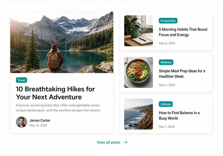
Featured splitEditorial

One Featured Post, Three Stacked

Creates a clear lead story, which an even grid never does. Only works if the featured post is genuinely your best — promoting whatever published last makes the asymmetry look arbitrary.

Create an asymmetric blog section: on the left, a featured post card taking about 60% of the width with a large 3:2 cover image, a category pill, a headline at display size, a three-line excerpt and an author row with avatar, date and reading time. On the right, three compact cards stacked vertically, each with a small square thumbnail on the left and a category, a two-line clamped title and a date on the right. Divide the stacked cards with hairline rules rather than shadows so they read as a list next to the feature. Stack the feature above the list on tablet and below on mobile, keeping the feature image eager loaded.

In MeDo testen
Index gridMega

Paginated Post Index

The standalone blog page rather than a homepage teaser. Nine cards is the ceiling before the grid stops being scannable — past that, pagination beats a longer page or infinite scroll.

Create a blog index section: a page heading, a horizontal row of category filter chips, and a nine-card grid at three columns. Each card carries a cover image in a fixed 16:9 box, a category pill, a clamped two-line title, a clamped two-line excerpt, and a meta row with author, a time element for the date and a reading time. Below the grid, numbered pagination with previous and next controls, aria-current on the active page, and real anchor hrefs to /blog/page/2 so pages are crawlable and linkable rather than swapped in by client state. Show a labelled empty state when a filter returns nothing. Two columns on tablet, one on mobile.

In MeDo testen
Text listLedger

Dated List With No Images

No thumbnails, just date, title and one line of description. Faster to scan than any card grid and the honest choice when your posts have no cover art — a grid of stock photography reads worse than plain text.

Create an image-free blog list: rows separated by hairline rules, each row showing a left-aligned date in a fixed-width muted column, then the post title as a link at large text size, a one-line clamped description beneath it, and a right-aligned reading time. Group the rows under year headings when the list spans multiple years. Give each row a full-width hover background so the whole row reads as the hit target, and keep the vertical rhythm tight so twenty posts fit in two screens. Stack the date above the title on mobile. Use an ordered list with time elements for the dates.

In MeDo testen
Category tabsStudio

Topic Tabs Over a Card Grid

Turns a mixed blog into something a reader can navigate by interest. Needs at least a few posts per tab — a tab that opens onto two articles makes the blog look thinner than one undivided grid would.

Create a blog section with topic tabs above a six-card grid: tabs labelled All, Engineering, Design and Product with a post count beside each. Use real tab semantics — a tablist with arrow-key navigation, aria-selected, and managed focus — and reflect the active tab in the URL so a topic view is linkable. Switching a tab swaps the card set with a short fade rather than a layout jump, and keeps the grid height stable by always rendering a fixed number of card slots. Each card has a cover image, category pill, clamped title and excerpt, and a meta row with author and date. Announce the result count in an aria-live region.

In MeDo testen
ChangelogShipfast

Release Notes Timeline

A blog section for product updates, where version and date matter more than a cover image. Keep the newest entry expanded and the rest collapsed so the page opens on what changed most recently.

Create a changelog-style blog section: a vertical timeline with a left rail of dots and connecting line, each entry showing a version tag, a date in a time element, a type pill for Added, Fixed or Changed, a title and a two-to-three sentence summary. Expand the most recent entry by default and render the rest as collapsed disclosure panels using button plus aria-expanded so keyboard users can open them. Add anchor links on each version so a specific release can be linked directly, and a Subscribe to updates link at the top of the section. Collapse the left rail to a simple stacked list on mobile.

In MeDo testen

So passen Sie Ihre Blog-Bereich an

Mit einem hervorgehobenen Beitrag beginnen

Heben Sie Ihren wichtigsten Artikel mit einer größeren Karte hervor — fügen Sie ein vollbreites Titelbild, einen längeren Auszug und eine markante visuelle Behandlung hinzu. Sagen Sie MeDo, welcher Beitrag „featured" ist, und es wird das asymmetrische Layout automatisch erstellen.

Kategorie- oder Tag-Filter hinzufügen

Wenn Sie zu mehreren Themen veröffentlichen, bitten Sie MeDo, eine horizontale Filterleiste über dem Raster einzufügen. Das verwandelt Ihren Blog-Bereich in ein Selbstbedienungs-Entdeckungstool und hält Leser länger auf der Seite.

Autorenkontext anzeigen

Ein Autoren-Avatar, ein Name und eine Lesezeitschätzung bauen Vertrauen auf und setzen Lesererwartungen. Erwähnen Sie diese Metadatenfelder in Ihrem Prompt, damit sie in jede Karte eingewoben werden.

Kartendichte mit Beitragsanzahl steuern

Geben Sie genau an, wie viele Beiträge angezeigt werden sollen — drei Karten für eine kompakte Startseiten-Vorschau, sechs bis neun für eine eigenständige Blog-Index-Seite. Kombinieren Sie es mit einem „Alle anzeigen"-CTA, um ein endloses Raster auf Marketingseiten zu vermeiden.

Wer die Blog-Bereich-Komponente nutzt

SaaS-Marketing-Website

Ein Dreikarten-Vorschaubereich auf der Startseite mit Links zu Produkt-Tutorials, Kundengeschichten und Release-Notes — treibt Blog-Traffic, ohne den Conversion-Flow zu überwältigen.

Content-orientierte Publikation

Ein vollbreites redaktionelles Layout mit einem Hauptartikel, Kategorie-Tabs und einem paginierten Kartengitter — alles, was Leser von einer professionellen Publikation erwarten.

Agentur oder Studio

Ein minimales zweispaltiges Mosaik aus Fallstudien und Thought-Leadership-Beiträgen, das potenziellen Kunden Fachkompetenz zeigt, bevor sie überhaupt klicken.

E-Commerce-Marke

Ein Lifestyle-Blog-Bereich mit großen Bildern und kurzen Teasern, die zu Kaufratgebern, Trend-Roundups und Behind-the-Scenes-Geschichten führen, die die Kaufabsicht steigern.

Blog-Bereich-Muster für verschiedene Websites

Dieselbe blog-bereich-Komponente, abgestimmt auf die Art der Website, auf der sie läuft.

01 / 06

SaaS Marketing Blog Section

A three-card teaser on the homepage, not an index. The job is proving the product is maintained and that someone is writing about the problem, so lead with the tutorial or customer story — release notes belong in their own changelog, not competing for the same three slots.

Blog-Bereich-Stile und -Varianten

Wählen Sie die Variante, die zum Rest der Seite passt, und generieren Sie sie.

01 / 06

Three-Card Grid

Equal cards in one row with a View all link beneath. The right default on a marketing page where the blog is supporting evidence rather than the destination, and it stays honest when you have only published a handful of posts.

Blog-Bereich in React, Next.js, Vue und Svelte

React, Next.js, Vue 3, SvelteKit, Astro oder reines HTML — dieselbe blog-bereich, sechs Wege zur Einbindung.

01 / 06

React Blog Section

Keep the posts in one typed array and let the card be a pure function of a post. No state is needed unless you add filters, which is what makes this section safe to render on the server.

src/components/BlogSection.tsx

type Post = { slug: string; title: string; excerpt: string; date: string; minutes: number }

export function BlogSection({ posts }: { posts: Post[] }) {
  return (
    <ul className="grid gap-8 md:grid-cols-3">
      {posts.map((post) => (
        <PostCard key={post.slug} post={post} />
      ))}
    </ul>
  )
}

So fügen Sie Ihre Blog-Bereich einem Projekt hinzu

Vier Schritte, von der Auswahl einer blog-bereich-Vorlage bis zum Einsatz in der Produktion.

01~30s

Pick a Blog Layout

Choose by post volume and by whether you have cover art — three cards for a homepage teaser, a featured split when one post should lead, a dated list when the posts have no images worth showing.

02~10s

Copy the Prompt

Take the prompt into MeDo, or paste it into Lovable, Bolt, v0 or Cursor. Name the metadata you actually have first — author, reading time, category — since a card designed around fields you cannot populate is the usual reason these sections get rebuilt.

03~1min

Generate and Refine

You get React + Tailwind back with a live preview. Follow up in plain English — "clamp titles to two lines", "drop the excerpt on mobile", "move the category above the title" — instead of tuning class strings by hand.

04~2min

Connect Your Posts

Point the component at your real source — an MDX directory, a content collection or a CMS query — and map the fields once. Sort by date server-side and let the card stay a pure function of a post.

Häufige Fragen zu Blog-Bereich

Wie erstelle ich mit KI einen Blog-Bereich?

Öffnen Sie MeDo und beschreiben Sie das benötigte Blog-Layout — Kartenstil, Anzahl der Beiträge, ob Sie einen hervorgehobenen Artikel möchten, welche Metadatenfelder angezeigt werden sollen (Autor, Datum, Lesezeit) und eventuelle Filter. MeDo generiert den vollständigen Komponenten-Code in Sekunden. Sie können ihn dann in Ihr Projekt kopieren und mit weiteren Prompts verfeinern.

Was ist der beste KI-Blog-Bereich-Generator?

MeDo ist speziell für die Generierung echter Website-Komponenten entwickelt worden, nicht nur für Design-Mockups. Im Gegensatz zu allgemeinen KI-Chat-Tools versteht MeDo Layout-Systeme, Kartenmuster und responsives Verhalten — sodass Ihr Blog-Bereich als sauberer, produktionsreifer Code herauskommt, anstatt als grober Ausgangspunkt, der umfangreiche Bearbeitung benötigt.

Kann KI ein responsives Blog-Kartengitter generieren?

Ja. MeDo generiert responsive Komponenten. Geben Sie an, wie viele Spalten Sie auf Desktop-Größe möchten, und es übernimmt die Breakpoints automatisch — auf Mobilgeräten wird auf einen einspaltigen Stapel reduziert, ohne zusätzliche Arbeit Ihrerseits.

Wie füge ich Kategoriefilter zu einem KI-generierten Blog-Bereich hinzu?

Fügen Sie die Filteranforderung in Ihren Prompt ein — zum Beispiel: „Füge Kategorie-Filter-Tabs für Design, Engineering und Produkt über dem Kartengitter hinzu." MeDo generiert die Filter-UI und die bedingte Anzeigelogik dazu.

Kann ich mit KI ein hervorgehobenes Blog-Beitragslayout generieren?

Absolut. Bitten Sie MeDo um ein asymmetrisches Layout mit einer großen hervorgehobenen Karte und kleineren sekundären Karten daneben. Dieses redaktionelle Muster ist eine der effektivsten Methoden, um Kerninhalte hervorzuheben und gleichzeitig mehrere aktuelle Beiträge zu zeigen.

Enthält der KI-generierte Blog-Bereich Autoren- und Datumsmetadaten?

Ja — erwähnen Sie einfach die gewünschten Metadaten in Ihrem Prompt. MeDo kann Autorenname und Avatar, Veröffentlichungsdatum, geschätzte Lesezeit, Kategorie-Tag und Auszug einbeziehen. Sie bestimmen genau, was auf jeder Karte erscheint.