MeDo

KI-Alert-Generator.

Beschreiben Sie die Meldung und MeDo generiert den vollständigen Inline-Alert-Satz — Info-, Erfolgs-, Warn- und Fehlervarianten mit Akzentleiste, Icon, Titel, Beschreibung, optionalem Aktionslink und einem Schließen-Steuerelement, wenn der Alert nicht dauerhaft ist.

Alert
Alert

Dringlichkeit muss auch ohne Farbe erkennbar bleiben

Alerts sind die eine Komponente, deren ganze Aufgabe darin besteht zu vermitteln, wie ernst etwas ist — und Farbe ist dafür der unzuverlässigste Kanal. Etwa einer von zwölf Männern hat eine Form der Farbsinnstörung, Rot und Grün sind das am häufigsten verwechselte Paar, und derselbe Alert verliert die Unterscheidung vollständig, wenn er im Dark Theme, auf einem dunklen Laptop-Display oder im Graustufendruck erscheint. Die praktische Konsequenz: Ein Alert braucht von Konstruktion an redundante Kodierung — eine eigene Icon-Form pro Schweregrad und eine Formulierung, die die Situation benennt, statt sich darauf zu verlassen, dass der Leser sie aus einem Farbton ableitet. Alle vier Schweregrade aus einer Beschreibung zu generieren ist genau das, was den Icon-Satz wirklich unterscheidbar hält, weil die Icons gegeneinander und nicht einzeln gewählt werden.

6 Vorlagen

Alert-Vorlagen, die Sie generieren können

Jede Vorlage ist ein echter Prompt, kein Screenshot. Kopieren Sie ihn in einen KI-Editor oder führen Sie ihn in MeDo aus und erhalten Sie React- und Tailwind-Code zurück.

BasicFour Severities

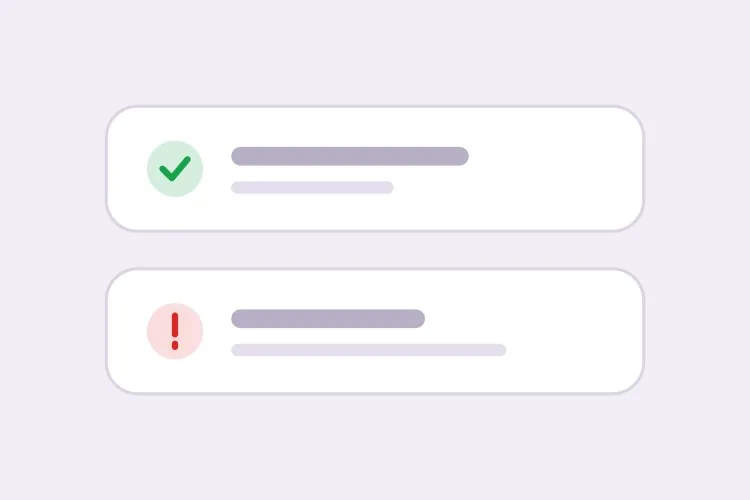
Accent-Bar Alert in Four Tones

The baseline set. Generating all four together is what keeps the icon shapes distinguishable from each other rather than four recolors of one glyph.

Create an inline alert component with four severities — info in blue with a circle icon, success in green with a check, warning in amber with a triangle, error in red with an octagon. Each is full width within its container with a 4px left accent bar in the severity color, a background tinted to roughly 8% of that color, 16px padding, an 8px radius, and a 20px icon aligned to the first text line rather than vertically centered. Render a semibold 15px title with an optional 14px muted description below. Because the alert renders with the page rather than appearing dynamically, use role="region" with an aria-label naming the severity, not role="alert" — an assertive live region on initial paint talks over everything else. Check every tinted background against its text color for 4.5:1 contrast.

In MeDo testen
ClosableDismissible

Alert With an Opt-In Close Button

Dismissal has to be per-instance, not global. A close button on an expired-payment alert lets the user hide a problem that still exists, and they will.

Add an opt-in dismiss control to an inline alert: a 32px icon button on the right with aria-label="Dismiss" and a visible focus ring, rendered only when a dismissible prop is passed so permanent alerts cannot be closed by accident. On dismiss, remove the alert from the DOM and move focus to the next focusable element after it rather than leaving focus on a detached node. Animate the collapse with height and opacity over 150ms, and skip the animation entirely under prefers-reduced-motion. Accept an onDismiss callback so the caller can persist the dismissal, and document that the alert should reappear on the next session while the underlying condition is unresolved.

In MeDo testen
With actionActionable

Alert Carrying One Next Step

An alert that names a problem without a route out of it just relocates the work. One action, concretely worded — two actions and neither reads as the primary.

Create an alert variant with a single inline action below the description, rendered in the severity color as a text link with an underline on hover and focus. Keep it to exactly one action so the next step is unambiguous, and require concrete wording in the label — "Update payment method", not "Learn more". If the action navigates, use an anchor; if it mutates state, use a button, and show an inline pending state on the button rather than replacing the alert while the request is in flight. Place the action inside the alert region so its purpose is announced together with the message, and keep its hit area at least 44px tall on touch.

In MeDo testen
CompactField Error

Single-Line Error Under an Input

No title, no icon block, no accent bar — just the message wired to the input it belongs to. The full alert anatomy next to a text field is visual noise that pushes the form apart.

Create a compact single-line alert for form-field errors: 13px text in the error color with a 14px inline icon, no title, no accent bar and no background tint, sitting 6px below its input with no vertical margin collapse. Give it a stable ID and reference it from the input with aria-describedby, and set aria-invalid="true" on the input at the same time. Because the message appears in response to a submit attempt, wrap it in role="alert" so it is announced immediately — but render the element only when there is an error rather than keeping an empty live region in the DOM, or the first error will be announced as a change to existing content. Reserve the line height so the layout does not jump when the message appears.

In MeDo testen
GlobalPage Banner

Full-Width Banner Above the App Shell

Trial countdowns, maintenance windows, degraded service. It sits above the layout rather than inside a page, so the thing that breaks is sticky-header offset math, not the alert itself.

Create a full-width alert banner that mounts above the application shell: edge-to-edge tinted background, centered content capped at the app container width, a 16px icon, one line of text and a single inline action, at 44px total height. Because it displaces the layout, expose its height as a CSS custom property on the root element so a sticky header can offset itself instead of being covered. Support a dismissible mode that persists to localStorage keyed by banner ID and version, so editing the message re-shows it to users who dismissed the previous one. Use role="region" with an aria-label rather than role="alert", since the banner is present on load and should not interrupt.

In MeDo testen
ValidationError Summary

Alert Listing Every Failed Field

The summary above the submit button, with one link per failure jumping to its input. It tells the user how many problems exist — the field-level messages tell them what to fix.

Create a validation summary alert for the top of a form: an error-severity block with a title stating the count — "3 fields need attention" — and an unordered list of links, each labelled with the field name plus the specific problem, each jumping to and focusing its input on click. Render it only after a submit attempt fails, give it role="alert" and move keyboard focus to the alert container itself with tabindex="-1" so a screen reader user lands on the summary rather than hunting for it. Rebuild the list on every failed submit and re-announce even when the set of errors is unchanged. Pair it with per-field messages wired through aria-describedby rather than replacing them.

In MeDo testen

So passen Sie Ihre Alert an

Kombinieren Sie jede Farbe mit einer eigenen Icon-Form

Fordern Sie ein konkretes Icon pro Schweregrad an — ein Häkchen für Erfolg, ein Dreieck für Warnung, ein Achteck für Fehler, einen Kreis für Info. Formen bleiben in Graustufen und für farbenblinde Nutzer lesbar und erlauben es, den Schweregrad im peripheren Blickfeld zu erkennen, bevor ein Wort gelesen ist.

Entscheiden Sie vorab, ob der Alert schließbar ist

Ein Schließen-Button an einem Alert, der einen ungelösten Zustand beschreibt — etwa eine abgelaufene Zahlungsmethode — erlaubt es dem Nutzer, ein weiterhin bestehendes Problem zu verbergen. Machen Sie das Schließen pro Instanz optional und halten Sie Alerts dauerhaft, wenn die Meldung erst verschwinden soll, sobald sich der zugrunde liegende Zustand ändert.

Trennen Sie seitenweite Banner von Feldfehlern

Ein seitenweiter Alert fasst zusammen und sitzt oben im Formular; ein Feldfehler steht direkt unter seinem Eingabefeld und wird über aria-describedby referenziert. Fordern Sie für den Feldfall eine kompakte einzeilige Variante an, damit sie nicht Titel und Icon-Block neben einem Texteingabefeld mitschleppt.

Schreiben Sie die Handlung in den Alert

Ein Alert, der ein Problem beschreibt, ohne einen Weg heraus anzubieten, verlagert die Arbeit nur. Legen Sie einen einzigen Inline-Aktionslink mit konkreter Formulierung fest, etwa „Zahlungsmethode aktualisieren", und beschränken Sie es auf eine Aktion, damit der nächste Schritt eindeutig bleibt.

Wer die Alert-Komponente nutzt

SaaS-Produkt

Ein dauerhaftes Warnbanner oben in der App, wenn eine Testphase noch drei Tage läuft, mit einem „Upgrade"-Aktionslink, plus Erfolgs-Alerts in Einstellungsseiten, die eine gespeicherte Konfiguration bestätigen.

Online-Shop

Ein Info-Alert auf der Warenkorbseite zum Versand-Annahmeschluss und ein Fehler-Alert über dem Checkout-Formular, der die Details einer abgelehnten Zahlung zusammenfasst, damit die Meldung das erneute Rendern der Seite übersteht.

Dashboard oder Admin-Tool

Fehler-Alerts auf Datenimport-Bildschirmen, die auflisten, welche Zeilen die Validierung nicht bestanden haben, und ein Info-Alert zu einem geplanten Wartungsfenster, der sichtbar bleibt, bis das Fenster vorbei ist.

Dokumentationsseite

Inline-Callout-Alerts, die veraltete APIs als Warnung und versionsspezifisches Verhalten als Info markieren — mitten im Textfluss, wo eine schwebende Benachrichtigung nutzlos wäre.

Alert-Muster für verschiedene Websites

Dieselbe alert-Komponente, abgestimmt auf die Art der Website, auf der sie läuft.

01 / 06

SaaS Product Alerts

Trial countdowns and plan limits as permanent banners above the app shell, success alerts inside settings pages after a save. The banner is the tricky one: expose its height as a custom property or your sticky header will sit under it on every route.

Alert-Stile und -Varianten

Wählen Sie die Variante, die zum Rest der Seite passt, und generieren Sie sie.

01 / 06

Left Accent Bar Alert

A 4px bar in the severity color with a tinted fill. The bar gives the eye a vertical edge to scan a stack of alerts against, which matters when three appear together on a settings page — four flat tinted boxes are much harder to separate.

Alert in React, Next.js, Vue und Svelte

React, Next.js, Vue 3, SvelteKit, Astro oder reines HTML — dieselbe alert, sechs Wege zur Einbindung.

01 / 06

React Alert

A static alert needs no state at all — keep the severity map outside the component so tones and icons stay in one place. Only the dismissible variant needs a hook, so split it out rather than making every alert stateful.

src/components/Alert.tsx

const tones = {
  info: { bar: 'bg-blue-500', bg: 'bg-blue-50', Icon: InfoIcon },
  error: { bar: 'bg-red-500', bg: 'bg-red-50', Icon: OctagonIcon },
}

export function Alert({ severity = 'info', title, children }) {
  const { bar, bg, Icon } = tones[severity]
  return (
    <div role="region" aria-label={severity} className={`flex gap-3 ${bg}`}>
      <span className={`w-1 ${bar}`} />
      <Icon className="mt-0.5 h-5 w-5" />
      <div>
        <p className="font-semibold">{title}</p>
        {children}
      </div>
    </div>
  )
}

So fügen Sie Ihre Alert einem Projekt hinzu

Vier Schritte, von der Auswahl einer alert-Vorlage bis zum Einsatz in der Produktion.

01~30s

Pick an Alert Pattern

Choose by where the message lives: the four-severity block for in-page state, the compact variant for a field error, the summary for a failed submit, the banner for something app-wide.

02~10s

Copy the Prompt

Take it into MeDo, Lovable, Bolt, v0 or Cursor. Decide whether this alert is dismissible before you run it — that choice determines whether a user can hide an unresolved problem.

03~1min

Generate and Refine

You get all four severities back with a live preview. Follow up in plain English — "add an Update payment method link", "make the error variant outlined", "drop the title on the compact one" — rather than recoloring tints by hand.

04~2min

Place It and Check the Roles

Put page-level alerts above the submit area and field errors under their inputs with aria-describedby. Then confirm the load-time alerts are not using role="alert", or a screen reader will announce them over the rest of the page.

Häufige Fragen zu Alert

Wie generiere ich eine Alert-Komponente mit KI?

Beschreiben Sie die Schweregrade, den Aufbau und ob der Alert geschlossen werden kann — zum Beispiel „Info-, Erfolgs-, Warn- und Fehler-Alerts mit linker Akzentleiste, Icon, Titel, Beschreibung und optionalem Aktionslink" — und MeDo generiert alle vier Varianten aus dieser einen Beschreibung. Weil sie gemeinsam entstehen, stimmen Innenabstand, Radius und Icon-Größe über alle Schweregrade hinweg überein.

Was ist der Unterschied zwischen einem Alert und einem Toast?

Ein Inline-Alert lebt im Seitenlayout und bleibt bestehen, bis sich der beschriebene Zustand ändert — er passt also für Zustände, die der Nutzer erneut lesen muss: ein Abrechnungsproblem, eine Wartungsmeldung, ein Formularfehler. Ein Toast ist eine kurzlebige Benachrichtigung, die über der Seite schwebt und nach wenigen Sekunden verschwindet; er passt zur Bestätigung einer Aktion, die der Nutzer gerade ausgeführt hat. Nutzen Sie einen Alert, wenn die Meldung auch nach dem Scrollen oder einem Neuladen noch da sein muss.

Sollte ein Alert schließbar sein?

Nur wenn die Meldung informativ ist und ihr Verlust nichts kostet. Beschreibt der Alert ein ungelöstes Problem, halten Sie ihn dauerhaft und lassen Sie ihn sich selbst auflösen, sobald der Zustand geklärt ist — andernfalls verbirgt das Schließen ein Problem, das weiterhin Aufmerksamkeit braucht. Ein häufiger Kompromiss: schließbar, aber der Alert erscheint in der nächsten Sitzung erneut, bis er behoben ist.

Kann ein Alert Dringlichkeit ohne Farbe vermitteln?

Er muss es. Kombinieren Sie jeden Schweregrad mit einer eigenen Icon-Form und einer Formulierung, die die Situation benennt, damit ein Graustufen-Bildschirm oder ein farbenblinder Leser die Meldung dennoch versteht. Fordern Sie im Prompt eine Icon-plus-Text-Kodierung an, und MeDo vergibt pro Schweregrad ein anderes Glyph, statt ein Icon viermal umzufärben.

Wo gehört ein Formularfehler-Alert hin?

Platzieren Sie einen Zusammenfassungs-Alert direkt über dem Absendebereich oder oben im Formular und die einzelnen Meldungen unter ihren jeweiligen Feldern, verdrahtet mit aria-describedby und aria-invalid. Die Zusammenfassung sagt dem Nutzer, wie viele Probleme es gibt, die Feldmeldungen sagen ihm, was zu korrigieren ist — und beides zusammen bedeutet, dass Tastatur- und Screenreader-Nutzer nicht nach dem Fehler suchen müssen.

Braucht ein Alert role="alert"?

Nicht immer. Verwenden Sie role="alert" nur für Meldungen, die dynamisch erscheinen und unterbrechen müssen, etwa ein Validierungsfehler nach einem Absendeversuch. Ein Alert, der beim Laden der Seite bereits vorhanden ist, sollte eine einfache Region sein oder role="status" verwenden, weil eine assertive Live-Region beim initialen Rendern einfach alles andere auf der Seite übertönt.