MeDo

AI機能グリッドジェネレーター。

製品のメリットを日本語で説明するだけで、MeDoが数秒で洗練されたレスポンシブな機能グリッドを生成します。アイコンの変更、カラム数の調整、コピーの微調整 — すべてコードに触れることなく実現できます。

機能グリッド
機能グリッド

優れた機能グリッドは訪問者を信者に変えます。

機能グリッドは、訪問者がヘッドラインを読んだ後に最初に目を向ける場所であることが多く、「具体的に何ができるの?」という疑問にスキャン可能なビジュアル形式で答えます。適切に構造化されたグリッドは素早く信頼性を構築します:明確なアイコンは認知負荷を軽減し、簡潔な説明文は注意力を尊重し、一貫したレイアウトは製品がよく考えられていることを示します。研究は一貫して、ファーストビューに配置された機能セクションがページ滞在時間とトライアル登録率を大幅に増加させることを示しています。

6 個のテンプレート

生成できる 機能グリッド テンプレート

どのテンプレートもスクリーンショットではなく実際のプロンプトです。任意の AI エディタに貼り付けるか、MeDo で実行して React + Tailwind のコードを受け取れます。

Icon cardsAcme

Three-Column Icon Card Grid

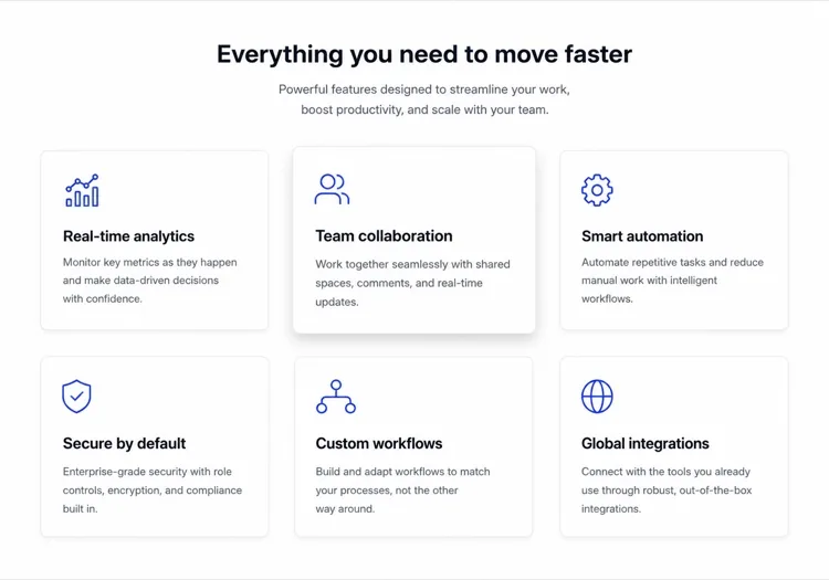
The workhorse feature grid. Six cards is the ceiling before scanning turns into reading — at nine the visitor stops comparing cards and starts skipping them.

Create a three-column feature grid holding exactly six cards. Above the grid, a centered eyebrow label, an h2 section heading and one line of supporting copy at a max width of 42rem. Each card has a filled icon in a tinted rounded square, an h3 title of two to four words, and a description of one to two sentences. Cards share a light surface, a 12px radius and a hairline border, with a hover state that raises the shadow and shifts the card up 2px — guarded behind prefers-reduced-motion. Collapse to two columns at 1024px and one at 640px, keeping equal card heights via the grid rather than fixed pixel values.

MeDoで試す
BentoMega

Bento Grid With One Feature Card

Unequal cells let one feature carry a screenshot while the rest stay text. Use it when the features are genuinely unequal in importance — a bento of six equally weighted cells is just a grid with worse alignment.

Create a bento-style feature grid on a twelve-column base: one hero cell spanning eight columns and two rows containing a title, two lines of copy and a cropped product screenshot; two cells of four columns each with an icon, title and one-line description; and a full-width cell at the bottom with a title, a short paragraph and a text link. Give every cell the same radius, border and internal padding so the varied spans still read as one system. Below 900px, flatten to a single column in importance order and drop the screenshot to full width with explicit dimensions.

MeDoで試す
Alternating rowsShipfast

Feature Rows With Alternating Screenshots

Not a grid at all — three stacked rows that flip image side each time. The right choice when each feature needs a screenshot to make sense, which an icon card can never provide.

Create a feature section as three alternating rows instead of a grid. Each row is a two-column layout: copy on one side with an eyebrow label, an h3, a two-sentence description and a bulleted list of three sub-points, and a product screenshot on the other side in a bordered frame at explicit width and height. Flip the image from right to left to right down the rows using an order utility at the desktop breakpoint only. Add generous vertical rhythm between rows and a hairline divider. Below 900px, every row stacks with the copy first so the reading order stays consistent.

MeDoで試す
Minimal listBuilders

Borderless Grid With Small Icons

No cards, no shadows — just a two-by-four field of small icons with tight copy. Fits documentation and developer sites where card chrome reads as marketing decoration.

Create a borderless feature grid with no cards or shadows: a four-column layout on desktop holding eight items, each with a 20px outline icon above an h3 title of two or three words and a description capped at two lines. Rely on column and row gap for separation rather than borders, and keep the icons a single stroke weight from one library. Add a left-aligned section heading and a single text link to the docs beneath the grid. Collapse to two columns at 768px and one at 480px, preserving the icon-above-title stacking at every size.

MeDoで試す
NumberedStudio

Numbered Capability Grid

Swaps icons for large numerals, which is the honest move when your features have no natural iconography. Reads as a deliverables list, so agencies and service pages get more from it than products do.

Create a numbered feature grid of six cells in three columns. Each cell opens with an oversized two-digit numeral in a muted tint, then an h3 title and a two-sentence description. Numbering runs left to right and must be visual only — set the numerals as decorative text with aria-hidden so a screen reader hears the titles as a clean list. Use a shared top border on each cell instead of full card outlines. Include a section heading and a short intro paragraph above. Two columns at 1024px, one at 640px, with the numeral scaling down one step on mobile.

MeDoで試す
ComparisonBrand*

Feature Grid With Plan Availability

Each card names the tier that includes it. Removes the click to pricing at the cost of maintenance — if the tiers change and this grid does not, it becomes a support ticket generator.

Create a feature grid where each card carries plan availability: three columns, six cards, and inside each an icon, an h3 title, a two-sentence description and a small badge row reading Starter, Pro or Enterprise. Style the badge by tier with distinguishable text labels rather than color alone. Add a filter row of tier pills above the grid that hides non-matching cards on click, keeping the pressed state on the active pill with aria-pressed. Announce the visible count in a live region. Collapse to two columns at 1024px and one at 640px, with the filter row scrolling horizontally on mobile.

MeDoで試す

機能グリッド をカスタマイズする方法

機能ではなく成果でリードする

「ロールベースの権限管理」の代わりに「ITチケットなしで誰が何を見られるかをコントロール」と書きましょう。各カードを機能名ではなくユーザーメリットを中心に再構成することで、グリッドは即座により説得力があり、コンバージョン重視になります。

一貫したアイコンスタイルとウェイトを使用する

アウトラインアイコンと塗りつぶしアイコンを混在させたり、異なるストロークウェイトを使用すると、視覚的ノイズが生じます。ひとつのスタイル — アウトライン、塗りつぶし、またはデュオトーン — を選び、すべてのカードに適用してください。MeDoに同じライブラリ(Lucide、Heroicons、Phosphor)からすべてのアイコンを取得するよう指示すれば、一貫性が自動的に保たれます。

グリッドに証拠を添える

各機能カードの下に控えめな統計値やソーシャルプルーフタグを追加しましょう — 「12,000チームが利用中」や「平均週3時間を節約」。ひとつの数字がメリットを現実に定着させ、認識される信頼性を劇的に高めます。

機能密度に合わせてカラム数を調整する

3〜4つの機能は2カラムレイアウトが最適で、各カードに余白が生まれます。6〜9つの機能は3カラムグリッドに適しています。9つを超える場合は、カードを追加するのではなくカテゴリヘッダーの下に機能をグループ化することを検討してください — グリッドは9要素を超えると圧倒的になります。

機能グリッド コンポーネントを使うのは誰か

SaaS製品ページ

機能グリッドはあらゆるSaaSマーケティングページの骨格です。見込み客が機能をスキャンして自己評価できるようにします — カードで自分の課題を認識した訪問者は、トライアルを開始する可能性がはるかに高くなります。

開発者ツールのランディングページ

開発者ツールは機能グリッドを使って技術的機能を強調します — SDK対応、パフォーマンスベンチマーク、連携機能 — エンジニアが長文を読むことなく30秒以内に把握できるフォーマットで。

モバイルアプリショーケースページ

アプリのランディングページはアイコン駆動の機能グリッドを使用して、限られた縦方向のスペースで豊富な機能セットを伝えます。多くの場合、レイアウトを視覚的にバランスよく保つためにアプリモックアップのスクリーンショットとグリッドを組み合わせます。

エージェンシー・フリーランサーのポートフォリオ

サービス業はパッケージに含まれるものをリスト化するために機能グリッドを使用します — デザイン、開発、SEO、サポート — 提案を透明にし、販売プロセスでのやり取りを削減します。

サイト種別ごとの 機能グリッド パターン

同じ 機能グリッド コンポーネントを、掲載するサイトの種類に合わせて調整します。

01 / 06

SaaS Product Feature Grid

Six icon cards framed as outcomes, not feature names. Visitors self-qualify by scanning for their own problem, so a card titled "Role-based permissions" does less work than one titled "Control who sees what". Keep the card count fixed as the product grows or this section becomes a changelog.

機能グリッド のスタイルとバリアント

ページ全体のトーンに合うバリアントを選び、そのまま生成します。

01 / 06

Icon Card Grid

Bordered or shadowed cards with a tinted icon tile, title and description. The most legible default because the card boundary does the grouping for you. Keep icons from one library at one stroke weight or the grid reads as assembled from three different sites.

React・Next.js・Vue・Svelte での 機能グリッド

React、Next.js、Vue 3、SvelteKit、Astro、素の HTML — 同じ 機能グリッド を 6 通りの方法で組み込めます。

01 / 06

React Feature Grid

Drive it from a typed array and map over it rather than hand-writing six near-identical card blocks. No state is involved, so this stays a plain function component even in a heavily interactive app.

src/components/FeatureGrid.tsx

const features = [
  { icon: Zap, title: 'Real-time sync', body: 'Changes land everywhere at once.' },
]

export function FeatureGrid() {
  return (
    <div className="grid gap-6 sm:grid-cols-2 lg:grid-cols-3">
      {features.map(({ icon: Icon, title, body }) => (
        <article key={title} className="rounded-xl border p-6">
          <Icon className="h-5 w-5" aria-hidden />
          <h3 className="mt-4 font-medium">{title}</h3>
          <p className="mt-2 text-sm text-zinc-500">{body}</p>
        </article>
      ))}
    </div>
  )
}

機能グリッド をプロジェクトに追加する方法

機能グリッド テンプレートを選んで本番に載せるまでの 4 ステップ。

01~30s

Pick a Feature Grid Template

Choose by what each feature needs to show. Icons and a sentence means a card grid; a screenshot per feature means alternating rows; no natural iconography means numbered cells.

02~10s

Copy the Prompt

Take the prompt into MeDo, Lovable, Bolt, v0 or Cursor. Replace the placeholder feature names with your real ones first — the card count decides the column count, not the other way round.

03~2min

Generate and Refine

You get React + Tailwind back with a live preview. Follow up in plain English — "make it four columns", "drop the shadows", "rewrite the titles as outcomes" — rather than hand-editing the array.

04~1min

Drop It Below the Hero

Place it after the hero and check the outline: one h2 for the section, h3 on each card. Then move the feature copy into a typed array or your CMS so the next edit does not touch JSX.

機能グリッドに関するよくある質問

AIで機能グリッドを作成するには?

MeDoを開き、表示したい機能を説明してください — カラム数、使用するアイコンや色、テキストのトーンを含めて — するとMeDoが完全にスタイリングされたレスポンシブな機能グリッドコンポーネントを生成します。フォローアップのプロンプトでレイアウトの調整、アイコンの変更、個別カードの説明文の書き直しが可能です。

最高のAI機能グリッドジェネレーターは?

MeDoは自然言語プロンプトから洗練されたUIコンポーネントを生成するために特別に設計されています。汎用AIコードツールとは異なり、MeDoはデザインの慣例を理解しています — 一貫したスペーシング、アクセシブルなカラーコントラスト、レスポンシブブレイクポイント — そのため生成される機能グリッドはテンプレートライブラリではなく、シニアデザイナーの作品のように見えます。

機能グリッドにはいくつの機能を表示すべき?

3〜9個の機能がスイートスポットです。3個未満だと内容が薄く感じられ、9個を超えると訪問者を圧倒し注意を散漫にします。9個以上の機能がある場合は、テーマ別のカテゴリにグループ化し — 各グループが独自のミニグリッドになる — すべてをひとつの長大なグリッドにリストするのではなく分割しましょう。

既存のデザインシステムに合った機能グリッドを生成できる?

はい。MeDoのプロンプトでデザイントークンを指定してください — プライマリカラー、フォントファミリー、ボーダーラディウス、シャドウの強度 — MeDoはそれらを生成されるコンポーネント全体に適用します。Tailwindの設定やCSS変数リストを貼り付けて、MeDoに既存のシステムに合わせたグリッドを構築するよう依頼することもできます。

機能グリッドに最適なアイコンは?

アウトラインアイコン(HeroiconsやLucideなど)はミニマルでモダンなデザインに適しています。塗りつぶしアイコンやデュオトーンアイコンは、よりボールドでカラフルなレイアウトに合います。最も重要なルールは一貫性です:グリッド内のすべてのアイコンは同じライブラリから取得し、同じストロークウェイトを使用すべきです。MeDoはデフォルトでLucideアイコンを使用しますが、指定した任意のライブラリを使用します。

MeDoはReactやNext.jsで機能グリッドを生成できる?

はい。フレームワークを指定してください — React、Next.js、Vue、Svelte — MeDoがフレームワークネイティブなコンポーネントを出力します。ReactとNext.jsプロジェクトでは、MeDoはプロップの型定義にTypeScriptインターフェースを使用し、コンテンツチームがJSXを編集せずに機能を更新できるよう、静的なデータ駆動の配列としてコンポーネントを生成できます。