MeDo

AI 기능 그리드 생성기.

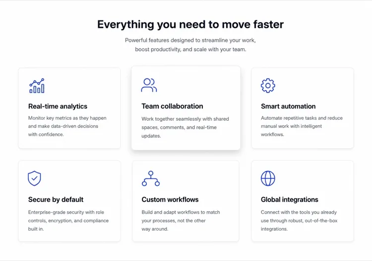
제품의 장점을 쉬운 한국어로 설명하면 MeDo가 몇 초 만에 세련되고 반응형인 기능 그리드를 생성합니다. 아이콘 교체, 칼럼 조정, 카피 다듬기 — 모두 코드 한 줄 건드리지 않고 가능합니다.

기능 그리드
기능 그리드

훌륭한 기능 그리드는 방문자를 신뢰자로 바꿉니다.

기능 그리드는 방문자가 헤드라인을 읽은 후 가장 먼저 보는 곳입니다 — "그래서 실제로 뭘 하는 거야?"라는 질문에 스캔 가능한 시각적 형식으로 답합니다. 잘 구조화된 그리드는 빠르게 신뢰를 구축합니다: 명확한 아이콘은 인지 부하를 줄이고, 간결한 설명은 주의 지속 시간을 존중하며, 일관된 레이아웃은 잘 설계된 제품임을 시사합니다. 연구에 따르면 퍼스트 뷰에 배치된 기능 섹션은 페이지 체류 시간과 트라이얼 가입률을 크게 높입니다.

템플릿 6개

생성할 수 있는 기능 그리드 템플릿

모든 템플릿은 스크린샷이 아니라 실제 프롬프트입니다. 어떤 AI 에디터에든 붙여넣거나 MeDo에서 실행해 React + Tailwind 코드를 그대로 받으세요.

Icon cardsAcme

Three-Column Icon Card Grid

The workhorse feature grid. Six cards is the ceiling before scanning turns into reading — at nine the visitor stops comparing cards and starts skipping them.

Create a three-column feature grid holding exactly six cards. Above the grid, a centered eyebrow label, an h2 section heading and one line of supporting copy at a max width of 42rem. Each card has a filled icon in a tinted rounded square, an h3 title of two to four words, and a description of one to two sentences. Cards share a light surface, a 12px radius and a hairline border, with a hover state that raises the shadow and shifts the card up 2px — guarded behind prefers-reduced-motion. Collapse to two columns at 1024px and one at 640px, keeping equal card heights via the grid rather than fixed pixel values.

MeDo에서 시도하기
BentoMega

Bento Grid With One Feature Card

Unequal cells let one feature carry a screenshot while the rest stay text. Use it when the features are genuinely unequal in importance — a bento of six equally weighted cells is just a grid with worse alignment.

Create a bento-style feature grid on a twelve-column base: one hero cell spanning eight columns and two rows containing a title, two lines of copy and a cropped product screenshot; two cells of four columns each with an icon, title and one-line description; and a full-width cell at the bottom with a title, a short paragraph and a text link. Give every cell the same radius, border and internal padding so the varied spans still read as one system. Below 900px, flatten to a single column in importance order and drop the screenshot to full width with explicit dimensions.

MeDo에서 시도하기
Alternating rowsShipfast

Feature Rows With Alternating Screenshots

Not a grid at all — three stacked rows that flip image side each time. The right choice when each feature needs a screenshot to make sense, which an icon card can never provide.

Create a feature section as three alternating rows instead of a grid. Each row is a two-column layout: copy on one side with an eyebrow label, an h3, a two-sentence description and a bulleted list of three sub-points, and a product screenshot on the other side in a bordered frame at explicit width and height. Flip the image from right to left to right down the rows using an order utility at the desktop breakpoint only. Add generous vertical rhythm between rows and a hairline divider. Below 900px, every row stacks with the copy first so the reading order stays consistent.

MeDo에서 시도하기
Minimal listBuilders

Borderless Grid With Small Icons

No cards, no shadows — just a two-by-four field of small icons with tight copy. Fits documentation and developer sites where card chrome reads as marketing decoration.

Create a borderless feature grid with no cards or shadows: a four-column layout on desktop holding eight items, each with a 20px outline icon above an h3 title of two or three words and a description capped at two lines. Rely on column and row gap for separation rather than borders, and keep the icons a single stroke weight from one library. Add a left-aligned section heading and a single text link to the docs beneath the grid. Collapse to two columns at 768px and one at 480px, preserving the icon-above-title stacking at every size.

MeDo에서 시도하기
NumberedStudio

Numbered Capability Grid

Swaps icons for large numerals, which is the honest move when your features have no natural iconography. Reads as a deliverables list, so agencies and service pages get more from it than products do.

Create a numbered feature grid of six cells in three columns. Each cell opens with an oversized two-digit numeral in a muted tint, then an h3 title and a two-sentence description. Numbering runs left to right and must be visual only — set the numerals as decorative text with aria-hidden so a screen reader hears the titles as a clean list. Use a shared top border on each cell instead of full card outlines. Include a section heading and a short intro paragraph above. Two columns at 1024px, one at 640px, with the numeral scaling down one step on mobile.

MeDo에서 시도하기
ComparisonBrand*

Feature Grid With Plan Availability

Each card names the tier that includes it. Removes the click to pricing at the cost of maintenance — if the tiers change and this grid does not, it becomes a support ticket generator.

Create a feature grid where each card carries plan availability: three columns, six cards, and inside each an icon, an h3 title, a two-sentence description and a small badge row reading Starter, Pro or Enterprise. Style the badge by tier with distinguishable text labels rather than color alone. Add a filter row of tier pills above the grid that hides non-matching cards on click, keeping the pressed state on the active pill with aria-pressed. Announce the visible count in a live region. Collapse to two columns at 1024px and one at 640px, with the filter row scrolling horizontally on mobile.

MeDo에서 시도하기

기능 그리드 커스터마이즈 방법

기능이 아닌 결과로 시작하세요

"역할 기반 권한" 대신 "IT 티켓 없이 누가 무엇을 볼 수 있는지 제어하세요"라고 작성하세요. 각 카드를 기능명이 아닌 사용자 혜택 중심으로 재구성하면 그리드가 즉시 더 설득력 있고 전환 중심이 됩니다.

일관된 아이콘 스타일과 웨이트를 사용하세요

아웃라인 아이콘과 채워진 아이콘을 혼합하거나 다른 스트로크 웨이트를 사용하면 시각적 잡음이 발생합니다. 하나의 스타일 — 아웃라인, 채움 또는 듀오톤 — 을 선택하고 모든 카드에 적용하세요. MeDo에 동일한 라이브러리(Lucide, Heroicons, Phosphor)에서 모든 아이콘을 가져오도록 요청하면 일관성이 자동으로 유지됩니다.

그리드에 증거를 결합하세요

각 기능 카드 아래에 은은한 통계 또는 소셜 프루프 태그를 추가하세요 — "12,000개 팀이 사용 중" 또는 "주 평균 3시간 절약." 하나의 숫자가 혜택을 현실에 고정시키고 인지된 신뢰도를 극적으로 높입니다.

기능 밀도에 맞게 칼럼 수를 조정하세요

3~4개 기능은 각 카드에 여유 공간이 생기는 2칼럼 레이아웃이 최적입니다. 6~9개 기능은 3칼럼 그리드에 적합합니다. 9개를 초과하면 카드를 추가하는 대신 카테고리 헤더 아래에 기능을 그룹화하는 것을 고려하세요 — 그리드는 9개 항목을 넘으면 압도적이 됩니다.

기능 그리드 컴포넌트를 사용하는 사람

SaaS 제품 페이지

기능 그리드는 모든 SaaS 마케팅 페이지의 핵심입니다. 잠재 고객이 기능을 스캔하여 자체 평가할 수 있게 합니다 — 카드에서 자신의 고충을 인식하는 방문자는 트라이얼을 시작할 가능성이 훨씬 높습니다.

개발자 도구 랜딩 페이지

개발자 도구는 기능 그리드를 사용하여 기술적 역량을 강조합니다 — SDK 지원, 성능 벤치마크, 연동 — 엔지니어가 긴 글을 읽지 않고도 30초 이내에 파악할 수 있는 형식으로.

모바일 앱 쇼케이스 페이지

앱 랜딩 페이지는 아이콘 기반 기능 그리드를 사용하여 제한된 세로 공간에서 풍부한 기능 세트를 전달하며, 레이아웃의 시각적 균형을 위해 앱 목업 스크린샷과 그리드를 결합하는 경우가 많습니다.

에이전시 및 프리랜서 포트폴리오

서비스 기반 비즈니스는 패키지에 포함된 항목을 나열하기 위해 기능 그리드를 사용합니다 — 디자인, 개발, SEO, 지원 — 제안서를 투명하게 만들고 영업 과정에서의 커뮤니케이션을 줄입니다.

웹사이트 유형별 기능 그리드 패턴

같은 기능 그리드 컴포넌트를 게시되는 사이트 유형에 맞춰 조정합니다.

01 / 06

SaaS Product Feature Grid

Six icon cards framed as outcomes, not feature names. Visitors self-qualify by scanning for their own problem, so a card titled "Role-based permissions" does less work than one titled "Control who sees what". Keep the card count fixed as the product grows or this section becomes a changelog.

기능 그리드 스타일과 변형

페이지의 나머지 부분과 어울리는 변형을 골라 바로 생성하세요.

01 / 06

Icon Card Grid

Bordered or shadowed cards with a tinted icon tile, title and description. The most legible default because the card boundary does the grouping for you. Keep icons from one library at one stroke weight or the grid reads as assembled from three different sites.

React, Next.js, Vue, Svelte에서의 기능 그리드

React, Next.js, Vue 3, SvelteKit, Astro 또는 순수 HTML — 같은 기능 그리드을 여섯 가지 방식으로 넣을 수 있습니다.

01 / 06

React Feature Grid

Drive it from a typed array and map over it rather than hand-writing six near-identical card blocks. No state is involved, so this stays a plain function component even in a heavily interactive app.

src/components/FeatureGrid.tsx

const features = [
  { icon: Zap, title: 'Real-time sync', body: 'Changes land everywhere at once.' },
]

export function FeatureGrid() {
  return (
    <div className="grid gap-6 sm:grid-cols-2 lg:grid-cols-3">
      {features.map(({ icon: Icon, title, body }) => (
        <article key={title} className="rounded-xl border p-6">
          <Icon className="h-5 w-5" aria-hidden />
          <h3 className="mt-4 font-medium">{title}</h3>
          <p className="mt-2 text-sm text-zinc-500">{body}</p>
        </article>
      ))}
    </div>
  )
}

기능 그리드을 프로젝트에 추가하는 방법

기능 그리드 템플릿을 고르고 프로덕션에 배포하기까지 네 단계.

01~30s

Pick a Feature Grid Template

Choose by what each feature needs to show. Icons and a sentence means a card grid; a screenshot per feature means alternating rows; no natural iconography means numbered cells.

02~10s

Copy the Prompt

Take the prompt into MeDo, Lovable, Bolt, v0 or Cursor. Replace the placeholder feature names with your real ones first — the card count decides the column count, not the other way round.

03~2min

Generate and Refine

You get React + Tailwind back with a live preview. Follow up in plain English — "make it four columns", "drop the shadows", "rewrite the titles as outcomes" — rather than hand-editing the array.

04~1min

Drop It Below the Hero

Place it after the hero and check the outline: one h2 for the section, h3 on each card. Then move the feature copy into a typed array or your CMS so the next edit does not touch JSX.

기능 그리드에 대한 자주 묻는 질문

AI로 기능 그리드를 어떻게 만드나요?

MeDo를 열고, 표시하고 싶은 기능을 설명하세요 — 칼럼 수, 사용할 아이콘이나 색상, 텍스트 톤을 포함하여 — MeDo가 완전히 스타일링된 반응형 기능 그리드 컴포넌트를 생성합니다. 후속 프롬프트로 레이아웃 조정, 아이콘 교체, 개별 카드 설명 재작성이 가능합니다.

최고의 AI 기능 그리드 생성기는?

MeDo는 자연어 프롬프트에서 세련된 UI 컴포넌트를 생성하기 위해 특별히 설계되었습니다. 범용 AI 코드 도구와 달리 MeDo는 디자인 관례를 이해합니다 — 일관된 간격, 접근성 있는 색상 대비, 반응형 브레이크포인트 — 그래서 생성된 기능 그리드는 템플릿 라이브러리가 아닌 시니어 디자이너의 작품처럼 보입니다.

기능 그리드에 몇 개의 기능을 표시해야 하나요?

3~9개 기능이 최적입니다. 3개 미만이면 빈약해 보이고, 9개 이상이면 방문자를 압도하고 주의를 분산시킵니다. 9개 이상의 기능이 있다면, 모든 것을 하나의 끝없는 그리드에 나열하는 대신 주제별 카테고리로 그룹화하세요 — 각 그룹이 자체 미니 그리드가 됩니다.

기존 디자인 시스템에 맞는 기능 그리드를 생성할 수 있나요?

네. MeDo 프롬프트에서 디자인 토큰을 지정하세요 — 기본 색상, 폰트 패밀리, 보더 라디우스, 그림자 강도 — MeDo가 생성된 컴포넌트 전체에 적용합니다. Tailwind 설정이나 CSS 변수 목록을 붙여넣고 MeDo에 기존 시스템에 맞게 그리드를 구축하도록 요청할 수도 있습니다.

기능 그리드에 가장 적합한 아이콘은?

아웃라인 아이콘(Heroicons 또는 Lucide 등)은 미니멀하고 모던한 디자인에 적합합니다. 채워진 아이콘이나 듀오톤 아이콘은 더 대담하고 컬러풀한 레이아웃에 어울립니다. 가장 중요한 규칙은 일관성입니다: 그리드의 모든 아이콘은 동일한 라이브러리에서 가져와 동일한 스트로크 웨이트를 사용해야 합니다. MeDo는 기본적으로 Lucide 아이콘을 사용하지만 지정한 라이브러리를 사용합니다.

MeDo로 React나 Next.js에서 기능 그리드를 생성할 수 있나요?

네. 프레임워크를 지정하세요 — React, Next.js, Vue, Svelte — MeDo가 프레임워크 네이티브 컴포넌트를 출력합니다. React 및 Next.js 프로젝트의 경우 MeDo는 prop 타이핑에 TypeScript 인터페이스를 사용하며, 콘텐츠 팀이 JSX를 편집하지 않고도 기능을 업데이트할 수 있도록 정적 데이터 기반 배열로 컴포넌트를 생성할 수 있습니다.