MeDo

Generador de Cuadrícula de Características con IA.

Describe los beneficios de tu producto en español sencillo y MeDo genera una cuadrícula de características pulida y responsiva en segundos. Cambia iconos, ajusta columnas y perfecciona textos — todo sin tocar una línea de código.

Cuadrícula de Características

Una gran cuadrícula de características convierte visitantes en creyentes.

La cuadrícula de características es a menudo el primer lugar donde un visitante mira después de leer tu titular — responde a la pregunta "¿pero qué hace realmente?" en un formato visual y escaneable. Un grid bien estructurado construye credibilidad rápidamente: iconos claros reducen la carga cognitiva, descripciones concisas respetan la capacidad de atención y un layout consistente señala un producto bien pensado. Los estudios muestran consistentemente que las secciones de características colocadas above the fold aumentan significativamente el tiempo en página y las tasas de registro para pruebas.

6 plantillas

Plantillas de Cuadrícula de Características que puedes generar

Cada plantilla es un prompt real, no una captura de pantalla. Cópialo en cualquier editor de IA o ejecútalo en MeDo y obtén código React + Tailwind.

Icon cardsAcme

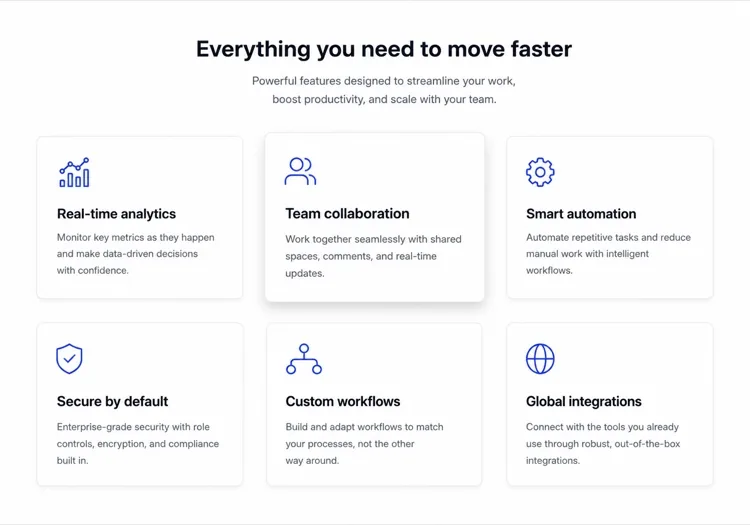
Three-Column Icon Card Grid

The workhorse feature grid. Six cards is the ceiling before scanning turns into reading — at nine the visitor stops comparing cards and starts skipping them.

Create a three-column feature grid holding exactly six cards. Above the grid, a centered eyebrow label, an h2 section heading and one line of supporting copy at a max width of 42rem. Each card has a filled icon in a tinted rounded square, an h3 title of two to four words, and a description of one to two sentences. Cards share a light surface, a 12px radius and a hairline border, with a hover state that raises the shadow and shifts the card up 2px — guarded behind prefers-reduced-motion. Collapse to two columns at 1024px and one at 640px, keeping equal card heights via the grid rather than fixed pixel values.

Prueba en MeDo
BentoMega

Bento Grid With One Feature Card

Unequal cells let one feature carry a screenshot while the rest stay text. Use it when the features are genuinely unequal in importance — a bento of six equally weighted cells is just a grid with worse alignment.

Create a bento-style feature grid on a twelve-column base: one hero cell spanning eight columns and two rows containing a title, two lines of copy and a cropped product screenshot; two cells of four columns each with an icon, title and one-line description; and a full-width cell at the bottom with a title, a short paragraph and a text link. Give every cell the same radius, border and internal padding so the varied spans still read as one system. Below 900px, flatten to a single column in importance order and drop the screenshot to full width with explicit dimensions.

Prueba en MeDo
Alternating rowsShipfast

Feature Rows With Alternating Screenshots

Not a grid at all — three stacked rows that flip image side each time. The right choice when each feature needs a screenshot to make sense, which an icon card can never provide.

Create a feature section as three alternating rows instead of a grid. Each row is a two-column layout: copy on one side with an eyebrow label, an h3, a two-sentence description and a bulleted list of three sub-points, and a product screenshot on the other side in a bordered frame at explicit width and height. Flip the image from right to left to right down the rows using an order utility at the desktop breakpoint only. Add generous vertical rhythm between rows and a hairline divider. Below 900px, every row stacks with the copy first so the reading order stays consistent.

Prueba en MeDo
Minimal listBuilders

Borderless Grid With Small Icons

No cards, no shadows — just a two-by-four field of small icons with tight copy. Fits documentation and developer sites where card chrome reads as marketing decoration.

Create a borderless feature grid with no cards or shadows: a four-column layout on desktop holding eight items, each with a 20px outline icon above an h3 title of two or three words and a description capped at two lines. Rely on column and row gap for separation rather than borders, and keep the icons a single stroke weight from one library. Add a left-aligned section heading and a single text link to the docs beneath the grid. Collapse to two columns at 768px and one at 480px, preserving the icon-above-title stacking at every size.

Prueba en MeDo
NumberedStudio

Numbered Capability Grid

Swaps icons for large numerals, which is the honest move when your features have no natural iconography. Reads as a deliverables list, so agencies and service pages get more from it than products do.

Create a numbered feature grid of six cells in three columns. Each cell opens with an oversized two-digit numeral in a muted tint, then an h3 title and a two-sentence description. Numbering runs left to right and must be visual only — set the numerals as decorative text with aria-hidden so a screen reader hears the titles as a clean list. Use a shared top border on each cell instead of full card outlines. Include a section heading and a short intro paragraph above. Two columns at 1024px, one at 640px, with the numeral scaling down one step on mobile.

Prueba en MeDo
ComparisonBrand*

Feature Grid With Plan Availability

Each card names the tier that includes it. Removes the click to pricing at the cost of maintenance — if the tiers change and this grid does not, it becomes a support ticket generator.

Create a feature grid where each card carries plan availability: three columns, six cards, and inside each an icon, an h3 title, a two-sentence description and a small badge row reading Starter, Pro or Enterprise. Style the badge by tier with distinguishable text labels rather than color alone. Add a filter row of tier pills above the grid that hides non-matching cards on click, keeping the pressed state on the active pill with aria-pressed. Announce the visible count in a live region. Collapse to two columns at 1024px and one at 640px, with the filter row scrolling horizontally on mobile.

Prueba en MeDo

Cómo personalizar tu Cuadrícula de Características

Lidera con resultados, no con características

En lugar de "Permisos Basados en Roles", escribe "Controla quién ve qué — sin ticket de IT." Reformular cada tarjeta en torno al beneficio del usuario en lugar del nombre de la función hace que el grid sea inmediatamente más convincente y orientado a la conversión.

Usa un estilo y peso de iconos consistente

Mezclar iconos outline con iconos filled, o diferentes grosores de trazo, crea ruido visual. Elige un estilo — outline, filled o duotone — y aplícalo en cada tarjeta. Pide a MeDo que obtenga todos los iconos de la misma biblioteca (Lucide, Heroicons, Phosphor) para mantener la cohesión automáticamente.

Combina el grid con un punto de prueba

Añade una estadística sutil o etiqueta de prueba social debajo de cada tarjeta — "Usado por 12.000 equipos" o "Ahorra 3 hrs/semana en promedio." Un solo número ancla el beneficio en la realidad y aumenta dramáticamente la credibilidad percibida.

Ajusta el número de columnas a la densidad de características

Tres o cuatro características funcionan mejor en un layout de 2 columnas para que cada tarjeta tenga espacio para respirar. Seis a nueve características se adaptan a un grid de 3 columnas. Más de nueve, considera agrupar características bajo encabezados de categoría en lugar de añadir más tarjetas — los grids se vuelven abrumadores por encima de 9 elementos.

Quién usa el componente Cuadrícula de Características

Páginas de producto SaaS

Las cuadrículas de características son la columna vertebral de toda página de marketing SaaS. Permiten a los prospectos auto-calificarse escaneando capacidades — un visitante que reconoce su punto de dolor en una tarjeta tiene muchas más probabilidades de iniciar una prueba.

Landing pages de herramientas para desarrolladores

Las herramientas de desarrollo usan feature grids para destacar capacidades técnicas — soporte SDK, benchmarks de rendimiento, integraciones — en un formato que los ingenieros pueden procesar en menos de 30 segundos sin leer un muro de texto.

Páginas de showcase de apps móviles

Las landing pages de apps usan cuadrículas de características con iconos para comunicar un conjunto rico de funcionalidades en un espacio vertical limitado, a menudo combinando el grid con una captura de mockup de la app para mantener el layout visualmente equilibrado.

Portfolios de agencias y freelancers

Los negocios de servicios usan cuadrículas de características para listar lo que incluye un paquete — diseño, desarrollo, SEO, soporte — haciendo que las propuestas se sientan transparentes y reduciendo las idas y vueltas durante el proceso de venta.

Patrones de Cuadrícula de Características para distintos sitios web

El mismo componente cuadrícula de características, adaptado al tipo de sitio donde se publica.

01 / 06

SaaS Product Feature Grid

Six icon cards framed as outcomes, not feature names. Visitors self-qualify by scanning for their own problem, so a card titled "Role-based permissions" does less work than one titled "Control who sees what". Keep the card count fixed as the product grows or this section becomes a changelog.

Estilos y variantes de Cuadrícula de Características

Elige la variante que encaje con el resto de la página y genérala.

01 / 06

Icon Card Grid

Bordered or shadowed cards with a tinted icon tile, title and description. The most legible default because the card boundary does the grouping for you. Keep icons from one library at one stroke weight or the grid reads as assembled from three different sites.

Cuadrícula de Características en React, Next.js, Vue y Svelte

React, Next.js, Vue 3, SvelteKit, Astro o HTML puro: el mismo cuadrícula de características, seis formas de integrarlo.

01 / 06

React Feature Grid

Drive it from a typed array and map over it rather than hand-writing six near-identical card blocks. No state is involved, so this stays a plain function component even in a heavily interactive app.

src/components/FeatureGrid.tsx

const features = [
  { icon: Zap, title: 'Real-time sync', body: 'Changes land everywhere at once.' },
]

export function FeatureGrid() {
  return (
    <div className="grid gap-6 sm:grid-cols-2 lg:grid-cols-3">
      {features.map(({ icon: Icon, title, body }) => (
        <article key={title} className="rounded-xl border p-6">
          <Icon className="h-5 w-5" aria-hidden />
          <h3 className="mt-4 font-medium">{title}</h3>
          <p className="mt-2 text-sm text-zinc-500">{body}</p>
        </article>
      ))}
    </div>
  )
}

Cómo añadir tu Cuadrícula de Características a un proyecto

Cuatro pasos, desde elegir una plantilla de cuadrícula de características hasta llevarlo a producción.

01~30s

Pick a Feature Grid Template

Choose by what each feature needs to show. Icons and a sentence means a card grid; a screenshot per feature means alternating rows; no natural iconography means numbered cells.

02~10s

Copy the Prompt

Take the prompt into MeDo, Lovable, Bolt, v0 or Cursor. Replace the placeholder feature names with your real ones first — the card count decides the column count, not the other way round.

03~2min

Generate and Refine

You get React + Tailwind back with a live preview. Follow up in plain English — "make it four columns", "drop the shadows", "rewrite the titles as outcomes" — rather than hand-editing the array.

04~1min

Drop It Below the Hero

Place it after the hero and check the outline: one h2 for the section, h3 on each card. Then move the feature copy into a typed array or your CMS so the next edit does not touch JSX.

Preguntas frecuentes sobre Cuadrícula de Características

¿Cómo creo una cuadrícula de características con IA?

Abre MeDo, describe las características que quieres mostrar — incluyendo cuántas columnas, qué iconos o colores usar, y el tono del texto — y MeDo genera un componente de cuadrícula de características completamente estilizado y responsivo. Puedes iterar con prompts de seguimiento para ajustar el layout, cambiar iconos o reescribir descripciones individuales de tarjetas.

¿Cuál es el mejor generador de feature grid con IA?

MeDo está diseñado específicamente para generar componentes UI pulidos a partir de prompts en lenguaje natural. A diferencia de herramientas de código IA de propósito general, MeDo entiende convenciones de diseño — espaciado consistente, contraste de color accesible, breakpoints responsivos — por lo que la cuadrícula de características que genera parece hecha por un diseñador senior, no una biblioteca de plantillas.

¿Cuántas características debo mostrar en una cuadrícula?

Entre 3 y 9 características es el punto ideal. Menos de 3 se siente escaso; más de 9 abruma a los visitantes y diluye la atención. Si tienes más de 9 características, agrúpalas bajo categorías temáticas — cada grupo convirtiéndose en su propio mini-grid — en lugar de listarlas todas en un solo grid interminable.

¿Puedo generar una cuadrícula que coincida con mi sistema de diseño existente?

Sí. En tu prompt de MeDo, especifica tus design tokens — color primario, familia tipográfica, border radius, intensidad de sombra — y MeDo los aplicará en todo el componente generado. También puedes pegar una configuración de Tailwind o lista de variables CSS y pedir a MeDo que construya el grid alrededor de tu sistema existente.

¿Qué iconos funcionan mejor para una cuadrícula de características?

Los iconos outline (como Heroicons o Lucide) funcionan bien para diseños minimalistas y modernos. Los iconos filled o duotone se adaptan a layouts más audaces y coloridos. La regla más importante es la consistencia: cada icono en el grid debe venir de la misma biblioteca y usar el mismo grosor de trazo. MeDo usa Lucide por defecto pero utilizará cualquier biblioteca que especifiques.

¿Puede MeDo generar una cuadrícula de características en React o Next.js?

Sí. Especifica tu framework — React, Next.js, Vue, Svelte — y MeDo genera un componente nativo del framework. Para proyectos React y Next.js, MeDo usa interfaces TypeScript para tipado de props y puede generar el componente como un array estático basado en datos para que tu equipo de contenido pueda actualizar características sin editar JSX.