MeDo

Generatore di Accordion IA.

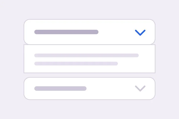
Descrivi le tue sezioni e MeDo genera un accordion comprimibile — comportamento ad apertura singola o multipla, un'animazione di altezza che funziona con qualsiasi lunghezza di contenuto, link diretti che aprono automaticamente un pannello e il JSON-LD FAQPage corrispondente per i rich result.

Accordion
Accordion

Un pannello chiuso è una scommessa sul fatto che il contenuto sia opzionale

Gli accordion vengono aggiunti di solito per far sembrare una pagina più corta, ma accorciare la pagina non è gratis. Ogni sezione compressa scambia la scansionabilità con la densità: chi avrebbe scorso sei risposte ora deve decidere su quale cliccare, e la maggior parte non ne clicca nessuna. Quel compromesso conviene per materiale davvero secondario come politiche di spedizione, domande su casi limite o lunghe tabelle di specifiche, ed è un cattivo affare per le due o tre risposte che risolvono davvero un'obiezione all'acquisto. La disciplina utile è portare i contenuti con la più alta intenzione fuori dall'accordion e nel testo normale della pagina, lasciando che l'accordion assorba la long tail. Farlo risolve anche il lato SEO dello stesso problema, poiché il testo dentro un pannello chiuso ma presente nell'HTML viene indicizzato, mentre il testo iniettato solo dopo un clic potrebbe non esserlo.

6 modelli

Modelli di Accordion che puoi generare

Ogni modello è un prompt reale, non uno screenshot. Copialo in qualsiasi editor IA, oppure eseguilo in MeDo e ottieni codice React + Tailwind.

BasicFAQ Single-Open

Exclusive-Open FAQ List

One answer visible at a time, which keeps a long FAQ from turning into a wall once someone starts clicking. The default for landing-page questions.

Create an FAQ accordion with six items in single-open mode, where opening one item closes the currently open one. Each header is a full-width button carrying the question in 16px semibold text with a chevron on the right that rotates 180 degrees over 200ms; set aria-expanded on the button and aria-controls pointing at the panel, and give the panel role="region" with aria-labelledby back to the header id. Animate the panel with grid-template-rows from 0fr to 1fr so long answers never clip and short ones do not ease for the same duration. Enter and Space toggle, Tab moves between headers normally since each is its own tab stop, and a visible focus-visible ring is required. Allow the open item to be collapsed so no panel is forced open.

Prova in MeDo
ComparisonMulti-Open

Several Panels Open at Once

For troubleshooting steps and spec tables, where someone genuinely needs two sections side by side. Add Expand all only here — it is meaningless in exclusive mode.

Create a multi-open accordion where any number of panels may be expanded at once, holding open ids in a set rather than a single value. Add an Expand all and Collapse all control above the stack whose label reflects the current state, and make it a real button with aria-expanded describing the group. Each header is a button with aria-expanded and aria-controls; each panel is role="region" with aria-labelledby. Animate with grid-template-rows 0fr to 1fr so several simultaneous transitions do not fight a shared max-height. Preserve panel scroll position and any half-filled form fields by keeping panels in the DOM and toggling the hidden attribute rather than unmounting them. Enter and Space toggle the focused header.

Prova in MeDo
No JavaScriptNative Details

Details and Summary Accordion

Works before your bundle loads, is keyboard accessible with zero attributes, and joins find-in-page so a browser search opens the matching panel. The baseline to beat.

Create an accordion using native details and summary elements with no JavaScript at all. Give each details the same name attribute so the browser enforces exclusive-open behavior natively. Style the summary as a full-width row with 20px vertical padding, remove the default marker with list-style: none and ::-webkit-details-marker, and add a custom chevron that rotates using the details[open] selector. Animate the panel with interpolate-size: allow-keywords plus a height transition from 0 to auto, and add ::details-content to the transition so the reveal is smooth where supported and an instant open elsewhere. Keep a visible focus ring on the summary and ensure find-in-page still expands a closed panel.

Prova in MeDo
ShareableDeep Linked

Hash-Opened Panels With Copy Link

Every panel gets its own URL, so a support reply can point at one answer rather than "scroll down to the FAQ". The offset for the sticky header is the part that gets skipped.

Create an accordion where each item is addressable by URL hash. Give every header a stable slug id derived from its question, and on mount read location.hash, open the matching panel, and scroll it into view with scroll-margin-top of 96px so it does not land underneath a sticky header. Update the hash on open using history.replaceState so the back button is not filled with toggles, and listen for hashchange so in-page links work after the first render. Add a small copy-link button inside each header row that writes the absolute URL to the clipboard and swaps its label to Copied for two seconds; stop its click from bubbling to the header button so copying does not also collapse the panel.

Prova in MeDo
SEOFAQ Schema

Accordion With FAQPage JSON-LD

Panels and structured data generated from one array, which is the only way they stay in sync six months later. Treat the markup as a clarity signal, not a guaranteed rich result.

Create an FAQ accordion that renders both the interactive panels and a matching FAQPage JSON-LD script from the same array of question and answer objects, so the two cannot drift apart when someone edits a question. Emit the JSON-LD server-side in a script tag with type="application/ld+json", using Question and Answer entities with acceptedAnswer text. Render every answer into the HTML even while collapsed, hiding it with CSS rather than fetching it on click, since content injected after a click may never be crawled. Keep the accessible pattern intact: header buttons with aria-expanded and aria-controls, panels as role="region" with aria-labelledby, and a grid-template-rows height animation.

Prova in MeDo
NestedNested Groups

Grouped Accordion With Sub-Sections

Two levels for a long feature matrix or a knowledge base. Depth past two is where people lose the thread — if you need a third, the content wants its own page.

Create a nested accordion two levels deep: outer groups such as Security, Integrations and Support, each containing three to five child items. Indent child headers by 20px, drop their type size by one step, and keep every level as its own button with aria-expanded and aria-controls, panels as role="region" with aria-labelledby — do not use a treeview role, since these are disclosures, not a tree. Outer groups are multi-open and children are single-open within their parent. When a parent collapses, remember which children were open so reopening the parent restores that state rather than resetting it, and make sure the parent panel height animation accounts for children expanding after the parent has settled.

Prova in MeDo

Come personalizzare il tuo Accordion

Decidi subito tra <details> e un pulsante

Una coppia nativa <details> e <summary> funziona senza JavaScript, è accessibile da tastiera per impostazione predefinita e resta aperta quando il browser cerca nella pagina. Un pulsante con aria-expanded ti dà pieno controllo su animazione e logica di apertura esclusiva. Indica quale vuoi, perché producono markup completamente diversi.

Non animare mai verso un max-height fisso

Un max-height fisso taglia le risposte lunghe e fa durare le brevi per lo stesso tempo. Chiedi grid-template-rows animato da 0fr a 1fr, oppure interpolate-size con calc-size per height auto, così la transizione segue la vera altezza del contenuto.

Sii esplicito su apertura singola o multipla

L'apertura esclusiva mantiene la pagina compatta e il lettore concentrato su una risposta. Consentire più pannelli aperti è meglio quando le persone confrontano sezioni o copiano dettagli da due di esse. Definisci il valore predefinito e se l'utente può chiudere tutti gli elementi, perché alcuni accordion tengono sempre un pannello aperto.

Chiedi deep link e offset di scroll insieme

Aprire un pannello dall'hash dell'URL è solo metà della funzionalità. Senza un offset di scroll esplicito il target finisce sotto un header sticky, quindi indica l'altezza dell'header e richiedi scroll-margin-top o un offset via script nello stesso prompt.

Chi usa il componente Accordion

Sezione FAQ di un sito marketing

Otto domande in un accordion ad apertura esclusiva in fondo a una landing page, ogni elemento raggiungibile con deep link così che le risposte del supporto possano puntare a una singola risposta, con JSON-LD FAQPage generato dallo stesso array di dati.

Pagina prodotto e-commerce

Spedizione, Resi e Istruzioni per la cura compressi sotto il pulsante aggiungi al carrello, mantenendo il box di acquisto visibile mentre il testo delle policy resta nell'HTML per i motori di ricerca.

Documentazione o knowledge base

Passaggi di troubleshooting in un accordion ad apertura multipla, così il lettore può tenere due sezioni correlate espanse affiancate mentre applica una soluzione.

Confronto nella pagina prezzi

Una lunga matrice di funzionalità suddivisa in gruppi comprimibili come Sicurezza, Integrazioni e Supporto, così le colonne dei piani restano visibili invece di scorrere oltre tre schermate di righe.

Pattern di Accordion per siti web diversi

Lo stesso componente accordion, calibrato sul tipo di sito su cui viene pubblicato.

01 / 06

Marketing Site FAQ

Exclusive-open questions at the bottom of a landing page, with the two or three answers that actually resolve a purchase objection promoted out into plain page copy above. An accordion holding your strongest answer is an accordion hiding it.

Stili e varianti di Accordion

Scegli la variante che si adatta al resto della pagina, poi generala.

01 / 06

Divider List Accordion

Flush rows separated by 1px light-grey lines, with no outer border at all. The quietest option and the right one for an FAQ of ten or more items, where card borders and gaps would add more visual noise than structure.

Accordion in React, Next.js, Vue e Svelte

React, Next.js, Vue 3, SvelteKit, Astro o HTML puro: lo stesso accordion, sei modi per integrarlo.

01 / 06

React Accordion

Hold open ids in a Set so the same component covers single and multi-open — swap the set for one id and you have exclusive mode. No height measurement is needed if the panel animates with grid rows.

src/components/Accordion.tsx

const [open, setOpen] = useState(new Set())

<button
  aria-expanded={open.has(item.id)}
  aria-controls={`panel-${item.id}`}
  onClick={() => toggle(item.id)}
>
  {item.question}
</button>
<div id={`panel-${item.id}`} role="region" className="grid"
     style={{ gridTemplateRows: open.has(item.id) ? '1fr' : '0fr' }}>
  <div className="overflow-hidden">{item.answer}</div>
</div>

Come aggiungere il tuo Accordion a un progetto

Quattro passaggi, dalla scelta di un modello di accordion alla messa in produzione.

01~30s

Pick an Accordion Template

Decide two things first: single or multi-open, and native details versus a button with aria-expanded. Those choices produce different markup, so picking after generation means regenerating.

02~10s

Copy the Prompt

Take the prompt into MeDo, Lovable, Bolt, v0 or Cursor and paste your real questions and answers in place of the placeholders. If you want FAQPage JSON-LD, say so now so it is generated from the same array rather than hand-written later.

03~1min

Generate and Refine

You get React + Tailwind back with a live preview. Follow up in plain English — "allow several open at once", "open the panel matching the URL hash", "swap the chevron for a plus" — instead of editing the transition by hand.

04~2min

Check the Content and Ship

Before shipping, confirm the longest answer does not clip mid-animation, every answer is present in the HTML while collapsed, and your highest-intent copy is in open page text rather than behind a click.

Domande comuni su Accordion

Come genero un accordion FAQ con l'IA?

Elenca domande e risposte nel prompt e indica se uno o più pannelli possono essere aperti contemporaneamente. MeDo genera i pulsanti di intestazione accessibili con aria-expanded e aria-controls, i pannelli animati e, opzionalmente, il JSON-LD FAQPage costruito dallo stesso contenuto, così markup e dati strutturati non possono divergere.

Devo usare <details> e <summary> o un accordion personalizzato?

Usa <details> e <summary> quando vuoi una base affidabile: funziona prima che JavaScript venga caricato, è accessibile da tastiera e screen reader senza alcun attributo e partecipa alla ricerca nella pagina del browser. Passa a un pulsante con aria-expanded quando ti serve apertura esclusiva, una curva di animazione controllata o uno stato che vive nell'URL. L'elemento nativo ora può comunque essere animato, dato che i browser supportano le transizioni di content-visibility e height con interpolate-size.

Come animo un accordion fino a height auto?

Avvolgi il pannello in una griglia CSS e fai la transizione di grid-template-rows da 0fr a 1fr, con overflow hidden sull'elemento interno. Questo segue la vera altezza del contenuto senza misurazioni in JavaScript. Nei browser che supportano interpolate-size: allow-keywords puoi fare la transizione di height da 0 ad auto direttamente, soluzione più semplice e utile come progressive enhancement.

Un accordion FAQ può ottenere rich result su Google?

Può, se la pagina contiene dati strutturati FAQPage validi e domande e risposte compaiono anche nell'HTML renderizzato. Google ha ristretto l'idoneità dei rich result FAQ principalmente a siti governativi e sanitari autorevoli, quindi tratta il markup come un segnale di chiarezza per la ricerca e i motori di risposta IA, non come una funzione SERP garantita. Chiedi a MeDo di generare il JSON-LD dallo stesso array che renderizza i pannelli, così restano sincronizzati.

Nascondere contenuti in un accordion influisce sulla SEO?

Il contenuto presente nell'HTML ma visivamente compresso viene indicizzato normalmente, e Google ha dichiarato che gli accordion su mobile sono un pattern responsive atteso. I rischi reali sono caricare le risposte solo al clic, lasciandole potenzialmente non scansionate, e seppellire i testi più importanti dove nessuno li espande. Tieni il messaggio principale nel testo visibile della pagina e usa i pannelli chiusi per i dettagli di supporto.

Devo usare un accordion o i tab?

Scegli un accordion quando le sezioni sono indipendenti, le etichette sono abbastanza lunghe da leggersi come frasi, o il lettore potrebbe voler tenerne più di una aperta: è per questo che gli elenchi FAQ sono quasi sempre accordion. Scegli i tab quando i pannelli sono alternative mutuamente esclusive da confrontare, come prezzo mensile contro annuale, e le etichette sono abbastanza brevi da stare su una riga orizzontale. Etichette lunghe in forma di domanda sono il segnale più chiaro che i tab sono il pattern sbagliato.