MeDo

Generatore di Alert IA.

Descrivi il messaggio e MeDo genera il set completo di alert inline — varianti info, successo, avviso ed errore con barra d'accento, icona, titolo, descrizione, link d'azione opzionale e un controllo di chiusura quando l'alert non è permanente.

Alert
Alert

La gravità deve sopravvivere senza il colore

Gli alert sono l'unico componente il cui compito interamente consiste nel comunicare quanto è grave una situazione, e il colore è il canale meno affidabile per farlo. Circa un uomo su dodici ha qualche forma di deficit della visione dei colori, rosso e verde sono la coppia più spesso confusa, e lo stesso alert reso in tema scuro, su un portatile poco luminoso o stampato in scala di grigi perde del tutto la distinzione. La conseguenza pratica è che un alert ha bisogno di una codifica ridondante per costruzione: una forma di icona distinta per ogni gravità e una formulazione che dichiari la situazione invece di affidarsi al lettore perché la deduca da una tonalità. Generare tutte e quattro le gravità da un'unica descrizione è ciò che mantiene il set di icone davvero distinguibile, perché vengono scelte le une rispetto alle altre e non una alla volta.

6 modelli

Modelli di Alert che puoi generare

Ogni modello è un prompt reale, non uno screenshot. Copialo in qualsiasi editor IA, oppure eseguilo in MeDo e ottieni codice React + Tailwind.

BasicFour Severities

Accent-Bar Alert in Four Tones

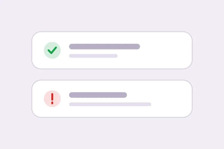
The baseline set. Generating all four together is what keeps the icon shapes distinguishable from each other rather than four recolors of one glyph.

Create an inline alert component with four severities — info in blue with a circle icon, success in green with a check, warning in amber with a triangle, error in red with an octagon. Each is full width within its container with a 4px left accent bar in the severity color, a background tinted to roughly 8% of that color, 16px padding, an 8px radius, and a 20px icon aligned to the first text line rather than vertically centered. Render a semibold 15px title with an optional 14px muted description below. Because the alert renders with the page rather than appearing dynamically, use role="region" with an aria-label naming the severity, not role="alert" — an assertive live region on initial paint talks over everything else. Check every tinted background against its text color for 4.5:1 contrast.

Prova in MeDo
ClosableDismissible

Alert With an Opt-In Close Button

Dismissal has to be per-instance, not global. A close button on an expired-payment alert lets the user hide a problem that still exists, and they will.

Add an opt-in dismiss control to an inline alert: a 32px icon button on the right with aria-label="Dismiss" and a visible focus ring, rendered only when a dismissible prop is passed so permanent alerts cannot be closed by accident. On dismiss, remove the alert from the DOM and move focus to the next focusable element after it rather than leaving focus on a detached node. Animate the collapse with height and opacity over 150ms, and skip the animation entirely under prefers-reduced-motion. Accept an onDismiss callback so the caller can persist the dismissal, and document that the alert should reappear on the next session while the underlying condition is unresolved.

Prova in MeDo
With actionActionable

Alert Carrying One Next Step

An alert that names a problem without a route out of it just relocates the work. One action, concretely worded — two actions and neither reads as the primary.

Create an alert variant with a single inline action below the description, rendered in the severity color as a text link with an underline on hover and focus. Keep it to exactly one action so the next step is unambiguous, and require concrete wording in the label — "Update payment method", not "Learn more". If the action navigates, use an anchor; if it mutates state, use a button, and show an inline pending state on the button rather than replacing the alert while the request is in flight. Place the action inside the alert region so its purpose is announced together with the message, and keep its hit area at least 44px tall on touch.

Prova in MeDo
CompactField Error

Single-Line Error Under an Input

No title, no icon block, no accent bar — just the message wired to the input it belongs to. The full alert anatomy next to a text field is visual noise that pushes the form apart.

Create a compact single-line alert for form-field errors: 13px text in the error color with a 14px inline icon, no title, no accent bar and no background tint, sitting 6px below its input with no vertical margin collapse. Give it a stable ID and reference it from the input with aria-describedby, and set aria-invalid="true" on the input at the same time. Because the message appears in response to a submit attempt, wrap it in role="alert" so it is announced immediately — but render the element only when there is an error rather than keeping an empty live region in the DOM, or the first error will be announced as a change to existing content. Reserve the line height so the layout does not jump when the message appears.

Prova in MeDo
GlobalPage Banner

Full-Width Banner Above the App Shell

Trial countdowns, maintenance windows, degraded service. It sits above the layout rather than inside a page, so the thing that breaks is sticky-header offset math, not the alert itself.

Create a full-width alert banner that mounts above the application shell: edge-to-edge tinted background, centered content capped at the app container width, a 16px icon, one line of text and a single inline action, at 44px total height. Because it displaces the layout, expose its height as a CSS custom property on the root element so a sticky header can offset itself instead of being covered. Support a dismissible mode that persists to localStorage keyed by banner ID and version, so editing the message re-shows it to users who dismissed the previous one. Use role="region" with an aria-label rather than role="alert", since the banner is present on load and should not interrupt.

Prova in MeDo
ValidationError Summary

Alert Listing Every Failed Field

The summary above the submit button, with one link per failure jumping to its input. It tells the user how many problems exist — the field-level messages tell them what to fix.

Create a validation summary alert for the top of a form: an error-severity block with a title stating the count — "3 fields need attention" — and an unordered list of links, each labelled with the field name plus the specific problem, each jumping to and focusing its input on click. Render it only after a submit attempt fails, give it role="alert" and move keyboard focus to the alert container itself with tabindex="-1" so a screen reader user lands on the summary rather than hunting for it. Rebuild the list on every failed submit and re-announce even when the set of errors is unchanged. Pair it with per-field messages wired through aria-describedby rather than replacing them.

Prova in MeDo

Come personalizzare il tuo Alert

Abbina una forma di icona distinta a ogni colore

Chiedi un'icona specifica per gravità — una spunta per il successo, un triangolo per l'avviso, un ottagono per l'errore, un cerchio per l'info. Le forme restano leggibili in scala di grigi e per gli utenti daltonici, e permettono di riconoscere la gravità con la visione periferica prima di leggere una parola.

Decidi in anticipo se l'alert è chiudibile

Un pulsante di chiusura su un alert che descrive una condizione irrisolta, come un metodo di pagamento scaduto, consente all'utente di nascondere un problema che esiste ancora. Rendi la chiusura opzionale per singola istanza e mantieni permanenti gli alert quando il messaggio deve sparire solo al cambiare dello stato sottostante.

Separa i banner di pagina dagli errori di campo

Un alert a livello di pagina riassume e sta in cima al form; un errore a livello di campo sta subito sotto il suo input ed è referenziato da aria-describedby. Chiedi una variante compatta su una riga per il caso del campo, così non porta con sé un blocco di titolo e icona accanto a un input di testo.

Scrivi l'azione dentro l'alert

Un alert che descrive un problema senza indicare una via d'uscita si limita a spostare il lavoro. Specifica un solo link d'azione inline con una formulazione concreta, come "Aggiorna metodo di pagamento", e mantieni una sola azione perché il passo successivo resti ovvio.

Chi usa il componente Alert

Prodotto SaaS

Un banner di avviso permanente in cima all'app quando alla prova gratuita restano tre giorni, con un link d'azione "Esegui l'upgrade", più alert di successo nelle pagine delle impostazioni che confermano una configurazione salvata.

Negozio e-commerce

Un alert info nella pagina del carrello che descrive l'orario limite per la spedizione, e un alert di errore sopra il form di checkout che riassume i dettagli di un pagamento rifiutato così il messaggio sopravvive al nuovo render della pagina.

Dashboard o strumento admin

Alert di errore nelle schermate di importazione dati che elencano quali righe non hanno superato la validazione, e un alert info che spiega una finestra di manutenzione programmata e resta visibile fino al termine della finestra.

Sito di documentazione

Alert callout inline che segnalano le API deprecate come avvisi e i comportamenti specifici per versione come info, collocati nel flusso del testo dove una notifica flottante sarebbe inutile.

Pattern di Alert per siti web diversi

Lo stesso componente alert, calibrato sul tipo di sito su cui viene pubblicato.

01 / 06

SaaS Product Alerts

Trial countdowns and plan limits as permanent banners above the app shell, success alerts inside settings pages after a save. The banner is the tricky one: expose its height as a custom property or your sticky header will sit under it on every route.

Stili e varianti di Alert

Scegli la variante che si adatta al resto della pagina, poi generala.

01 / 06

Left Accent Bar Alert

A 4px bar in the severity color with a tinted fill. The bar gives the eye a vertical edge to scan a stack of alerts against, which matters when three appear together on a settings page — four flat tinted boxes are much harder to separate.

Alert in React, Next.js, Vue e Svelte

React, Next.js, Vue 3, SvelteKit, Astro o HTML puro: lo stesso alert, sei modi per integrarlo.

01 / 06

React Alert

A static alert needs no state at all — keep the severity map outside the component so tones and icons stay in one place. Only the dismissible variant needs a hook, so split it out rather than making every alert stateful.

src/components/Alert.tsx

const tones = {
  info: { bar: 'bg-blue-500', bg: 'bg-blue-50', Icon: InfoIcon },
  error: { bar: 'bg-red-500', bg: 'bg-red-50', Icon: OctagonIcon },
}

export function Alert({ severity = 'info', title, children }) {
  const { bar, bg, Icon } = tones[severity]
  return (
    <div role="region" aria-label={severity} className={`flex gap-3 ${bg}`}>
      <span className={`w-1 ${bar}`} />
      <Icon className="mt-0.5 h-5 w-5" />
      <div>
        <p className="font-semibold">{title}</p>
        {children}
      </div>
    </div>
  )
}

Come aggiungere il tuo Alert a un progetto

Quattro passaggi, dalla scelta di un modello di alert alla messa in produzione.

01~30s

Pick an Alert Pattern

Choose by where the message lives: the four-severity block for in-page state, the compact variant for a field error, the summary for a failed submit, the banner for something app-wide.

02~10s

Copy the Prompt

Take it into MeDo, Lovable, Bolt, v0 or Cursor. Decide whether this alert is dismissible before you run it — that choice determines whether a user can hide an unresolved problem.

03~1min

Generate and Refine

You get all four severities back with a live preview. Follow up in plain English — "add an Update payment method link", "make the error variant outlined", "drop the title on the compact one" — rather than recoloring tints by hand.

04~2min

Place It and Check the Roles

Put page-level alerts above the submit area and field errors under their inputs with aria-describedby. Then confirm the load-time alerts are not using role="alert", or a screen reader will announce them over the rest of the page.

Domande comuni su Alert

Come genero un componente alert con l'IA?

Descrivi le gravità, l'anatomia e se l'alert può essere chiuso — per esempio "alert info, successo, avviso ed errore con barra d'accento sinistra, icona, titolo, descrizione e un link d'azione opzionale" — e MeDo genera tutte e quattro le varianti da quella singola descrizione. Poiché vengono prodotte insieme, padding, raggio e dimensione delle icone coincidono tra le gravità.

Qual è la differenza tra un alert e un toast?

Un alert inline vive nel layout della pagina e persiste finché la condizione che descrive non cambia, quindi serve per gli stati che l'utente potrebbe dover rileggere: un problema di fatturazione, un avviso di manutenzione, un errore di form. Un toast è una notifica temporanea che galleggia sopra la pagina e scompare dopo pochi secondi, quindi serve a confermare un'azione appena compiuta. Usa un alert quando il messaggio deve essere ancora lì dopo uno scroll o un ricaricamento.

Un alert dovrebbe essere chiudibile?

Solo quando il messaggio è informativo e perderlo non costa nulla. Se l'alert descrive un problema irrisolto, mantienilo permanente e lascia che si cancelli da sé quando lo stato si risolve, altrimenti la chiusura nasconde una questione che richiede ancora attenzione. Un compromesso comune è chiudibile, con l'alert che ricompare nella sessione successiva finché non è risolto.

Un alert può comunicare la gravità senza usare il colore?

Deve farlo. Abbina a ogni gravità una forma di icona distinta e una formulazione che nomini la situazione, così anche uno schermo in scala di grigi o un lettore daltonico riceve il messaggio. Chiedi a MeDo la codifica icona più testo nel prompt e assegnerà un glifo diverso per ogni gravità invece di ricolorare quattro volte la stessa icona.

Dove va un alert di errore di un form?

Metti un alert di riepilogo subito sopra l'area di invio o in cima al form, e i messaggi singoli sotto i rispettivi campi collegati con aria-describedby e aria-invalid. Il riepilogo dice all'utente quanti problemi ci sono, i messaggi di campo gli dicono cosa correggere, e avere entrambi significa che chi usa tastiera e screen reader non deve andare a caccia dell'errore.

Un alert ha bisogno di role="alert"?

Non sempre. Usa role="alert" solo per i messaggi che appaiono dinamicamente e devono interrompere, come un errore di validazione dopo un tentativo di invio. Un alert già presente al caricamento della pagina dovrebbe essere una region semplice o usare role="status", perché una live region assertiva al primo render non fa che parlare sopra tutto il resto della pagina.