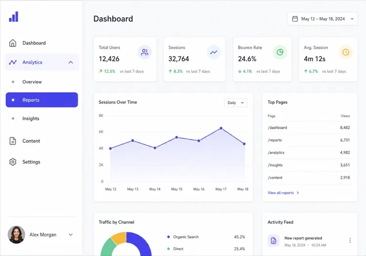
MeDo

Generatore di Schede IA.

Descrivi i tuoi pannelli e MeDo genera un componente a schede completo — ruoli ARIA corretti, navigazione con le frecce, un indicatore attivo animato, gestione dell'overflow su mobile e una scheda attiva sincronizzata con l'URL che sopravvive a un ricaricamento.

Schede
Schede

Le schede sono una decisione di routing travestita da decisione di stile

Un set di schede non nasconde solo contenuti: divide una pagina in più viste che condividono un unico URL. Nel momento in cui qualcuno vuole condividere la scheda Prezzi, collegarla da un articolo di supporto o ricaricare senza perdere il segno, il componente ha bisogno di uno stato reale che viva fuori da React. Di solito i team lo scoprono dopo il rilascio, poi innestano una gestione della query string che litiga con l'animazione e con il render iniziale. Decidere in anticipo che la scheda attiva derivi dall'URL invece che dallo stato locale semplifica tutto il componente: il trigger diventa un'azione simile a un link, i deep link funzionano gratis e il rendering lato server produce il pannello corretto già al primo paint. Cambia anche il modo in cui scrivi il markup, ed è per questo che generarlo così costa molto meno che adattarlo dopo.

6 modelli

Modelli di Schede che puoi generare

Ogni modello è un prompt reale, non uno screenshot. Copialo in qualsiasi editor IA, oppure eseguilo in MeDo e ottieni codice React + Tailwind.

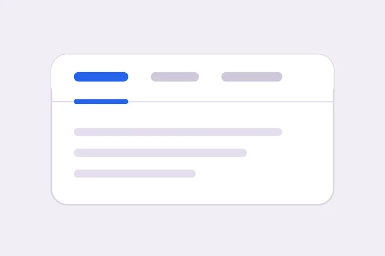
BasicUnderline

Underlined Tab Row With a Sliding Indicator

The default that reads as tabs without any explanation. Reach for it when the panels are static content and you want the indicator to do the signalling rather than a border box.

Create a tabs component with four triggers using the ARIA tabs pattern: role="tablist" on the container, role="tab" with aria-selected and aria-controls on each trigger, and role="tabpanel" with aria-labelledby on each panel. Use roving tabindex so only the selected tab has tabindex 0 and Tab moves out of the group entirely rather than through it. Left and Right arrows move focus and wrap at both ends, Home and End jump to the first and last tab, and activation is automatic because the panels are static text. Triggers are 40px tall with 15px medium labels, muted grey when inactive and near-black when active. Measure the active trigger and slide a 2px underline using translateX and scaleX over 200ms — never animate left or width.

Prova in MeDo
SegmentedPill Segmented

Segmented Control With a Sliding Pill

Two or three mutually exclusive options that belong on one control, like monthly versus annual. Do not use it past four tabs — the track stops fitting on a phone and equal widths force truncation.

Create a segmented-control tabs component: one rounded 36px-tall track with a light grey background and 2px inner padding, holding three equal-width triggers. The active trigger is a white pill with a soft shadow that moves between positions with translateX over 180ms, so the label text never reflows mid-transition. Keep the full ARIA tabs roles and roving tabindex — Left and Right arrows move focus with wrapping, Home and End jump to the ends, and activation is automatic. Give every trigger the same explicit min-width so switching from a short label to a long one does not resize the track. Under prefers-reduced-motion, cross-fade the pill background instead of sliding it.

Prova in MeDo
Deep linkableURL-Synced

Tabs Backed by a Query Parameter

The active tab lives in the URL, so support can link to one panel and a reload keeps your place. Worth doing before launch, because retrofitting it means rewriting the initial render.

Create a tabs component whose active tab is derived from a ?tab= query parameter rather than local state, so the first server render already paints the correct panel with no post-hydration flash. Read the parameter, validate it against the known tab ids, and fall back to the first tab when the value is unrecognised. On selection, write the new value with a replace-style navigation so the back button is not filled with tab switches, and preserve every other query parameter already on the URL. Keep the ARIA tabs wiring intact: roving tabindex, Left and Right arrows with wrapping, Home and End, and manual activation on Enter or Space.

Prova in MeDo
OverflowScrollable

Horizontally Scrolling Tablist

What happens when seven labels meet a 390px viewport. The part teams forget is scrolling the newly focused tab into view — arrow keys otherwise move focus to a tab nobody can see.

Create a tabs component that handles overflow by scrolling rather than wrapping or clipping. Under 640px the tablist scrolls horizontally with momentum, the scrollbar is hidden, and a gradient fade appears on either edge only while content remains in that direction. When Left or Right arrow moves the roving tabindex, call scrollIntoView with inline nearest on the newly focused trigger so keyboard focus is never off screen, and do the same for Home and End. Use scroll-snap-align on each trigger so a flick settles on a label boundary instead of mid-word. Keep the full ARIA roles and aria-controls wiring, and recompute the indicator position on scroll and on resize.

Prova in MeDo
PerformanceLazy Panels

Tabs With Deferred Panel Mounting

Only the active panel mounts, so opening Settings does not fetch invoices nobody asked for. The catch is state loss, so name the panels that must survive a switch.

Create a tabs component that mounts only the active panel and keeps every inactive panel out of the DOM entirely, so charts, video players and data fetches for unseen tabs never run. Use manual activation — arrow keys move the roving tabindex and only Enter or Space commits the change — because automatic activation would fire a request for every tab a keyboard user passes through. Accept a keepMounted list of tab ids whose panels stay in the DOM hidden with the hidden attribute instead, for panels holding half-filled forms or scroll position. Show a skeleton inside a newly mounted panel while its data resolves, and keep the panel container height stable so the page below does not jump.

Prova in MeDo
SidebarVertical

Vertical Tabs for Settings Screens

A left rail of labels beside one panel. The one thing that changes beyond layout is the arrow axis — Up and Down, not Left and Right, and aria-orientation has to say so.

Create a vertical tabs component for a settings screen: a 200px left rail of triggers with a single panel to its right. Set aria-orientation="vertical" on the tablist and bind Arrow Up and Arrow Down to move the roving tabindex with wrapping, since Left and Right are wrong on this axis; keep Home and End for the ends. Triggers are left-aligned rows, 36px tall, with a 2px indicator on the left edge that translates vertically over 200ms. Below 768px collapse the rail into a horizontal scrolling tablist above the panel and switch the arrow bindings and aria-orientation to match. Use manual activation, and give the panel tabindex="-1" so a programmatic focus move after selection is possible.

Prova in MeDo

Come personalizzare il tuo Schede

Scegli deliberatamente attivazione automatica o manuale

L'attivazione automatica cambia pannello mentre le frecce spostano il focus: è rapida ma inutile quando i pannelli sono costosi da renderizzare o caricano dati. L'attivazione manuale sposta prima il focus e attiva solo con Invio o Spazio. Indica quale vuoi, perché il codice della tastiera è diverso.

Anima l'indicatore con transform, non con width

Chiedi una sottolineatura che misuri il trigger attivo e scorra usando translateX e scaleX. Animare left e width stressa il layout a ogni frame, tremola sui confini subpixel e si rompe completamente quando la tablist può scorrere.

Decidi cosa succede quando le schede vanno in overflow

Quattro etichette brevi stanno su un telefono; sette no. Scegli un comportamento e dichiaralo: una tablist a scorrimento orizzontale con sfumatura sul bordo, il passaggio a una seconda riga, oppure il collasso in un select nativo sotto un breakpoint. Se non lo specifichi, le schede generate di solito vengono semplicemente tagliate.

Di' se i pannelli inattivi restano montati

Smontare i pannelli inattivi mantiene il DOM leggero ed evita di far girare grafici o player video che nessuno guarda, ma scarta anche la posizione di scroll e i campi di form compilati a metà. Indica quali pannelli conservano stato, così quelli verranno nascosti con il CSS.

Chi usa il componente Schede

Pagina prezzi

Fatturazione mensile e annuale come due schede sopra un'unica griglia di prezzi, con la scelta scritta nell'URL così che le vendite possano linkare direttamente al prezzo annuale e lo sconto annuale sia visibile al primo caricamento.

Documentazione di prodotto

Esempi di codice divisi per linguaggio — curl, Node, Python, Go — dove selezionare un linguaggio una volta si applica a ogni gruppo di schede della pagina e viene ricordato alla visita successiva.

Dashboard o strumento di amministrazione

Una schermata impostazioni con le schede Profilo, Team, Fatturazione e Chiavi API dove ogni pannello è montato in modo lazy, così aprire le Impostazioni non scarica fatture che nessuno ha chiesto.

Pagina prodotto e-commerce

Descrizione, Specifiche e Recensioni come schede sotto la galleria, con il numero di recensioni nell'etichetta del trigger e la descrizione resa anche nel corpo della pagina, così il testo principale non è raggiungibile solo dietro una scheda.

Pattern di Schede per siti web diversi

Lo stesso componente schede, calibrato sul tipo di sito su cui viene pubblicato.

01 / 06

SaaS Pricing Page Tabs

Monthly and annual billing as a two-tab segmented control above one price grid. Sync the choice to the URL so a sales email can open annual pricing directly — a pricing page where the discount is one unshareable click away is losing the conversation before it starts.

Stili e varianti di Schede

Scegli la variante che si adatta al resto della pagina, poi generala.

01 / 06

Underlined Tabs

A muted label row with a 2px indicator sliding beneath the active trigger. The most legible default because the underline gives the eye a single moving object to track. Animate it with translateX and scaleX — animating left and width thrashes layout every frame and jitters on subpixel boundaries.

Schede in React, Next.js, Vue e Svelte

React, Next.js, Vue 3, SvelteKit, Astro o HTML puro: lo stesso schede, sei modi per integrarlo.

01 / 06

React Tabs

Keep the selected id in one piece of state and derive tabindex from it — that is the whole roving tabindex mechanism. Hold refs to the triggers so the arrow handler can focus the next one directly.

src/components/Tabs.tsx

const [active, setActive] = useState(tabs[0].id)

<div role="tablist" onKeyDown={onArrowKeys}>
  {tabs.map((t) => (
    <button
      key={t.id}
      role="tab"
      aria-selected={t.id === active}
      aria-controls={`panel-${t.id}`}
      tabIndex={t.id === active ? 0 : -1}
      onClick={() => setActive(t.id)}
    >
      {t.label}
    </button>
  ))}
</div>

Come aggiungere il tuo Schede a un progetto

Quattro passaggi, dalla scelta di un modello di schede alla messa in produzione.

01~30s

Pick a Tabs Template

Choose by constraint, not by looks: segmented for two or three alternatives, scrollable once labels overflow a phone, vertical for a long settings rail, lazy when a panel fetches data.

02~10s

Copy the Prompt

Take the prompt into MeDo, Lovable, Bolt, v0 or Cursor, then edit two things — your real tab labels, and whether activation is automatic or manual. That second choice changes the keyboard code, so decide it before you generate.

03~1min

Generate and Refine

You get React + Tailwind back with a live preview. Follow up in plain English — "sync the active tab to ?tab=", "collapse to a select under 640px", "keep the chart panel mounted" — rather than editing the keydown handler by hand.

04~2min

Wire the Panels and Ship

Replace the placeholder panels with your real content and check three things with the keyboard only: Tab enters and leaves the group in one stop, arrows move within it, and a reload on a deep link opens the right panel.

Domande comuni su Schede

Come genero un componente a schede accessibile con l'IA?

Descrivi le etichette delle schede e il comportamento desiderato in un unico prompt, indicando se l'attivazione è automatica o manuale. MeDo genera i ruoli tablist, tab e tabpanel con il collegamento corrispondente di aria-controls e aria-labelledby, più il roving tabindex così che le frecce si muovano tra le schede e Tab esca del tutto dal gruppo.

Qual è la differenza tra attivazione automatica e manuale delle schede?

Con l'attivazione automatica, spostare il focus con una freccia mostra subito quel pannello, il che va bene per contenuti statici ed economici. Con l'attivazione manuale, le frecce spostano solo il focus e l'utente conferma con Invio o Spazio. Usa quella manuale ogni volta che un pannello carica dati, disegna un grafico o è comunque lento, perché l'attivazione automatica farebbe una richiesta per ogni scheda attraversata da chi usa la tastiera.

Posso collegarmi direttamente a una scheda specifica?

Sì, se la scheda attiva è memorizzata nell'URL invece che nello stato del componente. Chiedi un parametro di query come ?tab=pricing che inizializzi il primo render e si aggiorni con una navigazione di tipo replace, così il pulsante indietro non si riempie di cambi di scheda. Evita un frammento hash per questo, perché il browser proverebbe anche a scorrere fino a un elemento con quell'id.

I contenuti nascosti nelle schede inattive danneggiano la SEO?

I motori di ricerca indicizzano il testo presente nell'HTML anche quando un pannello è nascosto visivamente, quindi i contenuti a schede non sono invisibili. In genere vengono pesati come secondari rispetto a ciò che il visitatore vede subito, e i pannelli renderizzati solo dopo un clic potrebbero non essere scansionati affatto. Tieni titolo principale, proposta di valore e parole chiave target nella parte sempre visibile della pagina e usa le schede per i dettagli di supporto.

Come dovrebbero comportarsi le schede su mobile?

Scegli una sola strategia invece di far rimpicciolire le etichette. Una tablist scorribile orizzontalmente con una sfumatura sul bordo in overflow funziona bene fino a circa sei etichette brevi; oltre, il collasso in un select nativo offre un'area di tocco migliore ed evita schede nascoste. Indica a MeDo il breakpoint e la strategia e genererà entrambi i layout da un solo componente.

Meglio usare schede o una fisarmonica (accordion)?

Usa le schede quando i pannelli sono alternative che l'utente confronta una alla volta, come periodi di fatturazione o linguaggi di codice, e quando le etichette sono abbastanza brevi da stare su una riga. Usa un accordion quando le sezioni sono voci indipendenti che qualcuno potrebbe voler aperte contemporaneamente, quando le etichette sono domande complete, o quando il contenuto è così lungo che l'impilamento verticale si legge meglio — un elenco di FAQ è il caso tipico dell'accordion, non delle schede.