MeDo

Generatore di Sezione Blog IA.

Descrivi il layout di blog che desideri — stile delle schede, numero di post, articolo in evidenza, filtri di categoria — e MeDo genera il componente completo. Consegna una sezione blog curata senza toccare una singola proprietà CSS grid.

Sezione Blog
Sezione Blog

Un'ottima sezione blog trasforma i lettori in visitatori abituali.

Il tuo blog è uno dei tuoi asset SEO e di costruzione della fiducia più efficaci — ma solo se i visitatori riescono effettivamente a trovarlo ed esplorarlo. Una sezione blog ben progettata mette in evidenza i tuoi migliori contenuti immediatamente, comunica autorità tematica attraverso categorie visibili e guida i lettori da una pagina di destinazione al tuo funnel di contenuti. MeDo ti permette di generare esattamente il layout che si adatta al tuo brand e al volume dei tuoi contenuti, invece di adattarti a un tema generico.

6 modelli

Modelli di Sezione Blog che puoi generare

Ogni modello è un prompt reale, non uno screenshot. Copialo in qualsiasi editor IA, oppure eseguilo in MeDo e ottieni codice React + Tailwind.

Three cardAcme

Three-Card Homepage Preview

The smallest blog section that still looks intentional. Three posts and a View all link — enough to prove the blog is alive without turning a marketing page into an index.

Create a blog preview section with a section heading, a one-line subheading and a three-column card grid. Each card holds a 16:9 cover image in a fixed aspect-ratio box, a category pill above the title, a two-line title clamped with line-clamp-2, a two-line excerpt clamped with line-clamp-2, and a footer row with author name, publish date in a time element with a machine-readable datetime, and a reading-time estimate. Make the whole card one link with the heading as the accessible name rather than adding a separate Read more link. Below the grid, a centred View all posts link. Two columns on tablet, one on mobile, with the cover images lazy loaded.

Prova in MeDo
Featured splitEditorial

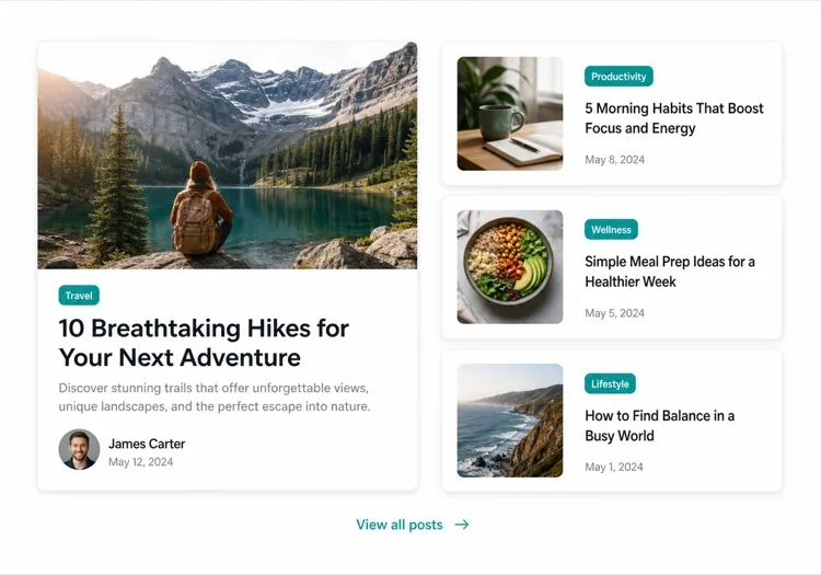
One Featured Post, Three Stacked

Creates a clear lead story, which an even grid never does. Only works if the featured post is genuinely your best — promoting whatever published last makes the asymmetry look arbitrary.

Create an asymmetric blog section: on the left, a featured post card taking about 60% of the width with a large 3:2 cover image, a category pill, a headline at display size, a three-line excerpt and an author row with avatar, date and reading time. On the right, three compact cards stacked vertically, each with a small square thumbnail on the left and a category, a two-line clamped title and a date on the right. Divide the stacked cards with hairline rules rather than shadows so they read as a list next to the feature. Stack the feature above the list on tablet and below on mobile, keeping the feature image eager loaded.

Prova in MeDo
Index gridMega

Paginated Post Index

The standalone blog page rather than a homepage teaser. Nine cards is the ceiling before the grid stops being scannable — past that, pagination beats a longer page or infinite scroll.

Create a blog index section: a page heading, a horizontal row of category filter chips, and a nine-card grid at three columns. Each card carries a cover image in a fixed 16:9 box, a category pill, a clamped two-line title, a clamped two-line excerpt, and a meta row with author, a time element for the date and a reading time. Below the grid, numbered pagination with previous and next controls, aria-current on the active page, and real anchor hrefs to /blog/page/2 so pages are crawlable and linkable rather than swapped in by client state. Show a labelled empty state when a filter returns nothing. Two columns on tablet, one on mobile.

Prova in MeDo
Text listLedger

Dated List With No Images

No thumbnails, just date, title and one line of description. Faster to scan than any card grid and the honest choice when your posts have no cover art — a grid of stock photography reads worse than plain text.

Create an image-free blog list: rows separated by hairline rules, each row showing a left-aligned date in a fixed-width muted column, then the post title as a link at large text size, a one-line clamped description beneath it, and a right-aligned reading time. Group the rows under year headings when the list spans multiple years. Give each row a full-width hover background so the whole row reads as the hit target, and keep the vertical rhythm tight so twenty posts fit in two screens. Stack the date above the title on mobile. Use an ordered list with time elements for the dates.

Prova in MeDo
Category tabsStudio

Topic Tabs Over a Card Grid

Turns a mixed blog into something a reader can navigate by interest. Needs at least a few posts per tab — a tab that opens onto two articles makes the blog look thinner than one undivided grid would.

Create a blog section with topic tabs above a six-card grid: tabs labelled All, Engineering, Design and Product with a post count beside each. Use real tab semantics — a tablist with arrow-key navigation, aria-selected, and managed focus — and reflect the active tab in the URL so a topic view is linkable. Switching a tab swaps the card set with a short fade rather than a layout jump, and keeps the grid height stable by always rendering a fixed number of card slots. Each card has a cover image, category pill, clamped title and excerpt, and a meta row with author and date. Announce the result count in an aria-live region.

Prova in MeDo
ChangelogShipfast

Release Notes Timeline

A blog section for product updates, where version and date matter more than a cover image. Keep the newest entry expanded and the rest collapsed so the page opens on what changed most recently.

Create a changelog-style blog section: a vertical timeline with a left rail of dots and connecting line, each entry showing a version tag, a date in a time element, a type pill for Added, Fixed or Changed, a title and a two-to-three sentence summary. Expand the most recent entry by default and render the rest as collapsed disclosure panels using button plus aria-expanded so keyboard users can open them. Add anchor links on each version so a specific release can be linked directly, and a Subscribe to updates link at the top of the section. Collapse the left rail to a simple stacked list on mobile.

Prova in MeDo

Come personalizzare il tuo Sezione Blog

Inizia con un post in evidenza

Metti in risalto il tuo articolo più importante con una scheda più grande — includi un'immagine di copertina a piena larghezza, un estratto più lungo e un trattamento visivo distintivo. Dì a MeDo quale post è "featured" e creerà automaticamente il layout asimmetrico.

Aggiungi filtri per categoria o tag

Se pubblichi su più argomenti, chiedi a MeDo di includere una barra di filtri orizzontale sopra la griglia. Questo trasforma la tua sezione blog in uno strumento di scoperta self-service e mantiene i lettori sulla pagina più a lungo.

Mostra il contesto dell'autore

Includere un avatar dell'autore, il nome e una stima del tempo di lettura crea fiducia e imposta le aspettative del lettore. Menziona questi campi di metadati nel tuo prompt per averli integrati in ogni scheda.

Controlla la densità delle schede con il numero di post

Specifica esattamente quanti post mostrare — tre schede per un'anteprima compatta sulla homepage, da sei a nove per una pagina di indice del blog standalone. Abbinalo a un CTA "Vedi tutto" per evitare una griglia infinita sulle pagine di marketing.

Chi usa il componente Sezione Blog

Sito di marketing SaaS

Una sezione di anteprima a tre schede sulla homepage con link a tutorial del prodotto, storie dei clienti e note di rilascio — generando traffico al blog senza sopraffare il flusso di conversione.

Pubblicazione incentrata sui contenuti

Un layout editoriale a piena larghezza con un articolo principale, schede di categorie e una griglia di schede paginata — tutto ciò che i lettori si aspettano da una pubblicazione professionale.

Agenzia o studio

Un mosaico minimalista a due colonne di casi studio e post di thought leadership, che mostra la profondità dell'expertise a potenziali clienti prima che facciano clic.

Brand e-commerce

Una sezione blog lifestyle con immagini grandi e brevi teaser che rimandano a guide all'acquisto, rassegne di tendenze e storie dietro le quinte che aumentano l'intenzione d'acquisto.

Pattern di Sezione Blog per siti web diversi

Lo stesso componente sezione blog, calibrato sul tipo di sito su cui viene pubblicato.

01 / 06

SaaS Marketing Blog Section

A three-card teaser on the homepage, not an index. The job is proving the product is maintained and that someone is writing about the problem, so lead with the tutorial or customer story — release notes belong in their own changelog, not competing for the same three slots.

Stili e varianti di Sezione Blog

Scegli la variante che si adatta al resto della pagina, poi generala.

01 / 06

Three-Card Grid

Equal cards in one row with a View all link beneath. The right default on a marketing page where the blog is supporting evidence rather than the destination, and it stays honest when you have only published a handful of posts.

Sezione Blog in React, Next.js, Vue e Svelte

React, Next.js, Vue 3, SvelteKit, Astro o HTML puro: lo stesso sezione blog, sei modi per integrarlo.

01 / 06

React Blog Section

Keep the posts in one typed array and let the card be a pure function of a post. No state is needed unless you add filters, which is what makes this section safe to render on the server.

src/components/BlogSection.tsx

type Post = { slug: string; title: string; excerpt: string; date: string; minutes: number }

export function BlogSection({ posts }: { posts: Post[] }) {
  return (
    <ul className="grid gap-8 md:grid-cols-3">
      {posts.map((post) => (
        <PostCard key={post.slug} post={post} />
      ))}
    </ul>
  )
}

Come aggiungere il tuo Sezione Blog a un progetto

Quattro passaggi, dalla scelta di un modello di sezione blog alla messa in produzione.

01~30s

Pick a Blog Layout

Choose by post volume and by whether you have cover art — three cards for a homepage teaser, a featured split when one post should lead, a dated list when the posts have no images worth showing.

02~10s

Copy the Prompt

Take the prompt into MeDo, or paste it into Lovable, Bolt, v0 or Cursor. Name the metadata you actually have first — author, reading time, category — since a card designed around fields you cannot populate is the usual reason these sections get rebuilt.

03~1min

Generate and Refine

You get React + Tailwind back with a live preview. Follow up in plain English — "clamp titles to two lines", "drop the excerpt on mobile", "move the category above the title" — instead of tuning class strings by hand.

04~2min

Connect Your Posts

Point the component at your real source — an MDX directory, a content collection or a CMS query — and map the fields once. Sort by date server-side and let the card stay a pure function of a post.

Domande comuni su Sezione Blog

Come creo una sezione blog con l'IA?

Apri MeDo e descrivi il layout di blog di cui hai bisogno — stile delle schede, numero di post, se vuoi un articolo in evidenza, quali campi di metadati mostrare (autore, data, tempo di lettura) e qualsiasi filtro. MeDo genera il codice completo del componente in pochi secondi. Poi puoi copiarlo nel tuo progetto e continuare a raffinarlo con prompt aggiuntivi.

Qual è il miglior generatore di sezione blog con IA?

MeDo è progettato specificamente per generare veri componenti web, non solo mockup di design. A differenza degli strumenti di chat IA generali, MeDo comprende i sistemi di layout, i pattern di schede e il comportamento responsive — quindi la tua sezione blog risulta in codice pulito pronto per la produzione piuttosto che un punto di partenza che richiede pesante editing.

L'IA può generare una griglia di schede blog responsive?

Sì. MeDo genera componenti responsive in primo luogo. Specifica quante colonne vuoi alla dimensione desktop e gestisce automaticamente i breakpoint — riducendosi a una pila a colonna singola su mobile senza lavoro extra da parte tua.

Come aggiungo filtri di categoria a una sezione blog generata dall'IA?

Includi il requisito del filtro nel tuo prompt — ad esempio, "aggiungi schede di filtro per categoria per Design, Engineering e Prodotto sopra la griglia di schede." MeDo genererà l'interfaccia del filtro e la logica di visualizzazione condizionale corrispondente.

Posso usare l'IA per generare un layout di post blog in evidenza?

Assolutamente. Chiedi a MeDo un layout asimmetrico con una grande scheda in evidenza e schede secondarie più piccole accanto. Questo pattern editoriale è uno dei modi più efficaci per evidenziare i contenuti principali mostrando comunque più post recenti.

La sezione blog generata dall'IA include metadati di autore e data?

Sì — menziona semplicemente i metadati che vuoi nel tuo prompt. MeDo può includere nome dell'autore e avatar, data di pubblicazione, tempo di lettura stimato, tag di categoria ed estratto. Controlli esattamente cosa appare su ogni scheda.