MeDo

AIアコーディオン生成。

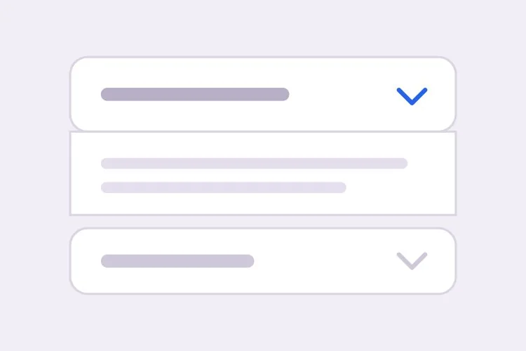
セクションを説明すればMeDoが折りたたみアコーディオンを生成します — 単一展開・複数展開の切り替え、どんな長さのコンテンツにも対応する高さアニメーション、パネルを自動で開くディープリンク、リッチリザルト向けのFAQPage JSON-LDまで一式です。

アコーディオン
アコーディオン

折りたたまれたパネルは「その内容は任意だ」という賭けです

アコーディオンはページを短く見せるために追加されがちですが、短くすることに代償がないわけではありません。折りたたまれたセクションは、流し読みのしやすさを情報密度と引き換えにします。6つの回答をざっと読んでいたはずの訪問者は、どれをクリックするか選ばなければならず、多くは何もクリックしません。配送ポリシーや例外的な質問、長い仕様表のような本当に副次的な内容ならこの取引は妥当ですが、購入の不安を実際に解消する2〜3の回答に対しては悪い取引です。有効な規律は、購買意図の高いコンテンツをアコーディオンから取り出して通常の本文に昇格させ、ロングテールだけをアコーディオンに吸収させることです。これは同じ問題のSEO側も解決します。閉じたパネル内でもHTMLに存在するテキストはインデックスされますが、クリック後にだけ挿入されるテキストはインデックスされない可能性があります。

6 個のテンプレート

生成できる アコーディオン テンプレート

どのテンプレートもスクリーンショットではなく実際のプロンプトです。任意の AI エディタに貼り付けるか、MeDo で実行して React + Tailwind のコードを受け取れます。

BasicFAQ Single-Open

Exclusive-Open FAQ List

One answer visible at a time, which keeps a long FAQ from turning into a wall once someone starts clicking. The default for landing-page questions.

Create an FAQ accordion with six items in single-open mode, where opening one item closes the currently open one. Each header is a full-width button carrying the question in 16px semibold text with a chevron on the right that rotates 180 degrees over 200ms; set aria-expanded on the button and aria-controls pointing at the panel, and give the panel role="region" with aria-labelledby back to the header id. Animate the panel with grid-template-rows from 0fr to 1fr so long answers never clip and short ones do not ease for the same duration. Enter and Space toggle, Tab moves between headers normally since each is its own tab stop, and a visible focus-visible ring is required. Allow the open item to be collapsed so no panel is forced open.

MeDoで試す
ComparisonMulti-Open

Several Panels Open at Once

For troubleshooting steps and spec tables, where someone genuinely needs two sections side by side. Add Expand all only here — it is meaningless in exclusive mode.

Create a multi-open accordion where any number of panels may be expanded at once, holding open ids in a set rather than a single value. Add an Expand all and Collapse all control above the stack whose label reflects the current state, and make it a real button with aria-expanded describing the group. Each header is a button with aria-expanded and aria-controls; each panel is role="region" with aria-labelledby. Animate with grid-template-rows 0fr to 1fr so several simultaneous transitions do not fight a shared max-height. Preserve panel scroll position and any half-filled form fields by keeping panels in the DOM and toggling the hidden attribute rather than unmounting them. Enter and Space toggle the focused header.

MeDoで試す
No JavaScriptNative Details

Details and Summary Accordion

Works before your bundle loads, is keyboard accessible with zero attributes, and joins find-in-page so a browser search opens the matching panel. The baseline to beat.

Create an accordion using native details and summary elements with no JavaScript at all. Give each details the same name attribute so the browser enforces exclusive-open behavior natively. Style the summary as a full-width row with 20px vertical padding, remove the default marker with list-style: none and ::-webkit-details-marker, and add a custom chevron that rotates using the details[open] selector. Animate the panel with interpolate-size: allow-keywords plus a height transition from 0 to auto, and add ::details-content to the transition so the reveal is smooth where supported and an instant open elsewhere. Keep a visible focus ring on the summary and ensure find-in-page still expands a closed panel.

MeDoで試す
ShareableDeep Linked

Hash-Opened Panels With Copy Link

Every panel gets its own URL, so a support reply can point at one answer rather than "scroll down to the FAQ". The offset for the sticky header is the part that gets skipped.

Create an accordion where each item is addressable by URL hash. Give every header a stable slug id derived from its question, and on mount read location.hash, open the matching panel, and scroll it into view with scroll-margin-top of 96px so it does not land underneath a sticky header. Update the hash on open using history.replaceState so the back button is not filled with toggles, and listen for hashchange so in-page links work after the first render. Add a small copy-link button inside each header row that writes the absolute URL to the clipboard and swaps its label to Copied for two seconds; stop its click from bubbling to the header button so copying does not also collapse the panel.

MeDoで試す
SEOFAQ Schema

Accordion With FAQPage JSON-LD

Panels and structured data generated from one array, which is the only way they stay in sync six months later. Treat the markup as a clarity signal, not a guaranteed rich result.

Create an FAQ accordion that renders both the interactive panels and a matching FAQPage JSON-LD script from the same array of question and answer objects, so the two cannot drift apart when someone edits a question. Emit the JSON-LD server-side in a script tag with type="application/ld+json", using Question and Answer entities with acceptedAnswer text. Render every answer into the HTML even while collapsed, hiding it with CSS rather than fetching it on click, since content injected after a click may never be crawled. Keep the accessible pattern intact: header buttons with aria-expanded and aria-controls, panels as role="region" with aria-labelledby, and a grid-template-rows height animation.

MeDoで試す
NestedNested Groups

Grouped Accordion With Sub-Sections

Two levels for a long feature matrix or a knowledge base. Depth past two is where people lose the thread — if you need a third, the content wants its own page.

Create a nested accordion two levels deep: outer groups such as Security, Integrations and Support, each containing three to five child items. Indent child headers by 20px, drop their type size by one step, and keep every level as its own button with aria-expanded and aria-controls, panels as role="region" with aria-labelledby — do not use a treeview role, since these are disclosures, not a tree. Outer groups are multi-open and children are single-open within their parent. When a parent collapses, remember which children were open so reopening the parent restores that state rather than resetting it, and make sure the parent panel height animation accounts for children expanding after the parent has settled.

MeDoで試す

アコーディオン をカスタマイズする方法

<details>とボタンのどちらを使うか最初に決める

ネイティブの<details>と<summary>の組み合わせはJavaScriptゼロで動作し、標準でキーボード操作に対応し、ブラウザのページ内検索時にも開いたままになります。aria-expandedを持つボタンは、アニメーションと排他展開ロジックを完全に制御できます。生成されるマークアップがまったく異なるため、どちらを使うか明示してください。

固定のmax-heightへアニメーションさせない

固定のmax-heightは長い回答を切り、短い回答も同じ時間をかけてイージングさせてしまいます。grid-template-rowsを0frから1frへアニメーションさせるか、height autoのためにinterpolate-sizeとcalc-sizeを指定して、実際のコンテンツ高さに沿った遷移にしてください。

単一展開か複数展開かを明示する

排他展開はページを短く保ち、読者を1つの回答に集中させます。複数同時展開は、セクションを比較したり2つから詳細をコピーしたりする場合に有利です。デフォルトの挙動と、すべての項目を閉じられるかどうかを指定してください。常に1つのパネルを開いたままにするアコーディオンもあります。

ディープリンクとスクロールオフセットは一緒に依頼する

URLハッシュからパネルを開くのは機能の半分に過ぎません。明示的なスクロールオフセットがないと、対象がスティッキーヘッダーの下に隠れます。ヘッダーの高さを伝え、同じプロンプトでscroll-margin-topまたはスクリプトによるオフセットを依頼してください。

アコーディオン コンポーネントを使うのは誰か

マーケティングサイトのFAQセクション

ランディングページ下部の排他展開アコーディオンに8つの質問を配置。各項目はディープリンク可能なのでサポート返信から特定の回答を指せます。同じデータ配列からFAQPage JSON-LDも出力します。

ECの商品ページ

配送、返品、お手入れ方法をカートに追加ボタンの下に折りたたみ、購入ボックスをファーストビューに保ちながら、ポリシー本文は検索エンジン向けにHTML内へ残します。

ドキュメントまたはナレッジベース

トラブルシューティング手順を複数展開アコーディオンにして、読者が修正作業をしながら関連する2つのセクションを並べて開いたままにできるようにします。

料金ページの比較

長い機能マトリクスをセキュリティ、連携、サポートといった折りたたみグループに分割し、3画面分の行をスクロールせずにプラン列を見えたままにします。

サイト種別ごとの アコーディオン パターン

同じ アコーディオン コンポーネントを、掲載するサイトの種類に合わせて調整します。

01 / 06

Marketing Site FAQ

Exclusive-open questions at the bottom of a landing page, with the two or three answers that actually resolve a purchase objection promoted out into plain page copy above. An accordion holding your strongest answer is an accordion hiding it.

アコーディオン のスタイルとバリアント

ページ全体のトーンに合うバリアントを選び、そのまま生成します。

01 / 06

Divider List Accordion

Flush rows separated by 1px light-grey lines, with no outer border at all. The quietest option and the right one for an FAQ of ten or more items, where card borders and gaps would add more visual noise than structure.

React・Next.js・Vue・Svelte での アコーディオン

React、Next.js、Vue 3、SvelteKit、Astro、素の HTML — 同じ アコーディオン を 6 通りの方法で組み込めます。

01 / 06

React Accordion

Hold open ids in a Set so the same component covers single and multi-open — swap the set for one id and you have exclusive mode. No height measurement is needed if the panel animates with grid rows.

src/components/Accordion.tsx

const [open, setOpen] = useState(new Set())

<button
  aria-expanded={open.has(item.id)}
  aria-controls={`panel-${item.id}`}
  onClick={() => toggle(item.id)}
>
  {item.question}
</button>
<div id={`panel-${item.id}`} role="region" className="grid"
     style={{ gridTemplateRows: open.has(item.id) ? '1fr' : '0fr' }}>
  <div className="overflow-hidden">{item.answer}</div>
</div>

アコーディオン をプロジェクトに追加する方法

アコーディオン テンプレートを選んで本番に載せるまでの 4 ステップ。

01~30s

Pick an Accordion Template

Decide two things first: single or multi-open, and native details versus a button with aria-expanded. Those choices produce different markup, so picking after generation means regenerating.

02~10s

Copy the Prompt

Take the prompt into MeDo, Lovable, Bolt, v0 or Cursor and paste your real questions and answers in place of the placeholders. If you want FAQPage JSON-LD, say so now so it is generated from the same array rather than hand-written later.

03~1min

Generate and Refine

You get React + Tailwind back with a live preview. Follow up in plain English — "allow several open at once", "open the panel matching the URL hash", "swap the chevron for a plus" — instead of editing the transition by hand.

04~2min

Check the Content and Ship

Before shipping, confirm the longest answer does not clip mid-animation, every answer is present in the HTML while collapsed, and your highest-intent copy is in open page text rather than behind a click.

アコーディオンに関するよくある質問

AIでFAQアコーディオンを生成するには?

プロンプトに質問と回答を列挙し、同時に開けるパネルが1つか複数かを指定してください。MeDoはaria-expandedとaria-controlsを備えたアクセシブルなヘッダーボタン、アニメーション付きパネル、必要に応じて同じコンテンツから組み立てたFAQPage JSON-LDを生成するため、マークアップと構造化データがずれることはありません。

<details>と<summary>を使うべきか、カスタムアコーディオンにすべきか?

信頼できるベースラインが欲しいときは<details>と<summary>を使ってください。JavaScriptの読み込み前から動作し、属性を一切付けなくてもキーボードとスクリーンリーダーに対応し、ブラウザのページ内検索にも参加します。排他展開の挙動、制御されたアニメーションカーブ、URLに保持される状態が必要な場合はaria-expanded付きのボタンを選びます。ブラウザがcontent-visibilityとheightの遷移をinterpolate-sizeでサポートするようになったため、ネイティブ要素もアニメーション可能です。

アコーディオンをheight autoへアニメーションさせる方法は?

パネルをCSSグリッドで包み、grid-template-rowsを0frから1frへ遷移させ、内側の要素にoverflow hiddenを付けます。JavaScriptでの計測なしに実際のコンテンツ高さに追従します。interpolate-size: allow-keywordsをサポートするブラウザではheightを0からautoへ直接遷移でき、よりシンプルなのでプログレッシブエンハンスメントとして採用する価値があります。

アコーディオンのFAQはGoogleでリッチリザルトを獲得できますか?

可能です。ページに有効なFAQPage構造化データがあり、質問と回答がレンダリング後のHTMLにも存在することが条件です。GoogleはFAQリッチリザルトの対象を主に権威ある政府・医療サイトへ絞り込んだため、マークアップは保証されたSERP機能ではなく、検索とAI回答エンジンに対する明確化のシグナルとして扱ってください。パネルを描画するのと同じ配列からJSON-LDを生成するようMeDoに依頼すれば、両者は同期し続けます。

アコーディオンでコンテンツを隠すとSEOに影響しますか?

HTMLに存在し視覚的に折りたたまれているだけのコンテンツは通常どおりインデックスされ、Googleもモバイルのアコーディオンは想定されたレスポンシブパターンだと述べています。本当のリスクは、クリック時にだけ回答を読み込んでクロールされないままになることと、最も重要な文章を誰も展開しない場所に埋めてしまうことです。主要なメッセージは開いた本文に残し、折りたたみパネルは補足的な詳細に使ってください。

アコーディオンとタブのどちらを使うべき?

セクションが互いに独立している場合、ラベルが文のように長い場合、読者が複数を同時に開きたい場合はアコーディオンを選びます。FAQリストがほぼ常にアコーディオンなのはこのためです。パネルが月額と年額の料金のように相互排他的な比較対象で、ラベルが横1列に収まるほど短い場合はタブを選びます。疑問文の形をした長いラベルは、タブが誤ったパターンであることを示す最も明確なサインです。