MeDo

منشئ القوائم المنسدلة بالذكاء الاصطناعي.

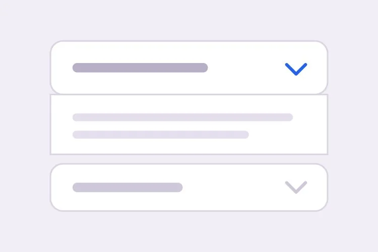
صِف أقسامك ويُنشئ MeDo قائمة منسدلة قابلة للطي — سلوك فتح فردي أو متعدد، وحركة ارتفاع تعمل مع أي طول محتوى، وروابط مباشرة تفتح اللوحة تلقائياً، مع JSON-LD من نوع FAQPage للنتائج المنسّقة.

القائمة المنسدلة
القائمة المنسدلة

اللوحة المطوية مجازفة بأن محتواها اختياري

تُضاف القوائم المنسدلة عادةً لتبدو الصفحة أقصر، لكن تقصير الصفحة ليس بلا ثمن. كل قسم مطوي يستبدل سهولة التصفح السريع بالكثافة: الزائر الذي كان سيمرّ على ستة أجوبة صار عليه أن يقرر أيها ينقر، ومعظمهم لا ينقر أياً منها. تلك المقايضة مجدية للمواد الثانوية فعلاً مثل سياسات الشحن أو أسئلة الحالات الطرفية أو جداول المواصفات الطويلة، وهي مقايضة سيئة للجوابين أو الثلاثة التي تحلّ فعلاً اعتراضاً على الشراء. الانضباط المفيد هو ترقية المحتوى الأعلى نية شرائية خارج القائمة المنسدلة إلى نص الصفحة العادي، ثم ترك القائمة تستوعب الذيل الطويل. وهذا يعالج أيضاً الجانب المتعلق بتحسين محركات البحث من المشكلة نفسها، إذ يُفهرس النص الموجود داخل لوحة مغلقة إن كان موجوداً في HTML، بينما النص الذي يُحقن بعد النقر فقط قد لا يُفهرس.

6 قالبًا

قوالب القائمة المنسدلة التي يمكنك توليدها

كل قالب هو طلب حقيقي لا صورة. انسخه إلى أي محرّر ذكاء اصطناعي، أو شغّله في MeDo لتحصل على كود React و Tailwind مباشرة.

BasicFAQ Single-Open

Exclusive-Open FAQ List

One answer visible at a time, which keeps a long FAQ from turning into a wall once someone starts clicking. The default for landing-page questions.

Create an FAQ accordion with six items in single-open mode, where opening one item closes the currently open one. Each header is a full-width button carrying the question in 16px semibold text with a chevron on the right that rotates 180 degrees over 200ms; set aria-expanded on the button and aria-controls pointing at the panel, and give the panel role="region" with aria-labelledby back to the header id. Animate the panel with grid-template-rows from 0fr to 1fr so long answers never clip and short ones do not ease for the same duration. Enter and Space toggle, Tab moves between headers normally since each is its own tab stop, and a visible focus-visible ring is required. Allow the open item to be collapsed so no panel is forced open.

جرّبه في MeDo
ComparisonMulti-Open

Several Panels Open at Once

For troubleshooting steps and spec tables, where someone genuinely needs two sections side by side. Add Expand all only here — it is meaningless in exclusive mode.

Create a multi-open accordion where any number of panels may be expanded at once, holding open ids in a set rather than a single value. Add an Expand all and Collapse all control above the stack whose label reflects the current state, and make it a real button with aria-expanded describing the group. Each header is a button with aria-expanded and aria-controls; each panel is role="region" with aria-labelledby. Animate with grid-template-rows 0fr to 1fr so several simultaneous transitions do not fight a shared max-height. Preserve panel scroll position and any half-filled form fields by keeping panels in the DOM and toggling the hidden attribute rather than unmounting them. Enter and Space toggle the focused header.

جرّبه في MeDo
No JavaScriptNative Details

Details and Summary Accordion

Works before your bundle loads, is keyboard accessible with zero attributes, and joins find-in-page so a browser search opens the matching panel. The baseline to beat.

Create an accordion using native details and summary elements with no JavaScript at all. Give each details the same name attribute so the browser enforces exclusive-open behavior natively. Style the summary as a full-width row with 20px vertical padding, remove the default marker with list-style: none and ::-webkit-details-marker, and add a custom chevron that rotates using the details[open] selector. Animate the panel with interpolate-size: allow-keywords plus a height transition from 0 to auto, and add ::details-content to the transition so the reveal is smooth where supported and an instant open elsewhere. Keep a visible focus ring on the summary and ensure find-in-page still expands a closed panel.

جرّبه في MeDo
ShareableDeep Linked

Hash-Opened Panels With Copy Link

Every panel gets its own URL, so a support reply can point at one answer rather than "scroll down to the FAQ". The offset for the sticky header is the part that gets skipped.

Create an accordion where each item is addressable by URL hash. Give every header a stable slug id derived from its question, and on mount read location.hash, open the matching panel, and scroll it into view with scroll-margin-top of 96px so it does not land underneath a sticky header. Update the hash on open using history.replaceState so the back button is not filled with toggles, and listen for hashchange so in-page links work after the first render. Add a small copy-link button inside each header row that writes the absolute URL to the clipboard and swaps its label to Copied for two seconds; stop its click from bubbling to the header button so copying does not also collapse the panel.

جرّبه في MeDo
SEOFAQ Schema

Accordion With FAQPage JSON-LD

Panels and structured data generated from one array, which is the only way they stay in sync six months later. Treat the markup as a clarity signal, not a guaranteed rich result.

Create an FAQ accordion that renders both the interactive panels and a matching FAQPage JSON-LD script from the same array of question and answer objects, so the two cannot drift apart when someone edits a question. Emit the JSON-LD server-side in a script tag with type="application/ld+json", using Question and Answer entities with acceptedAnswer text. Render every answer into the HTML even while collapsed, hiding it with CSS rather than fetching it on click, since content injected after a click may never be crawled. Keep the accessible pattern intact: header buttons with aria-expanded and aria-controls, panels as role="region" with aria-labelledby, and a grid-template-rows height animation.

جرّبه في MeDo
NestedNested Groups

Grouped Accordion With Sub-Sections

Two levels for a long feature matrix or a knowledge base. Depth past two is where people lose the thread — if you need a third, the content wants its own page.

Create a nested accordion two levels deep: outer groups such as Security, Integrations and Support, each containing three to five child items. Indent child headers by 20px, drop their type size by one step, and keep every level as its own button with aria-expanded and aria-controls, panels as role="region" with aria-labelledby — do not use a treeview role, since these are disclosures, not a tree. Outer groups are multi-open and children are single-open within their parent. When a parent collapses, remember which children were open so reopening the parent restores that state rather than resetting it, and make sure the parent panel height animation accounts for children expanding after the parent has settled.

جرّبه في MeDo

كيف تخصّص القائمة المنسدلة الخاص بك

اختر مبكراً بين <details> والزر

يعمل الزوج الأصلي <details> و<summary> دون أي JavaScript، وهو متاح للوحة المفاتيح افتراضياً، ويبقى مفتوحاً عندما يبحث المتصفح داخل الصفحة. أما الزر المزوّد بـ aria-expanded فيمنحك تحكماً كاملاً في الحركة ومنطق الفتح الحصري. حدّد أيهما تريد، لأنهما ينتجان ترميزاً مختلفاً تماماً.

لا تُحرّك أبداً نحو max-height ثابت

يقطع max-height الثابت الأجوبة الطويلة ويجعل القصيرة تستغرق المدة نفسها. اطلب تحريك grid-template-rows من 0fr إلى 1fr، أو interpolate-size مع calc-size من أجل height auto، حتى يتبع الانتقال ارتفاع المحتوى الحقيقي.

كن واضحاً بشأن الفتح الفردي مقابل المتعدد

الفتح الحصري يحفظ قصر الصفحة وتركيز القارئ على جواب واحد. أما السماح بفتح عدة لوحات معاً فهو أفضل عندما يقارن الناس الأقسام أو ينسخون تفاصيل من قسمين. حدّد السلوك الافتراضي وما إذا كان بإمكان المستخدم إغلاق كل العناصر، فبعض القوائم تُبقي لوحة واحدة مفتوحة دائماً.

اطلب الروابط المباشرة وإزاحة التمرير معاً

فتح لوحة من hash الرابط هو نصف الميزة فقط. فبدون إزاحة تمرير صريحة يستقر الهدف أسفل الترويسة الثابتة، لذا اذكر ارتفاع الترويسة واطلب scroll-margin-top أو إزاحة بالسكربت في الموجه نفسه.

من يستخدم مكوّن القائمة المنسدلة

قسم الأسئلة الشائعة في موقع تسويقي

ثمانية أسئلة في قائمة منسدلة بفتح حصري أسفل صفحة الهبوط، كل عنصر قابل للربط المباشر حتى تستطيع ردود الدعم الإشارة إلى جواب واحد، مع إصدار JSON-LD من نوع FAQPage من مصفوفة البيانات نفسها.

صفحة منتج تجارة إلكترونية

الشحن والإرجاع وتعليمات العناية مطوية أسفل زر الإضافة إلى السلة، مما يحفظ صندوق الشراء في الجزء المرئي بينما يبقى نص السياسات داخل HTML لمحركات البحث.

وثائق أو قاعدة معرفة

خطوات حل المشكلات في قائمة منسدلة متعددة الفتح ليتمكن القارئ من إبقاء قسمين مرتبطين مفتوحين جنباً إلى جنب أثناء تنفيذ الإصلاح.

مقارنة في صفحة الأسعار

مصفوفة ميزات طويلة مقسّمة إلى مجموعات قابلة للطي مثل الأمان والتكاملات والدعم، فتبقى أعمدة الخطط مرئية بدلاً من الاختفاء بعد ثلاث شاشات من الصفوف.

أنماط القائمة المنسدلة لمواقع مختلفة

المكوّن القائمة المنسدلة نفسه، مُهيّأ لنوع الموقع الذي يُنشر عليه.

01 / 06

Marketing Site FAQ

Exclusive-open questions at the bottom of a landing page, with the two or three answers that actually resolve a purchase objection promoted out into plain page copy above. An accordion holding your strongest answer is an accordion hiding it.

أنماط القائمة المنسدلة وتنويعاته

اختر التنويعة التي تناسب بقية الصفحة، ثم ولّدها.

01 / 06

Divider List Accordion

Flush rows separated by 1px light-grey lines, with no outer border at all. The quietest option and the right one for an FAQ of ten or more items, where card borders and gaps would add more visual noise than structure.

القائمة المنسدلة في React و Next.js و Vue و Svelte

React و Next.js و Vue 3 و SvelteKit و Astro أو HTML صِرف — المكوّن القائمة المنسدلة نفسه بست طرق للإضافة.

01 / 06

React Accordion

Hold open ids in a Set so the same component covers single and multi-open — swap the set for one id and you have exclusive mode. No height measurement is needed if the panel animates with grid rows.

src/components/Accordion.tsx

const [open, setOpen] = useState(new Set())

<button
  aria-expanded={open.has(item.id)}
  aria-controls={`panel-${item.id}`}
  onClick={() => toggle(item.id)}
>
  {item.question}
</button>
<div id={`panel-${item.id}`} role="region" className="grid"
     style={{ gridTemplateRows: open.has(item.id) ? '1fr' : '0fr' }}>
  <div className="overflow-hidden">{item.answer}</div>
</div>

كيف تضيف القائمة المنسدلة إلى مشروعك

أربع خطوات، من اختيار قالب القائمة المنسدلة إلى إطلاقه في الإنتاج.

01~30s

Pick an Accordion Template

Decide two things first: single or multi-open, and native details versus a button with aria-expanded. Those choices produce different markup, so picking after generation means regenerating.

02~10s

Copy the Prompt

Take the prompt into MeDo, Lovable, Bolt, v0 or Cursor and paste your real questions and answers in place of the placeholders. If you want FAQPage JSON-LD, say so now so it is generated from the same array rather than hand-written later.

03~1min

Generate and Refine

You get React + Tailwind back with a live preview. Follow up in plain English — "allow several open at once", "open the panel matching the URL hash", "swap the chevron for a plus" — instead of editing the transition by hand.

04~2min

Check the Content and Ship

Before shipping, confirm the longest answer does not clip mid-animation, every answer is present in the HTML while collapsed, and your highest-intent copy is in open page text rather than behind a click.

أسئلة شائعة حول القائمة المنسدلة

كيف أُنشئ قائمة أسئلة شائعة منسدلة بالذكاء الاصطناعي؟

أدرج أسئلتك وأجوبتك في الموجه وحدّد ما إذا كان بإمكان لوحة واحدة أو عدة لوحات أن تُفتح في الوقت نفسه. يُنشئ MeDo أزرار الترويسة سهلة الوصول مع aria-expanded و aria-controls، واللوحات المتحركة، واختيارياً JSON-LD من نوع FAQPage مبنياً على المحتوى نفسه، فلا يمكن أن يتباعد الترميز عن البيانات المنظمة.

هل أستخدم <details> و<summary> أم قائمة منسدلة مخصصة؟

استخدم <details> و<summary> عندما تريد أساساً موثوقاً: فهو يعمل قبل تحميل JavaScript، ومتاح للوحة المفاتيح وقارئات الشاشة دون أي سمات، ويشارك في ميزة البحث داخل الصفحة في المتصفح. واستخدم زراً مع aria-expanded عندما تحتاج سلوك فتح حصري أو منحنى حركة محكوماً أو حالة تُخزَّن في الرابط. ويمكن الآن تحريك العنصر الأصلي أيضاً بعد أن أصبحت المتصفحات تدعم انتقال content-visibility والارتفاع مع interpolate-size.

كيف أُحرّك قائمة منسدلة إلى height auto؟

لُف اللوحة داخل شبكة CSS وانتقل بـ grid-template-rows من 0fr إلى 1fr، مع overflow hidden على العنصر الداخلي. هذا يتبع ارتفاع المحتوى الحقيقي دون أي قياس في JavaScript. وفي المتصفحات التي تدعم interpolate-size: allow-keywords يمكنك الانتقال بالارتفاع من 0 إلى auto مباشرة، وهو أبسط ويستحق الاستخدام كتحسين تدريجي.

هل يمكن لقائمة الأسئلة الشائعة المنسدلة الحصول على نتائج منسّقة في Google؟

نعم، إن كانت الصفحة تحمل بيانات FAQPage منظمة صحيحة وظهرت الأسئلة والأجوبة في HTML المُصيَّر أيضاً. لقد قصرت Google أهلية النتائج المنسّقة للأسئلة الشائعة في الغالب على المواقع الحكومية والصحية الموثوقة، لذا تعامل مع الترميز كإشارة وضوح للبحث ومحركات الإجابة بالذكاء الاصطناعي وليس كميزة مضمونة في نتائج البحث. اطلب من MeDo إنشاء JSON-LD من المصفوفة نفسها التي تُصيّر اللوحات ليبقيا متزامنين.

هل يؤثر إخفاء المحتوى في قائمة منسدلة على تحسين محركات البحث؟

المحتوى الموجود في HTML لكنه مطوي بصرياً يُفهرس بشكل طبيعي، وقد ذكرت Google أن القوائم المنسدلة على الجوّال نمط استجابة متوقّع. الخطر الحقيقي هو تحميل الأجوبة عند النقر فقط، مما قد يتركها غير مزحوفة، وكذلك دفن أهم نصوصك في مكان لا يفتحه أحد. أبقِ الرسالة الأساسية في نص الصفحة الظاهر واستخدم اللوحات المطوية للتفاصيل المساندة.

هل أستخدم قائمة منسدلة أم علامات تبويب؟

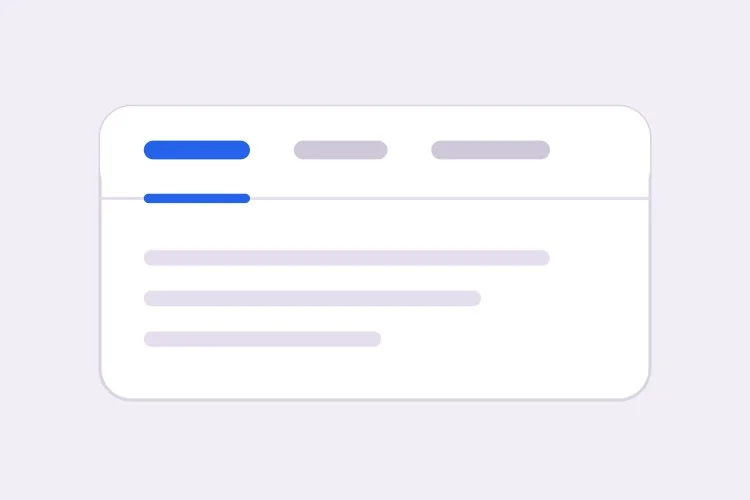
اختر القائمة المنسدلة عندما تكون الأقسام مستقلة، أو تكون التسميات طويلة بما يكفي لتُقرأ كجُمَل، أو قد يرغب القارئ في فتح أكثر من قسم في الوقت نفسه، ولهذا تكون قوائم الأسئلة الشائعة قوائم منسدلة في الغالب. واختر علامات التبويب عندما تكون اللوحات بدائل متعارضة تُقارن فيما بينها، مثل التسعير الشهري مقابل السنوي، وتكون التسميات قصيرة بما يكفي لتستقر في صف أفقي واحد. التسميات الطويلة ذات الصيغة السؤالية هي أوضح إشارة إلى أن علامات التبويب هي النمط الخطأ.