MeDo

AI 배지 생성기.

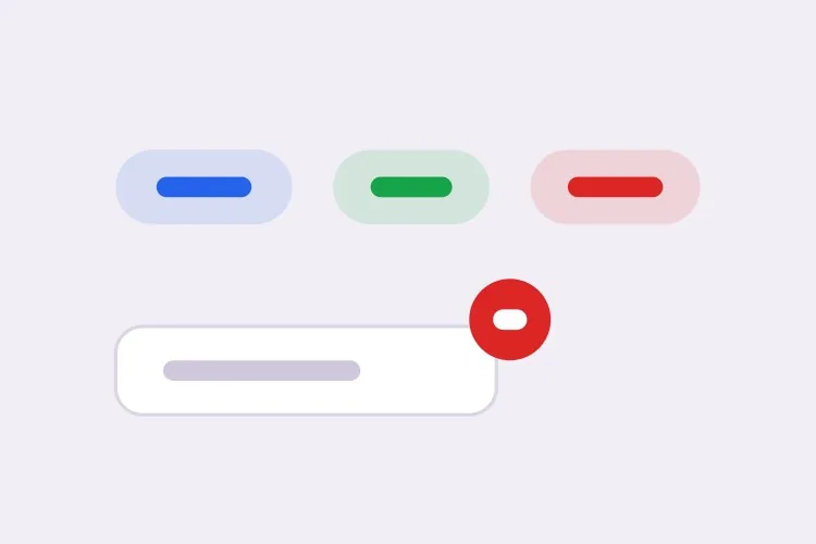
상태를 설명하면 MeDo가 배지 세트 전체를 생성합니다 — 시맨틱 상태 필, 삭제 가능한 태그 칩, 99+로 처리되는 숫자 카운트, 아바타 위에 얹혀도 잘리지 않는 점 인디케이터까지.

배지
배지

배지는 가장 작은 컴포넌트이면서 레이아웃을 깨뜨릴 확률이 가장 높습니다

배지는 다른 것 안에 놓입니다. 테이블 셀, 리스트 행, 내비게이션 항목, 제목 등이죠. 그래서 배지의 고유 높이는 스타일 선택이 아니라 레이아웃 의존성이 됩니다. 옆에 있는 텍스트보다 line-height가 1픽셀 높은 배지는 테이블의 모든 행을 조용히 늘리고, 그 버그는 "배지 문제"가 아니라 "테이블이 이상해 보인다"로 보고됩니다. 패딩과 폰트 메트릭에 맡기지 않고 배지를 고정 높이와 고정 line-height에 묶어 두는 것이 바로 어디에나 안전하게 넣을 수 있게 만드는 조건입니다. 세트를 한 번에 생성하면 모든 톤과 크기가 구조적으로 같은 높이 스케일을 공유합니다.

템플릿 6개

생성할 수 있는 배지 템플릿

모든 템플릿은 스크린샷이 아니라 실제 프롬프트입니다. 어떤 AI 에디터에든 붙여넣거나 MeDo에서 실행해 React + Tailwind 코드를 그대로 받으세요.

BasicStatus Pill

Five-Tone Status Pill

The one you need first. Generating all five tones together is what keeps them on a single height scale, which is what makes the badge safe to drop into a table cell.

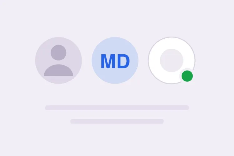
Create a status badge with five semantic tones — neutral grey, info blue, success green, warning amber, error red — each pairing a tinted background with a darker text color at 4.5:1 or better. Give it two sizes: sm at 18px tall with 11px text, md at 22px tall with 12px text, both at a 999px radius with 8px horizontal padding, a fixed line-height and inline-flex with align-items center, so a badge dropped into a table cell cannot change the row height. Always render a text label — the tone is redundant encoding, never the only signal. Render it as a span with no tabindex and no role, because a status badge is read-only output and adding a focus stop for it clutters keyboard navigation through a table.
MeDo에서 시도하기
NumericCount Badge

Notification Count With 99+ Clamping

A number, a min-width so single digits stay circular, and an announcement when it changes. Without the min-width the badge visibly changes shape as the count crosses from 9 to 10.

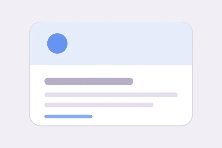
Create a numeric count badge that clamps displayed values above 99 to "99+" while keeping the true count in the accessible name. Set min-width equal to the badge height so a single digit renders as a circle rather than a narrow oval, use tabular-nums so the width does not jitter between values, and hide the badge entirely at zero rather than rendering an empty circle. Wrap the count in an element with role="status" and aria-live="polite" so an update is announced without interrupting, and phrase the accessible text as "3 unread messages" rather than a bare numeral. Do not use aria-live="assertive" — a count change almost never justifies cutting off whatever is being read.

MeDo에서 시도하기
AnchoredDot Indicator

Dot on an Icon or Avatar

An 8px circle overhanging the corner of a bell or an avatar. The failure is always the same: the wrapper has overflow: hidden for its rounding and clips the dot in half.

Create a dot indicator that anchors to the top-right of an icon or avatar: an 8px circle positioned absolutely with a small negative offset so it overhangs the edge, plus a 2px ring in the page surface color so it stays legible over a photo or a busy icon. Give the wrapper position: relative and explicitly no overflow: hidden — if the wrapper needs rounding, move the border-radius to an inner element so the dot is not clipped. Because a bare dot conveys nothing to a screen reader or a colorblind user, pair it with a visually hidden label naming the state or count. Mark the dot itself aria-hidden="true" so the label is announced once.

MeDo에서 시도하기
InteractiveRemovable Tag

Tag Chip With a Dismiss Button

The only variant that is a control rather than output. A dismiss glyph inside a div is why so many UIs ship tags a keyboard user cannot remove.

Create a removable tag chip: a label plus a dismiss control that is a real button element, not a span with a click handler, with aria-label naming the specific tag such as "Remove design" rather than a generic "Remove". Give the button a 16px glyph inside a 24px hit area, a visible focus ring, and Backspace or Delete as an alternative to Enter when it has focus. After removal, move focus to the next remaining chip, or to the group container when the last one is removed, so focus never lands on a detached node. Announce the removal through a polite live region. Keep the chip on the same height scale as the status badge so a row mixing both stays aligned.

MeDo에서 시도하기
With iconIcon + Label

Badge With a Leading Status Icon

A 12px glyph before the label for states that need to be identifiable in peripheral vision — a spinner for running, a check for passed, an octagon for failed in a CI list.

Create a badge variant with a 12px leading icon before the label, one distinct glyph per state so severity survives in grayscale: a check for passed, a spinning arc for running, an octagon for failed, a clock for queued. Mark the icon aria-hidden="true" since the label already carries the meaning. Keep the icon optically aligned to the text baseline rather than centered on the line box, and hold the overall badge height identical to the icon-less variant so a mixed column in a table does not develop two row heights. For the running state, drive the spin with a CSS animation and replace it with a static arc under prefers-reduced-motion rather than removing the icon.

MeDo에서 시도하기
SubtleOutline Badge

Bordered Badge for Dense Tables

A 1px border with a transparent fill, for screens where a column of tinted pills turns the table into a heat map. Also the variant that survives a dark theme without retinting.

Create an outlined badge variant: a 1px border in the tone color, a transparent background, and label text in the same tone at a darkened step so it holds 4.5:1 against both light and dark surfaces. Match the filled variant on height, radius, padding and line-height exactly, so the two can be swapped per column without any row reflowing — account for the 1px border inside the box by using box-sizing: border-box rather than reducing the padding. Provide a variant prop with filled and outline values on one component rather than a second component. Verify the border remains visible against a hovered table row background, which is the case that usually makes outline badges disappear.

MeDo에서 시도하기

배지 커스터마이즈 방법

톤은 색이 아니라 의미로 이름 짓기

초록, 앰버, 빨강 대신 success, warning, error로 요청하세요. 시맨틱한 이름을 쓰면 다크 모드나 리브랜딩을 위해 팔레트를 다시 조정하더라도 모든 사용처의 이름을 바꿀 필요가 없고, 배지가 상태 신호가 아니라 장식으로 쓰이는 경우도 금방 드러납니다.

색은 항상 레이블과 함께

빨간 점만으로는 색약 사용자에게 아무것도 전달되지 않고, 스크린 리더 사용자에게는 전혀 전달되지 않습니다. 모든 상태 배지가 텍스트를 렌더링하도록 명시하고, 정말 점만 필요하다면 시각적으로 숨긴 레이블을 함께 요청해 상태가 여전히 읽히도록 하세요.

카운트의 오버플로 규칙을 명시하기

임계값을 넘으면 어떻게 되는지 — 보통 "99+"로 제한 — 를 밝히고, 한 자리 카운트가 좁은 타원이 아니라 원으로 유지되도록 배지에 min-width를 주세요. min-width가 없으면 카운트가 9에서 10으로 넘어갈 때 배지 모양이 눈에 띄게 변합니다.

정적 배지와 인터랙티브 칩 구분하기

상태 배지는 텍스트이므로 포커스를 받아서는 안 됩니다. 삭제 가능한 태그는 컨트롤이므로 삭제 동작을 위한 실제 button, 포커스 링, "디자인 삭제" 같은 접근성 이름이 필요합니다. 어느 쪽을 원하는지 MeDo에 알려주지 않으면 클릭 가능해 보이지만 키보드로는 도달할 수 없는 div를 받게 됩니다.

배지 컴포넌트를 사용하는 사람

SaaS 대시보드

테이블의 상태 열에 활성, 대기 중, 실패를 동일한 높이 스케일의 옅은 필로 표시해, 행을 활성에서 실패로 바꿔도 색과 레이블만 바뀌고 행이 밀리지 않습니다.

이커머스 스토어

헤더의 장바구니 아이콘 우측 상단에 "99+"로 제한된 카운트 배지를 고정하고, 상품 카드에는 같은 톤 체계를 재사용한 "신규", "재고 부족" 필을 배치합니다.

프로젝트 관리 도구

태스크 카드의 라벨과 담당자를 위한 삭제 가능한 태그 칩. 각각 키보드로 접근 가능한 삭제 버튼을 갖고, 의도적으로 인터랙티브하지 않은 정적 우선순위 배지와 나란히 놓입니다.

문서 사이트

API 제목 옆의 인라인 버전 및 안정성 배지 — "Beta", "지원 중단", "v2.1" — 고정 line-height로 주석 대상 제목을 늘리지 않습니다.

웹사이트 유형별 배지 패턴

같은 배지 컴포넌트를 게시되는 사이트 유형에 맞춰 조정합니다.

01 / 06

SaaS Dashboards

A status column of Active, Pending and Failed pills, where the only thing that matters is that switching a row from one tone to another does not shift the row. Consider the outline variant once the table has more than about ten rows — a full column of tinted fills reads as a heat map.

배지 스타일과 변형

페이지의 나머지 부분과 어울리는 변형을 골라 바로 생성하세요.

01 / 06

Filled Status Pill

A tinted background with darker text at a 999px radius — the default, and the most legible at 11px. Keep the tint light: a saturated fill at this size makes small text harder to read exactly where the label is doing the accessibility work.

React, Next.js, Vue, Svelte에서의 배지

React, Next.js, Vue 3, SvelteKit, Astro 또는 순수 HTML — 같은 배지을 여섯 가지 방식으로 넣을 수 있습니다.

01 / 06

React Badge

Stateless by definition — a status badge is output, so no hooks and no client boundary. Keep the tone map outside the component so the palette can be retuned in one place instead of at each call site.

src/components/Badge.tsx

const tones = {
  neutral: 'bg-zinc-100 text-zinc-700',
  success: 'bg-emerald-100 text-emerald-800',
  error: 'bg-red-100 text-red-800',
}

export function Badge({ tone = 'neutral', size = 'md', children }) {
  return (
    <span className={`inline-flex items-center rounded-full px-2
      ${sizes[size]} ${tones[tone]}`}>
      {children}
    </span>
  )
}

배지을 프로젝트에 추가하는 방법

배지 템플릿을 고르고 프로덕션에 배포하기까지 네 단계.

01~30s

Pick a Badge Variant

Decide first whether you need output or a control: a status pill and a count are read-only, a tag chip is interactive. Then pick the tone set and the two sizes you actually need.

02~10s

Copy the Prompt

Take it into MeDo, Lovable, Bolt, v0 or Cursor. Name your tones semantically — success, warning, error — not by color, so a rebrand or a dark theme does not mean renaming every usage.

03~1min

Generate and Refine

You get the whole set on one height scale with a live preview. Follow up in plain English — "add an outline variant", "clamp at 999+", "make the dot ring match a dark surface" — instead of nudging padding values.

04~2min

Drop It Into a Table and Check the Row Height

Put a badge in a real table cell and a real heading, then compare row heights against a cell without one. If anything grew, the line-height is not pinned and the fix belongs in the component, not the table.

배지에 대한 자주 묻는 질문

AI로 배지 컴포넌트를 생성하는 방법은?

필요한 톤과 모드를 하나의 프롬프트로 설명하세요. 예를 들어 "다섯 가지 시맨틱 상태 톤에 숫자 카운트 배지와 삭제 가능한 태그 칩을 두 가지 크기로"처럼요. MeDo는 하드코딩된 단일 필이 아니라 높이 스케일, 라운드, 패딩을 공유하는 세트 전체를 생성합니다.

배지와 태그(칩)의 차이는 무엇인가요?

배지는 읽기 전용 출력입니다. 상태나 개수를 알리는 것이므로 포커스를 받아서는 안 됩니다. 태그나 칩은 사용자가 조작할 수 있는 입력으로, 보통 삭제할 수 있기 때문에 실제 button, 포커스 스타일, 접근성 이름이 필요합니다. 이 둘을 하나의 컴포넌트로 취급하는 것이 키보드 사용자가 삭제할 수 없는 태그가 많은 이유입니다.

배지가 색만으로 상태를 전달해도 되나요?

아니요. WCAG 1.4.1은 색이 정보 전달의 유일한 수단이 되지 않도록 요구하므로, 레이블 없는 빨간 배지는 색약 사용자와 스크린 리더 사용자에게 실패입니다. 톤과 함께 텍스트 레이블, 또는 아이콘과 시각적으로 숨긴 레이블을 렌더링하세요. 톤을 시맨틱하게 설명하면 MeDo가 기본으로 레이블을 포함합니다.

99를 넘는 알림 개수는 어떻게 표시하나요?

표시 값을 제한하고 개수가 임계값을 넘으면 "99+"를 렌더링하며, 실제 숫자가 중요하다면 접근성 이름에 남겨 두세요. 이 제한을 배지 높이와 같은 min-width와 함께 적용하면 한 자리 카운트도 원형을 유지합니다.

카운트 배지가 변경을 스크린 리더에 알려야 하나요?

페이지 이동 없이 개수가 갱신된다면 그렇습니다. aria-live="polite" 영역으로 감싸면 사용자를 방해하지 않고 새 값이 안내됩니다. 문구는 간결하게 — 숫자만 있는 것보다 "읽지 않음 3건"이 더 잘 읽힙니다. 알림 개수는 읽고 있던 내용을 끊을 만한 사안이 거의 아니므로 여기서 aria-live="assertive"는 피하세요.

점 배지를 아바타에 잘리지 않게 배치하는 방법은?

아바타 래퍼에 position: relative를 주고 overflow: hidden은 두지 않은 다음, 점을 absolute로 배치하며 약간의 음수 오프셋을 주어 원 밖으로 걸치게 하세요. 페이지 서피스 색상의 2px 링을 추가하면 복잡한 사진 위에서도 점이 또렷하게 보입니다. 래퍼가 자식을 잘라낸다면 라운딩을 내부 요소로 옮기세요.