MeDo

AI 블로그 섹션 생성기.

원하는 블로그 레이아웃 — 카드 스타일, 포스트 수, 추천 기사, 카테고리 필터 — 을 설명하면 MeDo가 완전한 컴포넌트를 생성합니다. 단 하나의 CSS grid 속성도 건드리지 않고 완성도 높은 블로그 섹션을 제공하세요.

블로그 섹션
블로그 섹션

훌륭한 블로그 섹션은 독자를 재방문자로 만듭니다.

블로그는 SEO와 신뢰 구축에 있어 가장 효과적인 자산 중 하나입니다 — 하지만 방문자가 실제로 찾아보고 탐색할 수 있을 때만 해당됩니다. 잘 설계된 블로그 섹션은 최고의 콘텐츠를 즉시 표시하고, 눈에 보이는 카테고리를 통해 주제 전문성을 전달하며, 독자를 랜딩 페이지에서 콘텐츠 퍼널로 안내합니다. MeDo를 사용하면 일반적인 테마에 맞추는 대신, 브랜드와 콘텐츠 볼륨에 딱 맞는 레이아웃을 정확히 생성할 수 있습니다.

템플릿 6개

생성할 수 있는 블로그 섹션 템플릿

모든 템플릿은 스크린샷이 아니라 실제 프롬프트입니다. 어떤 AI 에디터에든 붙여넣거나 MeDo에서 실행해 React + Tailwind 코드를 그대로 받으세요.

Three cardAcme

Three-Card Homepage Preview

The smallest blog section that still looks intentional. Three posts and a View all link — enough to prove the blog is alive without turning a marketing page into an index.

Create a blog preview section with a section heading, a one-line subheading and a three-column card grid. Each card holds a 16:9 cover image in a fixed aspect-ratio box, a category pill above the title, a two-line title clamped with line-clamp-2, a two-line excerpt clamped with line-clamp-2, and a footer row with author name, publish date in a time element with a machine-readable datetime, and a reading-time estimate. Make the whole card one link with the heading as the accessible name rather than adding a separate Read more link. Below the grid, a centred View all posts link. Two columns on tablet, one on mobile, with the cover images lazy loaded.
MeDo에서 시도하기
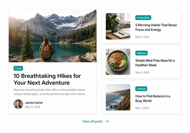
Featured splitEditorial

One Featured Post, Three Stacked

Creates a clear lead story, which an even grid never does. Only works if the featured post is genuinely your best — promoting whatever published last makes the asymmetry look arbitrary.

Create an asymmetric blog section: on the left, a featured post card taking about 60% of the width with a large 3:2 cover image, a category pill, a headline at display size, a three-line excerpt and an author row with avatar, date and reading time. On the right, three compact cards stacked vertically, each with a small square thumbnail on the left and a category, a two-line clamped title and a date on the right. Divide the stacked cards with hairline rules rather than shadows so they read as a list next to the feature. Stack the feature above the list on tablet and below on mobile, keeping the feature image eager loaded.

MeDo에서 시도하기
Index gridMega

Paginated Post Index

The standalone blog page rather than a homepage teaser. Nine cards is the ceiling before the grid stops being scannable — past that, pagination beats a longer page or infinite scroll.

Create a blog index section: a page heading, a horizontal row of category filter chips, and a nine-card grid at three columns. Each card carries a cover image in a fixed 16:9 box, a category pill, a clamped two-line title, a clamped two-line excerpt, and a meta row with author, a time element for the date and a reading time. Below the grid, numbered pagination with previous and next controls, aria-current on the active page, and real anchor hrefs to /blog/page/2 so pages are crawlable and linkable rather than swapped in by client state. Show a labelled empty state when a filter returns nothing. Two columns on tablet, one on mobile.

MeDo에서 시도하기
Text listLedger

Dated List With No Images

No thumbnails, just date, title and one line of description. Faster to scan than any card grid and the honest choice when your posts have no cover art — a grid of stock photography reads worse than plain text.

Create an image-free blog list: rows separated by hairline rules, each row showing a left-aligned date in a fixed-width muted column, then the post title as a link at large text size, a one-line clamped description beneath it, and a right-aligned reading time. Group the rows under year headings when the list spans multiple years. Give each row a full-width hover background so the whole row reads as the hit target, and keep the vertical rhythm tight so twenty posts fit in two screens. Stack the date above the title on mobile. Use an ordered list with time elements for the dates.

MeDo에서 시도하기
Category tabsStudio

Topic Tabs Over a Card Grid

Turns a mixed blog into something a reader can navigate by interest. Needs at least a few posts per tab — a tab that opens onto two articles makes the blog look thinner than one undivided grid would.

Create a blog section with topic tabs above a six-card grid: tabs labelled All, Engineering, Design and Product with a post count beside each. Use real tab semantics — a tablist with arrow-key navigation, aria-selected, and managed focus — and reflect the active tab in the URL so a topic view is linkable. Switching a tab swaps the card set with a short fade rather than a layout jump, and keeps the grid height stable by always rendering a fixed number of card slots. Each card has a cover image, category pill, clamped title and excerpt, and a meta row with author and date. Announce the result count in an aria-live region.

MeDo에서 시도하기
ChangelogShipfast

Release Notes Timeline

A blog section for product updates, where version and date matter more than a cover image. Keep the newest entry expanded and the rest collapsed so the page opens on what changed most recently.

Create a changelog-style blog section: a vertical timeline with a left rail of dots and connecting line, each entry showing a version tag, a date in a time element, a type pill for Added, Fixed or Changed, a title and a two-to-three sentence summary. Expand the most recent entry by default and render the rest as collapsed disclosure panels using button plus aria-expanded so keyboard users can open them. Add anchor links on each version so a specific release can be linked directly, and a Subscribe to updates link at the top of the section. Collapse the left rail to a simple stacked list on mobile.

MeDo에서 시도하기

블로그 섹션 커스터마이즈 방법

추천 포스트로 시작하기

더 큰 카드로 가장 중요한 기사를 강조하세요 — 전체 너비 커버 이미지, 긴 발췌문, 독특한 시각적 처리를 포함하세요. MeDo에게 어떤 포스트가 "featured"인지 알려주면 비대칭 레이아웃이 자동으로 생성됩니다.

카테고리 또는 태그 필터 추가하기

여러 주제로 게시한다면 MeDo에게 그리드 위에 수평 필터 바를 포함하도록 요청하세요. 이렇게 하면 블로그 섹션이 자기 주도적 검색 도구가 되어 독자들이 페이지에 더 오래 머물게 됩니다.

저자 컨텍스트 표시하기

저자 아바타, 이름, 예상 읽기 시간을 포함하면 신뢰가 쌓이고 독자 기대치가 설정됩니다. 이러한 메타데이터 필드를 프롬프트에 언급하면 각 카드에 통합됩니다.

포스트 수로 카드 밀도 제어하기

표시할 포스트 수를 정확히 지정하세요 — 홈페이지 간결한 미리보기에는 카드 3개, 독립형 블로그 인덱스 페이지에는 6~9개. 마케팅 페이지에서 무한 그리드를 피하기 위해 "모두 보기" CTA와 함께 사용하세요.

블로그 섹션 컴포넌트를 사용하는 사람

SaaS 마케팅 사이트

홈페이지에 제품 튜토리얼, 고객 스토리, 릴리즈 노트로 연결되는 3카드 미리보기 섹션 — 전환 흐름을 방해하지 않고 블로그 트래픽을 유도합니다.

콘텐츠 중심 출판물

히어로 기사, 카테고리 탭, 페이지화된 카드 그리드가 있는 전체 너비 편집 레이아웃 — 전문 출판물에서 독자들이 기대하는 모든 것.

에이전시 또는 스튜디오

잠재 고객이 클릭하기 전에 전문성의 깊이를 보여주는 케이스 스터디와 소트 리더십 포스트의 미니멀한 2열 모자이크.

이커머스 브랜드

구매 가이드, 트렌드 라운드업, 비하인드 스토리로 연결되는 큰 이미지와 짧은 티저가 있는 라이프스타일 블로그 섹션으로 구매 의도를 높입니다.

웹사이트 유형별 블로그 섹션 패턴

같은 블로그 섹션 컴포넌트를 게시되는 사이트 유형에 맞춰 조정합니다.

01 / 06

SaaS Marketing Blog Section

A three-card teaser on the homepage, not an index. The job is proving the product is maintained and that someone is writing about the problem, so lead with the tutorial or customer story — release notes belong in their own changelog, not competing for the same three slots.

블로그 섹션 스타일과 변형

페이지의 나머지 부분과 어울리는 변형을 골라 바로 생성하세요.

01 / 06

Three-Card Grid

Equal cards in one row with a View all link beneath. The right default on a marketing page where the blog is supporting evidence rather than the destination, and it stays honest when you have only published a handful of posts.

React, Next.js, Vue, Svelte에서의 블로그 섹션

React, Next.js, Vue 3, SvelteKit, Astro 또는 순수 HTML — 같은 블로그 섹션을 여섯 가지 방식으로 넣을 수 있습니다.

01 / 06

React Blog Section

Keep the posts in one typed array and let the card be a pure function of a post. No state is needed unless you add filters, which is what makes this section safe to render on the server.

src/components/BlogSection.tsx

type Post = { slug: string; title: string; excerpt: string; date: string; minutes: number }

export function BlogSection({ posts }: { posts: Post[] }) {
  return (
    <ul className="grid gap-8 md:grid-cols-3">
      {posts.map((post) => (
        <PostCard key={post.slug} post={post} />
      ))}
    </ul>
  )
}

블로그 섹션을 프로젝트에 추가하는 방법

블로그 섹션 템플릿을 고르고 프로덕션에 배포하기까지 네 단계.

01~30s

Pick a Blog Layout

Choose by post volume and by whether you have cover art — three cards for a homepage teaser, a featured split when one post should lead, a dated list when the posts have no images worth showing.

02~10s

Copy the Prompt

Take the prompt into MeDo, or paste it into Lovable, Bolt, v0 or Cursor. Name the metadata you actually have first — author, reading time, category — since a card designed around fields you cannot populate is the usual reason these sections get rebuilt.

03~1min

Generate and Refine

You get React + Tailwind back with a live preview. Follow up in plain English — "clamp titles to two lines", "drop the excerpt on mobile", "move the category above the title" — instead of tuning class strings by hand.

04~2min

Connect Your Posts

Point the component at your real source — an MDX directory, a content collection or a CMS query — and map the fields once. Sort by date server-side and let the card stay a pure function of a post.

블로그 섹션에 대한 자주 묻는 질문

AI로 블로그 섹션을 어떻게 만드나요?

MeDo를 열고 필요한 블로그 레이아웃을 설명하세요 — 카드 스타일, 포스트 수, 추천 기사 여부, 표시할 메타데이터 필드(저자, 날짜, 읽기 시간), 필터 등. MeDo가 몇 초 만에 전체 컴포넌트 코드를 생성합니다. 그런 다음 프로젝트에 복사하고 추가 프롬프트로 계속 다듬을 수 있습니다.

최고의 AI 블로그 섹션 생성기는 무엇인가요?

MeDo는 디자인 목업만이 아닌 실제 웹사이트 컴포넌트를 생성하기 위해 특별히 제작되었습니다. 일반적인 AI 채팅 도구와 달리, MeDo는 레이아웃 시스템, 카드 패턴, 반응형 동작을 이해합니다 — 따라서 블로그 섹션은 많은 편집이 필요한 출발점이 아닌 깔끔하고 프로덕션 준비된 코드로 나옵니다.

AI가 반응형 블로그 카드 그리드를 생성할 수 있나요?

네. MeDo는 반응형 우선 컴포넌트를 생성합니다. 데스크톱 크기에서 원하는 열 수를 지정하면 자동으로 브레이크포인트를 처리합니다 — 추가 작업 없이 모바일에서 단일 열 스택으로 축소됩니다.

AI 생성 블로그 섹션에 카테고리 필터를 어떻게 추가하나요?

프롬프트에 필터 요구사항을 포함하세요 — 예를 들어, "카드 그리드 위에 디자인, 엔지니어링, 프로덕트 카테고리 필터 탭을 추가하세요." MeDo가 필터 UI와 일치하는 조건부 표시 로직을 생성합니다.

AI를 사용하여 추천 블로그 포스트 레이아웃을 생성할 수 있나요?

물론입니다. MeDo에게 하나의 큰 추천 카드와 그 옆에 작은 보조 카드들이 있는 비대칭 레이아웃을 요청하세요. 이 편집 패턴은 여러 최근 포스트를 표시하면서 핵심 콘텐츠를 강조하는 가장 효과적인 방법 중 하나입니다.

AI 생성 블로그 섹션에 저자 및 날짜 메타데이터가 포함되나요?

네 — 프롬프트에서 원하는 메타데이터를 언급하기만 하면 됩니다. MeDo는 저자 이름과 아바타, 게시 날짜, 예상 읽기 시간, 카테고리 태그, 발췌문을 포함할 수 있습니다. 각 카드에 무엇이 표시될지 정확히 제어할 수 있습니다.