AI Alert Generator.

Describe the message and MeDo generates the full inline alert set — info, success, warning, and error variants with an accent bar, icon, title, description, optional action link, and a dismiss control when the alert is not permanent.

Alert
Alert

Severity Has to Survive Without Color

Alerts are the one component whose entire job is to communicate how serious something is, and color is the least reliable channel for doing it. Roughly one in twelve men has some form of color vision deficiency, red and green are the most commonly confused pair, and the same alert rendered in a dark theme, on a dim laptop, or in grayscale print loses the distinction entirely. The practical consequence is that an alert needs redundant encoding by construction: a distinct icon shape per severity, and wording that states the situation rather than relying on the reader inferring it from a hue. Generating all four severities from one description is what keeps the icon set genuinely distinguishable, because they are chosen against each other rather than one at a time.

6 templates

Alert Templates You Can Generate

Every template is a real prompt, not a screenshot. Copy it into any AI editor, or run it in MeDo and get React + Tailwind code back.

BasicFour Severities

Accent-Bar Alert in Four Tones

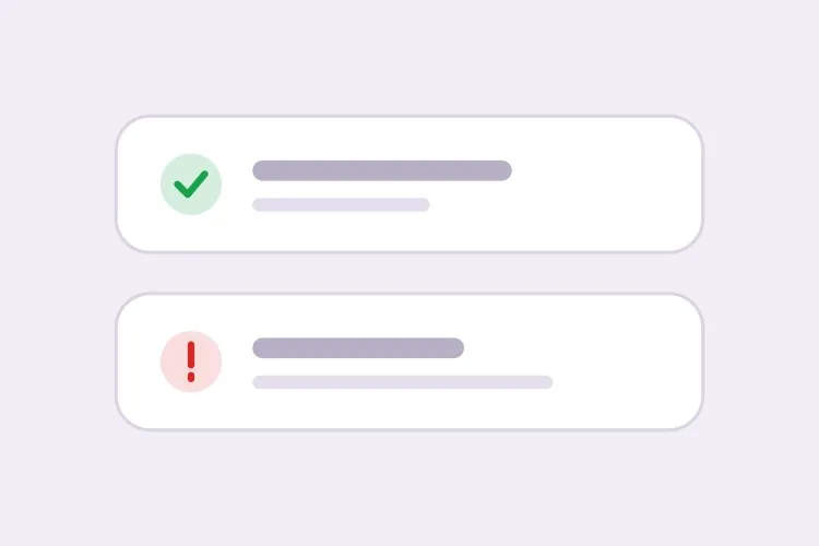
The baseline set. Generating all four together is what keeps the icon shapes distinguishable from each other rather than four recolors of one glyph.

Create an inline alert component with four severities — info in blue with a circle icon, success in green with a check, warning in amber with a triangle, error in red with an octagon. Each is full width within its container with a 4px left accent bar in the severity color, a background tinted to roughly 8% of that color, 16px padding, an 8px radius, and a 20px icon aligned to the first text line rather than vertically centered. Render a semibold 15px title with an optional 14px muted description below. Because the alert renders with the page rather than appearing dynamically, use role="region" with an aria-label naming the severity, not role="alert" — an assertive live region on initial paint talks over everything else. Check every tinted background against its text color for 4.5:1 contrast.

Try in MeDo
ClosableDismissible

Alert With an Opt-In Close Button

Dismissal has to be per-instance, not global. A close button on an expired-payment alert lets the user hide a problem that still exists, and they will.

Add an opt-in dismiss control to an inline alert: a 32px icon button on the right with aria-label="Dismiss" and a visible focus ring, rendered only when a dismissible prop is passed so permanent alerts cannot be closed by accident. On dismiss, remove the alert from the DOM and move focus to the next focusable element after it rather than leaving focus on a detached node. Animate the collapse with height and opacity over 150ms, and skip the animation entirely under prefers-reduced-motion. Accept an onDismiss callback so the caller can persist the dismissal, and document that the alert should reappear on the next session while the underlying condition is unresolved.

Try in MeDo
With actionActionable

Alert Carrying One Next Step

An alert that names a problem without a route out of it just relocates the work. One action, concretely worded — two actions and neither reads as the primary.

Create an alert variant with a single inline action below the description, rendered in the severity color as a text link with an underline on hover and focus. Keep it to exactly one action so the next step is unambiguous, and require concrete wording in the label — "Update payment method", not "Learn more". If the action navigates, use an anchor; if it mutates state, use a button, and show an inline pending state on the button rather than replacing the alert while the request is in flight. Place the action inside the alert region so its purpose is announced together with the message, and keep its hit area at least 44px tall on touch.

Try in MeDo
CompactField Error

Single-Line Error Under an Input

No title, no icon block, no accent bar — just the message wired to the input it belongs to. The full alert anatomy next to a text field is visual noise that pushes the form apart.

Create a compact single-line alert for form-field errors: 13px text in the error color with a 14px inline icon, no title, no accent bar and no background tint, sitting 6px below its input with no vertical margin collapse. Give it a stable ID and reference it from the input with aria-describedby, and set aria-invalid="true" on the input at the same time. Because the message appears in response to a submit attempt, wrap it in role="alert" so it is announced immediately — but render the element only when there is an error rather than keeping an empty live region in the DOM, or the first error will be announced as a change to existing content. Reserve the line height so the layout does not jump when the message appears.

Try in MeDo
GlobalPage Banner

Full-Width Banner Above the App Shell

Trial countdowns, maintenance windows, degraded service. It sits above the layout rather than inside a page, so the thing that breaks is sticky-header offset math, not the alert itself.

Create a full-width alert banner that mounts above the application shell: edge-to-edge tinted background, centered content capped at the app container width, a 16px icon, one line of text and a single inline action, at 44px total height. Because it displaces the layout, expose its height as a CSS custom property on the root element so a sticky header can offset itself instead of being covered. Support a dismissible mode that persists to localStorage keyed by banner ID and version, so editing the message re-shows it to users who dismissed the previous one. Use role="region" with an aria-label rather than role="alert", since the banner is present on load and should not interrupt.

Try in MeDo
ValidationError Summary

Alert Listing Every Failed Field

The summary above the submit button, with one link per failure jumping to its input. It tells the user how many problems exist — the field-level messages tell them what to fix.

Create a validation summary alert for the top of a form: an error-severity block with a title stating the count — "3 fields need attention" — and an unordered list of links, each labelled with the field name plus the specific problem, each jumping to and focusing its input on click. Render it only after a submit attempt fails, give it role="alert" and move keyboard focus to the alert container itself with tabindex="-1" so a screen reader user lands on the summary rather than hunting for it. Rebuild the list on every failed submit and re-announce even when the set of errors is unchanged. Pair it with per-field messages wired through aria-describedby rather than replacing them.

Try in MeDo

How to Customize Your Alert

Pair a distinct icon shape with each color

Ask for a specific icon per severity — a check for success, a triangle for warning, an octagon for error, a circle for info. Shapes stay readable in grayscale and for color-blind users, and they let someone identify the severity from peripheral vision before reading a word.

Decide upfront whether the alert is dismissible

A dismiss button on an alert describing an unresolved condition, such as an expired payment method, lets the user hide a problem that still exists. Make dismissal opt-in per instance and keep alerts permanent when the message should disappear only once the underlying state changes.

Separate page-level banners from field-level errors

A page-level alert summarizes and sits at the top of the form; a field-level error sits directly under its input and is referenced by aria-describedby. Ask for a compact single-line variant for the field case so it does not carry a title and icon block next to a text input.

Write the action into the alert

An alert that describes a problem without a route out of it just relocates the work. Specify one inline action link with concrete wording, such as "Update payment method", and keep it to a single action so the primary next step stays obvious.

Who Uses the Alert Component

SaaS product

A permanent warning banner across the top of the app when a trial has three days left, with an "Upgrade" action link, plus success alerts inside settings pages confirming a saved configuration.

E-commerce store

An info alert on the cart page describing a shipping cutoff, and an error alert above the checkout form summarizing declined-payment details so the message survives the page re-render.

Dashboard or admin tool

Error alerts on data-import screens listing which rows failed validation, and an info alert explaining a scheduled maintenance window that stays visible until the window passes.

Documentation site

Inline callout alerts marking deprecated APIs as warnings and version-specific behavior as info, sitting in the flow of the prose where a floating notification would be useless.

Alert Patterns for Different Websites

The same alert component, tuned to the kind of site it ships on.

01 / 06

SaaS Product Alerts

Trial countdowns and plan limits as permanent banners above the app shell, success alerts inside settings pages after a save. The banner is the tricky one: expose its height as a custom property or your sticky header will sit under it on every route.

Alert Styles and Variants

Pick the variant that matches the rest of the page, then generate it.

01 / 06

Left Accent Bar Alert

A 4px bar in the severity color with a tinted fill. The bar gives the eye a vertical edge to scan a stack of alerts against, which matters when three appear together on a settings page — four flat tinted boxes are much harder to separate.

Alert in React, Next.js, Vue and Svelte

React, Next.js, Vue 3, SvelteKit, Astro or plain HTML — the same alert, six ways to drop it in.

01 / 06

React Alert

A static alert needs no state at all — keep the severity map outside the component so tones and icons stay in one place. Only the dismissible variant needs a hook, so split it out rather than making every alert stateful.

src/components/Alert.tsx

const tones = {
  info: { bar: 'bg-blue-500', bg: 'bg-blue-50', Icon: InfoIcon },
  error: { bar: 'bg-red-500', bg: 'bg-red-50', Icon: OctagonIcon },
}

export function Alert({ severity = 'info', title, children }) {
  const { bar, bg, Icon } = tones[severity]
  return (
    <div role="region" aria-label={severity} className={`flex gap-3 ${bg}`}>
      <span className={`w-1 ${bar}`} />
      <Icon className="mt-0.5 h-5 w-5" />
      <div>
        <p className="font-semibold">{title}</p>
        {children}
      </div>
    </div>
  )
}

How to Add Your Alert to a Project

Four steps, from picking a alert template to shipping it in production.

01~30s

Pick an Alert Pattern

Choose by where the message lives: the four-severity block for in-page state, the compact variant for a field error, the summary for a failed submit, the banner for something app-wide.

02~10s

Copy the Prompt

Take it into MeDo, Lovable, Bolt, v0 or Cursor. Decide whether this alert is dismissible before you run it — that choice determines whether a user can hide an unresolved problem.

03~1min

Generate and Refine

You get all four severities back with a live preview. Follow up in plain English — "add an Update payment method link", "make the error variant outlined", "drop the title on the compact one" — rather than recoloring tints by hand.

04~2min

Place It and Check the Roles

Put page-level alerts above the submit area and field errors under their inputs with aria-describedby. Then confirm the load-time alerts are not using role="alert", or a screen reader will announce them over the rest of the page.

Common Questions About Alert

How do I generate an alert component with AI?

Describe the severities, anatomy, and whether the alert can be dismissed — for example "info, success, warning, and error alerts with a left accent bar, icon, title, description, and an optional action link" — and MeDo generates all four variants from that single description. Because they are produced together, the padding, radius, and icon sizing match across severities.

What is the difference between an alert and a toast?

An inline alert lives in the page layout and persists until the condition it describes changes, so it works for state the user may need to re-read: a billing problem, a maintenance notice, a form error. A toast floats above the page and disappears after a few seconds, so it works for confirming an action the user just performed. Use an alert when the message has to still be there after a scroll or a reload.

Should an alert be dismissible?

Only when the message is informational and the user losing it costs nothing. If the alert describes an unresolved problem, keep it permanent and let it clear itself when the state resolves, otherwise dismissal hides an issue that still needs attention. A common compromise is dismissible with the alert reappearing on the next session until fixed.

Can an alert convey severity without using color?

It has to. Pair each severity with a distinct icon shape and wording that names the situation, so a grayscale screen or a color-blind reader still gets the message. Ask MeDo for icon-plus-text encoding in the prompt and it will assign a different glyph per severity rather than recoloring one icon four times.

Where should a form error alert go?

Put a summary alert directly above the submit area or at the top of the form, and individual messages under their own fields wired up with aria-describedby and aria-invalid. The summary tells the user how many problems exist, the field-level messages tell them what to fix, and having both means keyboard and screen reader users are not hunting for the failure.

Does an alert need role="alert"?

Not always. Use role="alert" only for messages that appear dynamically and need to interrupt, such as a validation failure after a submit attempt. An alert that is present when the page loads should be a plain region or use role="status", because an assertive live region on initial render just talks over everything else on the page.