MeDo

AIバッジジェネレーター。

状態を説明するだけでMeDoがバッジセット全体を生成 — セマンティックなステータスピル、削除可能なタグチップ、99+で丸める数値カウント、アバターに重ねても切れないドットインジケーターまで。

バッジ
バッジ

バッジは最小のコンポーネントでありながら、レイアウトを壊す確率が最も高い

バッジは他の要素の内側に置かれます。テーブルセル、リスト行、ナビゲーション項目、見出しなどです。そのため固有の高さはスタイルの選択ではなくレイアウトの依存関係になります。隣のテキストよりline-heightが1ピクセル高いだけのバッジは、テーブルの全行を静かに引き伸ばし、その不具合は「テーブルの表示がおかしい」として報告され、バッジの問題として扱われません。パディングとフォントメトリクスに任せず、バッジを固定の高さとline-heightに固定することが、どこにでも安全に差し込める条件です。セット全体を一度に生成すれば、すべてのトーンとサイズが構造的に同じ高さスケールを共有します。

6 個のテンプレート

生成できる バッジ テンプレート

どのテンプレートもスクリーンショットではなく実際のプロンプトです。任意の AI エディタに貼り付けるか、MeDo で実行して React + Tailwind のコードを受け取れます。

BasicStatus Pill

Five-Tone Status Pill

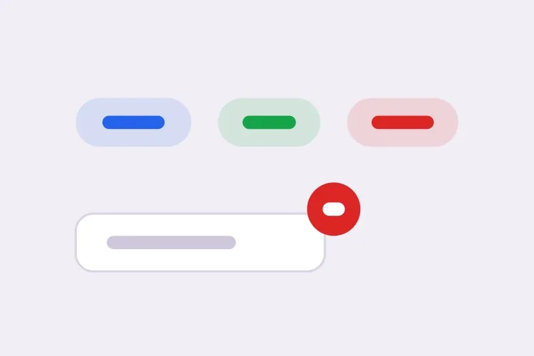
The one you need first. Generating all five tones together is what keeps them on a single height scale, which is what makes the badge safe to drop into a table cell.

Create a status badge with five semantic tones — neutral grey, info blue, success green, warning amber, error red — each pairing a tinted background with a darker text color at 4.5:1 or better. Give it two sizes: sm at 18px tall with 11px text, md at 22px tall with 12px text, both at a 999px radius with 8px horizontal padding, a fixed line-height and inline-flex with align-items center, so a badge dropped into a table cell cannot change the row height. Always render a text label — the tone is redundant encoding, never the only signal. Render it as a span with no tabindex and no role, because a status badge is read-only output and adding a focus stop for it clutters keyboard navigation through a table.
MeDoで試す
NumericCount Badge

Notification Count With 99+ Clamping

A number, a min-width so single digits stay circular, and an announcement when it changes. Without the min-width the badge visibly changes shape as the count crosses from 9 to 10.

Create a numeric count badge that clamps displayed values above 99 to "99+" while keeping the true count in the accessible name. Set min-width equal to the badge height so a single digit renders as a circle rather than a narrow oval, use tabular-nums so the width does not jitter between values, and hide the badge entirely at zero rather than rendering an empty circle. Wrap the count in an element with role="status" and aria-live="polite" so an update is announced without interrupting, and phrase the accessible text as "3 unread messages" rather than a bare numeral. Do not use aria-live="assertive" — a count change almost never justifies cutting off whatever is being read.

MeDoで試す
AnchoredDot Indicator

Dot on an Icon or Avatar

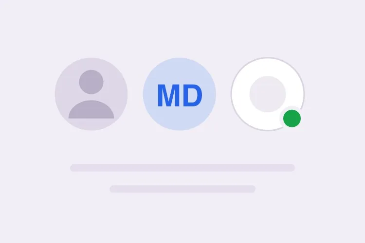
An 8px circle overhanging the corner of a bell or an avatar. The failure is always the same: the wrapper has overflow: hidden for its rounding and clips the dot in half.

Create a dot indicator that anchors to the top-right of an icon or avatar: an 8px circle positioned absolutely with a small negative offset so it overhangs the edge, plus a 2px ring in the page surface color so it stays legible over a photo or a busy icon. Give the wrapper position: relative and explicitly no overflow: hidden — if the wrapper needs rounding, move the border-radius to an inner element so the dot is not clipped. Because a bare dot conveys nothing to a screen reader or a colorblind user, pair it with a visually hidden label naming the state or count. Mark the dot itself aria-hidden="true" so the label is announced once.

MeDoで試す
InteractiveRemovable Tag

Tag Chip With a Dismiss Button

The only variant that is a control rather than output. A dismiss glyph inside a div is why so many UIs ship tags a keyboard user cannot remove.

Create a removable tag chip: a label plus a dismiss control that is a real button element, not a span with a click handler, with aria-label naming the specific tag such as "Remove design" rather than a generic "Remove". Give the button a 16px glyph inside a 24px hit area, a visible focus ring, and Backspace or Delete as an alternative to Enter when it has focus. After removal, move focus to the next remaining chip, or to the group container when the last one is removed, so focus never lands on a detached node. Announce the removal through a polite live region. Keep the chip on the same height scale as the status badge so a row mixing both stays aligned.

MeDoで試す
With iconIcon + Label

Badge With a Leading Status Icon

A 12px glyph before the label for states that need to be identifiable in peripheral vision — a spinner for running, a check for passed, an octagon for failed in a CI list.

Create a badge variant with a 12px leading icon before the label, one distinct glyph per state so severity survives in grayscale: a check for passed, a spinning arc for running, an octagon for failed, a clock for queued. Mark the icon aria-hidden="true" since the label already carries the meaning. Keep the icon optically aligned to the text baseline rather than centered on the line box, and hold the overall badge height identical to the icon-less variant so a mixed column in a table does not develop two row heights. For the running state, drive the spin with a CSS animation and replace it with a static arc under prefers-reduced-motion rather than removing the icon.

MeDoで試す
SubtleOutline Badge

Bordered Badge for Dense Tables

A 1px border with a transparent fill, for screens where a column of tinted pills turns the table into a heat map. Also the variant that survives a dark theme without retinting.

Create an outlined badge variant: a 1px border in the tone color, a transparent background, and label text in the same tone at a darkened step so it holds 4.5:1 against both light and dark surfaces. Match the filled variant on height, radius, padding and line-height exactly, so the two can be swapped per column without any row reflowing — account for the 1px border inside the box by using box-sizing: border-box rather than reducing the padding. Provide a variant prop with filled and outline values on one component rather than a second component. Verify the border remains visible against a hovered table row background, which is the case that usually makes outline badges disappear.

MeDoで試す

バッジ をカスタマイズする方法

トーンは色ではなく意味で命名する

グリーン、アンバー、レッドではなくsuccess、warning、errorと指定しましょう。セマンティックな名前なら、ダークモードやリブランドのためにパレットを調整しても各使用箇所の名前を変える必要がなく、バッジが状態の伝達ではなく装飾として使われている場面も一目で分かります。

色は必ずラベルと組み合わせる

赤いドットだけでは色覚特性のあるユーザーには何も伝わらず、スクリーンリーダー利用者には一切伝わりません。すべてのステータスバッジがテキストを表示するよう指定し、本当にドットのみが必要な場合は視覚的に隠したラベルを併記して状態が読み上げられるようにしてください。

カウントのオーバーフロー規則を明示する

しきい値を超えたときの挙動 — 通常は"99+"に丸める — を伝え、1桁のカウントが細い楕円ではなく円のままになるようmin-widthを指定しましょう。min-widthがないと、カウントが9から10になる瞬間にバッジの形が目に見えて変わります。

静的なバッジと操作可能なチップを区別する

ステータスバッジはテキストであり、フォーカス可能にすべきではありません。削除可能なタグはコントロールなので、削除操作には実際のbutton、フォーカスリング、「デザインを削除」のようなアクセシブルな名前が必要です。どちらが欲しいかMeDoに伝えないと、クリックできそうに見えてキーボードでは到達できないdivが返ってきます。

バッジ コンポーネントを使うのは誰か

SaaSダッシュボード

テーブルのステータス列に、有効・保留中・失敗を同じ高さスケールの淡色ピルで表示。行を有効から失敗に切り替えても、色とラベルだけが変わり行がずれません。

Eコマースストア

ヘッダーのカートアイコンの右上に"99+"で丸めるカウントバッジを配置し、商品カードには同じトーン体系を再利用した「新着」「在庫わずか」のピルを表示。

プロジェクト管理ツール

タスクカード上のラベルや担当者を表す削除可能なタグチップ。それぞれキーボードで到達できる削除ボタンを持ち、意図的に非インタラクティブな優先度バッジと並びます。

ドキュメントサイト

APIの見出し横に並ぶインラインのバージョン・安定性バッジ — 「Beta」「非推奨」「v2.1」 — 固定のline-heightで、注釈する見出しを引き伸ばしません。

サイト種別ごとの バッジ パターン

同じ バッジ コンポーネントを、掲載するサイトの種類に合わせて調整します。

01 / 06

SaaS Dashboards

A status column of Active, Pending and Failed pills, where the only thing that matters is that switching a row from one tone to another does not shift the row. Consider the outline variant once the table has more than about ten rows — a full column of tinted fills reads as a heat map.

バッジ のスタイルとバリアント

ページ全体のトーンに合うバリアントを選び、そのまま生成します。

01 / 06

Filled Status Pill

A tinted background with darker text at a 999px radius — the default, and the most legible at 11px. Keep the tint light: a saturated fill at this size makes small text harder to read exactly where the label is doing the accessibility work.

React・Next.js・Vue・Svelte での バッジ

React、Next.js、Vue 3、SvelteKit、Astro、素の HTML — 同じ バッジ を 6 通りの方法で組み込めます。

01 / 06

React Badge

Stateless by definition — a status badge is output, so no hooks and no client boundary. Keep the tone map outside the component so the palette can be retuned in one place instead of at each call site.

src/components/Badge.tsx

const tones = {
  neutral: 'bg-zinc-100 text-zinc-700',
  success: 'bg-emerald-100 text-emerald-800',
  error: 'bg-red-100 text-red-800',
}

export function Badge({ tone = 'neutral', size = 'md', children }) {
  return (
    <span className={`inline-flex items-center rounded-full px-2
      ${sizes[size]} ${tones[tone]}`}>
      {children}
    </span>
  )
}

バッジ をプロジェクトに追加する方法

バッジ テンプレートを選んで本番に載せるまでの 4 ステップ。

01~30s

Pick a Badge Variant

Decide first whether you need output or a control: a status pill and a count are read-only, a tag chip is interactive. Then pick the tone set and the two sizes you actually need.

02~10s

Copy the Prompt

Take it into MeDo, Lovable, Bolt, v0 or Cursor. Name your tones semantically — success, warning, error — not by color, so a rebrand or a dark theme does not mean renaming every usage.

03~1min

Generate and Refine

You get the whole set on one height scale with a live preview. Follow up in plain English — "add an outline variant", "clamp at 999+", "make the dot ring match a dark surface" — instead of nudging padding values.

04~2min

Drop It Into a Table and Check the Row Height

Put a badge in a real table cell and a real heading, then compare row heights against a cell without one. If anything grew, the line-height is not pinned and the fix belongs in the component, not the table.

バッジに関するよくある質問

AIでバッジコンポーネントを生成するには?

必要なトーンとモードを1つのプロンプトで説明してください。例えば「5つのセマンティックなステータストーンに加えて、数値カウントバッジと削除可能なタグチップを2サイズで」のように。MeDoは単一のハードコードされたピルではなく、高さスケール・角丸・パディングを共有するセット全体を生成します。

バッジとタグ(チップ)の違いは?

バッジは読み取り専用の出力です。状態や件数を伝えるものでフォーカス可能にすべきではありません。タグやチップはユーザーが操作できる入力で、通常は削除できるため、実際のbutton、フォーカススタイル、アクセシブルな名前が必要です。両者を同一のコンポーネントとして扱うことが、キーボードユーザーが削除できないタグを持つUIが多い理由です。

バッジは色だけで状態を伝えてよいですか?

いいえ。WCAG 1.4.1は色だけを情報伝達の手段にしないことを求めているため、ラベルのない赤いバッジは色覚特性のあるユーザーとスクリーンリーダー利用者に対して不適合です。トーンとあわせてテキストラベル、またはアイコンと視覚的に隠したラベルを表示してください。トーンをセマンティックに説明すれば、MeDoはデフォルトでラベルを含めます。

99を超える通知件数はどう表示すべき?

表示値を丸め、件数がしきい値を超えたら"99+"を表示します。実際の数値が重要ならアクセシブルな名前に残してください。あわせてバッジの高さと同じmin-widthを指定すると、1桁の件数でも円形が保たれます。

カウントバッジの変化をスクリーンリーダーに知らせるべき?

ページ遷移なしにカウントが更新される場合は必要です。aria-live="polite"のリージョンで囲めば、ユーザーを遮らずに新しい値が読み上げられます。文言は簡潔に — 数字だけよりも「未読3件」の方が伝わります。通知件数のために読み上げを中断させる必要はほとんどないため、ここでaria-live="assertive"は避けてください。

ドットバッジをアバターに切れずに配置する方法は?

アバターのラッパーにposition: relativeを設定し、overflow: hiddenを付けないようにしてから、ドットを絶対配置で少しマイナスにオフセットして円から張り出させます。ページのサーフェス色で2pxのリングを追加すると、情報量の多い写真の上でもドットが見分けやすくなります。ラッパーが子要素を切ってしまう場合は、角丸を内側の要素に移してください。