MeDo

AIアラート生成。

メッセージを説明するだけで、MeDoがインラインアラート一式を生成します — 情報・成功・警告・エラーの各バリアントに、アクセントバー、アイコン、タイトル、説明文、任意のアクションリンク、そして恒久表示でない場合は閉じるコントロールを備えます。

アラート
アラート

深刻度は色がなくても伝わらなければならない

アラートは、事の重大さを伝えることそのものが役割である唯一のコンポーネントですが、色はその伝達手段として最も信頼できないチャネルです。男性の約12人に1人が何らかの色覚特性を持ち、赤と緑は最も混同されやすい組み合わせです。同じアラートでも、ダークテーマ、輝度の低いノートPC、グレースケール印刷では区別が完全に失われます。実務的な帰結として、アラートには設計段階から冗長な符号化が必要です — 深刻度ごとに異なるアイコン形状と、読者が色合いから推測することに頼らず状況を明示する文言です。4つの深刻度を1つの説明からまとめて生成することが、アイコンセットを本当に識別可能に保ちます。1つずつではなく互いに対比しながら選ばれるからです。

6 個のテンプレート

生成できる アラート テンプレート

どのテンプレートもスクリーンショットではなく実際のプロンプトです。任意の AI エディタに貼り付けるか、MeDo で実行して React + Tailwind のコードを受け取れます。

BasicFour Severities

Accent-Bar Alert in Four Tones

The baseline set. Generating all four together is what keeps the icon shapes distinguishable from each other rather than four recolors of one glyph.

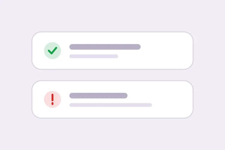
Create an inline alert component with four severities — info in blue with a circle icon, success in green with a check, warning in amber with a triangle, error in red with an octagon. Each is full width within its container with a 4px left accent bar in the severity color, a background tinted to roughly 8% of that color, 16px padding, an 8px radius, and a 20px icon aligned to the first text line rather than vertically centered. Render a semibold 15px title with an optional 14px muted description below. Because the alert renders with the page rather than appearing dynamically, use role="region" with an aria-label naming the severity, not role="alert" — an assertive live region on initial paint talks over everything else. Check every tinted background against its text color for 4.5:1 contrast.

MeDoで試す
ClosableDismissible

Alert With an Opt-In Close Button

Dismissal has to be per-instance, not global. A close button on an expired-payment alert lets the user hide a problem that still exists, and they will.

Add an opt-in dismiss control to an inline alert: a 32px icon button on the right with aria-label="Dismiss" and a visible focus ring, rendered only when a dismissible prop is passed so permanent alerts cannot be closed by accident. On dismiss, remove the alert from the DOM and move focus to the next focusable element after it rather than leaving focus on a detached node. Animate the collapse with height and opacity over 150ms, and skip the animation entirely under prefers-reduced-motion. Accept an onDismiss callback so the caller can persist the dismissal, and document that the alert should reappear on the next session while the underlying condition is unresolved.

MeDoで試す
With actionActionable

Alert Carrying One Next Step

An alert that names a problem without a route out of it just relocates the work. One action, concretely worded — two actions and neither reads as the primary.

Create an alert variant with a single inline action below the description, rendered in the severity color as a text link with an underline on hover and focus. Keep it to exactly one action so the next step is unambiguous, and require concrete wording in the label — "Update payment method", not "Learn more". If the action navigates, use an anchor; if it mutates state, use a button, and show an inline pending state on the button rather than replacing the alert while the request is in flight. Place the action inside the alert region so its purpose is announced together with the message, and keep its hit area at least 44px tall on touch.

MeDoで試す
CompactField Error

Single-Line Error Under an Input

No title, no icon block, no accent bar — just the message wired to the input it belongs to. The full alert anatomy next to a text field is visual noise that pushes the form apart.

Create a compact single-line alert for form-field errors: 13px text in the error color with a 14px inline icon, no title, no accent bar and no background tint, sitting 6px below its input with no vertical margin collapse. Give it a stable ID and reference it from the input with aria-describedby, and set aria-invalid="true" on the input at the same time. Because the message appears in response to a submit attempt, wrap it in role="alert" so it is announced immediately — but render the element only when there is an error rather than keeping an empty live region in the DOM, or the first error will be announced as a change to existing content. Reserve the line height so the layout does not jump when the message appears.

MeDoで試す
GlobalPage Banner

Full-Width Banner Above the App Shell

Trial countdowns, maintenance windows, degraded service. It sits above the layout rather than inside a page, so the thing that breaks is sticky-header offset math, not the alert itself.

Create a full-width alert banner that mounts above the application shell: edge-to-edge tinted background, centered content capped at the app container width, a 16px icon, one line of text and a single inline action, at 44px total height. Because it displaces the layout, expose its height as a CSS custom property on the root element so a sticky header can offset itself instead of being covered. Support a dismissible mode that persists to localStorage keyed by banner ID and version, so editing the message re-shows it to users who dismissed the previous one. Use role="region" with an aria-label rather than role="alert", since the banner is present on load and should not interrupt.

MeDoで試す
ValidationError Summary

Alert Listing Every Failed Field

The summary above the submit button, with one link per failure jumping to its input. It tells the user how many problems exist — the field-level messages tell them what to fix.

Create a validation summary alert for the top of a form: an error-severity block with a title stating the count — "3 fields need attention" — and an unordered list of links, each labelled with the field name plus the specific problem, each jumping to and focusing its input on click. Render it only after a submit attempt fails, give it role="alert" and move keyboard focus to the alert container itself with tabindex="-1" so a screen reader user lands on the summary rather than hunting for it. Rebuild the list on every failed submit and re-announce even when the set of errors is unchanged. Pair it with per-field messages wired through aria-describedby rather than replacing them.

MeDoで試す

アラート をカスタマイズする方法

各色に固有のアイコン形状を組み合わせる

深刻度ごとに具体的なアイコンを指定しましょう — 成功にはチェック、警告には三角、エラーには八角形、情報には丸。形状はグレースケールでも色覚特性のあるユーザーにも読み取れ、一文字も読む前に周辺視野で深刻度を判別できます。

アラートを閉じられるかどうかを先に決める

期限切れの支払い方法など未解決の状態を伝えるアラートに閉じるボタンを付けると、ユーザーは依然として存在する問題を隠せてしまいます。閉じる機能はインスタンス単位のオプトインとし、根底の状態が変わったときにだけ消えるべきメッセージは恒久表示にしましょう。

ページレベルのバナーとフィールドレベルのエラーを分ける

ページレベルのアラートは要約でフォーム上部に置き、フィールドレベルのエラーは対応する入力の直下に置いてaria-describedbyで参照します。フィールド用にはコンパクトな1行バリアントを指定し、テキスト入力の隣にタイトルとアイコンのブロックを抱えないようにしましょう。

アラートの中に次の行動を書く

問題を説明するだけで抜け道を示さないアラートは、作業を移動させるだけです。「支払い方法を更新」のように具体的な文言のインラインアクションリンクを1つだけ指定し、次の一手が明確に保たれるようにしましょう。

アラート コンポーネントを使うのは誰か

SaaS製品

トライアル残り3日のときにアプリ上部へ「アップグレード」アクションリンク付きの恒久的な警告バナーを表示し、設定ページ内では保存された構成を確認する成功アラートを表示します。

Eコマースストア

カートページには配送締め切りを伝える情報アラート、チェックアウトフォームの上には決済拒否の詳細をまとめたエラーアラートを置き、ページの再レンダリング後もメッセージが残るようにします。

ダッシュボードや管理ツール

データインポート画面ではどの行が検証に失敗したかを列挙するエラーアラートを、計画メンテナンス時間帯については終了まで表示され続ける情報アラートを使います。

ドキュメントサイト

非推奨APIを警告、バージョン固有の挙動を情報として示すインラインの注記アラートを、浮動通知では役に立たない本文の流れの中に配置します。

サイト種別ごとの アラート パターン

同じ アラート コンポーネントを、掲載するサイトの種類に合わせて調整します。

01 / 06

SaaS Product Alerts

Trial countdowns and plan limits as permanent banners above the app shell, success alerts inside settings pages after a save. The banner is the tricky one: expose its height as a custom property or your sticky header will sit under it on every route.

アラート のスタイルとバリアント

ページ全体のトーンに合うバリアントを選び、そのまま生成します。

01 / 06

Left Accent Bar Alert

A 4px bar in the severity color with a tinted fill. The bar gives the eye a vertical edge to scan a stack of alerts against, which matters when three appear together on a settings page — four flat tinted boxes are much harder to separate.

React・Next.js・Vue・Svelte での アラート

React、Next.js、Vue 3、SvelteKit、Astro、素の HTML — 同じ アラート を 6 通りの方法で組み込めます。

01 / 06

React Alert

A static alert needs no state at all — keep the severity map outside the component so tones and icons stay in one place. Only the dismissible variant needs a hook, so split it out rather than making every alert stateful.

src/components/Alert.tsx

const tones = {
  info: { bar: 'bg-blue-500', bg: 'bg-blue-50', Icon: InfoIcon },
  error: { bar: 'bg-red-500', bg: 'bg-red-50', Icon: OctagonIcon },
}

export function Alert({ severity = 'info', title, children }) {
  const { bar, bg, Icon } = tones[severity]
  return (
    <div role="region" aria-label={severity} className={`flex gap-3 ${bg}`}>
      <span className={`w-1 ${bar}`} />
      <Icon className="mt-0.5 h-5 w-5" />
      <div>
        <p className="font-semibold">{title}</p>
        {children}
      </div>
    </div>
  )
}

アラート をプロジェクトに追加する方法

アラート テンプレートを選んで本番に載せるまでの 4 ステップ。

01~30s

Pick an Alert Pattern

Choose by where the message lives: the four-severity block for in-page state, the compact variant for a field error, the summary for a failed submit, the banner for something app-wide.

02~10s

Copy the Prompt

Take it into MeDo, Lovable, Bolt, v0 or Cursor. Decide whether this alert is dismissible before you run it — that choice determines whether a user can hide an unresolved problem.

03~1min

Generate and Refine

You get all four severities back with a live preview. Follow up in plain English — "add an Update payment method link", "make the error variant outlined", "drop the title on the compact one" — rather than recoloring tints by hand.

04~2min

Place It and Check the Roles

Put page-level alerts above the submit area and field errors under their inputs with aria-describedby. Then confirm the load-time alerts are not using role="alert", or a screen reader will announce them over the rest of the page.

アラートに関するよくある質問

AIでアラートコンポーネントを生成するには?

深刻度、構成要素、閉じられるかどうかを説明してください — たとえば「左アクセントバー、アイコン、タイトル、説明、任意のアクションリンクを備えた情報・成功・警告・エラーのアラート」— MeDoはその1つの説明から4つのバリアントすべてを生成します。まとめて生成されるため、パディング、角丸、アイコンサイズが深刻度間で揃います。

アラートとトーストの違いは何ですか?

インラインアラートはページのレイアウト内に存在し、伝えている状態が変わるまで残ります。そのため請求の問題、メンテナンス告知、フォームエラーなど、ユーザーが読み返す必要のある状態に向いています。トーストはページの上に浮かび数秒で消える一時的な通知なので、ユーザーが今行った操作の確認に向いています。スクロールや再読み込みの後でもメッセージが残っていなければならない場合はアラートを使ってください。

アラートは閉じられるようにすべきですか?

メッセージが情報提供のみで、見失っても損失がない場合に限ります。未解決の問題を伝えるアラートは恒久表示のままにし、状態が解決したときに自ら消えるようにしてください。そうしないと、閉じる操作がまだ対応の必要な問題を隠してしまいます。よく使われる妥協案は、閉じられるが解決するまで次のセッションで再表示する方式です。

アラートは色を使わずに深刻度を伝えられますか?

伝えられなければなりません。各深刻度に固有のアイコン形状と、状況を名指しする文言を組み合わせれば、グレースケールの画面でも色覚特性のある読者にもメッセージが届きます。プロンプトでアイコン+テキストの符号化をMeDoに求めれば、1つのアイコンを4回塗り替えるのではなく深刻度ごとに異なるグリフを割り当てます。

フォームエラーのアラートはどこに置くべきですか?

要約アラートは送信エリアの直上かフォームの先頭に置き、個別のメッセージは各フィールドの下にaria-describedbyとaria-invalidで結び付けて置きます。要約は問題がいくつあるかを伝え、フィールドレベルのメッセージは何を直すかを伝えます。両方あることで、キーボードやスクリーンリーダーの利用者が失敗箇所を探し回らずに済みます。

アラートにrole="alert"は必要ですか?

常に必要ではありません。role="alert"は、送信試行後の検証エラーのように動的に現れて割り込む必要があるメッセージにのみ使ってください。ページ読み込み時から存在するアラートは通常のregionにするかrole="status"を使うべきです。初回レンダリングでassertiveなライブリージョンを使うと、ページ上の他のすべてを読み上げでかき消してしまいます。