MeDo

AIタブジェネレーター。

パネルを説明するだけで、MeDoが完全なタブコンポーネントを生成します — 正しいARIAロール、矢印キー操作、アニメーションするアクティブインジケーター、モバイルのオーバーフロー処理、そしてURLと同期しリロードしても維持されるアクティブタブ。

タブ
タブ

タブはスタイリングの判断に見えて、実はルーティングの判断です

タブセットは単にコンテンツを隠すのではなく、1つのURLを共有する複数のビューへページを分割します。誰かが料金タブを共有したい、サポート記事からリンクしたい、あるいは位置を失わずにリロードしたいと思った瞬間に、コンポーネントはReactの外側で生きる本物の状態を必要とします。多くのチームはタブを公開した後にこれに気づき、アニメーションと初期レンダリングと衝突するクエリ文字列処理を後付けします。アクティブなタブをローカルstateではなくURLから導出すると最初から決めておけば、コンポーネント全体が単純になります。トリガーはリンクのようなアクションになり、ディープリンクは自然に機能し、サーバーレンダリングは最初のペイントで正しいパネルを出力します。マークアップの書き方そのものも変わるため、後から改修するよりも最初からその形で生成するほうが圧倒的に安く済みます。

6 個のテンプレート

生成できる タブ テンプレート

どのテンプレートもスクリーンショットではなく実際のプロンプトです。任意の AI エディタに貼り付けるか、MeDo で実行して React + Tailwind のコードを受け取れます。

BasicUnderline

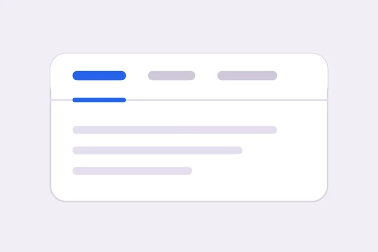
Underlined Tab Row With a Sliding Indicator

The default that reads as tabs without any explanation. Reach for it when the panels are static content and you want the indicator to do the signalling rather than a border box.

Create a tabs component with four triggers using the ARIA tabs pattern: role="tablist" on the container, role="tab" with aria-selected and aria-controls on each trigger, and role="tabpanel" with aria-labelledby on each panel. Use roving tabindex so only the selected tab has tabindex 0 and Tab moves out of the group entirely rather than through it. Left and Right arrows move focus and wrap at both ends, Home and End jump to the first and last tab, and activation is automatic because the panels are static text. Triggers are 40px tall with 15px medium labels, muted grey when inactive and near-black when active. Measure the active trigger and slide a 2px underline using translateX and scaleX over 200ms — never animate left or width.

MeDoで試す
SegmentedPill Segmented

Segmented Control With a Sliding Pill

Two or three mutually exclusive options that belong on one control, like monthly versus annual. Do not use it past four tabs — the track stops fitting on a phone and equal widths force truncation.

Create a segmented-control tabs component: one rounded 36px-tall track with a light grey background and 2px inner padding, holding three equal-width triggers. The active trigger is a white pill with a soft shadow that moves between positions with translateX over 180ms, so the label text never reflows mid-transition. Keep the full ARIA tabs roles and roving tabindex — Left and Right arrows move focus with wrapping, Home and End jump to the ends, and activation is automatic. Give every trigger the same explicit min-width so switching from a short label to a long one does not resize the track. Under prefers-reduced-motion, cross-fade the pill background instead of sliding it.

MeDoで試す
Deep linkableURL-Synced

Tabs Backed by a Query Parameter

The active tab lives in the URL, so support can link to one panel and a reload keeps your place. Worth doing before launch, because retrofitting it means rewriting the initial render.

Create a tabs component whose active tab is derived from a ?tab= query parameter rather than local state, so the first server render already paints the correct panel with no post-hydration flash. Read the parameter, validate it against the known tab ids, and fall back to the first tab when the value is unrecognised. On selection, write the new value with a replace-style navigation so the back button is not filled with tab switches, and preserve every other query parameter already on the URL. Keep the ARIA tabs wiring intact: roving tabindex, Left and Right arrows with wrapping, Home and End, and manual activation on Enter or Space.

MeDoで試す
OverflowScrollable

Horizontally Scrolling Tablist

What happens when seven labels meet a 390px viewport. The part teams forget is scrolling the newly focused tab into view — arrow keys otherwise move focus to a tab nobody can see.

Create a tabs component that handles overflow by scrolling rather than wrapping or clipping. Under 640px the tablist scrolls horizontally with momentum, the scrollbar is hidden, and a gradient fade appears on either edge only while content remains in that direction. When Left or Right arrow moves the roving tabindex, call scrollIntoView with inline nearest on the newly focused trigger so keyboard focus is never off screen, and do the same for Home and End. Use scroll-snap-align on each trigger so a flick settles on a label boundary instead of mid-word. Keep the full ARIA roles and aria-controls wiring, and recompute the indicator position on scroll and on resize.

MeDoで試す
PerformanceLazy Panels

Tabs With Deferred Panel Mounting

Only the active panel mounts, so opening Settings does not fetch invoices nobody asked for. The catch is state loss, so name the panels that must survive a switch.

Create a tabs component that mounts only the active panel and keeps every inactive panel out of the DOM entirely, so charts, video players and data fetches for unseen tabs never run. Use manual activation — arrow keys move the roving tabindex and only Enter or Space commits the change — because automatic activation would fire a request for every tab a keyboard user passes through. Accept a keepMounted list of tab ids whose panels stay in the DOM hidden with the hidden attribute instead, for panels holding half-filled forms or scroll position. Show a skeleton inside a newly mounted panel while its data resolves, and keep the panel container height stable so the page below does not jump.

MeDoで試す
SidebarVertical

Vertical Tabs for Settings Screens

A left rail of labels beside one panel. The one thing that changes beyond layout is the arrow axis — Up and Down, not Left and Right, and aria-orientation has to say so.

Create a vertical tabs component for a settings screen: a 200px left rail of triggers with a single panel to its right. Set aria-orientation="vertical" on the tablist and bind Arrow Up and Arrow Down to move the roving tabindex with wrapping, since Left and Right are wrong on this axis; keep Home and End for the ends. Triggers are left-aligned rows, 36px tall, with a 2px indicator on the left edge that translates vertically over 200ms. Below 768px collapse the rail into a horizontal scrolling tablist above the panel and switch the arrow bindings and aria-orientation to match. Use manual activation, and give the panel tabindex="-1" so a programmatic focus move after selection is possible.

MeDoで試す

タブ をカスタマイズする方法

自動アクティベーションか手動かを意図的に選ぶ

自動アクティベーションは矢印キーでフォーカスが移動するたびにパネルを切り替えます。高速ですが、パネルのレンダリングが重い場合やデータを取得する場合には使えません。手動アクティベーションは先にフォーカスだけを移動し、Enter または Space で初めて切り替えます。キーボード処理のコードが変わるので、どちらが必要かを明示してください。

インジケーターは width ではなく transform でアニメーションする

アクティブなトリガーを計測し translateX と scaleX でスライドする下線をリクエストしてください。left と width のアニメーションはフレームごとにレイアウトを乱し、サブピクセル境界でちらつき、tablist がスクロール可能になると完全に壊れます。

タブがあふれたときの挙動を決める

短いラベル4つはスマートフォンに収まりますが、7つは収まりません。挙動を1つ選んで明示してください。端をフェードさせた横スクロールの tablist、2行目への折り返し、あるいはブレークポイント未満でネイティブの select に畳む方法です。指定がないと、生成されたタブはたいてい単に切り取られます。

非アクティブなパネルをマウントし続けるか明示する

非アクティブなパネルをアンマウントするとDOMが小さく保たれ、誰も見ていないチャートや動画プレーヤーが動くのを防げますが、スクロール位置や入力途中のフォームも失われます。状態を保持したいパネルを伝えれば、それらは代わりにCSSで非表示にされます。

タブ コンポーネントを使うのは誰か

料金ページ

月額と年額の請求を単一の価格表の上に2つのタブとして配置し、選択をURLに書き込むことで営業が年額プランへ直接リンクでき、年間割引が初回読み込み時から見えるようにします。

製品ドキュメント

curl、Node、Python、Goなど言語別に分けたコードサンプル。一度言語を選ぶとページ上のすべてのタブグループに適用され、次回訪問時にも記憶されます。

ダッシュボードや管理ツール

プロフィール、チーム、請求、APIキーのタブを持つ設定画面。各パネルは遅延マウントされるため、設定を開いただけで誰も求めていない請求書を取得することはありません。

ECの商品ページ

ギャラリーの下に説明、仕様、レビューをタブとして配置し、トリガーのラベルにレビュー件数を表示。説明はページ本文にも描画して、主要なコピーがタブの裏だけにならないようにします。

サイト種別ごとの タブ パターン

同じ タブ コンポーネントを、掲載するサイトの種類に合わせて調整します。

01 / 06

SaaS Pricing Page Tabs

Monthly and annual billing as a two-tab segmented control above one price grid. Sync the choice to the URL so a sales email can open annual pricing directly — a pricing page where the discount is one unshareable click away is losing the conversation before it starts.

タブ のスタイルとバリアント

ページ全体のトーンに合うバリアントを選び、そのまま生成します。

01 / 06

Underlined Tabs

A muted label row with a 2px indicator sliding beneath the active trigger. The most legible default because the underline gives the eye a single moving object to track. Animate it with translateX and scaleX — animating left and width thrashes layout every frame and jitters on subpixel boundaries.

React・Next.js・Vue・Svelte での タブ

React、Next.js、Vue 3、SvelteKit、Astro、素の HTML — 同じ タブ を 6 通りの方法で組み込めます。

01 / 06

React Tabs

Keep the selected id in one piece of state and derive tabindex from it — that is the whole roving tabindex mechanism. Hold refs to the triggers so the arrow handler can focus the next one directly.

src/components/Tabs.tsx

const [active, setActive] = useState(tabs[0].id)

<div role="tablist" onKeyDown={onArrowKeys}>
  {tabs.map((t) => (
    <button
      key={t.id}
      role="tab"
      aria-selected={t.id === active}
      aria-controls={`panel-${t.id}`}
      tabIndex={t.id === active ? 0 : -1}
      onClick={() => setActive(t.id)}
    >
      {t.label}
    </button>
  ))}
</div>

タブ をプロジェクトに追加する方法

タブ テンプレートを選んで本番に載せるまでの 4 ステップ。

01~30s

Pick a Tabs Template

Choose by constraint, not by looks: segmented for two or three alternatives, scrollable once labels overflow a phone, vertical for a long settings rail, lazy when a panel fetches data.

02~10s

Copy the Prompt

Take the prompt into MeDo, Lovable, Bolt, v0 or Cursor, then edit two things — your real tab labels, and whether activation is automatic or manual. That second choice changes the keyboard code, so decide it before you generate.

03~1min

Generate and Refine

You get React + Tailwind back with a live preview. Follow up in plain English — "sync the active tab to ?tab=", "collapse to a select under 640px", "keep the chart panel mounted" — rather than editing the keydown handler by hand.

04~2min

Wire the Panels and Ship

Replace the placeholder panels with your real content and check three things with the keyboard only: Tab enters and leaves the group in one stop, arrows move within it, and a reload on a deep link opens the right panel.

タブに関するよくある質問

AIでアクセシブルなタブコンポーネントを生成するには?

タブのラベルと望む挙動を、アクティベーションが自動か手動かも含めて1つのプロンプトで説明してください。MeDoは tablist、tab、tabpanel の各ロールを、対応する aria-controls と aria-labelledby の紐付けとともに生成し、さらに roving tabindex により矢印キーでタブ間を移動し、Tab キーではグループ全体から抜けるようにします。

自動アクティベーションと手動アクティベーションの違いは?

自動アクティベーションでは矢印キーでフォーカスを移した時点でそのパネルが表示され、軽量な静的コンテンツに向いています。手動アクティベーションでは矢印キーはフォーカスのみを移動し、ユーザーが Enter または Space で確定します。パネルがデータを取得する、チャートを描画する、その他処理が遅い場合は必ず手動にしてください。自動だとキーボード利用者が通過するタブごとにリクエストが発生します。

特定のタブに直接リンクできますか?

はい。アクティブなタブをコンポーネントのstateではなくURLに保存していれば可能です。?tab=pricing のようなクエリパラメーターで初期レンダリングを決め、replace 方式のナビゲーションで更新するようリクエストしてください。そうすれば戻るボタンの履歴がタブ切り替えで埋まりません。この用途にハッシュフラグメントは避けてください。ブラウザが同じidの要素までスクロールしようとするためです。

非アクティブなタブに隠れたコンテンツはSEOに悪影響がありますか?

検索エンジンはパネルが視覚的に隠れていてもHTMLに存在するテキストをインデックスするため、タブ内のコンテンツが見えないわけではありません。ただし訪問者がすぐ目にするコンテンツより副次的に重み付けされるのが一般的で、クリック後にのみ描画されるパネルはまったくクロールされないこともあります。主要な見出し、価値提案、ターゲットキーワードは常に表示される部分に置き、タブは補足的な詳細に使ってください。

モバイルでタブはどう振る舞うべきですか?

ラベルを縮めるのではなく、単一の戦略を選んでください。あふれる端をフェードさせた横スクロールの tablist は短いラベル6つ程度までなら快適です。それを超える場合はネイティブの select に畳むほうがタップ領域が大きく、隠れたタブも生じません。ブレークポイントと戦略をMeDoに伝えれば、1つのコンポーネントから両方のレイアウトを生成します。

タブとアコーディオンのどちらを使うべき?

請求期間やコードの言語のように、ユーザーが一度に1つずつ比較する選択肢がパネルであり、ラベルが1行に収まるほど短い場合はタブを使ってください。セクションが独立した項目で複数同時に開きたい場合、ラベルが完全な疑問文の場合、あるいは内容が長く縦に積んだ方が読みやすい場合はアコーディオンを使ってください。FAQ一覧はアコーディオンの典型例であり、タブの用途ではありません。