MeDo

AIブログセクション生成ツール。

希望するブログレイアウト — カードスタイル、記事数、注目記事、カテゴリーフィルター — を説明するだけで、MeDoが完全なコンポーネントを生成します。CSSグリッドのプロパティに一切触れることなく、洗練されたブログセクションを仕上げましょう。

ブログセクション
ブログセクション

優れたブログセクションは読者をリピーターに変えます。

ブログはSEOと信頼構築において最も効果的なアセットの一つです — ただし、訪問者が実際にコンテンツを見つけて探索できる場合に限ります。よく設計されたブログセクションは、最良のコンテンツをすぐに表示し、可視化されたカテゴリーを通じてテーマの権威を伝え、読者をランディングページからコンテンツファネルへと誘導します。MeDoを使えば、汎用テーマに合わせるのではなく、ブランドとコンテンツ量にぴったり合ったレイアウトを生成できます。

6 個のテンプレート

生成できる ブログセクション テンプレート

どのテンプレートもスクリーンショットではなく実際のプロンプトです。任意の AI エディタに貼り付けるか、MeDo で実行して React + Tailwind のコードを受け取れます。

Three cardAcme

Three-Card Homepage Preview

The smallest blog section that still looks intentional. Three posts and a View all link — enough to prove the blog is alive without turning a marketing page into an index.

Create a blog preview section with a section heading, a one-line subheading and a three-column card grid. Each card holds a 16:9 cover image in a fixed aspect-ratio box, a category pill above the title, a two-line title clamped with line-clamp-2, a two-line excerpt clamped with line-clamp-2, and a footer row with author name, publish date in a time element with a machine-readable datetime, and a reading-time estimate. Make the whole card one link with the heading as the accessible name rather than adding a separate Read more link. Below the grid, a centred View all posts link. Two columns on tablet, one on mobile, with the cover images lazy loaded.

MeDoで試す
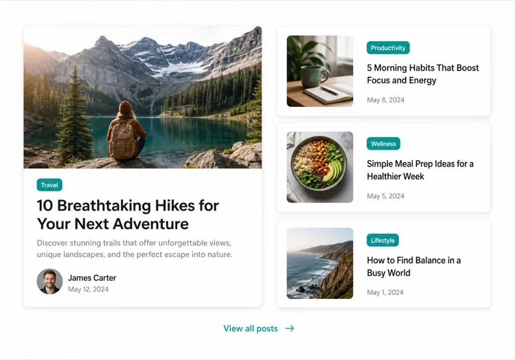
Featured splitEditorial

One Featured Post, Three Stacked

Creates a clear lead story, which an even grid never does. Only works if the featured post is genuinely your best — promoting whatever published last makes the asymmetry look arbitrary.

Create an asymmetric blog section: on the left, a featured post card taking about 60% of the width with a large 3:2 cover image, a category pill, a headline at display size, a three-line excerpt and an author row with avatar, date and reading time. On the right, three compact cards stacked vertically, each with a small square thumbnail on the left and a category, a two-line clamped title and a date on the right. Divide the stacked cards with hairline rules rather than shadows so they read as a list next to the feature. Stack the feature above the list on tablet and below on mobile, keeping the feature image eager loaded.

MeDoで試す
Index gridMega

Paginated Post Index

The standalone blog page rather than a homepage teaser. Nine cards is the ceiling before the grid stops being scannable — past that, pagination beats a longer page or infinite scroll.

Create a blog index section: a page heading, a horizontal row of category filter chips, and a nine-card grid at three columns. Each card carries a cover image in a fixed 16:9 box, a category pill, a clamped two-line title, a clamped two-line excerpt, and a meta row with author, a time element for the date and a reading time. Below the grid, numbered pagination with previous and next controls, aria-current on the active page, and real anchor hrefs to /blog/page/2 so pages are crawlable and linkable rather than swapped in by client state. Show a labelled empty state when a filter returns nothing. Two columns on tablet, one on mobile.

MeDoで試す
Text listLedger

Dated List With No Images

No thumbnails, just date, title and one line of description. Faster to scan than any card grid and the honest choice when your posts have no cover art — a grid of stock photography reads worse than plain text.

Create an image-free blog list: rows separated by hairline rules, each row showing a left-aligned date in a fixed-width muted column, then the post title as a link at large text size, a one-line clamped description beneath it, and a right-aligned reading time. Group the rows under year headings when the list spans multiple years. Give each row a full-width hover background so the whole row reads as the hit target, and keep the vertical rhythm tight so twenty posts fit in two screens. Stack the date above the title on mobile. Use an ordered list with time elements for the dates.

MeDoで試す
Category tabsStudio

Topic Tabs Over a Card Grid

Turns a mixed blog into something a reader can navigate by interest. Needs at least a few posts per tab — a tab that opens onto two articles makes the blog look thinner than one undivided grid would.

Create a blog section with topic tabs above a six-card grid: tabs labelled All, Engineering, Design and Product with a post count beside each. Use real tab semantics — a tablist with arrow-key navigation, aria-selected, and managed focus — and reflect the active tab in the URL so a topic view is linkable. Switching a tab swaps the card set with a short fade rather than a layout jump, and keeps the grid height stable by always rendering a fixed number of card slots. Each card has a cover image, category pill, clamped title and excerpt, and a meta row with author and date. Announce the result count in an aria-live region.

MeDoで試す
ChangelogShipfast

Release Notes Timeline

A blog section for product updates, where version and date matter more than a cover image. Keep the newest entry expanded and the rest collapsed so the page opens on what changed most recently.

Create a changelog-style blog section: a vertical timeline with a left rail of dots and connecting line, each entry showing a version tag, a date in a time element, a type pill for Added, Fixed or Changed, a title and a two-to-three sentence summary. Expand the most recent entry by default and render the rest as collapsed disclosure panels using button plus aria-expanded so keyboard users can open them. Add anchor links on each version so a specific release can be linked directly, and a Subscribe to updates link at the top of the section. Collapse the left rail to a simple stacked list on mobile.

MeDoで試す

ブログセクション をカスタマイズする方法

注目記事でリードする

最も重要な記事を大きなカードで強調表示 — フルワイドのカバー画像、長めの抜粋、明確なビジュアル処理を含めます。MeDoにどの記事が「featured」かを伝えると、非対称レイアウトが自動的に作成されます。

カテゴリーまたはタグフィルターを追加する

複数のトピックで公開している場合は、MeDoにグリッドの上に横向きのフィルターバーを含めるよう依頼してください。これにより、ブログセクションがセルフサービスの発見ツールになり、読者がページに長く滞在するようになります。

著者コンテキストを表示する

著者アバター、名前、推定読了時間を含めると、信頼感が生まれ、読者の期待値が設定されます。プロンプトでこれらのメタデータフィールドに言及すると、各カードに組み込まれます。

記事数でカードの密度を制御する

表示する記事数を正確に指定してください — ホームページのコンパクトなプレビューには3枚、独立したブログインデックスページには6〜9枚。マーケティングページで無限グリッドを避けるために「すべて表示」CTAと組み合わせてください。

ブログセクション コンポーネントを使うのは誰か

SaaSマーケティングサイト

ホームページにある3カードプレビューセクションで、製品チュートリアル、顧客事例、リリースノートへのリンクを提供し、コンバージョンフローを邪魔せずにブログトラフィックを促進します。

コンテンツ重視のパブリケーション

ヒーロー記事、カテゴリータブ、ページ化されたカードグリッドを備えたフルワイドの編集レイアウト — プロフェッショナルなパブリケーションに読者が期待するすべて。

エージェンシーまたはスタジオ

ケーススタディとソートリーダーシップ記事のミニマルな2カラムモザイクで、クリックする前から見込み客に専門性の深さを示します。

Eコマースブランド

購買ガイド、トレンドまとめ、舞台裏ストーリーへのリンクを持つ大きな画像と短いティーザーを備えたライフスタイルブログセクションで、購買意向を高めます。

サイト種別ごとの ブログセクション パターン

同じ ブログセクション コンポーネントを、掲載するサイトの種類に合わせて調整します。

01 / 06

SaaS Marketing Blog Section

A three-card teaser on the homepage, not an index. The job is proving the product is maintained and that someone is writing about the problem, so lead with the tutorial or customer story — release notes belong in their own changelog, not competing for the same three slots.

ブログセクション のスタイルとバリアント

ページ全体のトーンに合うバリアントを選び、そのまま生成します。

01 / 06

Three-Card Grid

Equal cards in one row with a View all link beneath. The right default on a marketing page where the blog is supporting evidence rather than the destination, and it stays honest when you have only published a handful of posts.

React・Next.js・Vue・Svelte での ブログセクション

React、Next.js、Vue 3、SvelteKit、Astro、素の HTML — 同じ ブログセクション を 6 通りの方法で組み込めます。

01 / 06

React Blog Section

Keep the posts in one typed array and let the card be a pure function of a post. No state is needed unless you add filters, which is what makes this section safe to render on the server.

src/components/BlogSection.tsx

type Post = { slug: string; title: string; excerpt: string; date: string; minutes: number }

export function BlogSection({ posts }: { posts: Post[] }) {
  return (
    <ul className="grid gap-8 md:grid-cols-3">
      {posts.map((post) => (
        <PostCard key={post.slug} post={post} />
      ))}
    </ul>
  )
}

ブログセクション をプロジェクトに追加する方法

ブログセクション テンプレートを選んで本番に載せるまでの 4 ステップ。

01~30s

Pick a Blog Layout

Choose by post volume and by whether you have cover art — three cards for a homepage teaser, a featured split when one post should lead, a dated list when the posts have no images worth showing.

02~10s

Copy the Prompt

Take the prompt into MeDo, or paste it into Lovable, Bolt, v0 or Cursor. Name the metadata you actually have first — author, reading time, category — since a card designed around fields you cannot populate is the usual reason these sections get rebuilt.

03~1min

Generate and Refine

You get React + Tailwind back with a live preview. Follow up in plain English — "clamp titles to two lines", "drop the excerpt on mobile", "move the category above the title" — instead of tuning class strings by hand.

04~2min

Connect Your Posts

Point the component at your real source — an MDX directory, a content collection or a CMS query — and map the fields once. Sort by date server-side and let the card stay a pure function of a post.

ブログセクションに関するよくある質問

AIでブログセクションを作成するにはどうすればよいですか?

MeDoを開いて、必要なブログレイアウトを説明してください — カードスタイル、記事数、注目記事が欲しいかどうか、表示するメタデータフィールド(著者、日付、読了時間)、フィルターなど。MeDoが数秒でコンポーネントコード全体を生成します。それをプロジェクトにコピーして、追加のプロンプトで磨き上げることができます。

最高のAIブログセクション生成ツールは何ですか?

MeDoはデザインモックアップだけでなく、本物のウェブサイトコンポーネントを生成するために特別に構築されています。一般的なAIチャットツールとは異なり、MeDoはレイアウトシステム、カードパターン、レスポンシブな動作を理解しています — そのため、ブログセクションは大幅な編集が必要な出発点ではなく、クリーンな本番対応コードとして出力されます。

AIはレスポンシブなブログカードグリッドを生成できますか?

はい。MeDoはレスポンシブファーストのコンポーネントを生成します。デスクトップサイズで何列表示したいかを指定すると、自動的にブレークポイントを処理し、モバイルでは余分な作業なしに1カラムスタックに折りたたみます。

AIが生成したブログセクションにカテゴリーフィルターを追加するにはどうすればよいですか?

プロンプトにフィルター要件を含めてください — 例えば、「カードグリッドの上にデザイン、エンジニアリング、プロダクトのカテゴリーフィルタータブを追加してください。」MeDoがフィルターUIと一致する条件表示ロジックを生成します。

AIを使って注目ブログ記事のレイアウトを生成できますか?

もちろんです。MeDoに大きな注目カードと隣の小さなセカンダリカードを持つ非対称レイアウトを依頼してください。この編集パターンは、複数の最新記事を表示しながらコーナーストーンコンテンツを強調する最も効果的な方法の一つです。

AIが生成したブログセクションには著者と日付のメタデータが含まれますか?

はい — プロンプトで希望するメタデータを言及するだけです。MeDoは著者名とアバター、公開日、推定読了時間、カテゴリータグ、抜粋を含めることができます。各カードに何を表示するかを完全にコントロールできます。