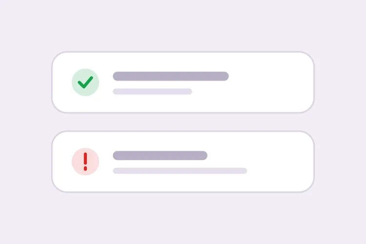
AI Toast Generator.

Describe your notification behavior and MeDo generates the full toast system — four semantic types, a stacking queue, auto-dismiss timers that pause on hover, swipe-to-dismiss on touch, and correct aria-live politeness for each type.

Toast
Toast

A Toast Is a Timer, a Queue, and a Live Region Pretending to Be a Box

The visual part of a toast takes minutes. Everything underneath it does not. A toast has to decide how long it stays, what happens when three arrive at once, what happens when the user is mid-sentence in a form, and how a screen reader hears it without being interrupted. The non-obvious consequence is that toast bugs surface as trust bugs: a save confirmation that vanishes before it is read, or an error that disappears while the user is reading the field it refers to, teaches people not to believe the interface. Generating the timing rules, queue limits, and live-region politeness together keeps those decisions consistent instead of scattered across whichever call site fired the notification.

6 templates

Toast Templates You Can Generate

Every template is a real prompt, not a screenshot. Copy it into any AI editor, or run it in MeDo and get React + Tailwind code back.

BasicFour Tones

Success, Error, Warning, Info Stack

The baseline set, and the only one where per-type rules matter more than styling. Errors that auto-dismiss are the single most common toast bug in production.

Create a toast system with four semantic types — success with a check icon and green accent, error with an alert icon and red accent, warning with a triangle and amber accent, info with a circle and blue accent. Each toast is 360px wide with a 12px radius, 16px padding, a semibold title, an optional description and a close button with an accessible label. Stack in the bottom-right with 8px gaps, newest on top, three visible at once and the rest queued. Auto-dismiss success, info and warning after 5000ms; keep errors until the user closes them. Wrap non-error toasts in role="status" with aria-live="polite" and give errors role="alert". Slide in 16px from the right and fade out; under prefers-reduced-motion, fade only.


Try in MeDo
TimingPausable Timer

Countdown Bar That Freezes on Hover

A visible progress bar plus a timer that stops while the pointer or keyboard focus is on the toast. Without the pause, a toast can vanish while the user is reaching for its own action button.

Create a toast with a visible dismiss countdown: a 2px progress bar along the bottom edge animating from full to zero over the toast duration. Pause the timer and freeze the bar on pointerenter and on focusin anywhere inside the toast, then resume from the remaining time on pointerleave and focusout — track elapsed time explicitly rather than restarting the interval, or the toast will live longer every time the pointer crosses it. Reset to the full duration when the toast content is updated in place. Under prefers-reduced-motion, replace the animated bar with a static severity stripe and keep the timer behaviour unchanged. Keep the toast in a role="status" region with aria-live="polite".

Try in MeDo
UndoAction Toast

Toast With an Undo or Retry Action

The moment a toast carries a button, it stops being decoration and becomes the only route to a reversible operation — so it must not auto-dismiss while the action is still valid.

Create a toast variant with a single inline action button — Undo or Retry — beside the close control. Do not auto-dismiss while an action is present unless the caller passes an explicit duration, and never dismiss on a timer shorter than the window in which the action is still valid server-side. Move keyboard focus nowhere on mount; instead expose the toast region via a landmark and make the action reachable through a documented shortcut plus normal tab order, so a toast never steals focus from a form the user is typing in. Announce the toast with role="status" and aria-live="polite", and include the action label in the announced text so the option is heard, not just seen.

Try in MeDo
AsyncPromise Toast

One Toast That Updates in Place

Pending, then success or error, on the same node. Firing a second toast when a request resolves stacks two notifications about one event and doubles the screen reader announcement.

Create a promise-driven toast that mounts in a pending state with a spinner and a loading title, then updates the same toast node to success or error when the promise settles rather than mounting a second toast. Keep the toast ID stable across the transition so the stack position does not change, swap the icon and accent, and start the auto-dismiss timer only once the promise resolves. On rejection, switch the container to role="alert" and cancel auto-dismiss. Because the live region content changes in place, debounce the announcement so a request that resolves in under 400ms announces the final state only. Cap the pending state with a timeout that converts to an error toast rather than spinning forever.

Try in MeDo
MobileSwipe Toast

Top-Center Toast With Swipe Dismiss

On a phone the bottom corner is under the thumb and the home indicator. Top-center with a horizontal drag threshold is the only placement that does not fight the platform.

Create a mobile-first toast pinned to the top-center with a safe-area inset using env(safe-area-inset-top), full width minus 16px gutters, capped at a single line of title text with the description truncated to two lines. Add horizontal swipe-to-dismiss with a 60px or 40% drag threshold, translating with the pointer and springing back below the threshold; suppress the pointer handlers while the user is scrolling the page underneath. Keep the close button hit area at 44px even though the glyph is 16px. Show one toast at a time and replace rather than stack, since a stack on a 375px viewport covers the content. Use role="status" with aria-live="polite" and disable the spring under prefers-reduced-motion.

Try in MeDo
SnackbarCompact Snackbar

Single-Line Bar With No Icon

One line, no title, no icon — for low-stakes confirmations like "Link copied" where a 360px card with an icon block is more furniture than the message deserves.

Create a compact snackbar toast: a single line of 14px text on a dark surface, 8px radius, 12px vertical and 16px horizontal padding, no icon and no separate title, with an optional text-only action on the right. Anchor it bottom-center with a 24px offset and allow only one at a time — a new snackbar replaces the current one and resets its 4000ms timer instead of queueing, because these fire from rapid interactions like copy and toggle. Announce via role="status" with aria-live="polite", and when the text is identical to the previous message, force re-announcement by clearing the live region for one frame. Fade and lift 8px on entry; fade only under prefers-reduced-motion.

Try in MeDo

How to Customize Your Toast

Give errors different rules from everything else

Ask for auto-dismiss on success, info, and warning, and for errors to persist until dismissed. Errors usually require the user to do something, and a message that removes itself before it is understood is worse than no message.

Set a stack limit and say what overflow does

Specify how many toasts can be visible at once — three is a reasonable ceiling — and whether extras queue behind them or replace the oldest. Without a limit, a loop that fires per-item notifications will paper over the entire viewport.

Ask for the timer to pause on hover and focus

Prompt for the dismiss countdown to freeze while the pointer is over the toast or a control inside it has keyboard focus. Otherwise a toast can disappear while the user is reaching for its own action button.

Name the corner and the safe area

Pick one placement and describe it: bottom-right sits away from most primary navigation, top-center reads fastest. On mobile, ask for env(safe-area-inset-bottom) padding so toasts do not land under the home indicator or a fixed tab bar.

Who Uses the Toast Component

SaaS product

Short success toasts confirming autosaves and invites, with persistent error toasts carrying a "Retry" action when a background sync fails. Bottom-right placement keeps them clear of the app sidebar.

E-commerce store

An "Added to cart" toast with a thumbnail and a "View cart" link, dismissing after five seconds. Stock and payment failures use the error type and stay put so the shopper can read what went wrong.

Dashboard or admin tool

Bulk operations emit one summary toast rather than one per record, and long-running jobs update a single toast in place from pending to success instead of stacking a second notification on top.

Mobile web app

Top-center toasts with swipe-to-dismiss and safe-area insets, sized to a single line so they never cover the field the user is typing into.

Toast Patterns for Different Websites

The same toast component, tuned to the kind of site it ships on.

01 / 06

SaaS Product Toasts

Autosave confirmations and invite receipts, bottom-right so they clear the sidebar. The rule that matters most here is that background-sync failures get persistent error toasts with a Retry action — a sync error that dismisses itself is indistinguishable from a sync that worked.

Toast Styles and Variants

Pick the variant that matches the rest of the page, then generate it.

01 / 06

Card Toast With Icon and Accent

The full anatomy: icon, semibold title, description, close button, colored accent. Worth the vertical space when the message has a subject and a detail. It is overkill for "Copied" — use the snackbar for those.

Toast in React, Next.js, Vue and Svelte

React, Next.js, Vue 3, SvelteKit, Astro or plain HTML — the same toast, six ways to drop it in.

01 / 06

React Toast

A context provider holding the queue plus a portal for the container. Mount the provider once above the router so navigating between routes does not unmount the toast that was just fired.

src/components/ToastProvider.tsx

export function ToastProvider({ children }) {
  const [toasts, setToasts] = useState([])
  const push = (t) => setToasts((prev) => [...prev, { id: uid(), ...t }])

  return (
    <ToastContext.Provider value={{ push }}>
      {children}
      {createPortal(<ToastStack toasts={toasts} />, document.body)}
    </ToastContext.Provider>
  )
}

How to Add Your Toast to a Project

Four steps, from picking a toast template to shipping it in production.

01~30s

Pick a Toast Pattern

Choose by the event, not the look: the four-tone stack for general notifications, the promise toast for async jobs, the action toast for anything reversible, the swipe variant for phone-first surfaces.

02~10s

Copy the Prompt

Take it into MeDo, Lovable, Bolt, v0 or Cursor. Set the duration and the stack limit before you run it, and decide there whether errors auto-dismiss — that is the decision you will otherwise relitigate at every call site.

03~1min

Generate and Refine

You get the provider, the queue and the toast back with a live preview. Follow up in plain English — "pause the timer on hover", "move it to top-center on mobile", "cap the stack at two" — instead of hand-editing timer logic.

04~2min

Mount the Provider Once

Put it above the router in your root layout so a toast fired just before a navigation survives it, then fire one from a real form submit and confirm a screen reader announces it without cutting off the page.

Common Questions About Toast

How do I generate a toast notification component with AI?

Describe the semantic types, placement, and timing in one prompt — for example "success, error, warning, and info toasts stacked bottom-right, auto-dismiss after 5 seconds except errors" — and MeDo generates the provider, the queue, and the toast itself. You get the trigger function alongside the markup rather than a static box you still have to wire up.

How long should a toast stay on screen?

Four to six seconds works for a short confirmation, and 5000ms is a sensible default. Longer messages need more time because reading speed, not aesthetics, sets the floor. Errors and anything with an action button should not auto-dismiss at all.

What is the difference between an alert and a toast?

A toast is transient and floats above the page in a fixed corner, so it is right for confirmations of something the user just did. An inline alert is part of the document flow and persists until the condition changes, so it is right for state that outlives a single action — a failed billing method, a maintenance window, a form-level error. If the user needs to be able to come back and read it, use an alert.

Should a toast use role="status" or role="alert"?

Use role="status" with aria-live="polite" for success and informational toasts so the announcement waits for a pause in speech. Reserve role="alert", which is implicitly assertive and interrupts, for errors and warnings that need immediate attention. Marking every toast as an alert makes a screen reader talk over the user constantly.

Can I stack multiple toasts without them overlapping?

Yes. Ask MeDo for a toast container that renders a limited stack with a fixed gap and queues anything beyond the limit, releasing the next item as one dismisses. Adding an exit transition and reserving the height of the leaving item until the animation finishes stops the remaining toasts from jumping.

Does a toast work on touch devices?

It does if you ask for gesture support. Specify horizontal swipe-to-dismiss with a drag threshold, keep the close button at least 44px in its tappable area, and add safe-area inset padding so the toast clears the home indicator and any fixed bottom bar.
