MeDo

Generador de Pestañas con IA.

Describe tus paneles y MeDo genera un componente de pestañas completo — roles ARIA correctos, navegación con flechas, un indicador activo animado, manejo del desbordamiento en móvil y una pestaña activa que se sincroniza con la URL para sobrevivir a una recarga.

Pestañas
Pestañas

Las pestañas son una decisión de enrutamiento disfrazada de decisión de estilo

Un conjunto de pestañas no solo oculta contenido: divide una página en varias vistas que comparten una sola URL. En el momento en que alguien quiere compartir la pestaña de Precios, enlazarla desde un artículo de soporte o recargar sin perder su sitio, el componente necesita estado real que viva fuera de React. Los equipos suelen descubrir esto después de lanzar las pestañas y luego añaden a la fuerza un manejo de query string que pelea con la animación y el render inicial. Decidir de antemano que la pestaña activa se deriva de la URL en lugar del estado local simplifica todo el componente: el disparador se convierte en una acción tipo enlace, los enlaces profundos funcionan gratis y el renderizado en servidor produce el panel correcto en el primer pintado. También cambia cómo escribes el markup, y por eso es mucho más barato generarlo así que adaptarlo después.

6 plantillas

Plantillas de Pestañas que puedes generar

Cada plantilla es un prompt real, no una captura de pantalla. Cópialo en cualquier editor de IA o ejecútalo en MeDo y obtén código React + Tailwind.

BasicUnderline

Underlined Tab Row With a Sliding Indicator

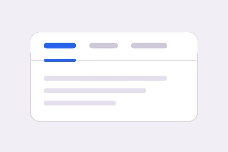
The default that reads as tabs without any explanation. Reach for it when the panels are static content and you want the indicator to do the signalling rather than a border box.

Create a tabs component with four triggers using the ARIA tabs pattern: role="tablist" on the container, role="tab" with aria-selected and aria-controls on each trigger, and role="tabpanel" with aria-labelledby on each panel. Use roving tabindex so only the selected tab has tabindex 0 and Tab moves out of the group entirely rather than through it. Left and Right arrows move focus and wrap at both ends, Home and End jump to the first and last tab, and activation is automatic because the panels are static text. Triggers are 40px tall with 15px medium labels, muted grey when inactive and near-black when active. Measure the active trigger and slide a 2px underline using translateX and scaleX over 200ms — never animate left or width.

Prueba en MeDo
SegmentedPill Segmented

Segmented Control With a Sliding Pill

Two or three mutually exclusive options that belong on one control, like monthly versus annual. Do not use it past four tabs — the track stops fitting on a phone and equal widths force truncation.

Create a segmented-control tabs component: one rounded 36px-tall track with a light grey background and 2px inner padding, holding three equal-width triggers. The active trigger is a white pill with a soft shadow that moves between positions with translateX over 180ms, so the label text never reflows mid-transition. Keep the full ARIA tabs roles and roving tabindex — Left and Right arrows move focus with wrapping, Home and End jump to the ends, and activation is automatic. Give every trigger the same explicit min-width so switching from a short label to a long one does not resize the track. Under prefers-reduced-motion, cross-fade the pill background instead of sliding it.

Prueba en MeDo
Deep linkableURL-Synced

Tabs Backed by a Query Parameter

The active tab lives in the URL, so support can link to one panel and a reload keeps your place. Worth doing before launch, because retrofitting it means rewriting the initial render.

Create a tabs component whose active tab is derived from a ?tab= query parameter rather than local state, so the first server render already paints the correct panel with no post-hydration flash. Read the parameter, validate it against the known tab ids, and fall back to the first tab when the value is unrecognised. On selection, write the new value with a replace-style navigation so the back button is not filled with tab switches, and preserve every other query parameter already on the URL. Keep the ARIA tabs wiring intact: roving tabindex, Left and Right arrows with wrapping, Home and End, and manual activation on Enter or Space.

Prueba en MeDo
OverflowScrollable

Horizontally Scrolling Tablist

What happens when seven labels meet a 390px viewport. The part teams forget is scrolling the newly focused tab into view — arrow keys otherwise move focus to a tab nobody can see.

Create a tabs component that handles overflow by scrolling rather than wrapping or clipping. Under 640px the tablist scrolls horizontally with momentum, the scrollbar is hidden, and a gradient fade appears on either edge only while content remains in that direction. When Left or Right arrow moves the roving tabindex, call scrollIntoView with inline nearest on the newly focused trigger so keyboard focus is never off screen, and do the same for Home and End. Use scroll-snap-align on each trigger so a flick settles on a label boundary instead of mid-word. Keep the full ARIA roles and aria-controls wiring, and recompute the indicator position on scroll and on resize.

Prueba en MeDo
PerformanceLazy Panels

Tabs With Deferred Panel Mounting

Only the active panel mounts, so opening Settings does not fetch invoices nobody asked for. The catch is state loss, so name the panels that must survive a switch.

Create a tabs component that mounts only the active panel and keeps every inactive panel out of the DOM entirely, so charts, video players and data fetches for unseen tabs never run. Use manual activation — arrow keys move the roving tabindex and only Enter or Space commits the change — because automatic activation would fire a request for every tab a keyboard user passes through. Accept a keepMounted list of tab ids whose panels stay in the DOM hidden with the hidden attribute instead, for panels holding half-filled forms or scroll position. Show a skeleton inside a newly mounted panel while its data resolves, and keep the panel container height stable so the page below does not jump.

Prueba en MeDo
SidebarVertical

Vertical Tabs for Settings Screens

A left rail of labels beside one panel. The one thing that changes beyond layout is the arrow axis — Up and Down, not Left and Right, and aria-orientation has to say so.

Create a vertical tabs component for a settings screen: a 200px left rail of triggers with a single panel to its right. Set aria-orientation="vertical" on the tablist and bind Arrow Up and Arrow Down to move the roving tabindex with wrapping, since Left and Right are wrong on this axis; keep Home and End for the ends. Triggers are left-aligned rows, 36px tall, with a 2px indicator on the left edge that translates vertically over 200ms. Below 768px collapse the rail into a horizontal scrolling tablist above the panel and switch the arrow bindings and aria-orientation to match. Use manual activation, and give the panel tabindex="-1" so a programmatic focus move after selection is possible.

Prueba en MeDo

Cómo personalizar tu Pestañas

Elige activación automática o manual de forma deliberada

La activación automática cambia de panel a medida que las flechas mueven el foco, lo cual es rápido pero inútil cuando los paneles son costosos de renderizar o piden datos. La activación manual mueve primero el foco y solo activa con Enter o Espacio. Indica cuál quieres, porque el código de teclado es distinto.

Anima el indicador con transform, no con width

Pide un subrayado que mida el disparador activo y se desplace usando translateX y scaleX. Animar left y width provoca recálculos de layout en cada fotograma, tiembla en los límites de subpíxel y se rompe por completo cuando la tablist puede hacer scroll.

Decide qué pasa cuando las pestañas desbordan

Cuatro etiquetas cortas caben en un móvil; siete no. Elige un comportamiento y especifícalo: una tablist con scroll horizontal y degradado en el borde, salto a una segunda fila, o colapso en un select nativo por debajo de un breakpoint. Sin indicarlo, las pestañas generadas suelen simplemente recortarse.

Di si los paneles inactivos siguen montados

Desmontar los paneles inactivos mantiene el DOM pequeño y evita ejecutar gráficas o reproductores de vídeo que nadie ve, pero también descarta la posición de scroll y los campos de formulario a medio rellenar. Menciona qué paneles guardan estado para que esos se oculten con CSS en su lugar.

Quién usa el componente Pestañas

Página de precios

Facturación mensual y anual como dos pestañas sobre una única tabla de precios, con la elección escrita en la URL para que ventas pueda enlazar directamente al precio anual y el descuento anual sea visible en la primera carga.

Documentación de producto

Ejemplos de código divididos por lenguaje — curl, Node, Python, Go — donde seleccionar un lenguaje una vez se aplica a cada grupo de pestañas de la página y se recuerda en la siguiente visita.

Panel o herramienta de administración

Una pantalla de ajustes con pestañas de Perfil, Equipo, Facturación y Claves API donde cada panel se monta de forma diferida, para que abrir Ajustes no descargue facturas que nadie pidió.

Página de producto de e-commerce

Descripción, Especificaciones y Opiniones como pestañas bajo la galería, con el número de opiniones en la etiqueta del disparador y la descripción también renderizada en el cuerpo de la página, para que el texto principal no sea accesible solo detrás de una pestaña.

Patrones de Pestañas para distintos sitios web

El mismo componente pestañas, adaptado al tipo de sitio donde se publica.

01 / 06

SaaS Pricing Page Tabs

Monthly and annual billing as a two-tab segmented control above one price grid. Sync the choice to the URL so a sales email can open annual pricing directly — a pricing page where the discount is one unshareable click away is losing the conversation before it starts.

Estilos y variantes de Pestañas

Elige la variante que encaje con el resto de la página y genérala.

01 / 06

Underlined Tabs

A muted label row with a 2px indicator sliding beneath the active trigger. The most legible default because the underline gives the eye a single moving object to track. Animate it with translateX and scaleX — animating left and width thrashes layout every frame and jitters on subpixel boundaries.

Pestañas en React, Next.js, Vue y Svelte

React, Next.js, Vue 3, SvelteKit, Astro o HTML puro: el mismo pestañas, seis formas de integrarlo.

01 / 06

React Tabs

Keep the selected id in one piece of state and derive tabindex from it — that is the whole roving tabindex mechanism. Hold refs to the triggers so the arrow handler can focus the next one directly.

src/components/Tabs.tsx

const [active, setActive] = useState(tabs[0].id)

<div role="tablist" onKeyDown={onArrowKeys}>
  {tabs.map((t) => (
    <button
      key={t.id}
      role="tab"
      aria-selected={t.id === active}
      aria-controls={`panel-${t.id}`}
      tabIndex={t.id === active ? 0 : -1}
      onClick={() => setActive(t.id)}
    >
      {t.label}
    </button>
  ))}
</div>

Cómo añadir tu Pestañas a un proyecto

Cuatro pasos, desde elegir una plantilla de pestañas hasta llevarlo a producción.

01~30s

Pick a Tabs Template

Choose by constraint, not by looks: segmented for two or three alternatives, scrollable once labels overflow a phone, vertical for a long settings rail, lazy when a panel fetches data.

02~10s

Copy the Prompt

Take the prompt into MeDo, Lovable, Bolt, v0 or Cursor, then edit two things — your real tab labels, and whether activation is automatic or manual. That second choice changes the keyboard code, so decide it before you generate.

03~1min

Generate and Refine

You get React + Tailwind back with a live preview. Follow up in plain English — "sync the active tab to ?tab=", "collapse to a select under 640px", "keep the chart panel mounted" — rather than editing the keydown handler by hand.

04~2min

Wire the Panels and Ship

Replace the placeholder panels with your real content and check three things with the keyboard only: Tab enters and leaves the group in one stop, arrows move within it, and a reload on a deep link opens the right panel.

Preguntas frecuentes sobre Pestañas

¿Cómo genero un componente de pestañas accesible con IA?

Describe las etiquetas de las pestañas y el comportamiento que quieres en un solo prompt, incluyendo si la activación es automática o manual. MeDo genera los roles tablist, tab y tabpanel con el cableado correspondiente de aria-controls y aria-labelledby, además de roving tabindex para que las flechas se muevan entre pestañas y Tab salga del grupo por completo.

¿Cuál es la diferencia entre activación automática y manual de pestañas?

Con la activación automática, mover el foco con una flecha muestra ese panel de inmediato, lo que encaja con contenido estático y barato. Con la activación manual, las flechas solo mueven el foco y el usuario confirma con Enter o Espacio. Usa manual siempre que un panel pida datos, renderice una gráfica o sea lento, ya que la activación automática dispararía una petición por cada pestaña que atraviese un usuario de teclado.

¿Puedo enlazar directamente a una pestaña concreta?

Sí, si la pestaña activa se guarda en la URL y no en el estado del componente. Pide un parámetro de consulta como ?tab=pricing que alimente el render inicial y se actualice con una navegación de tipo replace, para que el botón atrás no se llene de cambios de pestaña. Evita un fragmento de hash para esto, porque el navegador también intentará desplazarse hasta un elemento con ese id.

¿El contenido oculto en pestañas inactivas perjudica al SEO?

Los motores de búsqueda indexan el texto presente en el HTML aunque un panel esté oculto visualmente, así que el contenido en pestañas no es invisible. Normalmente se pondera como secundario frente al contenido que el visitante ve de inmediato, y los paneles renderizados solo tras un clic puede que no se rastreen en absoluto. Mantén tu encabezado principal, tu propuesta de valor y tus palabras clave objetivo en la parte siempre visible de la página y usa las pestañas para el detalle complementario.

¿Cómo deben comportarse las pestañas en móvil?

Elige una única estrategia en lugar de dejar que las etiquetas se encojan. Una tablist con scroll horizontal y un degradado en el borde que desborda funciona bien hasta unas seis etiquetas cortas; por encima de eso, colapsar en un select nativo ofrece mejor área de toque y evita pestañas escondidas. Dile a MeDo el breakpoint y la estrategia y generará ambos diseños desde un solo componente.

¿Debo usar pestañas o un acordeón?

Usa pestañas cuando los paneles son alternativas que el usuario compara de una en una, como periodos de facturación o lenguajes de código, y cuando las etiquetas son lo bastante cortas para caber en una línea. Usa un acordeón cuando las secciones son elementos independientes que alguien puede querer abiertos a la vez, cuando las etiquetas son preguntas completas, o cuando el contenido es lo bastante largo para que el apilado vertical se lea mejor — una lista de preguntas frecuentes es el caso canónico de acordeón, no de pestañas.