MeDo

Generador de Alerts con IA.

Describe el mensaje y MeDo genera el conjunto completo de alerts en línea — variantes de info, éxito, advertencia y error con barra de acento, icono, título, descripción, enlace de acción opcional y un control de cierre cuando el alert no es permanente.

Alert
Alert

La gravedad tiene que sobrevivir sin color

Las alertas son el único componente cuyo trabajo entero es comunicar lo grave que es algo, y el color es el canal menos fiable para hacerlo. Aproximadamente uno de cada doce hombres tiene alguna forma de deficiencia en la visión del color, el rojo y el verde son el par que más se confunde, y la misma alerta renderizada en tema oscuro, en un portátil con poco brillo o impresa en escala de grises pierde la distinción por completo. La consecuencia práctica es que una alerta necesita codificación redundante por construcción: una forma de icono distinta por gravedad y una redacción que declare la situación en lugar de confiar en que el lector la deduzca de un tono. Generar las cuatro gravedades desde una sola descripción es lo que mantiene el conjunto de iconos genuinamente distinguible, porque se eligen unos frente a otros y no de uno en uno.

6 plantillas

Plantillas de Alert que puedes generar

Cada plantilla es un prompt real, no una captura de pantalla. Cópialo en cualquier editor de IA o ejecútalo en MeDo y obtén código React + Tailwind.

BasicFour Severities

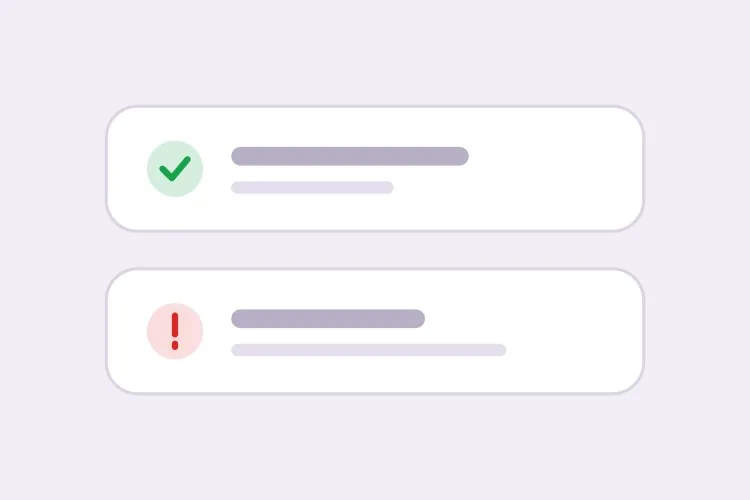
Accent-Bar Alert in Four Tones

The baseline set. Generating all four together is what keeps the icon shapes distinguishable from each other rather than four recolors of one glyph.

Create an inline alert component with four severities — info in blue with a circle icon, success in green with a check, warning in amber with a triangle, error in red with an octagon. Each is full width within its container with a 4px left accent bar in the severity color, a background tinted to roughly 8% of that color, 16px padding, an 8px radius, and a 20px icon aligned to the first text line rather than vertically centered. Render a semibold 15px title with an optional 14px muted description below. Because the alert renders with the page rather than appearing dynamically, use role="region" with an aria-label naming the severity, not role="alert" — an assertive live region on initial paint talks over everything else. Check every tinted background against its text color for 4.5:1 contrast.

Prueba en MeDo
ClosableDismissible

Alert With an Opt-In Close Button

Dismissal has to be per-instance, not global. A close button on an expired-payment alert lets the user hide a problem that still exists, and they will.

Add an opt-in dismiss control to an inline alert: a 32px icon button on the right with aria-label="Dismiss" and a visible focus ring, rendered only when a dismissible prop is passed so permanent alerts cannot be closed by accident. On dismiss, remove the alert from the DOM and move focus to the next focusable element after it rather than leaving focus on a detached node. Animate the collapse with height and opacity over 150ms, and skip the animation entirely under prefers-reduced-motion. Accept an onDismiss callback so the caller can persist the dismissal, and document that the alert should reappear on the next session while the underlying condition is unresolved.

Prueba en MeDo
With actionActionable

Alert Carrying One Next Step

An alert that names a problem without a route out of it just relocates the work. One action, concretely worded — two actions and neither reads as the primary.

Create an alert variant with a single inline action below the description, rendered in the severity color as a text link with an underline on hover and focus. Keep it to exactly one action so the next step is unambiguous, and require concrete wording in the label — "Update payment method", not "Learn more". If the action navigates, use an anchor; if it mutates state, use a button, and show an inline pending state on the button rather than replacing the alert while the request is in flight. Place the action inside the alert region so its purpose is announced together with the message, and keep its hit area at least 44px tall on touch.

Prueba en MeDo
CompactField Error

Single-Line Error Under an Input

No title, no icon block, no accent bar — just the message wired to the input it belongs to. The full alert anatomy next to a text field is visual noise that pushes the form apart.

Create a compact single-line alert for form-field errors: 13px text in the error color with a 14px inline icon, no title, no accent bar and no background tint, sitting 6px below its input with no vertical margin collapse. Give it a stable ID and reference it from the input with aria-describedby, and set aria-invalid="true" on the input at the same time. Because the message appears in response to a submit attempt, wrap it in role="alert" so it is announced immediately — but render the element only when there is an error rather than keeping an empty live region in the DOM, or the first error will be announced as a change to existing content. Reserve the line height so the layout does not jump when the message appears.

Prueba en MeDo
GlobalPage Banner

Full-Width Banner Above the App Shell

Trial countdowns, maintenance windows, degraded service. It sits above the layout rather than inside a page, so the thing that breaks is sticky-header offset math, not the alert itself.

Create a full-width alert banner that mounts above the application shell: edge-to-edge tinted background, centered content capped at the app container width, a 16px icon, one line of text and a single inline action, at 44px total height. Because it displaces the layout, expose its height as a CSS custom property on the root element so a sticky header can offset itself instead of being covered. Support a dismissible mode that persists to localStorage keyed by banner ID and version, so editing the message re-shows it to users who dismissed the previous one. Use role="region" with an aria-label rather than role="alert", since the banner is present on load and should not interrupt.

Prueba en MeDo
ValidationError Summary

Alert Listing Every Failed Field

The summary above the submit button, with one link per failure jumping to its input. It tells the user how many problems exist — the field-level messages tell them what to fix.

Create a validation summary alert for the top of a form: an error-severity block with a title stating the count — "3 fields need attention" — and an unordered list of links, each labelled with the field name plus the specific problem, each jumping to and focusing its input on click. Render it only after a submit attempt fails, give it role="alert" and move keyboard focus to the alert container itself with tabindex="-1" so a screen reader user lands on the summary rather than hunting for it. Rebuild the list on every failed submit and re-announce even when the set of errors is unchanged. Pair it with per-field messages wired through aria-describedby rather than replacing them.

Prueba en MeDo

Cómo personalizar tu Alert

Empareja una forma de icono distinta con cada color

Pide un icono específico por gravedad: una marca de verificación para éxito, un triángulo para advertencia, un octágono para error, un círculo para info. Las formas siguen siendo legibles en escala de grises y para usuarios con daltonismo, y permiten identificar la gravedad con la visión periférica antes de leer una palabra.

Decide de antemano si la alerta es descartable

Un botón de cierre en una alerta que describe una condición sin resolver, como un método de pago vencido, permite al usuario ocultar un problema que sigue existiendo. Haz que descartar sea opcional por instancia y mantén las alertas permanentes cuando el mensaje solo deba desaparecer al cambiar el estado subyacente.

Separa los banners de página de los errores de campo

Una alerta a nivel de página resume y se sitúa arriba del formulario; un error a nivel de campo va directamente bajo su input y se referencia con aria-describedby. Pide una variante compacta de una línea para el caso de campo, así no arrastra un bloque de título e icono junto a una entrada de texto.

Escribe la acción dentro de la alerta

Una alerta que describe un problema sin ofrecer una salida solo reubica el trabajo. Especifica un único enlace de acción en línea con texto concreto, como "Actualizar método de pago", y limítalo a una sola acción para que el siguiente paso quede obvio.

Quién usa el componente Alert

Producto SaaS

Un banner de advertencia permanente en la parte superior de la app cuando a la prueba le quedan tres días, con un enlace de acción "Mejorar plan", además de alertas de éxito dentro de las páginas de ajustes que confirman una configuración guardada.

Tienda de comercio electrónico

Una alerta de info en la página del carrito describiendo el corte de envío, y una alerta de error sobre el formulario de pago resumiendo los detalles del pago rechazado para que el mensaje sobreviva al re-renderizado de la página.

Dashboard o herramienta de administración

Alertas de error en las pantallas de importación de datos listando qué filas fallaron la validación, y una alerta de info explicando una ventana de mantenimiento programado que permanece visible hasta que la ventana pasa.

Sitio de documentación

Alertas de aviso en línea que marcan APIs obsoletas como advertencia y comportamientos específicos de versión como info, situadas en el flujo del texto donde una notificación flotante sería inútil.

Patrones de Alert para distintos sitios web

El mismo componente alert, adaptado al tipo de sitio donde se publica.

01 / 06

SaaS Product Alerts

Trial countdowns and plan limits as permanent banners above the app shell, success alerts inside settings pages after a save. The banner is the tricky one: expose its height as a custom property or your sticky header will sit under it on every route.

Estilos y variantes de Alert

Elige la variante que encaje con el resto de la página y genérala.

01 / 06

Left Accent Bar Alert

A 4px bar in the severity color with a tinted fill. The bar gives the eye a vertical edge to scan a stack of alerts against, which matters when three appear together on a settings page — four flat tinted boxes are much harder to separate.

Alert en React, Next.js, Vue y Svelte

React, Next.js, Vue 3, SvelteKit, Astro o HTML puro: el mismo alert, seis formas de integrarlo.

01 / 06

React Alert

A static alert needs no state at all — keep the severity map outside the component so tones and icons stay in one place. Only the dismissible variant needs a hook, so split it out rather than making every alert stateful.

src/components/Alert.tsx

const tones = {
  info: { bar: 'bg-blue-500', bg: 'bg-blue-50', Icon: InfoIcon },
  error: { bar: 'bg-red-500', bg: 'bg-red-50', Icon: OctagonIcon },
}

export function Alert({ severity = 'info', title, children }) {
  const { bar, bg, Icon } = tones[severity]
  return (
    <div role="region" aria-label={severity} className={`flex gap-3 ${bg}`}>
      <span className={`w-1 ${bar}`} />
      <Icon className="mt-0.5 h-5 w-5" />
      <div>
        <p className="font-semibold">{title}</p>
        {children}
      </div>
    </div>
  )
}

Cómo añadir tu Alert a un proyecto

Cuatro pasos, desde elegir una plantilla de alert hasta llevarlo a producción.

01~30s

Pick an Alert Pattern

Choose by where the message lives: the four-severity block for in-page state, the compact variant for a field error, the summary for a failed submit, the banner for something app-wide.

02~10s

Copy the Prompt

Take it into MeDo, Lovable, Bolt, v0 or Cursor. Decide whether this alert is dismissible before you run it — that choice determines whether a user can hide an unresolved problem.

03~1min

Generate and Refine

You get all four severities back with a live preview. Follow up in plain English — "add an Update payment method link", "make the error variant outlined", "drop the title on the compact one" — rather than recoloring tints by hand.

04~2min

Place It and Check the Roles

Put page-level alerts above the submit area and field errors under their inputs with aria-describedby. Then confirm the load-time alerts are not using role="alert", or a screen reader will announce them over the rest of the page.

Preguntas frecuentes sobre Alert

¿Cómo genero un componente de alerta con IA?

Describe las gravedades, la anatomía y si la alerta se puede descartar — por ejemplo "alertas de info, éxito, advertencia y error con barra de acento izquierda, icono, título, descripción y un enlace de acción opcional" — y MeDo genera las cuatro variantes desde esa única descripción. Como se producen juntas, el relleno, el radio y el tamaño de los iconos coinciden entre gravedades.

¿Cuál es la diferencia entre un alert y un toast?

Un alert en línea vive en el layout de la página y persiste hasta que cambia la condición que describe, así que sirve para estados que el usuario puede necesitar releer: un problema de facturación, un aviso de mantenimiento, un error de formulario. Un toast es una notificación pasajera que flota sobre la página y desaparece a los pocos segundos, así que sirve para confirmar una acción que el usuario acaba de realizar. Usa un alert cuando el mensaje deba seguir ahí después de hacer scroll o recargar.

¿Debería una alerta ser descartable?

Solo cuando el mensaje es informativo y perderlo no cuesta nada. Si la alerta describe un problema sin resolver, mantenla permanente y deja que se limpie sola cuando el estado se resuelva; de lo contrario, descartarla oculta un asunto que sigue necesitando atención. Un compromiso habitual es que sea descartable pero reaparezca en la siguiente sesión hasta que se solucione.

¿Puede una alerta transmitir gravedad sin usar color?

Tiene que hacerlo. Empareja cada gravedad con una forma de icono distinta y una redacción que nombre la situación, para que una pantalla en escala de grises o un lector con daltonismo reciba igualmente el mensaje. Pide a MeDo codificación de icono más texto en el prompt y asignará un glifo diferente por gravedad en lugar de recolorear el mismo icono cuatro veces.

¿Dónde debe ir una alerta de error de formulario?

Pon una alerta de resumen justo encima del área de envío o al principio del formulario, y los mensajes individuales bajo sus propios campos conectados con aria-describedby y aria-invalid. El resumen dice al usuario cuántos problemas hay, los mensajes de campo le dicen qué corregir, y tener ambos significa que los usuarios de teclado y lector de pantalla no van a la caza del fallo.

¿Necesita una alerta role="alert"?

No siempre. Usa role="alert" solo para mensajes que aparecen dinámicamente y necesitan interrumpir, como un fallo de validación tras un intento de envío. Una alerta presente al cargar la página debería ser una región normal o usar role="status", porque una live region asertiva en el render inicial simplemente habla por encima de todo lo demás.