MeDo

Generatore di Gallerie IA.

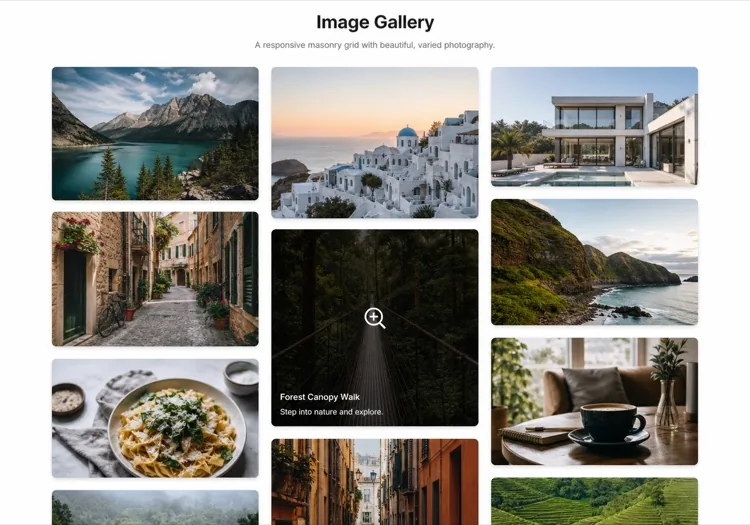
Descrivi la griglia che desideri e MeDo genera una galleria di immagini completamente stilizzata in pochi secondi. Layout masonry, overlay lightbox, effetti hover, breakpoint responsivi — tutto da un singolo prompt.

Galleria
Galleria

Una buona galleria trasforma i visitatori in convinti.

Le immagini sono il segnale di fiducia più rapido sul web — i visitatori si formano un'opinione sulla tua qualità visiva in meno di 200 ms. Una galleria ben strutturata permette a quella qualità di parlare su scala, che tu stia mostrando un portfolio, un catalogo prodotti o foto di eventi. Il layout giusto influenza anche la SEO: componenti di immagine correttamente strutturati con testo alternativo e dati strutturati contribuiscono alla visibilità nella ricerca immagini e alle metriche di engagement della pagina.

6 modelli

Modelli di Galleria che puoi generare

Ogni modello è un prompt reale, non uno screenshot. Copialo in qualsiasi editor IA, oppure eseguilo in MeDo e ottieni codice React + Tailwind.

Uniform gridAcme

Fixed Aspect-Ratio Image Grid

Every tile the same shape, so the grid reads as one object rather than a collage. The right default for product shots — and the wrong one for editorial photography, where cropping to a square throws away the composition.

Create a responsive image grid: four columns on desktop, three on tablet, two on mobile, with a consistent gap. Wrap each image in a 4:3 aspect-ratio box with object-fit: cover so the grid never reflows as images resolve, and set explicit width and height attributes on every img. Use loading="lazy" and decoding="async" on everything below the first row, and eager loading plus fetchpriority="high" on the first row so the largest contentful paint is not deferred. Add a hover state that lifts the tile slightly and fades in a caption over a gradient scrim; drive the same state from :focus-visible so keyboard users see it. Render each item as a figure with figcaption.


Prova in MeDo
MasonryMega

Column Masonry With Mixed Heights

Keeps the original aspect ratio of every shot, which is the point for photography. The trap is CSS columns — they order items top-to-bottom per column, so a chronological set reads out of sequence.

Create a masonry image gallery that preserves each image's native aspect ratio. Use CSS grid with grid-auto-rows set to a small row unit and a span calculated per item from its intrinsic ratio, rather than CSS multi-column, so reading order stays left-to-right and matches the source order. Set the aspect-ratio property on every image wrapper from the known width and height so the grid reserves the exact space before the file loads and nothing shifts. Three columns on desktop, two on tablet, one on mobile. Lazy load below the fold, add a blurred low-resolution placeholder that cross-fades to the full image, and keep a fixed gap on both axes.

Prova in MeDo
LightboxLumen

Grid With a Full-Screen Lightbox

The interaction most galleries get half right: the overlay opens, then Escape does nothing and focus is still behind it. Trap focus and restore it to the thumbnail on close or the gallery is unusable by keyboard.

Create an image grid where clicking a tile opens a full-screen lightbox. The overlay renders as a dialog with aria-modal, moves focus to the close button on open, traps Tab within the overlay, closes on Escape and on backdrop click, and returns focus to the thumbnail that opened it. Support left and right arrow keys plus on-screen previous and next buttons, show a counter such as 4 of 18, and render the caption beneath the image. Preload the neighbouring two images so navigation is instant, lock body scroll while open, and add touch swipe on mobile. Respect prefers-reduced-motion by dropping the zoom transition.

Prova in MeDo
FilterableStudio

Category Filters Above the Grid

Worth adding past a dozen images and a liability below it — three filter chips over nine photos is furniture. Filter in the URL, not just in state, so a client can send a link to one category.

Create a filterable image gallery: a horizontal row of category chips above a responsive grid, with an All chip active by default and a count beside each label. Filtering hides non-matching items and animates the remaining tiles to their new positions with a transform-based transition rather than re-laying out abruptly. Reflect the active filter in the URL query string so a filtered view is linkable and survives reload. Use real button semantics with aria-pressed on each chip, announce the resulting item count in an aria-live region, and show an empty state when a category has no items. Keep the aspect-ratio boxes fixed so filtering never changes tile size.

Prova in MeDo
CarouselReel

Scroll-Snap Thumbnail Carousel

For a strip inside a page rather than a full section — a product detail block or a case study. Build it on scroll-snap, not a JavaScript slider, so it still works with a trackpad and a touch drag.

Create a horizontal image carousel using CSS scroll-snap: a flex row with overflow-x auto, scroll-snap-type x mandatory and scroll-snap-align center on each slide, so native touch and trackpad scrolling work without a slider library. Sit a thumbnail strip beneath it where the active thumb is outlined and clicking one scrolls the main rail to that slide via scrollIntoView with smooth behaviour. Add previous and next buttons that disable at each end, hide the scrollbar visually while keeping keyboard scrolling intact, and give the rail a role and label so it is announced as a group. Fixed aspect-ratio slides, lazy loading past the second image.

Prova in MeDo
MosaicEditorial

Asymmetric Feature Mosaic

One image spans two columns and two rows, the rest fill around it. Gives a set of otherwise equal photographs a focal point — but only ever promote one tile, because two hero cells cancel each other out.

Create an asymmetric mosaic gallery on a six-column CSS grid: the first item spans four columns and two rows, two items span two columns each, and the remainder fill single cells, with explicit grid-column and grid-row spans rather than auto-placement. Give every cell a fixed aspect-ratio box and object-fit: cover so the mosaic holds its shape at any image size. Collapse to a two-column grid on tablet and a single column on mobile, keeping the feature image first. Add a hover scrim with a title and a year, lazy load everything after the feature cell, and eager load the feature image so it can be the largest contentful paint.

Prova in MeDo

Come personalizzare il tuo Galleria

Scegli un layout adatto alla densità del tuo contenuto

Le griglie uniformi funzionano bene per la fotografia di prodotto dove la coerenza conta. Le griglie masonry eccellono con contenuti di proporzioni miste come foto editoriali o scatti da portfolio. Chiedi a MeDo di cambiare layout semplicemente aggiornando il tuo prompt — nessuna ristrutturazione necessaria.

Aggiungi filtri per categoria per grandi collezioni

Quando la tua galleria contiene più di una dozzina di immagini, filtrare per tag o categoria migliora drasticamente l'usabilità. Chiedi a MeDo di includere una barra filtri sopra la griglia e animare la transizione del layout quando si cambia categoria.

Ottimizza i Core Web Vitals con il lazy loading

Le gallerie sono tra i principali responsabili di punteggi LCP e spostamento del layout scadenti. Chiedi a MeDo di includere il lazy loading nativo, dimensioni esplicite delle immagini ed effetti di sfocatura placeholder per mantenere le metriche di performance pulite.

Rendi la lightbox accessibile da tastiera e screen reader

Una lightbox che intrappola il focus, risponde a Escape e ai tasti freccia, e annuncia le descrizioni delle immagini agli screen reader è molto più inclusiva — ed evita fallimenti negli audit di accessibilità. Specifica questi requisiti nel tuo prompt MeDo e saranno integrati fin dall'inizio.

Chi usa il componente Galleria

Portfolio creativi

Designer, fotografi e illustratori si affidano alle gallerie come pezzo centrale del loro sito. Una griglia masonry con una lightbox pulita lascia il lavoro respirare senza che l'interfaccia competa per l'attenzione.

Pagine prodotto e-commerce

Gallerie prodotto multi-immagine con barre di miniature e funzionalità zoom influenzano direttamente le decisioni di acquisto. Una galleria ben costruita riduce i resi aiutando gli acquirenti a esaminare i prodotti in dettaglio prima dell'acquisto.

Siti di eventi e matrimoni

Fotografi di eventi e location usano le gallerie per mostrare lavori passati e costruire prova sociale. Griglie filtrabili organizzate per tipo di evento rendono facile per i potenziali clienti trovare rapidamente esempi rilevanti.

Annunci immobiliari

Gli annunci di proprietà con una galleria fotografica completa — inclusa un'immagine hero prominente, una barra di miniature e una lightbox a schermo intero — generano significativamente più richieste rispetto agli annunci con sole immagini statiche.

Pattern di Galleria per siti web diversi

Lo stesso componente galleria, calibrato sul tipo di sito su cui viene pubblicato.

01 / 06

Photography Portfolio Gallery

Masonry, no crops, and a lightbox that shows the frame at full width. Square-cropping a photographer's work into a uniform grid destroys the composition they were hired for. Keep the chrome minimal — captions on hover, not permanently on top of the image.

Stili e varianti di Galleria

Scegli la variante che si adatta al resto della pagina, poi generala.

01 / 06

Uniform Grid

Equal tiles at one aspect ratio. Reads as a single object and is trivially responsive, at the cost of cropping every image to the same shape — fine for products, destructive for photography.

Galleria in React, Next.js, Vue e Svelte

React, Next.js, Vue 3, SvelteKit, Astro o HTML puro: lo stesso galleria, sei modi per integrarlo.

01 / 06

React Gallery

Map over an images array where each entry carries its intrinsic width and height, and use them to set the aspect-ratio box. Only the lightbox needs state — the grid itself is pure markup.

src/components/Gallery.tsx

export function Gallery({ images }) {
  const [open, setOpen] = useState(null)
  return (
    <ul className="grid gap-4 md:grid-cols-3">
      {images.map((img, i) => (
        <li key={img.src} style={{ aspectRatio: img.w / img.h }}>
          <button onClick={() => setOpen(i)}>
            <img src={img.src} alt={img.alt} width={img.w} height={img.h} loading="lazy" />
          </button>
        </li>
      ))}
    </ul>
  )
}

Come aggiungere il tuo Galleria a un progetto

Quattro passaggi, dalla scelta di un modello di galleria alla messa in produzione.

01~30s

Pick a Gallery Layout

Choose by what your images have in common — uniform grid when the shapes match, masonry when they do not, mosaic when one image should lead, carousel when the gallery is a block inside a longer page.

02~10s

Copy the Prompt

Take the prompt into MeDo, or paste it into Lovable, Bolt, v0 or Cursor. Set your real column counts and aspect ratio before running it, since those two decisions drive every breakpoint that follows.

03~1min

Generate and Refine

You get React + Tailwind back with a live preview. Follow up in plain English — "add Escape to close", "two columns on tablet", "captions under the image instead of over it" — rather than editing grid spans by hand.

04~2min

Wire Up Your Images

Swap the placeholders for your own files with real alt text and intrinsic width and height on every one. That is what keeps the grid from shifting as images resolve, and it is the step most likely to be skipped.

Domande comuni su Galleria

Come creo una galleria di immagini con l'IA?

Apri MeDo e descrivi la galleria desiderata — stile di layout, numero di colonne, comportamento hover e se hai bisogno di una lightbox. MeDo genera un componente galleria completo e pronto per la produzione in pochi secondi. Puoi iterare raffinando il tuo prompt fino a quando il risultato corrisponde alla tua visione.

Qual è il miglior generatore di gallerie IA?

MeDo è progettato specificamente per generare componenti UI da prompt in linguaggio naturale. A differenza degli strumenti IA generici, MeDo comprende le convenzioni frontend come griglie responsive, transizioni CSS, lazy loading e pattern di accessibilità — quindi la galleria generata è effettivamente deployabile, non solo prototipata visivamente.

Posso generare una galleria masonry con l'IA?

Sì. Specifica semplicemente "layout masonry" nel tuo prompt MeDo. MeDo genererà un layout basato su CSS Grid o Masonry che gestisce elegantemente immagini di altezza variabile, con spaziatura corretta e conteggi di colonne responsivi ad ogni breakpoint.

Come aggiungo una lightbox a una galleria generata con IA?

Includi "lightbox" nel tuo prompt MeDo — ad esempio, "cliccando su un'immagine si deve aprire una lightbox a schermo intero con frecce di navigazione." MeDo collegherà il gestore dei clic, l'overlay e i controlli da tastiera. Puoi anche richiedere funzionalità come supporto allo swipe, didascalie delle immagini o un pulsante di chiusura nello stesso prompt.

Il generatore di gallerie IA può creare una galleria filtrabile?

Sì. Chiedi a MeDo di includere una barra filtri o navigazione basata su tag nel tuo prompt della galleria. MeDo genererà l'interfaccia filtri, assegnerà categorie ad ogni slot immagine e animerà la transizione della griglia al cambio filtri — tutto in un solo passaggio.

Come rendo una galleria generata con IA SEO-friendly?

Chiedi a MeDo di includere placeholder di testo alternativo descrittivi, markup figure/figcaption corretto e attributi di lazy loading. Per una SEO delle immagini più ricca, puoi anche chiedere a MeDo di aggiungere dati strutturati ImageObject (schema.org) a ogni elemento della galleria, aiutando i motori di ricerca a indicizzare le tue immagini con precisione.