MeDo

مولّد معارض الصور بالذكاء الاصطناعي.

صِف الشبكة التي تريدها وMeDo يولّد معرض صور مُنسَّق بالكامل في ثوانٍ. تخطيطات ماسونري، تراكبات الصندوق المضيء، تأثيرات التحويم، نقاط التوقف المتجاوبة — كل ذلك من موجّه واحد.

معرض الصور
معرض الصور

معرض الصور الجيد يحوّل الزوار إلى مقتنعين.

الصور هي أسرع إشارة ثقة على الويب — يكوّن الزوار رأياً حول جودتك البصرية في أقل من 200 مللي ثانية. معرض منظم جيداً يتيح لتلك الجودة أن تتحدث على نطاق واسع، سواء كنت تعرض حافظة أعمال أو كتالوج منتجات أو صور فعاليات. التخطيط الصحيح يؤثر أيضاً على تحسين محركات البحث: مكونات الصور المهيكلة بشكل صحيح مع نص بديل وبيانات منظمة تساهم في ظهور البحث بالصور ومقاييس تفاعل الصفحة.

6 قالبًا

قوالب معرض الصور التي يمكنك توليدها

كل قالب هو طلب حقيقي لا صورة. انسخه إلى أي محرّر ذكاء اصطناعي، أو شغّله في MeDo لتحصل على كود React و Tailwind مباشرة.

Uniform gridAcme

Fixed Aspect-Ratio Image Grid

Every tile the same shape, so the grid reads as one object rather than a collage. The right default for product shots — and the wrong one for editorial photography, where cropping to a square throws away the composition.

Create a responsive image grid: four columns on desktop, three on tablet, two on mobile, with a consistent gap. Wrap each image in a 4:3 aspect-ratio box with object-fit: cover so the grid never reflows as images resolve, and set explicit width and height attributes on every img. Use loading="lazy" and decoding="async" on everything below the first row, and eager loading plus fetchpriority="high" on the first row so the largest contentful paint is not deferred. Add a hover state that lifts the tile slightly and fades in a caption over a gradient scrim; drive the same state from :focus-visible so keyboard users see it. Render each item as a figure with figcaption.


جرّبه في MeDo
MasonryMega

Column Masonry With Mixed Heights

Keeps the original aspect ratio of every shot, which is the point for photography. The trap is CSS columns — they order items top-to-bottom per column, so a chronological set reads out of sequence.

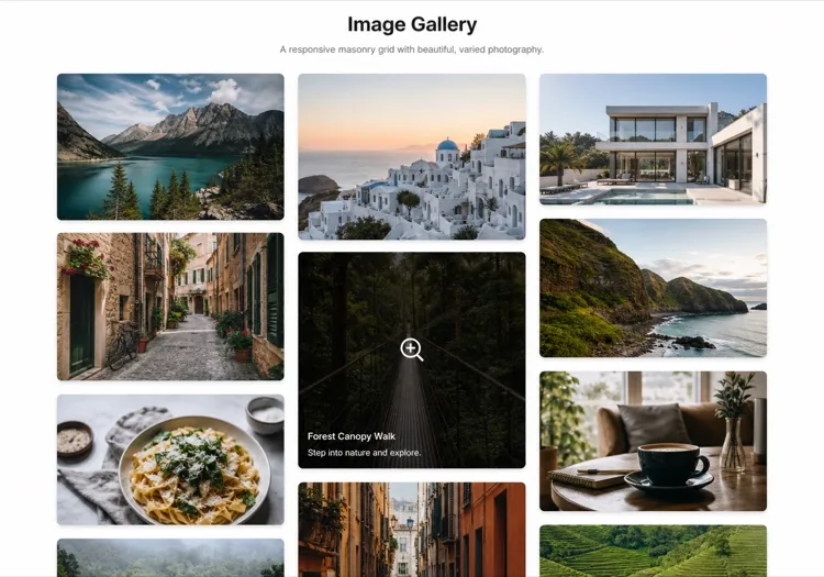
Create a masonry image gallery that preserves each image's native aspect ratio. Use CSS grid with grid-auto-rows set to a small row unit and a span calculated per item from its intrinsic ratio, rather than CSS multi-column, so reading order stays left-to-right and matches the source order. Set the aspect-ratio property on every image wrapper from the known width and height so the grid reserves the exact space before the file loads and nothing shifts. Three columns on desktop, two on tablet, one on mobile. Lazy load below the fold, add a blurred low-resolution placeholder that cross-fades to the full image, and keep a fixed gap on both axes.

جرّبه في MeDo
LightboxLumen

Grid With a Full-Screen Lightbox

The interaction most galleries get half right: the overlay opens, then Escape does nothing and focus is still behind it. Trap focus and restore it to the thumbnail on close or the gallery is unusable by keyboard.

Create an image grid where clicking a tile opens a full-screen lightbox. The overlay renders as a dialog with aria-modal, moves focus to the close button on open, traps Tab within the overlay, closes on Escape and on backdrop click, and returns focus to the thumbnail that opened it. Support left and right arrow keys plus on-screen previous and next buttons, show a counter such as 4 of 18, and render the caption beneath the image. Preload the neighbouring two images so navigation is instant, lock body scroll while open, and add touch swipe on mobile. Respect prefers-reduced-motion by dropping the zoom transition.

جرّبه في MeDo
FilterableStudio

Category Filters Above the Grid

Worth adding past a dozen images and a liability below it — three filter chips over nine photos is furniture. Filter in the URL, not just in state, so a client can send a link to one category.

Create a filterable image gallery: a horizontal row of category chips above a responsive grid, with an All chip active by default and a count beside each label. Filtering hides non-matching items and animates the remaining tiles to their new positions with a transform-based transition rather than re-laying out abruptly. Reflect the active filter in the URL query string so a filtered view is linkable and survives reload. Use real button semantics with aria-pressed on each chip, announce the resulting item count in an aria-live region, and show an empty state when a category has no items. Keep the aspect-ratio boxes fixed so filtering never changes tile size.

جرّبه في MeDo
CarouselReel

Scroll-Snap Thumbnail Carousel

For a strip inside a page rather than a full section — a product detail block or a case study. Build it on scroll-snap, not a JavaScript slider, so it still works with a trackpad and a touch drag.

Create a horizontal image carousel using CSS scroll-snap: a flex row with overflow-x auto, scroll-snap-type x mandatory and scroll-snap-align center on each slide, so native touch and trackpad scrolling work without a slider library. Sit a thumbnail strip beneath it where the active thumb is outlined and clicking one scrolls the main rail to that slide via scrollIntoView with smooth behaviour. Add previous and next buttons that disable at each end, hide the scrollbar visually while keeping keyboard scrolling intact, and give the rail a role and label so it is announced as a group. Fixed aspect-ratio slides, lazy loading past the second image.

جرّبه في MeDo
MosaicEditorial

Asymmetric Feature Mosaic

One image spans two columns and two rows, the rest fill around it. Gives a set of otherwise equal photographs a focal point — but only ever promote one tile, because two hero cells cancel each other out.

Create an asymmetric mosaic gallery on a six-column CSS grid: the first item spans four columns and two rows, two items span two columns each, and the remainder fill single cells, with explicit grid-column and grid-row spans rather than auto-placement. Give every cell a fixed aspect-ratio box and object-fit: cover so the mosaic holds its shape at any image size. Collapse to a two-column grid on tablet and a single column on mobile, keeping the feature image first. Add a hover scrim with a title and a year, lazy load everything after the feature cell, and eager load the feature image so it can be the largest contentful paint.

جرّبه في MeDo

كيف تخصّص معرض الصور الخاص بك

اختر تخطيطاً يتناسب مع كثافة محتواك

الشبكات الموحدة تعمل جيداً لتصوير المنتجات حيث الاتساق مهم. شبكات الماسونري تتألق مع محتوى بنسب أبعاد مختلطة كالصور التحريرية أو لقطات الحافظة. اطلب من MeDo تغيير التخطيط بمجرد تحديث موجّهك — لا حاجة لإعادة هيكلة.

أضف مرشحات الفئات للمجموعات الكبيرة

عندما يحتوي معرضك على أكثر من عشرة صور، يحسّن الترشيح بالعلامة أو الفئة قابلية الاستخدام بشكل كبير. اطلب من MeDo تضمين شريط مرشحات فوق الشبكة وتحريك انتقال التخطيط عند التبديل بين الفئات.

حسّن مؤشرات الويب الأساسية بالتحميل الكسول

المعارض من أبرز المساهمين في درجات LCP وتحول التخطيط السيئة. اطلب من MeDo تضمين التحميل الكسول الأصلي وأبعاد الصور الصريحة وتأثيرات الضبابية البديلة لإبقاء مقاييس الأداء نظيفة.

اجعل الصندوق المضيء قابلاً للوصول عبر لوحة المفاتيح وقارئ الشاشة

صندوق مضيء يحبس التركيز ويستجيب لمفتاح Escape والأسهم ويُعلن أوصاف الصور لقارئات الشاشة هو أكثر شمولاً بكثير — ويتجنب فشل تدقيقات إمكانية الوصول. حدد هذه المتطلبات في موجّه MeDo وستُدمج من البداية.

من يستخدم مكوّن معرض الصور

الحافظات الإبداعية

يعتمد المصممون والمصورون والرسامون على المعارض كقطعة مركزية في موقعهم. شبكة ماسونري مع صندوق مضيء نظيف تتيح للعمل التنفس دون تنافس واجهة المستخدم على الانتباه.

صفحات منتجات التجارة الإلكترونية

معارض المنتجات متعددة الصور مع شرائط مصغرة ووظيفة التكبير تؤثر مباشرة على قرارات الشراء. معرض مبني جيداً يقلل المرتجعات بمساعدة المشترين على فحص المنتجات بدقة قبل الشراء.

مواقع الفعاليات والأعراس

يستخدم مصورو الفعاليات والأماكن المعارض لعرض أعمالهم السابقة وبناء الدليل الاجتماعي. الشبكات القابلة للترشيح المنظمة حسب نوع الفعالية تسهّل على العملاء المحتملين إيجاد أمثلة ذات صلة بسرعة.

قوائم العقارات

قوائم العقارات مع معرض صور كامل المزايا — يشمل صورة رئيسية بارزة وشريط مصغرات وصندوق مضيء بملء الشاشة — تولّد استفسارات أكثر بكثير من القوائم ذات الصور الثابتة فقط.

أنماط معرض الصور لمواقع مختلفة

المكوّن معرض الصور نفسه، مُهيّأ لنوع الموقع الذي يُنشر عليه.

01 / 06

Photography Portfolio Gallery

Masonry, no crops, and a lightbox that shows the frame at full width. Square-cropping a photographer's work into a uniform grid destroys the composition they were hired for. Keep the chrome minimal — captions on hover, not permanently on top of the image.

أنماط معرض الصور وتنويعاته

اختر التنويعة التي تناسب بقية الصفحة، ثم ولّدها.

01 / 06

Uniform Grid

Equal tiles at one aspect ratio. Reads as a single object and is trivially responsive, at the cost of cropping every image to the same shape — fine for products, destructive for photography.

معرض الصور في React و Next.js و Vue و Svelte

React و Next.js و Vue 3 و SvelteKit و Astro أو HTML صِرف — المكوّن معرض الصور نفسه بست طرق للإضافة.

01 / 06

React Gallery

Map over an images array where each entry carries its intrinsic width and height, and use them to set the aspect-ratio box. Only the lightbox needs state — the grid itself is pure markup.

src/components/Gallery.tsx

export function Gallery({ images }) {
  const [open, setOpen] = useState(null)
  return (
    <ul className="grid gap-4 md:grid-cols-3">
      {images.map((img, i) => (
        <li key={img.src} style={{ aspectRatio: img.w / img.h }}>
          <button onClick={() => setOpen(i)}>
            <img src={img.src} alt={img.alt} width={img.w} height={img.h} loading="lazy" />
          </button>
        </li>
      ))}
    </ul>
  )
}

كيف تضيف معرض الصور إلى مشروعك

أربع خطوات، من اختيار قالب معرض الصور إلى إطلاقه في الإنتاج.

01~30s

Pick a Gallery Layout

Choose by what your images have in common — uniform grid when the shapes match, masonry when they do not, mosaic when one image should lead, carousel when the gallery is a block inside a longer page.

02~10s

Copy the Prompt

Take the prompt into MeDo, or paste it into Lovable, Bolt, v0 or Cursor. Set your real column counts and aspect ratio before running it, since those two decisions drive every breakpoint that follows.

03~1min

Generate and Refine

You get React + Tailwind back with a live preview. Follow up in plain English — "add Escape to close", "two columns on tablet", "captions under the image instead of over it" — rather than editing grid spans by hand.

04~2min

Wire Up Your Images

Swap the placeholders for your own files with real alt text and intrinsic width and height on every one. That is what keeps the grid from shifting as images resolve, and it is the step most likely to be skipped.

أسئلة شائعة حول معرض الصور

كيف أنشئ معرض صور بالذكاء الاصطناعي؟

افتح MeDo وصِف المعرض الذي تريده — أسلوب التخطيط، عدد الأعمدة، سلوك التحويم، وما إذا كنت بحاجة لصندوق مضيء. يولّد MeDo مكوّن معرض كامل وجاهز للإنتاج في ثوانٍ. يمكنك التكرار بتنقيح موجّهك حتى يتطابق الناتج مع رؤيتك.

ما هو أفضل مولّد معارض بالذكاء الاصطناعي؟

MeDo مصمم خصيصاً لتوليد مكونات واجهة المستخدم من موجّهات اللغة الطبيعية. بخلاف أدوات الذكاء الاصطناعي العامة، يفهم MeDo اصطلاحات الواجهة الأمامية مثل الشبكات المتجاوبة وانتقالات CSS والتحميل الكسول وأنماط إمكانية الوصول — لذا المعرض المُولّد قابل للنشر فعلاً وليس مجرد نموذج بصري.

هل يمكنني توليد معرض ماسونري بالذكاء الاصطناعي؟

نعم. حدد فقط "تخطيط ماسونري" في موجّه MeDo. سيولّد MeDo تخطيطاً مبنياً على CSS Grid أو Masonry يتعامل بأناقة مع صور متغيرة الارتفاع، مع تباعد صحيح وأعداد أعمدة متجاوبة عند كل نقطة توقف.

كيف أضيف صندوقاً مضيئاً لمعرض مُولّد بالذكاء الاصطناعي؟

ضمّن "صندوق مضيء" في موجّه MeDo — مثلاً "النقر على صورة يجب أن يفتح صندوقاً مضيئاً بملء الشاشة مع أسهم تنقل." سيربط MeDo معالج النقر والتراكب وعناصر التحكم بلوحة المفاتيح. يمكنك أيضاً طلب ميزات مثل دعم السحب وتعليقات الصور أو زر إغلاق في نفس الموجّه.

هل يمكن لمولّد المعارض بالذكاء الاصطناعي إنشاء معرض قابل للترشيح؟

نعم. اطلب من MeDo تضمين شريط مرشحات أو تنقل قائم على العلامات في موجّه معرضك. سيولّد MeDo واجهة المرشحات ويخصص فئات لكل فتحة صورة ويحرّك انتقال الشبكة عند تبديل المرشحات — كل ذلك في مسار واحد.

كيف أجعل معرضاً مولّداً بالذكاء الاصطناعي متوافقاً مع SEO؟

أخبر MeDo بتضمين عناصر نائبة للنص البديل الوصفي وترميز figure/figcaption صحيح وسمات التحميل الكسول. لتحسين محركات البحث للصور بشكل أغنى، يمكنك أيضاً طلب إضافة بيانات ImageObject المنظمة (schema.org) لكل عنصر في المعرض، مما يساعد محركات البحث على فهرسة صورك بدقة.