MeDo

Generador de Galerías con IA.

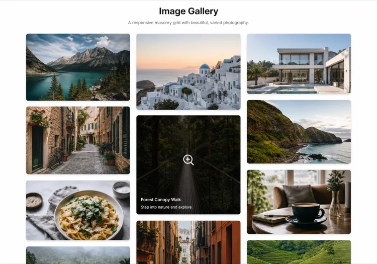
Describe la cuadrícula que deseas y MeDo genera una galería de imágenes completamente estilizada en segundos. Diseños masonry, overlays de lightbox, efectos hover, breakpoints responsivos — todo desde un único prompt.

Galería
Galería

Una buena galería convierte visitantes en creyentes.

Las imágenes son la señal de confianza más rápida en la web — los visitantes se forman una opinión sobre tu calidad visual en menos de 200 ms. Una galería bien estructurada permite que esa calidad hable a escala, ya sea que estés mostrando un portafolio, un catálogo de productos o fotos de eventos. El diseño correcto también afecta el SEO: los componentes de imagen correctamente estructurados con texto alternativo y datos estructurados contribuyen a la visibilidad en búsqueda de imágenes y a las métricas de interacción con la página.

6 plantillas

Plantillas de Galería que puedes generar

Cada plantilla es un prompt real, no una captura de pantalla. Cópialo en cualquier editor de IA o ejecútalo en MeDo y obtén código React + Tailwind.

Uniform gridAcme

Fixed Aspect-Ratio Image Grid

Every tile the same shape, so the grid reads as one object rather than a collage. The right default for product shots — and the wrong one for editorial photography, where cropping to a square throws away the composition.

Create a responsive image grid: four columns on desktop, three on tablet, two on mobile, with a consistent gap. Wrap each image in a 4:3 aspect-ratio box with object-fit: cover so the grid never reflows as images resolve, and set explicit width and height attributes on every img. Use loading="lazy" and decoding="async" on everything below the first row, and eager loading plus fetchpriority="high" on the first row so the largest contentful paint is not deferred. Add a hover state that lifts the tile slightly and fades in a caption over a gradient scrim; drive the same state from :focus-visible so keyboard users see it. Render each item as a figure with figcaption.


Prueba en MeDo
MasonryMega

Column Masonry With Mixed Heights

Keeps the original aspect ratio of every shot, which is the point for photography. The trap is CSS columns — they order items top-to-bottom per column, so a chronological set reads out of sequence.

Create a masonry image gallery that preserves each image's native aspect ratio. Use CSS grid with grid-auto-rows set to a small row unit and a span calculated per item from its intrinsic ratio, rather than CSS multi-column, so reading order stays left-to-right and matches the source order. Set the aspect-ratio property on every image wrapper from the known width and height so the grid reserves the exact space before the file loads and nothing shifts. Three columns on desktop, two on tablet, one on mobile. Lazy load below the fold, add a blurred low-resolution placeholder that cross-fades to the full image, and keep a fixed gap on both axes.

Prueba en MeDo
LightboxLumen

Grid With a Full-Screen Lightbox

The interaction most galleries get half right: the overlay opens, then Escape does nothing and focus is still behind it. Trap focus and restore it to the thumbnail on close or the gallery is unusable by keyboard.

Create an image grid where clicking a tile opens a full-screen lightbox. The overlay renders as a dialog with aria-modal, moves focus to the close button on open, traps Tab within the overlay, closes on Escape and on backdrop click, and returns focus to the thumbnail that opened it. Support left and right arrow keys plus on-screen previous and next buttons, show a counter such as 4 of 18, and render the caption beneath the image. Preload the neighbouring two images so navigation is instant, lock body scroll while open, and add touch swipe on mobile. Respect prefers-reduced-motion by dropping the zoom transition.

Prueba en MeDo
FilterableStudio

Category Filters Above the Grid

Worth adding past a dozen images and a liability below it — three filter chips over nine photos is furniture. Filter in the URL, not just in state, so a client can send a link to one category.

Create a filterable image gallery: a horizontal row of category chips above a responsive grid, with an All chip active by default and a count beside each label. Filtering hides non-matching items and animates the remaining tiles to their new positions with a transform-based transition rather than re-laying out abruptly. Reflect the active filter in the URL query string so a filtered view is linkable and survives reload. Use real button semantics with aria-pressed on each chip, announce the resulting item count in an aria-live region, and show an empty state when a category has no items. Keep the aspect-ratio boxes fixed so filtering never changes tile size.

Prueba en MeDo
CarouselReel

Scroll-Snap Thumbnail Carousel

For a strip inside a page rather than a full section — a product detail block or a case study. Build it on scroll-snap, not a JavaScript slider, so it still works with a trackpad and a touch drag.

Create a horizontal image carousel using CSS scroll-snap: a flex row with overflow-x auto, scroll-snap-type x mandatory and scroll-snap-align center on each slide, so native touch and trackpad scrolling work without a slider library. Sit a thumbnail strip beneath it where the active thumb is outlined and clicking one scrolls the main rail to that slide via scrollIntoView with smooth behaviour. Add previous and next buttons that disable at each end, hide the scrollbar visually while keeping keyboard scrolling intact, and give the rail a role and label so it is announced as a group. Fixed aspect-ratio slides, lazy loading past the second image.

Prueba en MeDo
MosaicEditorial

Asymmetric Feature Mosaic

One image spans two columns and two rows, the rest fill around it. Gives a set of otherwise equal photographs a focal point — but only ever promote one tile, because two hero cells cancel each other out.

Create an asymmetric mosaic gallery on a six-column CSS grid: the first item spans four columns and two rows, two items span two columns each, and the remainder fill single cells, with explicit grid-column and grid-row spans rather than auto-placement. Give every cell a fixed aspect-ratio box and object-fit: cover so the mosaic holds its shape at any image size. Collapse to a two-column grid on tablet and a single column on mobile, keeping the feature image first. Add a hover scrim with a title and a year, lazy load everything after the feature cell, and eager load the feature image so it can be the largest contentful paint.

Prueba en MeDo

Cómo personalizar tu Galería

Elige un diseño que coincida con la densidad de tu contenido

Las cuadrículas uniformes funcionan bien para fotografía de productos donde la consistencia importa. Las cuadrículas masonry brillan con contenido de relación de aspecto mixta como fotos editoriales o tomas de portafolio. Pide a MeDo que cambie de diseño simplemente actualizando tu prompt — no se requiere refactorización estructural.

Añade filtros de categoría para colecciones grandes

Cuando tu galería contiene más de una docena de imágenes, filtrar por etiqueta o categoría mejora drásticamente la usabilidad. Pide a MeDo que incluya una barra de filtros sobre la cuadrícula y anime la transición del diseño al cambiar entre categorías.

Optimiza los Core Web Vitals con lazy loading

Las galerías son de los principales contribuidores a puntuaciones deficientes de LCP y desplazamiento de diseño. Pide a MeDo que incluya lazy loading nativo, dimensiones explícitas de imagen y efectos de desenfoque de marcador de posición para mantener las métricas de rendimiento limpias.

Haz el lightbox accesible por teclado y lector de pantalla

Un lightbox que atrapa el foco, responde a Escape y teclas de flecha, y anuncia las descripciones de imagen a los lectores de pantalla es mucho más inclusivo — y evita fallos en auditorías de accesibilidad. Especifica estos requisitos en tu prompt de MeDo y estarán integrados desde el inicio.

Quién usa el componente Galería

Portafolios creativos

Diseñadores, fotógrafos e ilustradores dependen de las galerías como pieza central de su sitio. Una cuadrícula masonry con un lightbox limpio deja que el trabajo respire sin que la interfaz compita por la atención.

Páginas de productos de e-commerce

Las galerías de productos con múltiples imágenes, tiras de miniaturas y funcionalidad de zoom influyen directamente en las decisiones de compra. Una galería bien construida reduce devoluciones al ayudar a los compradores a examinar los productos a fondo antes de comprar.

Sitios de eventos y bodas

Los fotógrafos de eventos y los recintos usan galerías para mostrar trabajos anteriores y generar prueba social. Las cuadrículas filtrables organizadas por tipo de evento facilitan que los clientes potenciales encuentren ejemplos relevantes rápidamente.

Listados de bienes raíces

Los listados de propiedades con una galería de fotos completa — incluyendo una imagen héroe prominente, una tira de miniaturas y un lightbox a pantalla completa — generan significativamente más consultas que los listados con solo imágenes estáticas.

Patrones de Galería para distintos sitios web

El mismo componente galería, adaptado al tipo de sitio donde se publica.

01 / 06

Photography Portfolio Gallery

Masonry, no crops, and a lightbox that shows the frame at full width. Square-cropping a photographer's work into a uniform grid destroys the composition they were hired for. Keep the chrome minimal — captions on hover, not permanently on top of the image.

Estilos y variantes de Galería

Elige la variante que encaje con el resto de la página y genérala.

01 / 06

Uniform Grid

Equal tiles at one aspect ratio. Reads as a single object and is trivially responsive, at the cost of cropping every image to the same shape — fine for products, destructive for photography.

Galería en React, Next.js, Vue y Svelte

React, Next.js, Vue 3, SvelteKit, Astro o HTML puro: el mismo galería, seis formas de integrarlo.

01 / 06

React Gallery

Map over an images array where each entry carries its intrinsic width and height, and use them to set the aspect-ratio box. Only the lightbox needs state — the grid itself is pure markup.

src/components/Gallery.tsx

export function Gallery({ images }) {
  const [open, setOpen] = useState(null)
  return (
    <ul className="grid gap-4 md:grid-cols-3">
      {images.map((img, i) => (
        <li key={img.src} style={{ aspectRatio: img.w / img.h }}>
          <button onClick={() => setOpen(i)}>
            <img src={img.src} alt={img.alt} width={img.w} height={img.h} loading="lazy" />
          </button>
        </li>
      ))}
    </ul>
  )
}

Cómo añadir tu Galería a un proyecto

Cuatro pasos, desde elegir una plantilla de galería hasta llevarlo a producción.

01~30s

Pick a Gallery Layout

Choose by what your images have in common — uniform grid when the shapes match, masonry when they do not, mosaic when one image should lead, carousel when the gallery is a block inside a longer page.

02~10s

Copy the Prompt

Take the prompt into MeDo, or paste it into Lovable, Bolt, v0 or Cursor. Set your real column counts and aspect ratio before running it, since those two decisions drive every breakpoint that follows.

03~1min

Generate and Refine

You get React + Tailwind back with a live preview. Follow up in plain English — "add Escape to close", "two columns on tablet", "captions under the image instead of over it" — rather than editing grid spans by hand.

04~2min

Wire Up Your Images

Swap the placeholders for your own files with real alt text and intrinsic width and height on every one. That is what keeps the grid from shifting as images resolve, and it is the step most likely to be skipped.

Preguntas frecuentes sobre Galería

¿Cómo creo una galería de imágenes con IA?

Abre MeDo y describe la galería que deseas — estilo de diseño, número de columnas, comportamiento al hover y si necesitas un lightbox. MeDo genera un componente de galería completo y listo para producción en segundos. Puedes iterar refinando tu prompt hasta que el resultado coincida con tu visión.

¿Cuál es el mejor generador de galerías con IA?

MeDo está diseñado específicamente para generar componentes de UI a partir de prompts en lenguaje natural. A diferencia de las herramientas de IA generales, MeDo entiende las convenciones de frontend como cuadrículas responsivas, transiciones CSS, lazy loading y patrones de accesibilidad — por lo que la galería que genera es realmente desplegable, no solo visualmente prototipada.

¿Puedo generar una galería masonry con IA?

Sí. Solo especifica "diseño masonry" en tu prompt de MeDo. MeDo generará un diseño basado en CSS Grid o Masonry que maneja elegantemente imágenes de altura variable, con espaciado correcto y conteos de columnas responsivos en cada breakpoint.

¿Cómo añado un lightbox a una galería generada con IA?

Incluye "lightbox" en tu prompt de MeDo — por ejemplo, "al hacer clic en una imagen debe abrirse un lightbox a pantalla completa con flechas de navegación." MeDo conectará el manejador de clics, el overlay y los controles de teclado. También puedes pedir funciones como soporte para deslizar, leyendas de imagen o un botón de cierre en el mismo prompt.

¿Puede el generador de galerías con IA crear una galería filtrable?

Sí. Pide a MeDo que incluya una barra de filtros o navegación basada en etiquetas en tu prompt de galería. MeDo generará la UI de filtros, asignará categorías a cada slot de imagen y animará la transición de cuadrícula al cambiar filtros — todo en un solo pase.

¿Cómo hago una galería generada con IA compatible con SEO?

Dile a MeDo que incluya marcadores de posición de texto alternativo descriptivos, marcado correcto de figure/figcaption y atributos de lazy loading. Para un SEO de imágenes más rico, también puedes pedir a MeDo que añada datos estructurados ImageObject (schema.org) a cada elemento de la galería, lo que ayuda a los motores de búsqueda a indexar tus imágenes con precisión.