AI Blog Section Generator.

Describe the blog layout you want — card style, post count, featured article, category filters — and MeDo generates the complete component. Ship a polished blog section without touching a single CSS grid property.

Blog Section
Blog Section

A Great Blog Section Turns Readers Into Return Visitors.

Your blog is one of your highest-leverage SEO and trust-building assets — but only if visitors can actually find and explore it. A well-designed blog section surfaces your best content immediately, communicates topical authority through visible categories, and guides readers from a landing page into your content funnel. MeDo lets you generate exactly the layout that fits your brand and content volume, rather than squeezing into a generic theme.

6 templates

Blog Section Templates You Can Generate

Every template is a real prompt, not a screenshot. Copy it into any AI editor, or run it in MeDo and get React + Tailwind code back.

Three cardAcme

Three-Card Homepage Preview

The smallest blog section that still looks intentional. Three posts and a View all link — enough to prove the blog is alive without turning a marketing page into an index.

Create a blog preview section with a section heading, a one-line subheading and a three-column card grid. Each card holds a 16:9 cover image in a fixed aspect-ratio box, a category pill above the title, a two-line title clamped with line-clamp-2, a two-line excerpt clamped with line-clamp-2, and a footer row with author name, publish date in a time element with a machine-readable datetime, and a reading-time estimate. Make the whole card one link with the heading as the accessible name rather than adding a separate Read more link. Below the grid, a centred View all posts link. Two columns on tablet, one on mobile, with the cover images lazy loaded.

Try in MeDo
Featured splitEditorial

One Featured Post, Three Stacked

Creates a clear lead story, which an even grid never does. Only works if the featured post is genuinely your best — promoting whatever published last makes the asymmetry look arbitrary.

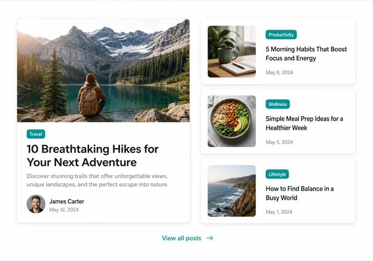
Create an asymmetric blog section: on the left, a featured post card taking about 60% of the width with a large 3:2 cover image, a category pill, a headline at display size, a three-line excerpt and an author row with avatar, date and reading time. On the right, three compact cards stacked vertically, each with a small square thumbnail on the left and a category, a two-line clamped title and a date on the right. Divide the stacked cards with hairline rules rather than shadows so they read as a list next to the feature. Stack the feature above the list on tablet and below on mobile, keeping the feature image eager loaded.

Try in MeDo
Index gridMega

Paginated Post Index

The standalone blog page rather than a homepage teaser. Nine cards is the ceiling before the grid stops being scannable — past that, pagination beats a longer page or infinite scroll.

Create a blog index section: a page heading, a horizontal row of category filter chips, and a nine-card grid at three columns. Each card carries a cover image in a fixed 16:9 box, a category pill, a clamped two-line title, a clamped two-line excerpt, and a meta row with author, a time element for the date and a reading time. Below the grid, numbered pagination with previous and next controls, aria-current on the active page, and real anchor hrefs to /blog/page/2 so pages are crawlable and linkable rather than swapped in by client state. Show a labelled empty state when a filter returns nothing. Two columns on tablet, one on mobile.

Try in MeDo
Text listLedger

Dated List With No Images

No thumbnails, just date, title and one line of description. Faster to scan than any card grid and the honest choice when your posts have no cover art — a grid of stock photography reads worse than plain text.

Create an image-free blog list: rows separated by hairline rules, each row showing a left-aligned date in a fixed-width muted column, then the post title as a link at large text size, a one-line clamped description beneath it, and a right-aligned reading time. Group the rows under year headings when the list spans multiple years. Give each row a full-width hover background so the whole row reads as the hit target, and keep the vertical rhythm tight so twenty posts fit in two screens. Stack the date above the title on mobile. Use an ordered list with time elements for the dates.

Try in MeDo
Category tabsStudio

Topic Tabs Over a Card Grid

Turns a mixed blog into something a reader can navigate by interest. Needs at least a few posts per tab — a tab that opens onto two articles makes the blog look thinner than one undivided grid would.

Create a blog section with topic tabs above a six-card grid: tabs labelled All, Engineering, Design and Product with a post count beside each. Use real tab semantics — a tablist with arrow-key navigation, aria-selected, and managed focus — and reflect the active tab in the URL so a topic view is linkable. Switching a tab swaps the card set with a short fade rather than a layout jump, and keeps the grid height stable by always rendering a fixed number of card slots. Each card has a cover image, category pill, clamped title and excerpt, and a meta row with author and date. Announce the result count in an aria-live region.

Try in MeDo
ChangelogShipfast

Release Notes Timeline

A blog section for product updates, where version and date matter more than a cover image. Keep the newest entry expanded and the rest collapsed so the page opens on what changed most recently.

Create a changelog-style blog section: a vertical timeline with a left rail of dots and connecting line, each entry showing a version tag, a date in a time element, a type pill for Added, Fixed or Changed, a title and a two-to-three sentence summary. Expand the most recent entry by default and render the rest as collapsed disclosure panels using button plus aria-expanded so keyboard users can open them. Add anchor links on each version so a specific release can be linked directly, and a Subscribe to updates link at the top of the section. Collapse the left rail to a simple stacked list on mobile.

Try in MeDo

How to Customize Your Blog Section

Lead with a featured post

Spotlight your most important article with a larger card — include a full-width cover image, longer excerpt, and a distinct visual treatment. Tell MeDo which post is "featured" and it will create the asymmetric layout automatically.

Add category or tag filters

If you publish across multiple topics, ask MeDo to include a horizontal filter bar above the grid. This turns your blog section into a self-serve discovery tool and keeps readers on-page longer.

Show author context

Including an author avatar, name, and read-time estimate builds trust and sets reader expectations. Mention these metadata fields in your prompt to have them woven into each card.

Control card density with post count

Specify exactly how many posts to show — three cards for a tight homepage preview, six to nine for a standalone blog index page. Pair it with a "View all" CTA to avoid an infinite grid on marketing pages.

Who Uses the Blog Section Component

SaaS marketing site

A three-card preview section on the homepage linking to product tutorials, customer stories, and release notes — driving blog traffic without overwhelming the conversion flow.

Content-first publication

A full-width editorial layout with a hero article, category tabs, and a paginated card grid — everything readers expect from a professional publication.

Agency or studio

A minimal two-column mosaic of case studies and thought-leadership posts, showing depth of expertise to prospective clients before they even click.

E-commerce brand

A lifestyle blog section with large imagery and short teasers linking to buying guides, trend roundups, and behind-the-scenes stories that warm up purchase intent.

Blog Section Patterns for Different Websites

The same blog section component, tuned to the kind of site it ships on.

01 / 06

SaaS Marketing Blog Section

A three-card teaser on the homepage, not an index. The job is proving the product is maintained and that someone is writing about the problem, so lead with the tutorial or customer story — release notes belong in their own changelog, not competing for the same three slots.

Blog Section Styles and Variants

Pick the variant that matches the rest of the page, then generate it.

01 / 06

Three-Card Grid

Equal cards in one row with a View all link beneath. The right default on a marketing page where the blog is supporting evidence rather than the destination, and it stays honest when you have only published a handful of posts.

Blog Section in React, Next.js, Vue and Svelte

React, Next.js, Vue 3, SvelteKit, Astro or plain HTML — the same blog section, six ways to drop it in.

01 / 06

React Blog Section

Keep the posts in one typed array and let the card be a pure function of a post. No state is needed unless you add filters, which is what makes this section safe to render on the server.

src/components/BlogSection.tsx

type Post = { slug: string; title: string; excerpt: string; date: string; minutes: number }

export function BlogSection({ posts }: { posts: Post[] }) {
  return (
    <ul className="grid gap-8 md:grid-cols-3">
      {posts.map((post) => (
        <PostCard key={post.slug} post={post} />
      ))}
    </ul>
  )
}

How to Add Your Blog Section to a Project

Four steps, from picking a blog section template to shipping it in production.

01~30s

Pick a Blog Layout

Choose by post volume and by whether you have cover art — three cards for a homepage teaser, a featured split when one post should lead, a dated list when the posts have no images worth showing.

02~10s

Copy the Prompt

Take the prompt into MeDo, or paste it into Lovable, Bolt, v0 or Cursor. Name the metadata you actually have first — author, reading time, category — since a card designed around fields you cannot populate is the usual reason these sections get rebuilt.

03~1min

Generate and Refine

You get React + Tailwind back with a live preview. Follow up in plain English — "clamp titles to two lines", "drop the excerpt on mobile", "move the category above the title" — instead of tuning class strings by hand.

04~2min

Connect Your Posts

Point the component at your real source — an MDX directory, a content collection or a CMS query — and map the fields once. Sort by date server-side and let the card stay a pure function of a post.

Common Questions About Blog Section

How do I create a blog section with AI?

Open MeDo and describe the blog layout you need — card style, number of posts, whether you want a featured article, which metadata fields to show (author, date, read time), and any filters. MeDo generates the full component code in seconds. You can then copy it into your project and continue refining with follow-up prompts.

What is the best AI blog section generator?

MeDo is purpose-built for generating real website components, not just design mockups. Unlike general AI chat tools, MeDo understands layout systems, card patterns, and responsive behavior — so your blog section comes out as clean, production-ready code rather than a rough starting point that needs heavy editing.

Can AI generate a responsive blog card grid?

Yes. MeDo generates responsive-first components. Specify how many columns you want at desktop size and it handles the breakpoints automatically — collapsing to a single-column stack on mobile without extra work on your part.

How do I add category filters to an AI-generated blog section?

Include the filter requirement in your prompt — for example, "add category filter tabs for Design, Engineering, and Product above the card grid." MeDo will generate the filter UI and the conditional display logic to match.

Can I use AI to generate a featured blog post layout?

Absolutely. Ask MeDo for an asymmetric layout with one large featured card and secondary smaller cards alongside it. This editorial pattern is one of the most effective ways to highlight cornerstone content while still surfacing multiple recent posts.

Does the AI-generated blog section include author and date metadata?

Yes — just mention the metadata you want in your prompt. MeDo can include author name and avatar, publish date, estimated read time, category tag, and excerpt. You control exactly what appears on each card.