
AI Newsletter Signup Generator.

Turn a one-sentence brief into a polished newsletter signup section. Email field, supporting copy, social proof, and styled code — all generated and ready to ship.

Newsletter Signup
Newsletter Signup

Your Email List Is the One Audience You Actually Own

Social algorithms shift, ad costs rise, and platform reach decays — but an email subscriber list compounds over time and belongs entirely to you. A well-designed newsletter signup component turns passive visitors into a direct, permission-based audience. Getting the copy, layout, and friction right at this moment is one of the highest-leverage investments a site can make.

6 templates

Newsletter Signup Templates You Can Generate

Every template is a real prompt, not a screenshot. Copy it into any AI editor, or run it in MeDo and get React + Tailwind code back.

CenteredAcme

Centered Section With One Field

The default: headline, one line of value exchange, email, button. One field is the whole design decision — asking for a first name alongside the email buys you a merge tag and costs you subscribers.

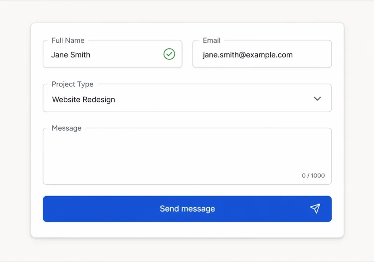
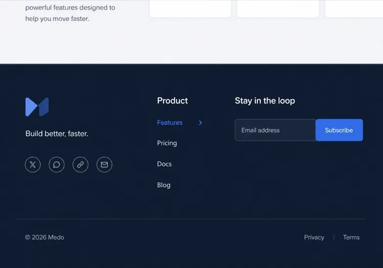
Create a centered newsletter signup section with generous vertical padding: a headline naming the topic and the cadence, one supporting line describing exactly what arrives and how often, then an inline form with a single email input and a Subscribe button sitting flush beside it on desktop and stacked full-width on mobile. Use type="email", autocomplete="email", inputmode="email" and a visually hidden label. Validate on blur and on submit rather than on every keystroke, showing the message in an element referenced by aria-describedby with aria-invalid on the field. Disable the button and swap its label to a spinner while submitting, then replace the whole form with a confirmation message asking the reader to check their inbox.
Try in MeDo
InlineInline

In-Article Capture Strip

A compact strip dropped mid-post, where the reader has already decided the writing is worth their time. Catches intent that a footer form never sees, but it has to stay short — a full section mid-article reads as an interruption.

Create a compact inline newsletter strip for placement mid-article: a tinted rounded panel about the width of the article column, with a one-line bold prompt referencing the topic of the surrounding post, a short second line naming the cadence, and a single-row form with an email input and a short button label. No heading larger than the article body headings, so it does not read as a new section. Validate inline on blur with the error text replacing the cadence line rather than growing the panel, keep the panel height fixed across default, error and success states, and on success swap the form for a one-line confirmation in place.

Try in MeDo
Split panelMega

Two-Column Panel With a Sample Issue

Copy and form on one side, a preview of a real issue on the other. Showing the thing itself outperforms describing it — a reader who can see the format does not have to trust your adjectives.

Create a two-column newsletter signup panel: on the left, a headline, three short bullet points naming what each issue contains, the email form and a muted no-spam line; on the right, a framed screenshot or rendered preview of a recent issue with a link to read it in full before subscribing. Give the right column a fixed aspect-ratio box so the panel does not reflow while the preview image loads. Keep the form to one input plus a button, with inline validation on blur and an aria-live region for the result. Stack to one column on mobile with the preview below the form, and lazy load the preview image.

Try in MeDo
Lead magnetShipfast

Signup Traded for a Download

The email buys a specific artefact rather than a subscription. It converts colder traffic, and it fills your list with people who wanted the file — say plainly that the newsletter continues after it.

Create a lead-magnet signup section: a thumbnail of the asset on the left, and on the right a headline naming the asset concretely, a line stating its format and length, an email input with a Send it to me button, and a small line stating that subscribers also receive the weekly email so the ongoing commitment is not a surprise. Add a required consent checkbox with the wording as a visible label rather than a tooltip, and block submission with an inline message if it is unchecked. On success, show a confirmation that names the sending address and asks the reader to confirm the double opt-in email before the download link arrives.

Try in MeDo
Social proofStudio

Subscriber Count With Reader Faces

A stacked avatar row and a real count above the form. It answers the fear of joining a dead list — but only with a true number, since a rounded-up count is the easiest kind of claim for a reader to disbelieve.

Create a newsletter signup section led by social proof: a stacked row of five overlapping reader avatars with a plus-N chip, then a line stating the subscriber count and who they are, then the headline, then the form. Below the button, a two-item reassurance row covering unsubscribe in one click and no sharing of addresses. Keep the form to one email field with inline validation on blur, aria-invalid on the field and the message wired via aria-describedby. Give the avatars explicit width and height so the row does not shift as images load, and render a confirmation state in place of the form on success rather than a toast.

Try in MeDo
Footer barAnchor

Persistent Bottom Capture Bar

A slim bar pinned to the bottom of the viewport after a scroll threshold. The lowest-friction placement and the easiest one to overdo — one dismissal must be remembered, or it stops being a form and becomes a nuisance.

Create a slim newsletter capture bar fixed to the bottom of the viewport, revealed once the reader passes about 60% scroll depth and animated in with a short translate. It holds one line of copy, an email input, a short button and a labelled dismiss button. Persist the dismissal in localStorage so it never returns for that reader, and hide it entirely for anyone already subscribed. Show validation errors as a tooltip above the input rather than growing the bar, keep the bar under 72px tall, add bottom padding to the page so it never covers the final content, respect prefers-reduced-motion, and collapse to a single tap target that expands into the form on mobile.

Try in MeDo

How to Customize Your Newsletter Signup

Name exactly what the subscriber gets and when

Vague CTAs like "Subscribe to our newsletter" underperform. Replace it with specifics: "Get one actionable growth tactic every Friday" or "Weekly case studies for indie founders". The more precisely you describe the content cadence and format, the easier it is for the right reader to say yes.

Add a subscriber count as social proof

A single line — "Join 12,000 readers" or "Trusted by 4,500 developers" — placed below the subscribe button removes the fear of signing up for something nobody reads. Even a modest real number outperforms no number, because it signals the list is alive.

Reduce the form to one field

Asking for a first name alongside an email increases drop-off. Start with email only. Personalization can happen later once the subscriber is inside the funnel. Every extra field is a reason to click away.

Offer a lead magnet for low-intent visitors

For audiences that need more convincing, pair the signup form with a concrete giveaway: a free checklist, a sample issue, or an exclusive resource. A small immediate reward converts undecided visitors who would otherwise leave without subscribing.

Who Uses the Newsletter Signup Component

SaaS product blog

Product blogs embed inline newsletter signups mid-article and at the end of posts, typically offering a digest of new articles or a curated tool list — capturing readers at the moment they are most engaged with the content.

Independent creator or writer

Solopreneur sites center the entire homepage around a newsletter signup, leading with a bold personal hook — the specific topic and cadence — and using a real subscriber count as the primary credibility signal.

E-commerce or DTC brand

Retail sites use newsletter signups to offer a first-order discount, then nurture subscribers with product launches, restocks, and seasonal campaigns — making the email list a direct revenue channel.

Developer tool or open-source project

Dev-focused newsletters promise release notes, changelog summaries, and technical deep-dives. Signups on these sites are minimal — email field, one-line description, and a submit button — because the audience values substance over style.

Newsletter Signup Patterns for Different Websites

The same newsletter signup component, tuned to the kind of site it ships on.

01 / 06

SaaS Product Blog Signup

Inline mid-article beats a footer form here, because the reader who is 60% through a technical post is the only one whose intent you can actually read. Promise the specific thing — release notes, or a monthly digest — not "our newsletter".

Newsletter Signup Styles and Variants

Pick the variant that matches the rest of the page, then generate it.

01 / 06

Centered Section

Headline, one supporting line, one field, one button, centred with wide padding. The safest default and the one that survives being dropped anywhere on the page, since it makes no assumption about the content around it.

Newsletter Signup in React, Next.js, Vue and Svelte

React, Next.js, Vue 3, SvelteKit, Astro or plain HTML — the same newsletter signup, six ways to drop it in.

01 / 06

React Newsletter Signup

Model the form as one status value — idle, submitting, success, error — rather than three booleans, so the impossible states cannot render. Keep the input controlled so validation and the disabled button read from the same source.

src/components/NewsletterSignup.tsx

type Status = 'idle' | 'submitting' | 'success' | 'error'

export function NewsletterSignup() {
  const [email, setEmail] = useState('')
  const [status, setStatus] = useState<Status>('idle')

  if (status === 'success') return <p role="status">Check your inbox to confirm.</p>

  return (
    <form onSubmit={submit} noValidate>
      <input type="email" value={email} onChange={(e) => setEmail(e.target.value)} required />
      <button disabled={status === 'submitting'}>Subscribe</button>
    </form>
  )
}

How to Add Your Newsletter Signup to a Project

Four steps, from picking a newsletter signup template to shipping it in production.

01~30s

Pick a Signup Layout

Match the placement to the reader's state — inline mid-article for engaged readers, a centred section for a landing page, a split panel when showing a sample issue does the persuading.

02~10s

Copy the Prompt

Take the prompt into MeDo, or paste it into Lovable, Bolt, v0 or Cursor. Write the real value exchange first — topic, cadence, what arrives — because "Subscribe to our newsletter" is the line that costs you the signup.

03~1min

Generate and Refine

You get React + Tailwind back with a live preview. Follow up in plain English — "add a consent checkbox", "show the error under the input", "keep the panel height fixed across states" — rather than editing markup by hand.

04~2min

Wire It to Your List

Post to your provider from a server action or API route so the token never reaches the browser, turn on double opt-in, and check the success, error and already-subscribed states before shipping.

Common Questions About Newsletter Signup

What is an AI newsletter signup generator?

An AI newsletter signup generator is a tool that takes a plain-language description of your newsletter — topic, audience, and incentive — and produces a complete signup component with copy, layout, email input, and styled code. MeDo generates the full component including headline, subtext, input field, button, and social-proof line in a single prompt.

How do I create a newsletter signup form with AI?

Open MeDo and describe your newsletter in plain language: who it is for, what it covers, how often it sends, and any lead magnet you offer. For example: "Create a newsletter signup for a weekly email on personal finance for millennials — include a headline, a two-line description, an email input, and a subscribe button." MeDo generates the component; you can refine styling and copy with follow-up prompts.

What should a good newsletter signup section include?

At minimum: a specific headline naming the topic and cadence, one to two lines of supporting copy, an email input field, and a clear subscribe button. High-performing signups also include a subscriber count for social proof, a one-line privacy reassurance ("no spam, unsubscribe anytime"), and optionally a lead-magnet callout above the form.

What is the best AI tool to generate newsletter signup components?

MeDo is built specifically for generating UI components from prompts, including newsletter signups. Unlike general chat tools, MeDo understands conversion patterns, component structure, and accessibility — so the output is production-ready rather than a rough starting point that needs extensive cleanup.

How can I increase newsletter signup conversion rates?

The three highest-impact changes are: replacing vague CTAs with specific content promises, adding a real subscriber count as social proof, and reducing the form to a single email field. Beyond that, placement matters — inline signups mid-article consistently outperform footer-only forms because they catch readers while they are engaged.

Can AI write the copy for my newsletter signup as well as the code?

Yes. MeDo generates both the component code and the copy inside it — headline, subheading, button label, and social-proof text — based on your prompt. You can ask it to rewrite the copy with a different tone, swap in a real subscriber count, or test alternative headlines without touching code.
