AI電子報訂閱生成器。

一句話簡報即可生成精美的電子報訂閱區域。電郵輸入框、輔助文案、社交證明和樣式化程式碼 — 全部生成,即可部署。

電子報訂閱
電子報訂閱

你的電郵名單是唯一真正屬於你的受眾

社交演算法在變,廣告成本在漲,平台觸及在降 — 但電郵訂閱者名單會隨時間複利增長,且完全屬於你。一個精心設計的電子報訂閱元件將被動訪客轉化為直接的、基於許可的受眾。在這一刻把文案、佈局和摩擦力調對,是網站能做出的最高槓桿投資之一。

6 個模板

可以產生的 電子報訂閱 模板

每個模板都是真實的提示詞,而非截圖。複製到任何 AI 編輯器,或在 MeDo 中執行,直接取得 React + Tailwind 程式碼。

CenteredAcme

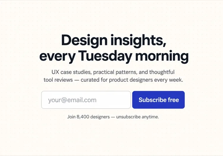
Centered Section With One Field

The default: headline, one line of value exchange, email, button. One field is the whole design decision — asking for a first name alongside the email buys you a merge tag and costs you subscribers.

Create a centered newsletter signup section with generous vertical padding: a headline naming the topic and the cadence, one supporting line describing exactly what arrives and how often, then an inline form with a single email input and a Subscribe button sitting flush beside it on desktop and stacked full-width on mobile. Use type="email", autocomplete="email", inputmode="email" and a visually hidden label. Validate on blur and on submit rather than on every keystroke, showing the message in an element referenced by aria-describedby with aria-invalid on the field. Disable the button and swap its label to a spinner while submitting, then replace the whole form with a confirmation message asking the reader to check their inbox.
在 MeDo 中試試
InlineInline

In-Article Capture Strip

A compact strip dropped mid-post, where the reader has already decided the writing is worth their time. Catches intent that a footer form never sees, but it has to stay short — a full section mid-article reads as an interruption.

Create a compact inline newsletter strip for placement mid-article: a tinted rounded panel about the width of the article column, with a one-line bold prompt referencing the topic of the surrounding post, a short second line naming the cadence, and a single-row form with an email input and a short button label. No heading larger than the article body headings, so it does not read as a new section. Validate inline on blur with the error text replacing the cadence line rather than growing the panel, keep the panel height fixed across default, error and success states, and on success swap the form for a one-line confirmation in place.

在 MeDo 中試試
Split panelMega

Two-Column Panel With a Sample Issue

Copy and form on one side, a preview of a real issue on the other. Showing the thing itself outperforms describing it — a reader who can see the format does not have to trust your adjectives.

Create a two-column newsletter signup panel: on the left, a headline, three short bullet points naming what each issue contains, the email form and a muted no-spam line; on the right, a framed screenshot or rendered preview of a recent issue with a link to read it in full before subscribing. Give the right column a fixed aspect-ratio box so the panel does not reflow while the preview image loads. Keep the form to one input plus a button, with inline validation on blur and an aria-live region for the result. Stack to one column on mobile with the preview below the form, and lazy load the preview image.

在 MeDo 中試試
Lead magnetShipfast

Signup Traded for a Download

The email buys a specific artefact rather than a subscription. It converts colder traffic, and it fills your list with people who wanted the file — say plainly that the newsletter continues after it.

Create a lead-magnet signup section: a thumbnail of the asset on the left, and on the right a headline naming the asset concretely, a line stating its format and length, an email input with a Send it to me button, and a small line stating that subscribers also receive the weekly email so the ongoing commitment is not a surprise. Add a required consent checkbox with the wording as a visible label rather than a tooltip, and block submission with an inline message if it is unchecked. On success, show a confirmation that names the sending address and asks the reader to confirm the double opt-in email before the download link arrives.

在 MeDo 中試試
Social proofStudio

Subscriber Count With Reader Faces

A stacked avatar row and a real count above the form. It answers the fear of joining a dead list — but only with a true number, since a rounded-up count is the easiest kind of claim for a reader to disbelieve.

Create a newsletter signup section led by social proof: a stacked row of five overlapping reader avatars with a plus-N chip, then a line stating the subscriber count and who they are, then the headline, then the form. Below the button, a two-item reassurance row covering unsubscribe in one click and no sharing of addresses. Keep the form to one email field with inline validation on blur, aria-invalid on the field and the message wired via aria-describedby. Give the avatars explicit width and height so the row does not shift as images load, and render a confirmation state in place of the form on success rather than a toast.

在 MeDo 中試試
Footer barAnchor

Persistent Bottom Capture Bar

A slim bar pinned to the bottom of the viewport after a scroll threshold. The lowest-friction placement and the easiest one to overdo — one dismissal must be remembered, or it stops being a form and becomes a nuisance.

Create a slim newsletter capture bar fixed to the bottom of the viewport, revealed once the reader passes about 60% scroll depth and animated in with a short translate. It holds one line of copy, an email input, a short button and a labelled dismiss button. Persist the dismissal in localStorage so it never returns for that reader, and hide it entirely for anyone already subscribed. Show validation errors as a tooltip above the input rather than growing the bar, keep the bar under 72px tall, add bottom padding to the page so it never covers the final content, respect prefers-reduced-motion, and collapse to a single tap target that expands into the form on mobile.

在 MeDo 中試試

如何自訂你的 電子報訂閱

明確說明訂閱者將獲得什麼以及何時獲得

「訂閱我們的電子報」這類模糊CTA表現很差。用具體內容替代:「每週五一個可執行的增長策略」或「獨立創業者的每週案例研究」。你越精確地描述內容節奏和形式,正確的讀者就越容易做出決定。

新增訂閱者數量作為社交證明

一行簡單的文字 — 「加入12,000位讀者」或「4,500位開發者信賴」 — 放在訂閱按鈕下方,消除了訂閱一個沒人看的東西的恐懼。即使是一個適度的真實數字也比沒有數字好,因為它表明名單是活躍的。

將表單精簡到一個欄位

在電郵之外要求填寫姓名會增加流失率。只從電郵開始。個人化可以在訂閱者進入漏斗後再做。每多一個欄位都是離開的理由。

為低意向訪客提供引流磁石

對於需要更多說服力的受眾,將註冊表單與一個具體的贈品搭配:免費清單、樣刊或獨家資源。一個小的即時獎勵能轉化那些否則會不訂閱就離開的猶豫訪客。

誰在使用 電子報訂閱 組件

SaaS產品部落格

產品部落格在文章中間和帖子末尾嵌入內嵌電子報訂閱,通常提供新文章摘要或精選工具列表 — 在讀者與內容互動最深的時刻擷取他們。

獨立創作者或作家

個人創業網站將整個首頁圍繞電子報訂閱展開,以大膽的個人鉤子引導 — 具體主題和節奏 — 並使用真實訂閱者數量作為主要可信度訊號。

電商或DTC品牌

零售網站使用電子報訂閱來提供首單折扣,然後透過產品發佈、補貨和季節性活動培育訂閱者 — 使電郵名單成為直接收入渠道。

開發者工具或開源專案

面向開發者的電子報承諾發佈說明、變更日誌摘要和技術深度分析。這些網站上的訂閱極簡 — 電郵欄位、一行描述和提交按鈕 — 因為受眾重視內容而非形式。

不同網站的 電子報訂閱 方案

同一個 電子報訂閱 組件,針對它所在網站的類型作調整。

01 / 06

SaaS Product Blog Signup

Inline mid-article beats a footer form here, because the reader who is 60% through a technical post is the only one whose intent you can actually read. Promise the specific thing — release notes, or a monthly digest — not "our newsletter".

電子報訂閱 的風格與變體

挑選與頁面其餘部分相襯的變體,然後產生它。

01 / 06

Centered Section

Headline, one supporting line, one field, one button, centred with wide padding. The safest default and the one that survives being dropped anywhere on the page, since it makes no assumption about the content around it.

在 React、Next.js、Vue 與 Svelte 中使用 電子報訂閱

React、Next.js、Vue 3、SvelteKit、Astro 或純 HTML —— 同一個 電子報訂閱,六種接入方式。

01 / 06

React Newsletter Signup

Model the form as one status value — idle, submitting, success, error — rather than three booleans, so the impossible states cannot render. Keep the input controlled so validation and the disabled button read from the same source.

src/components/NewsletterSignup.tsx

type Status = 'idle' | 'submitting' | 'success' | 'error'

export function NewsletterSignup() {
  const [email, setEmail] = useState('')
  const [status, setStatus] = useState<Status>('idle')

  if (status === 'success') return <p role="status">Check your inbox to confirm.</p>

  return (
    <form onSubmit={submit} noValidate>
      <input type="email" value={email} onChange={(e) => setEmail(e.target.value)} required />
      <button disabled={status === 'submitting'}>Subscribe</button>
    </form>
  )
}

如何把 電子報訂閱 加入專案

四個步驟,從挑選 電子報訂閱 模板到推上生產環境。

01~30s

Pick a Signup Layout

Match the placement to the reader's state — inline mid-article for engaged readers, a centred section for a landing page, a split panel when showing a sample issue does the persuading.

02~10s

Copy the Prompt

Take the prompt into MeDo, or paste it into Lovable, Bolt, v0 or Cursor. Write the real value exchange first — topic, cadence, what arrives — because "Subscribe to our newsletter" is the line that costs you the signup.

03~1min

Generate and Refine

You get React + Tailwind back with a live preview. Follow up in plain English — "add a consent checkbox", "show the error under the input", "keep the panel height fixed across states" — rather than editing markup by hand.

04~2min

Wire It to Your List

Post to your provider from a server action or API route so the token never reaches the browser, turn on double opt-in, and check the success, error and already-subscribed states before shipping.

關於 電子報訂閱 的常見問題

什麼是AI電子報訂閱生成器?

AI電子報訂閱生成器是一種工具,它接受對你的電子報的自然語言描述 — 主題、受眾和激勵措施 — 並生成包含文案、佈局、電郵輸入和樣式化程式碼的完整訂閱元件。MeDo在單個提示詞中生成包括標題、副文本、輸入框、按鈕和社交證明行在內的完整元件。

如何用AI建立電子報訂閱表單?

開啟MeDo,用自然語言描述你的電子報:面向誰、涵蓋什麼、發送頻率以及提供什麼引流磁石。例如:「為千禧世代的個人理財週刊建立電子報訂閱 — 包含標題、兩行描述、電郵輸入和訂閱按鈕。」MeDo生成元件;你可以透過後續提示詞完善樣式和文案。

好的電子報訂閱區域應包含什麼?

至少包含:一個標明主題和頻率的具體標題、一到兩行輔助文案、一個電郵輸入框和一個清晰的訂閱按鈕。高轉化的訂閱還包括訂閱者數量作為社交證明、一行隱私保證(「無垃圾郵件,隨時取消」)以及表單上方可選的引流磁石說明。

生成電子報訂閱元件的最佳AI工具是什麼?

MeDo專為從提示詞生成UI元件而建構,包括電子報訂閱。與通用聊天工具不同,MeDo理解轉化模式、元件結構和無障礙性 — 因此輸出是生產就緒的,而非需要大量清理的粗糙起點。

如何提高電子報訂閱轉化率?

三個最有影響力的改變是:用具體的內容承諾替代模糊CTA、新增真實訂閱者數量作為社交證明、將表單精簡到單個電郵欄位。此外,位置很重要 — 文章中間的內嵌訂閱始終優於僅在頁腳的表單,因為它們在讀者參與時擷取他們。

AI能為我的電子報訂閱寫文案嗎?

可以。MeDo根據你的提示詞同時生成元件程式碼和其中的文案 — 標題、副標題、按鈕標籤和社交證明文本。你可以讓它用不同語調重寫文案、插入真實訂閱者數量或測試替代標題,而無需觸碰程式碼。
